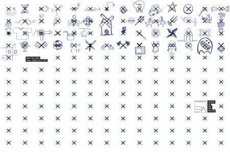
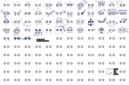
I was really excited to see this ad campaign by Panamericana School of Art and Design, to me it shows how much further you should push yourself be it making music, design, video, etc. I remember early in school you’d usually take the first idea you had that the teacher ok’d and ran with it but the older and older I become the more I steer away from even my first 10 ideas I come up with on a project, I know then that it might form into something a bit more unique.
Posts in Advertising
How Far Does Your Creativity Go? Ad
Parisian Love
This was easily the best ad of the Super Bowl hands down. It was exciting to see Google’s first Super Bowl advertisement ever (and first TV ad period I think…though there may have been the odd commercial early on). Apparently “Parisian Love” as it’s called was available for viewing well before tonight as part of Google’s Search Stories. Anyway I found it refreshing and clever; a nice change from the rest of the nonsense.
On average I was very disappointed with the quality and originality of the ads. I was surprised how many concepts seemed to double up (not only that, but also play consecutively). Tackling was a surprisingly frequent punch line. Yawn. I think Super Bowl ads peaked sometime back in the late 90’s early 00’s. Cheers to Google for putting out something worthwhile.
Vintage Ski Ads Pt.2: Skis
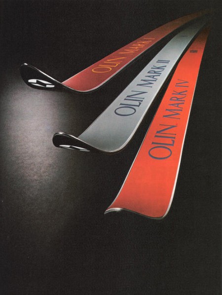
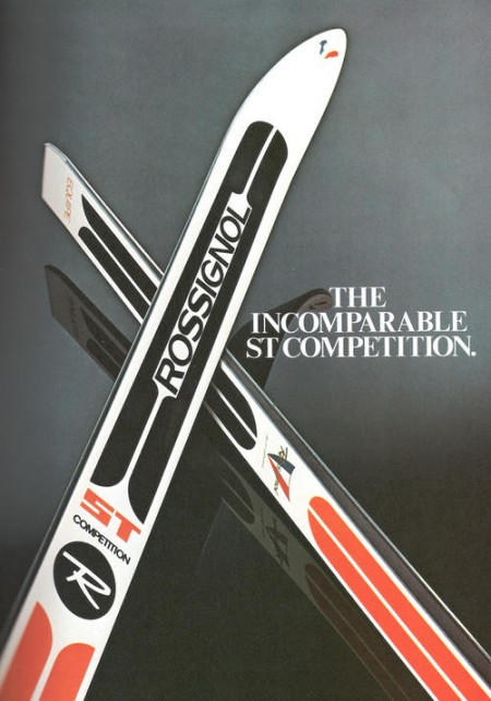
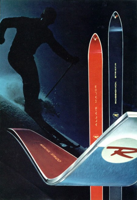
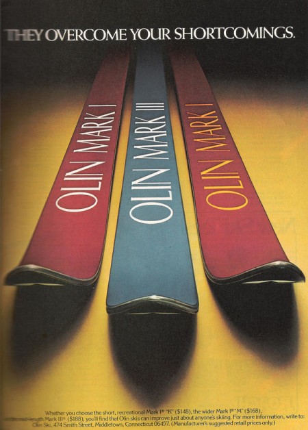
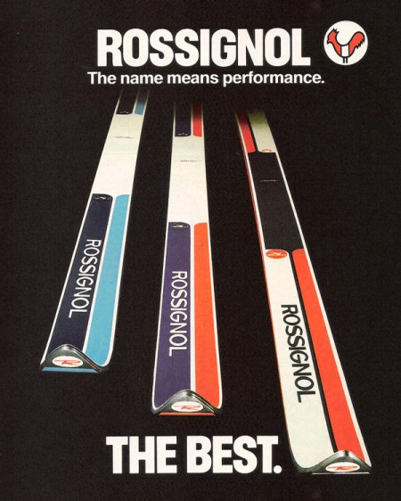
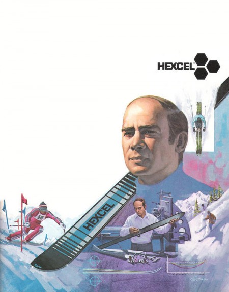
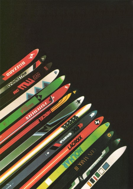
In part 2 of the Vintage Ski Ads Series I chose some that focused in on the skis themselves. When I see skis these days they either look like pop culture threw up all over them or they were designed by the same guy who makes the info graphics at the bottom of the ESPN screen. Looking at the examples above it’s plain to see they had a little more appreciation for subtlety and a sense for classic design back in the day. Either that or the printing methods were such that they were limited to simple shapes and colors and the designer in me is just picking up on that.
When I think about it, this could be the case with a lot of older stuff. I think we as designers often appreciate unintended aesthetic elements; things that were a function of necessity or limitation rather than deliberate design decisions. A good example would be vintage audio equipment. I think the Neve Sidecar is one of the most beautiful inanimate objects ever created. But when you really look at it you realize it was designed by engineers; pretty much every design decision was dictated by necessity and function. So I must be reinterpreting that as physical beauty creating a connection between the idea of an object’s functionality and it’s aesthetic beauty. In other words, maybe I only like how it looks because I appreciate how it works (or in this case, sounds). Then again, I have some gear around the studio that I love the sound and functionality of but is just downright ugly to look at.
Anyways, all those Rossi’s are incredible. This whole style needs to make a comeback, but it seems these days people need to be beaten over the head with design instead of left to appreciate its finer points on their own. I’m not saying there’s not a place for busy, crazy graphics on skis — I myself have designed several busy, crazy skis — I just wish there were more like these to choose from. I guess it’s a different industry, no longer do guys in mock turtlenecks with comb-overs get all scientific and wear collared dress shirts while developing new skis in the lab, now it’s just this guy and a Nintendo DS in a dark room.
Vintage Ski Ads Pt.1: Racing
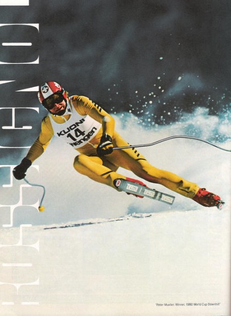
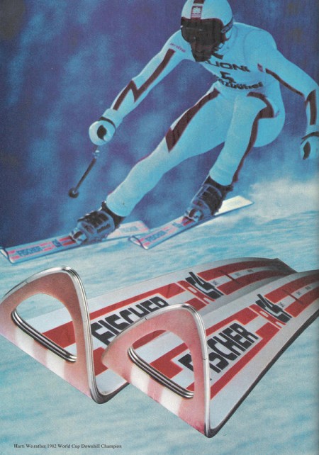
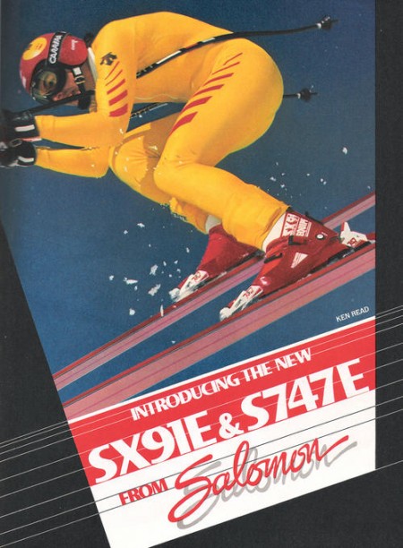
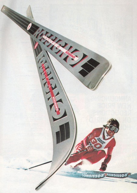
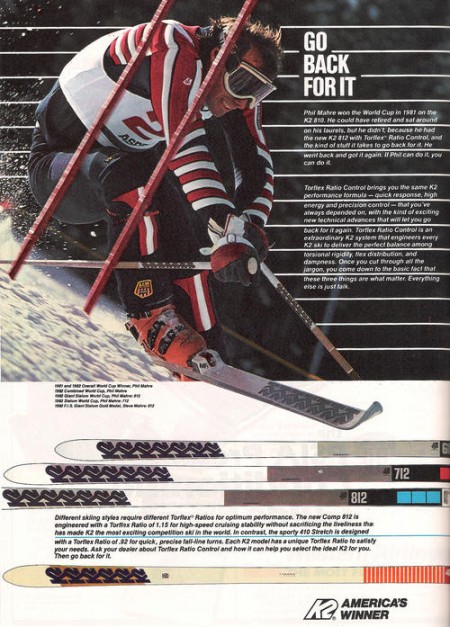
I got my first couple days of skiing for the season in last week right after some nice snow up at Heavenly. Skiing always reminds me of being really young and going up with my parents, Sacramento is only an hour from the Sierras so we’d get up a few times a year. I loved all the design associated with ski equipment and I found that when I first started out in design I was always trying to emulate that style in my work.
My latest trip got me thinking about vintage ski graphics so I set out to track down some good examples. Most of what I found were from magazine ads, this first set focuses on racing imagery. I’ll be posting some more in the days to come, hope you enjoy this first batch.
Vintage BMW Ads
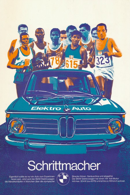
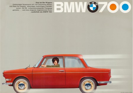
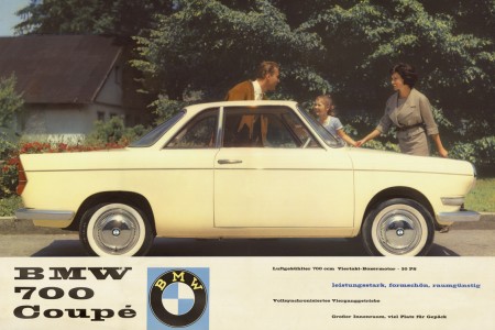
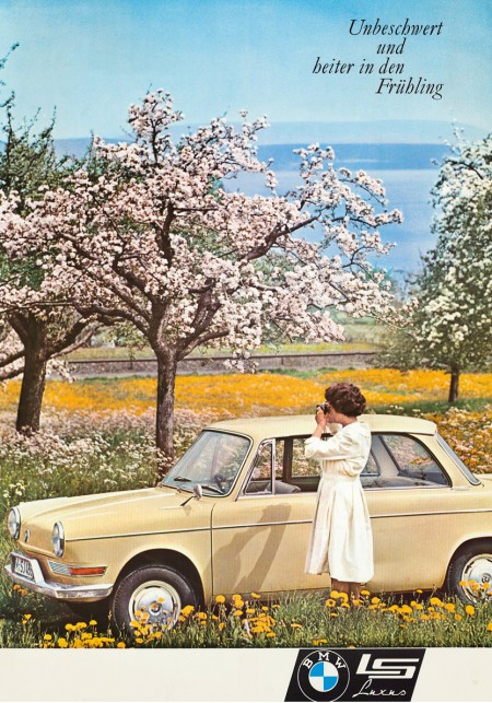
In keeping with my recent car kick I thought I’d post these vintage BMW ads. The first one — created as part of BMW’s affiliation with the 1972 Munich Olympics — is vaguely reminiscent of Otl Aicher’s posters. I’m assuming this was no accident. It’s also a big enough file that you could probably get a pretty good print out of it off a nice inkjet (click image to view full size). I really wish more vintage posters like this were available in higher resolutions. With most of this advertising stuff, the owners of the copyrights have no intention of ever printing them again, it’s a shame they can’t be reproduced and enjoyed by more people.
Via CarType
Shiny Suds (Ad)
Modern Publicicty


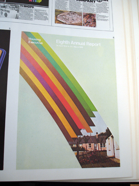


Insect54 has a great Flickr set of 70’s and 80’s Modern Publicity issues. Still waiting to find a stack of something like this in an old closet or at a garage sale, not holding my breath. Where do you find stuff like this anyways? I suppose at this point it’s down to going to shows and swap meets, I doubt there are many gems like this just floating around anymore.
Published Annually by Studio VIsta. Showcasing the best work submitted by designers from around the world.
Shown here are:
Number 40 –– 1970/71
Number 42 –– 1972/73
Number 50 –– 1981
Art & Copy / Recent Design Related Films
Art & Copy is a film about advertising currently making its way around the country. The film is an in-depth look at some of the best and most creative minds in the business. As director Doug Pray states, “I felt it could be a more powerful statement to focus the film only on those rare few who actually moved and inspired our culture with their work. And that higher standard made me want to make a film that reflected the same kind of disciplined artistic approach that my subjects used.” It looks really interesting and I’m really excited to see it.
The frightening and most difficult thing about being what somebody calls a creative person is that you have absolutely no idea where any of your thoughts come from really — and especially you don’t have any idea where they are going to come from tomorrow. — Art & Copy
We’ve been watching The Persuaders in class over the last few weeks and, while it’s not specifically about graphic design per se, it’s easy to draw useful parallels between the two disciplines of advertising and design (as they are often one and the same anyway, whether you like it or not). If you are interested, you can watch all of The Persuaders on the website.
This winter is shaping up to be a pretty excellent time for designers as far as film is concerned. Art & Copy will be in San Francisco in early November, Objectified comes out on DVD on October 13th (so sad they had to push it two weeks due to a “manufacturing snafu”…how ironic), and Visual Acoustics will be here November 6th.
I think I am most excited for Visual Acoustics — I remember writing about it a while ago and have been surviving off of Shulman’s wonderful photography in the meantime. Also worth mentioning is The September Issue, the film chronicling the development and process behind the largest issue of Vogue Magazine. I saw this one recently and would recommend it, but it wasn’t quite as good as I was hoping. It’s exciting to see design related films making their way into the (almost) mainstream!
Side note: Art & Copy employs a beautiful ampersand in the logo for the film. Not sure what it is, but it’s very excellent looking.
Man Must Explore / Tom and Tim Muller




Easily the coolest advertisement for a fragrance I have ever seen. Tom and Tim Muller put this together as part of the campaign for Diesel’s new fragrance Only the Brave. There are many other videos up on the site — nothing comes close to this. (Though Si Scott’s could be cool in a few weeks.) This video, in addition to being flat out gorgeous, really captures the essence of the phrase only the brave. The Apollo 15 Mission connection is a perfect match:
As I stand out here in the wonders of the unknown at Hadley, I sort of realize there is a fundamental truth to our nature. Man must explore.
UPDATE: Tom Muller has written a post detailing this project on his blog. Great to hear a bit more about this fascinating project.
The iPods of the 70s
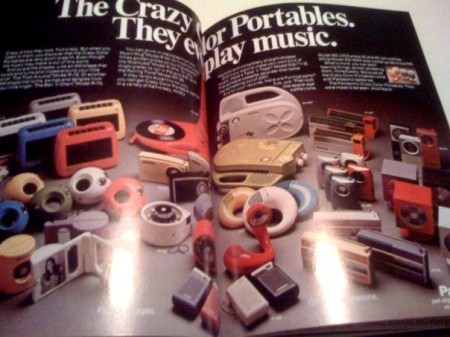
As a collector of 70’s-80’s knick-knacks this selection of portable music players is a dream come true, the thing that makes it for me for the non 70’s fans that might not understand is the color selection and that plastic. It’s almost unbeatable sometimes when in today’s market i’m choosing from gross colors like Beetle shell neon lime green and Bratz doll shiny purple.
