Posts in Advertising

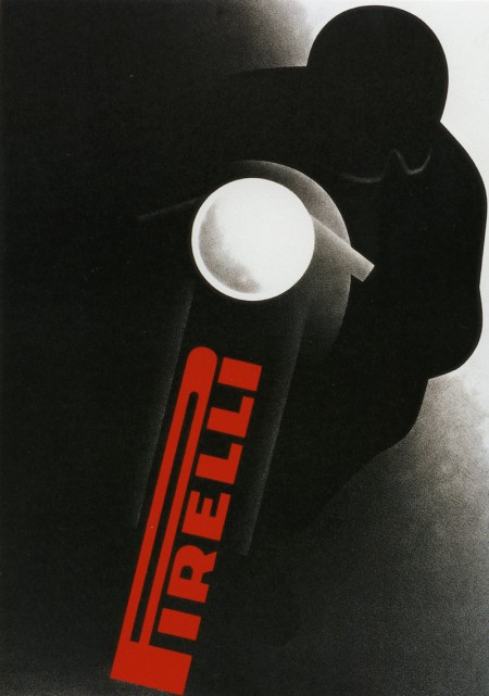
Gerhard Forster for Pirelli

pirelli
I am not one for motorcycles, but it’s an ad like this that makes me reconsider my position. Sign me up to be one of the motorcycle bad guys in the Bourne films.

What about that logo! I like it — maybe a little unwieldy, but it does a good job conjuring their product. I guess it’s hard to evaluate at this point given its classic status. As far as I know, Pirelli was in the business of tires and not bikes. Either way, Gerhard Forster makes the thing look damn cool. I love the charcoal-like texture in the shadows; similar to some of the Robert Longo work I wrote about a few weeks ago.

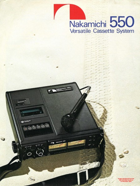
Nakamichi 550

48d8bd455e4ed55148ff02d54392c54e-orig
Always loved the Nakamichi logo.

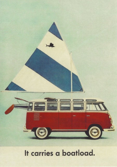
VW 23 Window Bus

23window
I saw this on This Isn’t Happiness today and it reminded me of my friend’s brother who used to be way into restoring VWs. He was always talking about “23 Window” buses like they were the holy grail of VW collecting (well, that and a split window Bug). I’ve seen one of these on the street in my lifetime — here in San Francisco — and one restored and sitting in a garage back home in Sacramento. I always wanted one, but at this point I think I’d settle for a new school one with the pop-top and sink and all that.

On another note: I love VW’s old adverts; they were always simple and to the point. They are all over my old Newsweeks from the 60’s, I’ll have to post some up soon.

Pin-Up Girls In Stereo

0409-layla
minnie
marth-center
samsung
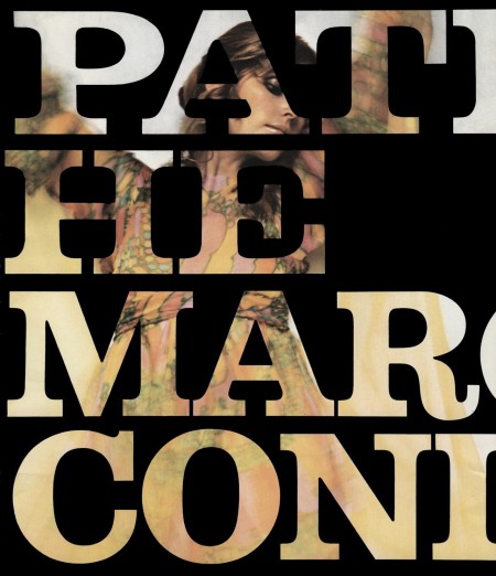
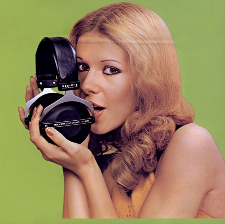
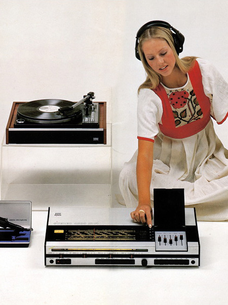
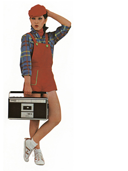
These pin-ups are from the amazing Vintage Knob collection. There’s plenty more of these to see over there along with the more basic fare: close-ups of audio/visual equipment sans hot girls. That Marconi one up there is the best thing I’ve seen in a while; wall size print coming up as soon as they deliver the 9900. Seeing stuff like this always gives me mixed feelings. It just reminds me of the wealth of beautiful images out there that are just lost to time. Can you imagine being able to get the original negatives to these shots and do serious enlargements? It’s nice that sites like The Vintage Knob are making these available in some form, but 72dpi Jpegs just don’t cut it for print output.

Swiss Graphic Design: Geigy

geigycut2
geigycut3
geigycut1
geigycut4
geigycut5
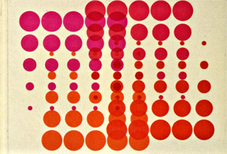
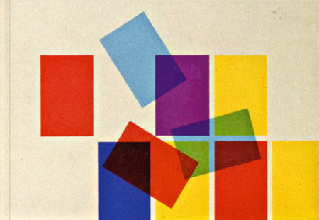
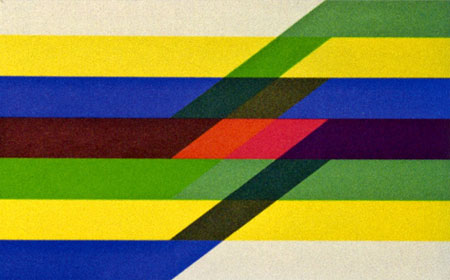
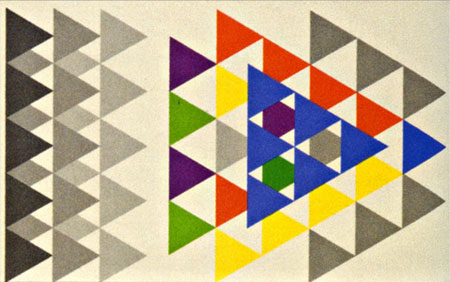
Swiss pharma company Geigy (now Novartis) cranked out tons of drugs and tons of great designs to sell them during their time. The images above are from the book “Corporate Diversity : Swiss Graphic Design and Advertising by Geigy 1940 – 1970” (amazon) which chronicles their best work during that period. There are more images and info over at Things To Look At and Grain Edit.

Images via Things To Look At

The Greatest Thing In The World. Ever.

kale7
kale3
kale6
kale8
kale2
kale5
kale9
kale4
httpv://www.youtube.com/watch?v=L3QBcrliFNk

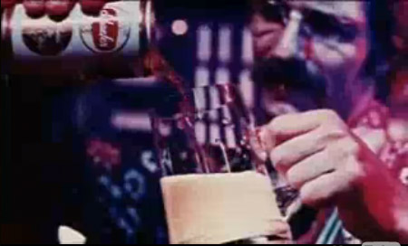
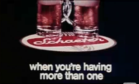
When I was down in LA for the Ghostly show, Jakub, Sam and I were talking and this Schaefer’s Beer ad came up. It’s one of those things that’s so great you want to wait to post it for as long as possible. Well, it’s been years since I first saw it and I guess now is as good a time as any.

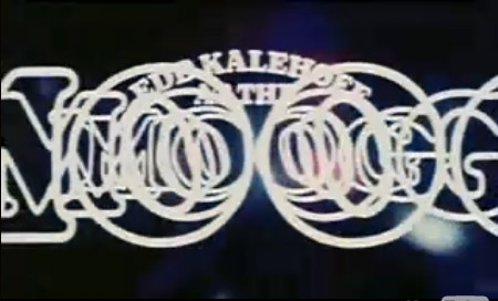
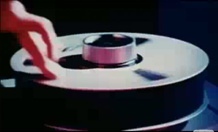
This is Ed Kalehoff performing a jingle he wrote on the Moog Modular System for Schaefer’s beer. Even if you don’t know of him, you know his work; he did most of the music and cues for The Price is Right. Nothing tops this though, nothing. How great it would have been to live in a time when a beer slogan like that could fly. Also, was he scratching on that 2″ reel? Awesome.

Advertising 101 With Tim & Eric

httpv://www.youtube.com/watch?v=5p0QtJMKt1s

Tim Heidecker & Eric Wareheim are comic geniuses and their show on Adult Swim is the best thing on Television or the Innernette. It’s basically a free-form public-access-VHS style collection of sketches with what seems to be a loose focus on late-eighties to mid-nineties culture. Beyond the immediate, viscerally comic aspects of their work there’s a deeper commentary going on and for me, that’s what makes the show so enjoyable time and time again.

Unfortunately, no one I know besides Jakub, Dusty, and Sam agree with me and over the past few years I’ve come to realize that Tim & Eric are rather polarizing figures; you either love them or you hate them. I’ve refrained from posting on them in the past just because it’s a little off topic for this blog and I doubt most of you come here looking for hilarious shows to watch. But today I came across Daniel Murphy’s Esquire article about the series of ads Tim & Eric and Zach Galifianakis created for Absolut Vodka and I thought it was an interesting look at how they approached the project from an advertising perspective. The three spots — which I consider to be some of Tim & Eric’s best work — came out last year as part of the Absolut World campaign. The vodka maker basically gave them an open ended commission; they could make whatever they wanted as long as they mentioned the product. I’ve never worked directly in advertising, but I’d have to imagine this would be a dream gig for anyone in the industry.

“It’s the incense, it’s the ferns.”

A Vodka Movie Pt. 1 – Watch
Esquire Article about Pt. 1 – Read

And the other two parts:
A Vodka Movie Pt. 2 – Watch
A Vodka Movie Pt. 3 – Watch
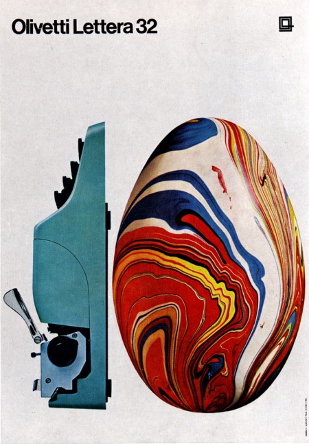
Olivetti Lettera 32

505514446_c77768746f_b
480136252_7e7a676045_b1
“The Olivetti Lettera 32 is a portable mechanical typewriter designed by Marcello Nizzoli for Olivetti in 1963 as the successor of the popular Olivetti Lettera 22. This typewriter was popular amongst journalists and students.
The typewriter is sized about 34x35x10 cm (with the carriage return lever adding about 1-2 more centimeters in height), making it portable at least for the time’s standards, even though its 5.9 kg weight may limit portability somewhat.”

Wikipedia

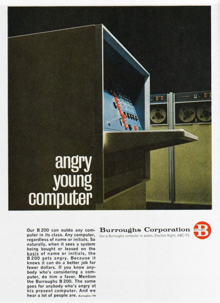
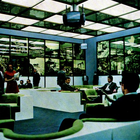
Collection of 60s Advertising

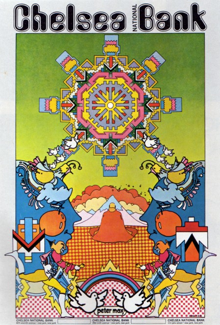
Chelsea Bank
Burroughs Corporations
All business
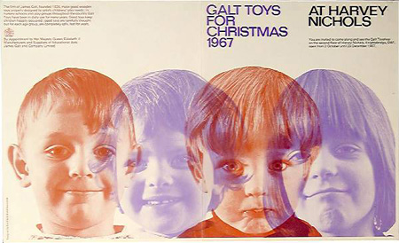
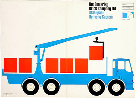
Just found a nice size collection of 1960’s Advertising from around the world on Flickr, plenty more photos of exhibitions, typefaces, tv ad’s, and print.

Ken Garland and Associates – UK

Garland_1
Garland_2
Garland_3
Garland_5
The beautiful graphic design of Ken Garland and Associates, from storefront font layout to pamphlet covers these guys have been putting together solid work since 1962.