Posts in Advertising
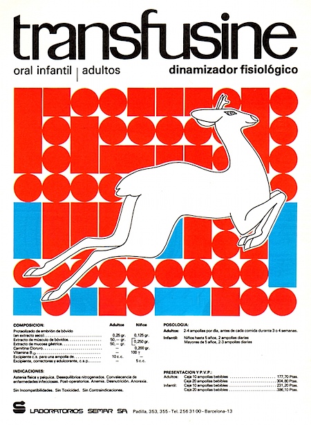
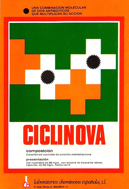
More Spanish Drugs
Alvin Lustig
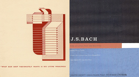
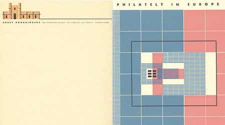
Alvin Lustig contributions to the design of books and book jackets, magazines, interiors, and textiles as well as his teachings would have made him a credible candidate for the AIGA Lifetime Achievement award when he was alive. By the time he died at the age of forty in 1955, he had already introduced principles of Modern art to graphic design that have had a long-term influence on contemporary practice. He was in the vanguard of a relatively small group who fervently, indeed religiously, believed in the curative power of good design when applied to all aspects of American life. He was a generalist, and yet in the specific media in which he excelled he established standards that are viable today. If one were to reconstruct, based on photographs, Lustig’s 1949 exhibition at The Composing Room Gallery in New York, the exhibits on view and the installation would be remarkably fresh, particularly in terms of the current trends in art-based imagery.
Update: I really can’t find larger images of this work so I put 2 in each image which doesn’t give them justice, please visit here.
Helvetica and Cigarettes
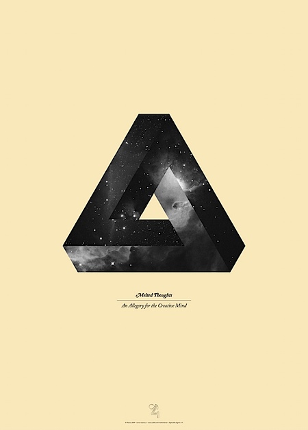
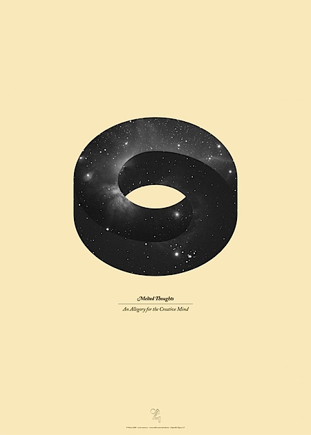
Vasava’s Impossible Objects
Mac vs PC: PC using iPhone?

I was on the train to Coney Island this weekend and next to me is the actor that plays PC in the Apple commercials. I really didn’t pay much attention to or bother him since he was probably just enjoying his weekend with his daughter but half way through the ride i noticed that he pulled out his phone, and there it was an Apple iPhone being held by the PC guy. I couldn’t pass up the chance take a quick photo.
As many of you noted, PC is actually John Hodgman of The Daily Show fame who is also an author.
Recta Film (Italy)
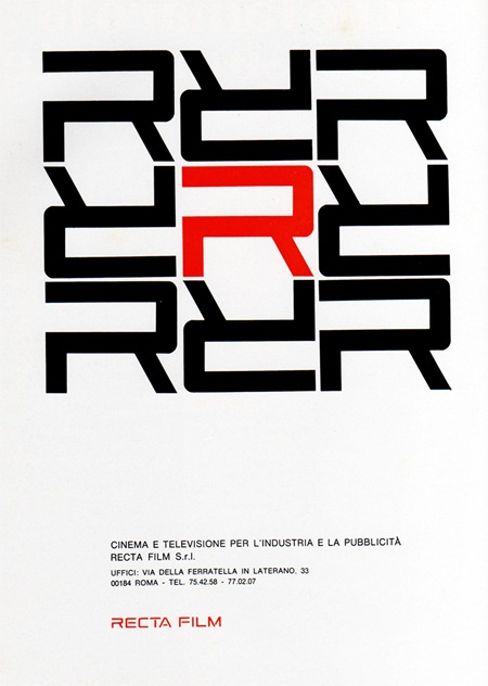
1969 Magazine Advertisement
Recta Film
"Cinema e televisione per l’industria e la pubblicitá"
Italy
Via Pink Ponk
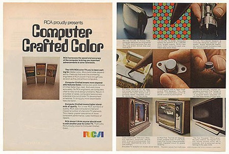
RCA Two Thousand
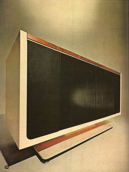
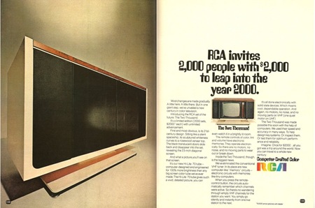
Caught this ad on Paleofuture. The RCA Two Thousand was a TV set released in 1969 with a price tag of $2000 (roughly $12,000 in today’s market). It leveraged then nascent computer technology to, among other things, store favorite channels electronically and automate tuning. The interesting thing to me is how much it resembled a modern flat panel when the cabinet was closed (top and bottom left). Unfortunately, those are just doors; when in it’s opened state the Two Thousand looks a lot like any other old tube set from the 70’s. At any rate, the top image is wonderful to look at and downright prophetic when you consider this was designed in the late 60’s. It seems ripe for some sort of Ive-esque re-purposing a’ la the Dieter Rams inspired iMac.
101 Classic Computer Ads
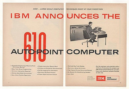
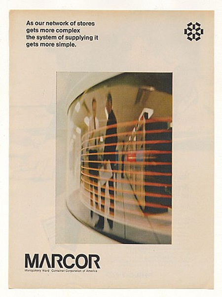
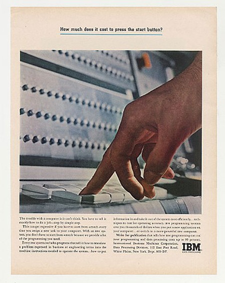
Rob Beschizza posted 101 Classic Computer Ads over at Boing Boing. I am recognizing a lot of them from my Newsweek collection, but there are some unfamiliar gems in there as well. Check out that Trade Gothic Extended action on the IBM 610 ad. And everything about that Marcor page is just perfect. Of course, a lot of it ranges into the camp / kitsch zone, but it’s still entertaining. Link
Bonus: Can anyone identify the face used for the condensed red "610" in the first ad? Let us know in the comments.
IBM Slides: 1975
![ib9[1]](https://blog.iso50.com/wp-content/uploads/2008/07/windowslivewriteribmslides1975-304dib91-thumb-1.jpg)
![ib23[1]](https://blog.iso50.com/wp-content/uploads/2008/07/windowslivewriteribmslides1975-304dib231-thumb-1.jpg)
![ib7[1]](https://blog.iso50.com/wp-content/uploads/2008/07/windowslivewriteribmslides1975-304dib71-thumb-1.jpg)
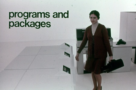
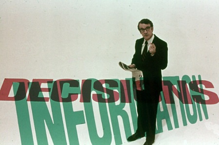
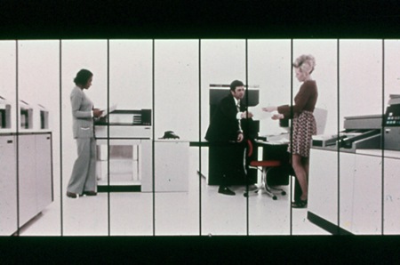
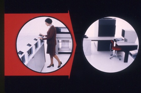
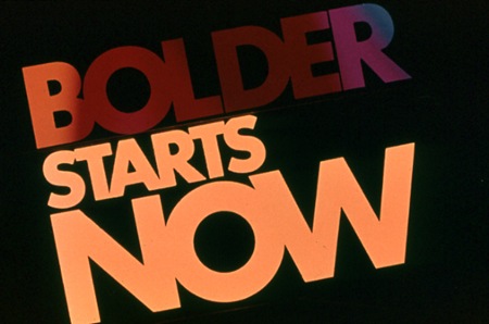
Stuart Dixon sent in these slides from a 1975 IBM presentation. They’re posted in a collection featured at Square America; the only information listed is the tagline at the top:
"It’s 1975 And This Man Is About To Show You The Future (Scenes From An IBM Slide Presentation)"
Have a browse through the rest of the collection, there are some really nice slides in there. I particularly like the information design examples like the last image pictured above. As far as I can tell much of it is set in Helvetica, but there seem to be a couple other faces floating around in there. The segmented slide (4th one down from top) would be great as a massive wall hanging. Someone needs to email Square America and see if we can get hi-res versions of these; many would make great posters.
1971 Architectural Record Issue 2
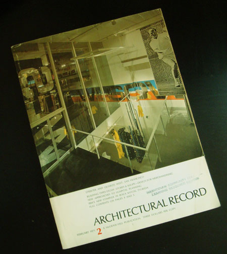
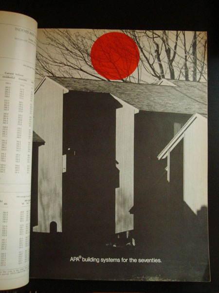
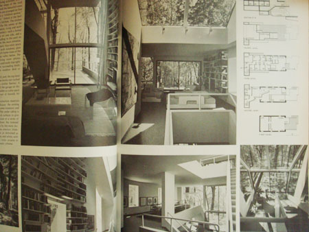
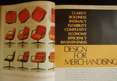
I grabbed some copies of this magazine because someone was going to throw them away. I’ve had them for awhile now and i thought i could share a few. I really love the red dot one, the dot just shows up randomly thru the magazine on black and white photographs. When i look at these older magazines i always wondered where they got all their typography, did these designers meet up and share? was there a mail-in ordering company for different types? hopefully i’m not treating the 1960’s-70’s like the stone age or anything to anyone but i always wondered about the process of graphic design was during that time to put out a well layed out higher end magazine.
