Posts in Architecture

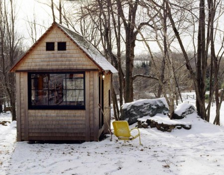
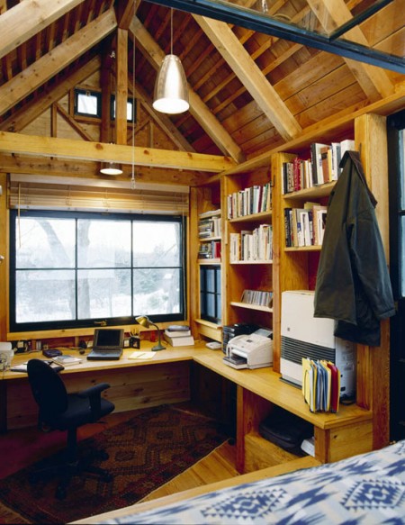
Michael Pollan’s Writing House

pollan-writing-house
Michael Pollan's Writing House
pollan-writing-house-2

Michael Pollan's Writing House


Author Michael Pollan (In Defense of Food: An Eater’s Manifesto and The Omnivore’s Dilemma) spoke at U.C. Berkeley’s Zellerbach Hall tonight. If you haven’t heard of his books, you may recognize him from the recent film Food, Inc. — which I highly recommended seeing.

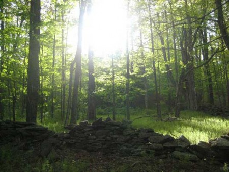
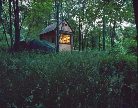
In one of his books, A Place of My Own, Pollan describes how he personally, with no carpentry experience, built this small structure behind his house in Vermont. This whole thing might be ringing a bell if you read the Linda Aldredge post, but remember her tree house is a real, fully livable home, isolated in the woods, in a tree. She definitely wins the battle of priciple, but Pollan gets the honorable mention for pragmatism. Although how many people just happen to have an acre of woods in their backyard? Or happen to own an acre of raw forest for that matter… I think this is an east coast thing, the woods always look amazing out there.

This “writing house” — as he describes it — is a great concept and I am willing to bet it’s an incredibly productive environment. I often find that working in the same space as I live presents unique challenges to motivation and focus. This seems like a cost-effective alternative to having different addresses for your working and living spaces.

How many of you work primarily from home? Do you find there to be a conflict between convenience and distraction in the home work environment? Comment

1971 Entertainment Center

Wonderwall 1971 - Screen
Wonderwall 1971 - Items
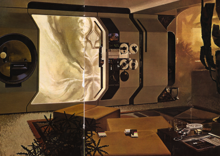
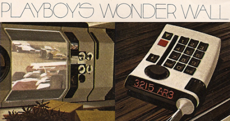
I had to scan this Home Entertainment Center out of a vintage magazine for you all, imagine just having that control panel to drool over and look at or it just being part of your interior architecture of your home. I love that there is soo much space used with beige panels, buttons, reels, and wall design, thats what makes a ton of the design in the past more admirable to me sometimes.

Case Da Abitare

case-da-abitare1
2541510582_27b26d2cb3_o1
2541508592_6f1847cb21_o1
2541512008_87a9f260b4_o1
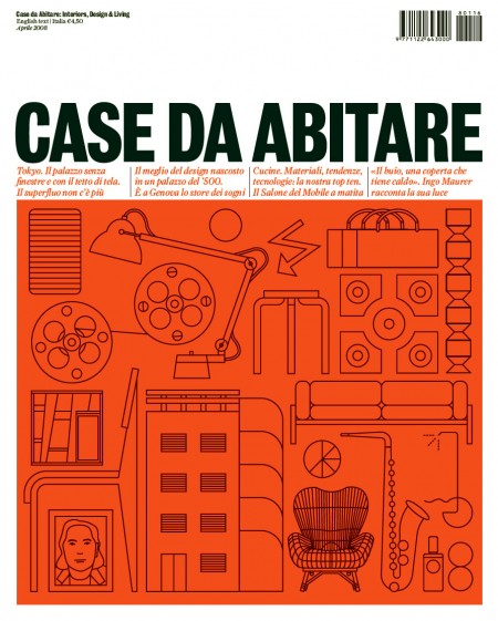
Caught these images of Case Da Abitare magazine over at Things To Look At. Very nice!

Philipp Schaerer

picture-42
picture-9
picture-61
picture-111
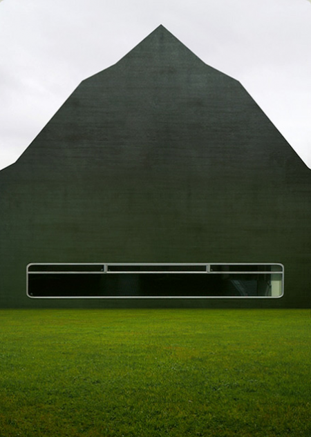
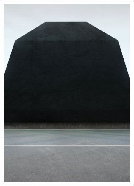
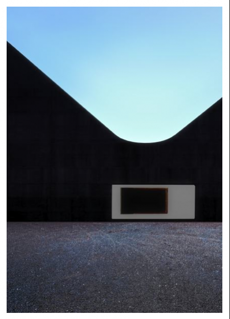
Architectural imagery by Philipp Schaerer. I love the negative space created by the buildings in his Bildbauten series. As he describes on his site, the images are based on the photographic language, and “reflect a built, exaggerated reality.” I’m not sure the techniques used in the creation of the images, but I love the results. You can try and decode his description on his site.

Micro Compact Home

2194_1_micro1big
micro-compact-home-by-horden-cherry-lee-architects-and-haack-hopfner-architects
microcompact
ts_2
faq_1
ltd_2
ISO50 is back online after the server apparently took a much needed 24 hour nap, hope you didn’t miss us too much…

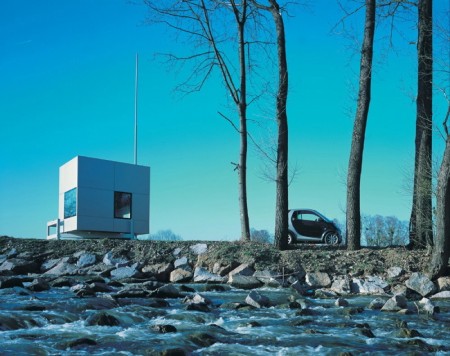
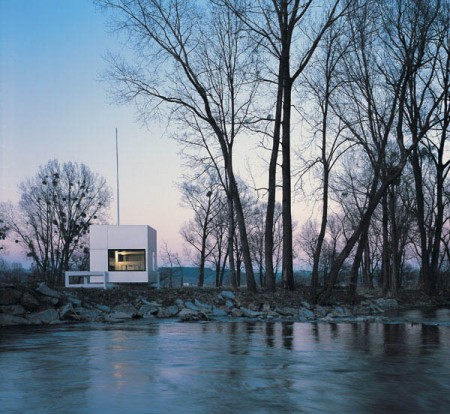
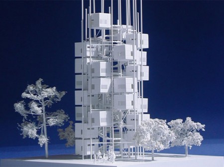
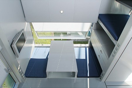
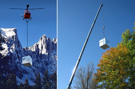
Anyways, before the outage I had planned on posting this amazing prefab home from architects Horden Cherry Lee. The “Micro Compact Home” is a joint Japanese/German project and it shows. You really can’t go wrong with that combination and you also can’t go wrong when your new home is delivered into the mountains by some Swiss helicopter. Awesome. Loving that antenna too, or is it a flag pole? Either way it makes the whole thing about 100 times better.

The Architecture of Happiness

alain
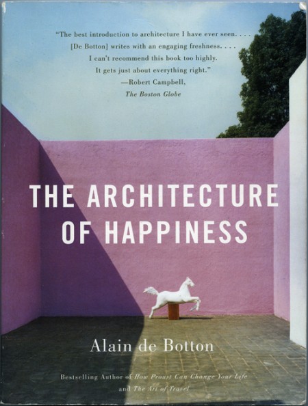
I purchased The Architecture of Happiness by Alain de Botton because I loved the cover. I think it was the colors that first caught my eye. I was also intrigued by the shadow and the shape it created; how it almost touches the statue in the most perfect way. The eye follows the line it creates, and it helps reinforce the hierarchy of the page really effectively. For whatever reason, and as the title indicates the book may elucidate, the whole design makes me happy every time I look at it.

Why this design makes me happy, and to a greater extent, why architecture of a certain aesthetic caliber appeals to us, is largely what this book explores. It is a must read for designers of all disciplines as it pursues the question at the core of what we do: Why make things look beautiful (what does “beautiful” even mean?) and not just purely functional? One of my favorite parts of the book describes the principles of some nineteenth century engineers that felt like they had determined the end-all criteria for evaluating structural design:

The engineers had landed on an apparently impregnable method of evaluating the wisdom of a design: they felt confidently able to declare that a structure was correct and honest in so far as it performed its mechanical functions efficiently; and false and immoral in so far as it was burdened with non-supporting pillars, decorative statures, frescos or carvings. Exchanging discussions of beauty for considerations of function promised to move architecture away from a morass or perplexing, insoluble disputes about aesthetics towards an uncontentious pursuit of technological truth, ensuring that it might henceforth be as peculiar to argue about the appearance of a building as it would be to argue about the answer to a simple algebraic equation.

As the rest of the book unfolds, Botton examines, as eloquently as he does above, the alternative to what these engineers proposed. Why it is that we strive to make things beautiful, and what qualities beautiful work possesses. The parallels between his chosen arena of architecture, and other realms of design, are easily drawn, and make it very worthwhile for interested minds in every field. My favorite paragraph is on page 72, and does a nice job bringing together a lot of what he discusses in the book:

In essence, what works of design and architecture talk to us about is the kind of life that would most appropriately unfold within and around them. They tell us of certain moods that they seek to encourage and sustain in their inhabitants. While keeping us warm and helping us in mechanical ways, they simultaneously hold out an invitation for us to be specific sorts of people. They speak of visions of happiness. [Buy on Amazon]

– – – –

On an unrelated Note: Peter, of Buchanan-Smith, wrote in to clarify the attribution information of a previous post on designer Josef Reyes. The work presented was produced by the studio Buchanan-Smith, where Reyes works as a designer, and the post has been updated to credit the work to the Buchanan-Smith studio. Definitely make sure to check out their site, they have a lot of great work.
Linda Aldredge’s Treehouse

6a00e00992ac3d8833010535f96d66970c-800wi
l1023502
6a00e00992ac3d8833010535f973b3970c-800wi
6a00e00992ac3d88330105365a6cb8970c-800wi
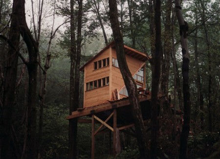
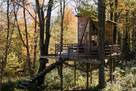
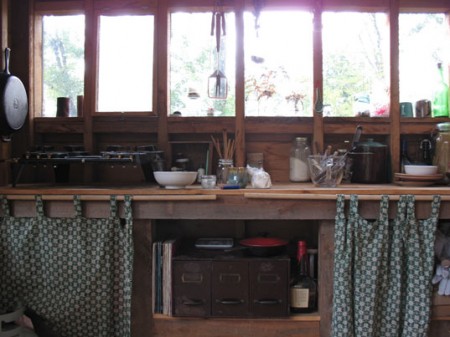
Linda Aldredge is a graphic designer and the creative mind behind LuLu Organics. Also, SHE LIVES IN A FACKING TREE FORT. This is so amazing I can’t even put it into words, the pictures will have to fill in the blanks. Judging by the interior shots I’m pretty sure I would have a hard time coping with the rather spartan accommodations. But, of course, living in a treehouse would probably more than make up for any lack of modern accouterments. The best part is that the whole thing cost like $12,000 or something and runs entirely on solar. I really love the modern design of the exterior; it looks like it belongs right where it is. The house — situated in upstate New York — was designed by Kursten Bracchi and built by her and some friends. The images above are from an InHabitat article about the house which delves a bit deeper into the whys and hows of the whole situation. There’s also an in-depth look at the build process at DominoMag.

Seeing stuff like this makes me realize I’m going to wake up one day when I’m 60 and realize I never really did anything all that adventurous in my life. Maybe on that day I will decide to go into the forest and build a tree house, but I seriously doubt it and I also doubt that solar panels could provide the 200 jigawatts required to power my studio, even in 2037. Of course, all of this is likely moot as by that time we will have been enslaved by some sort of robot overlords and/or the Illuminati or whatever. But not Linda Aldredge, she’ll still be kicking it in the woods all off-the-grid style with her solar panels and iPod like that old couple in Children of Men. What? Anyways, point is, it would be cool to live in a treehouse.

Modernism 101: 50’s Architecture

mags101
Just a few gems from the Modernism 101 collection. Modernists in the 50’s had it down and it’s images like these that remind me it wasn’t all garishness back then. Not everything had bubbles and fins and bulges; some people were hiding out in the woods quietly appreciating their straight lines and right angles. Unfortunately, most of them stayed in the midwestern United States. Out here in San Francisco, apparently they decided that the height of architecture was the victorian age so all we got is a bunch of ugly houses with 400 rooms in them and Mel’s Drive In.

The Modernism of Julius Shulman

rotatephp3
6a00d8341cd7ed53ef00e5506889038834-800wi2
o_shulman_122
picture-72
o_shulman_62
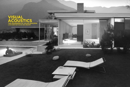
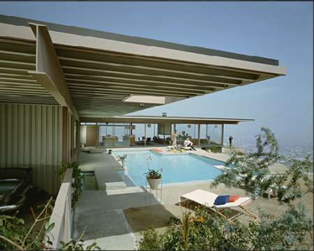
Visual Acoustics is a documentary about architectural photographer Julius Shulman. It’s been touring the country since July of last year, when it premiered in Los Angeles, and just recently won an award for Best Documentary Feature at the Palm Springs International Film Festival. I guess it’s not hard to believe; mix photography, modern architecture, and film together and you have an unbeatable combination! Shulman’s work epitomizes architectural photography, and it would be fascinating to hear him talk about it and get an in-depth look into his world. I just watched the trailer and it really does look amazing. I just wish they would have a screening in San Francisco…

Anyone seen this yet?

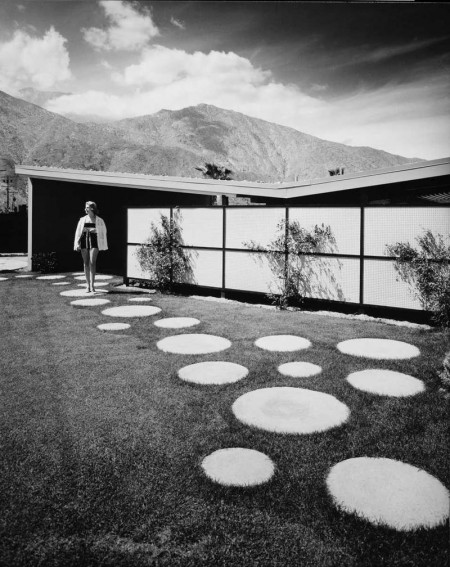
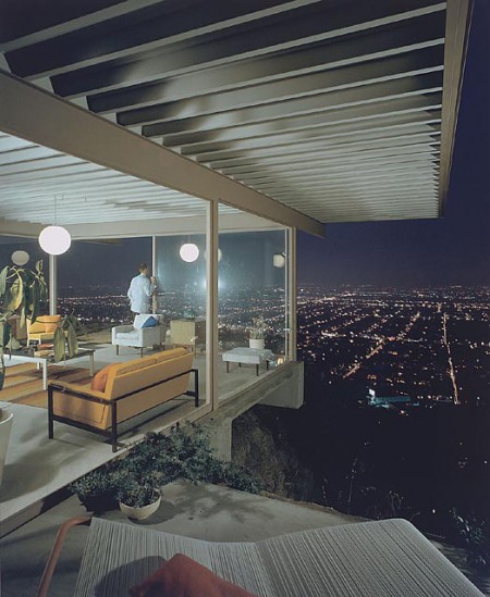
Populating his photos with human models and striking landscapes, Shulman combined the organic with the synthetic, melding nature with revolutionary urban design. The resulting images helped to shape the careers of some of the greatest architects of the 20th Century…Through the exploration of both Shulman’s art and uniquely individualistic life, Visual Acoustics offers an unforgettable portrait of Modernism’s most eloquent ambassador. [Link]

Frederic Chaubin: Soviet Sci-Fi

frederic_chaubin04
frederic_chaubin01
frederic_chaubin03
frederic_chaubin
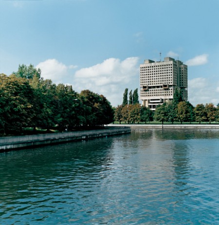
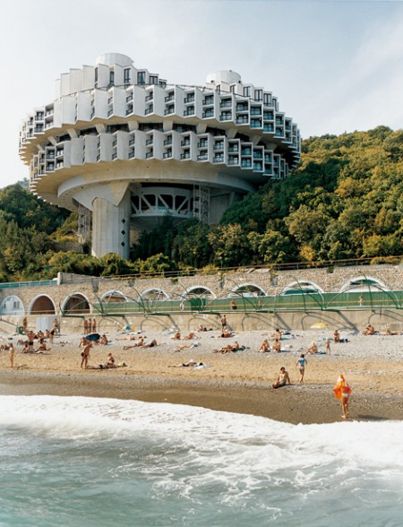
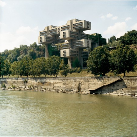
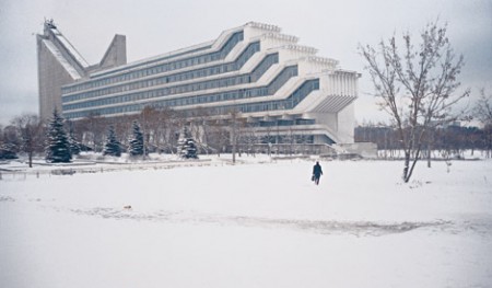
Pop Up Storefront Los Angeles showcased some great photos from Frederic Chaubin, the Cambodian born French-Spanish editor of Citizen K magazine. The show, entitled “CCCP: Cosmic Communist Constructions Photographed”, focused on Chaubin’s fascination with the sort of futurist architecture that came out of Soviet Russia’s Cold-War era. I’ve always been quite impressed by Soviet architecture like this; they somehow built real versions of all those artist’s renderings of future societies that people were cranking out in the 50’s and 60’s. I’ve never seen it represented quite so faithfully; Chaubin’s photos really capture that whole utopian society vibe.

PingMag Interview With Caubin
NYT coverage of the show