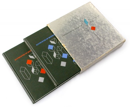
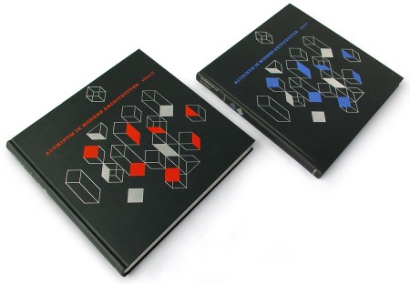
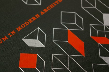
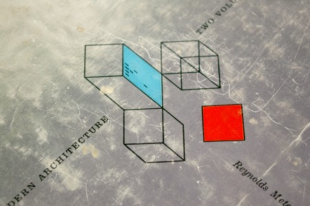
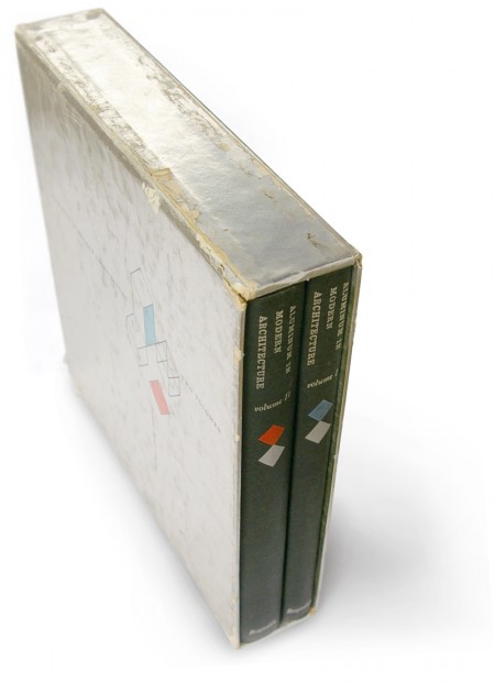
This book caught my eye over at Book Worship and the aluminum slip cover reminded me of Alex’s Set In Stone project (although that cover was in Zinc). Looks like the cover worked, the books are in great shape for their age.
Via Book Worship


This book caught my eye over at Book Worship and the aluminum slip cover reminded me of Alex’s Set In Stone project (although that cover was in Zinc). Looks like the cover worked, the books are in great shape for their age.
Via Book Worship
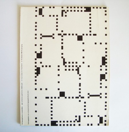
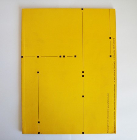
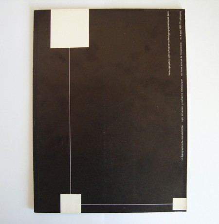
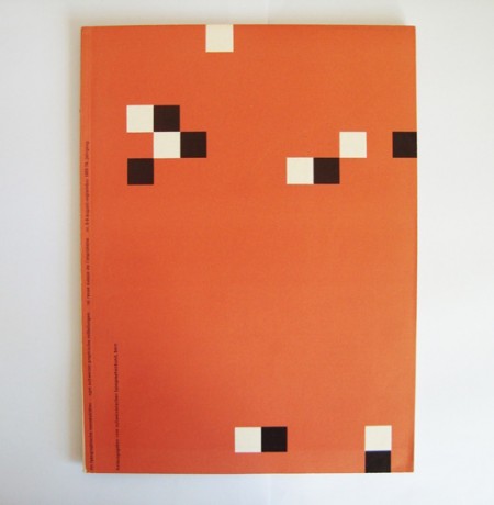
Typographische Monatsblätter 10, 4, 8/9, 12. 1955
Some additional info (apparently translated) from 80 Magazine:
“in 1953, TM held a competition to design a cover series, inside layout and advertising pages. 12 people took part, including the basel typography teachers emil ruder and robert büchler. the TM jury report on ruder’s entry:
‘the designer if his competition work chose the square as design motif, wich also resonates again in the page layout. this cover series is designed with sparkling fantasy; bold and new, far way from tested solutions, in a darling refreshing attemp. […] a really new solution which could have an interesting change from the arrangement up to now’
five covers by emil ruder were applied to break the monotony of the winning entry of robert büchler”
extracto da revista-libro ‘ruder typography ruder philosophy’. idea magazine 333. vol. 57. marzo 2009. xapon. issn 0019-1299 +
Via 80 Magazine
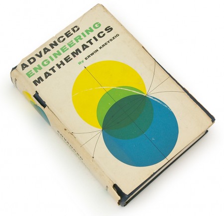
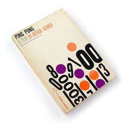

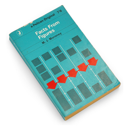
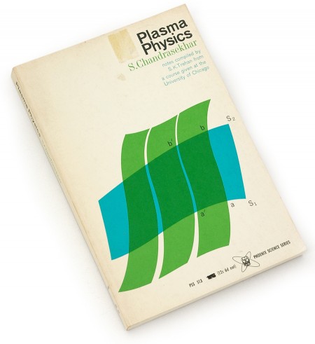
I’ve been enjoying the terrific blog Book Worship recently. The images above are some of the many beautiful books that Shawn Hazen has collected. As I’ve mentioned before, I have never had very good luck combing used bookstores in San Francisco — most of the cool stuff seems particularly adept at hiding from me (that or it’s long gone from the troves of other SF designers looking for the same things). Shawn, as you see, is much better at this than I. Definitely going to keep checking back often for more posts about these books he describes as “…graphically interesting, but otherwise uncollectible, books that entered and exited bookstores quietly in the 50s, 60s, and 70s.”
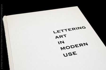
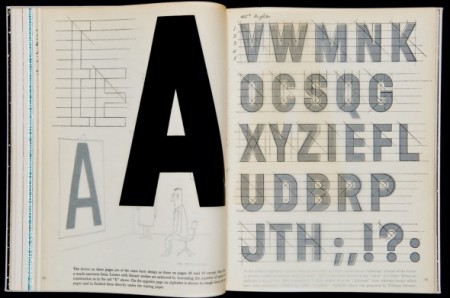
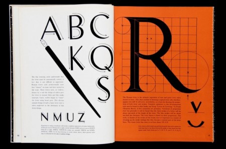
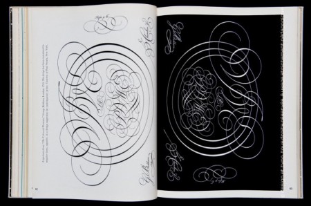
Sébastien Hayez’s Designers Books blog has a great post on Lettering Art In Modern Use and various other design-related books. I love that last one; I was at the printers the other day looking at some samples and they showed me a letter-pressed wedding invitation with that same script style. It was embossed into the paper with inlaid gold leaf, so nice.
Via Surfstation
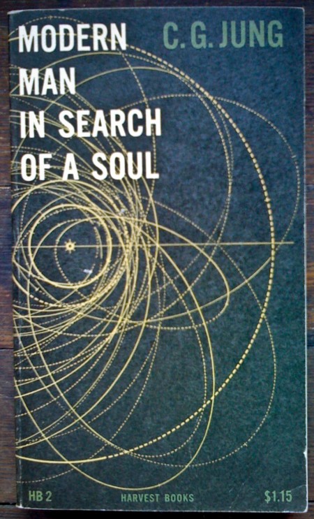


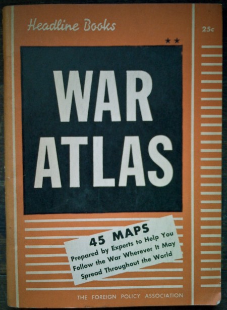
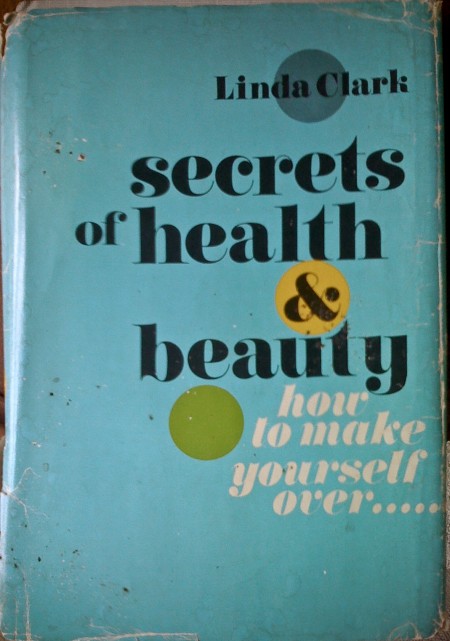
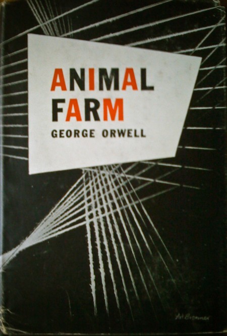
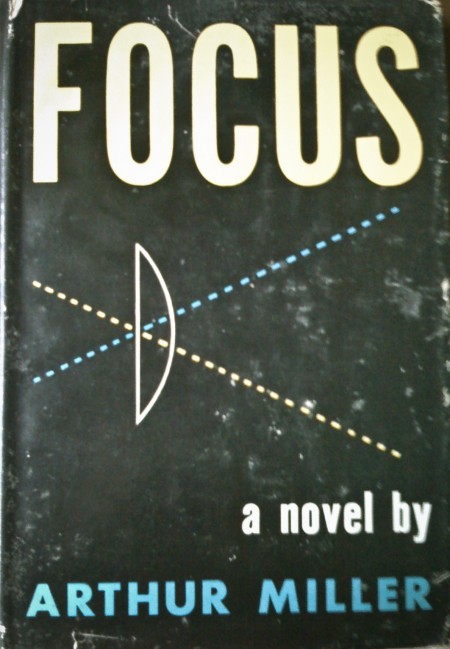
I was exploring the depths of my basement the other day and came across these books. My favorite is the first one, but I think they all have something interesting going on. (I remember the Animal Farm cover from Scott’s post a while back.) The typography of each cover is worth noting — especially the beautiful implementation of the lowercase Carousel on the “Secrets of Health…” cover! The ampersand in particular is pretty amazing. As much as I love Bodoni and Didot, Carousel has a few extra twists that make it more exciting to me.
Sometimes I wish I didn’t live in a design centric city; all the used bookstores were plundered long ago of anything with cool design at work. It is a rare occurrence that I find something worth buying at even the most remote vintage bookshop. Got out here too late!
Apologies for the iPhone photos — it was all I had at the time and I couldn’t pass up the chance to snap some shots. Also worth noting is the price of some of these…when was the last time you paid 25c for a book?
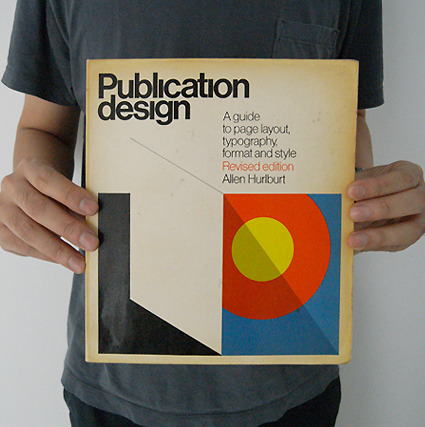
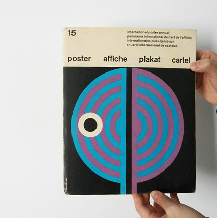
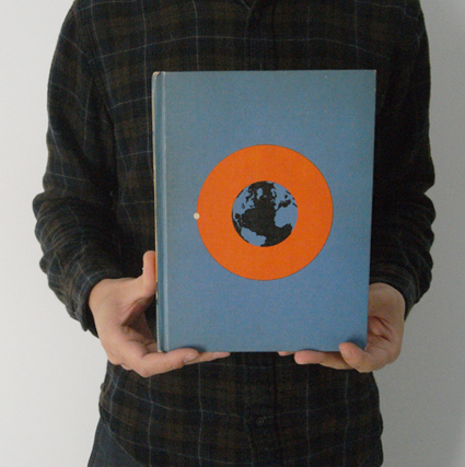
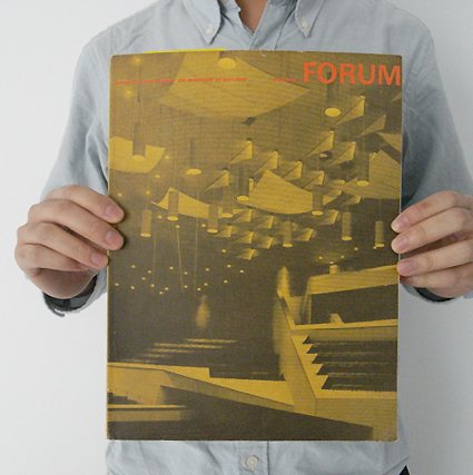
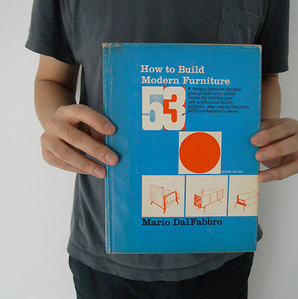
Some inspirational vintage book covers from the Itis Edition store.
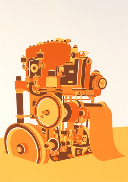

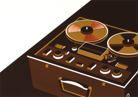
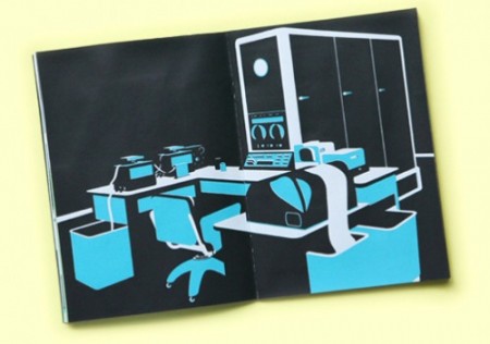
Said the Computer to the Specialist is a new book by Tom Rowe. It’s a collection of illustrations of analog recording equipment and long extinct super computers. Very stylish if you ask me. I would love to see some typography going on though — could really make some of these pieces. Nothing crazy, just some interesting titling to introduce some variety and that extra level of visual interest. Either way, some terrific illustrations.
Production is limited to 50 signed/numbered copies, so better act fast if you’re interested. Availible for purchase through Nobrow press.
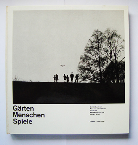
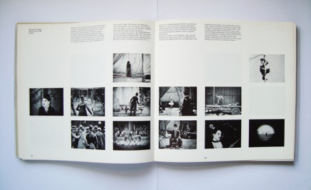
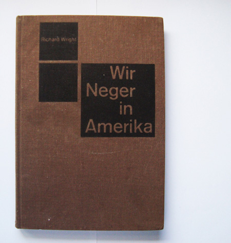
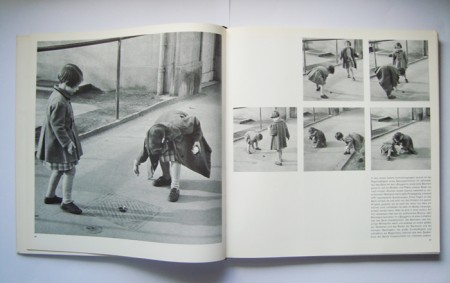
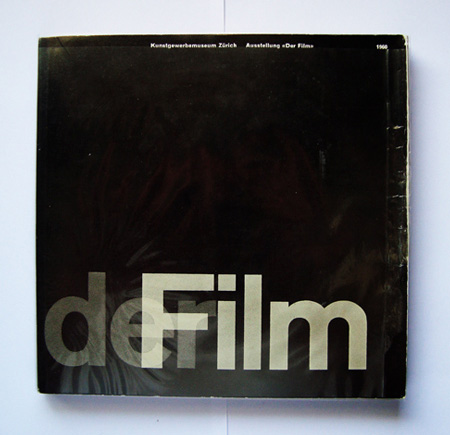
Some nice photography books with grid layouts. That Garten cover is absolutely perfect.
Via 80 Magazine
Note: I wrote this process post a while ago about a project I completed last November. There has been so much going on these days that I forgot about it in the depths of my terribly cluttered hard drive. As I have transitioned to thesis mode now, there are less of these sorts of projects in the pipeline. This is one of my favorites I have completed at the Academy thus far and it was interesting to revisit. This is the article in its original form, as I wrote it last December.
Assignment
This semester we were asked to immerse ourselves in one topic and research it through a series of week long projects. The content of each project would be the result of our extensive research, and we were expected to pick a topic robust enough to be worthy of 15 weeks of study. Each project encouraged us to explore different design solutions and helped us hone in on a visual style that we could use for the final project, which would synthesize all of our work into one deliverable.
For the last month of the semester, we were tasked with compiling all of our research into a book that we would write, design, and bind ourselves. It was to have a minimum of 48 pages (6″ x 9″), a hardcover, and provide some meaningful insights about our topic which we uncovered during our semester of research. In addition to providing a worthy and refreshing commentary, it was to be a covetable piece of graphic design that felt visually appropriate for our topic.
The topic I chose for the semester was Mega Cities (urban areas with a population over 10 million people). The original focus of the project was an examination of what makes a city successful — what it is about a massive city that makes it unique. It eventually dovetailed into an exploration of the ways these cities are confronting the problems they face and how increasing populations make solving these problems more complicated and time sensitive. These problems are becoming increasingly relevant as the world’s urban population continues to grow at an unprecedented rate. I flirted with numerous other topics, some of which I thought were quite interesting, but I found that Mega Cities would provide me with the most interesting and engaging material.
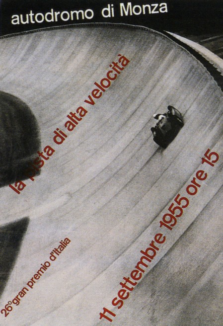
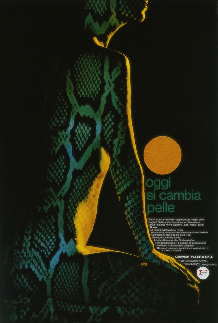
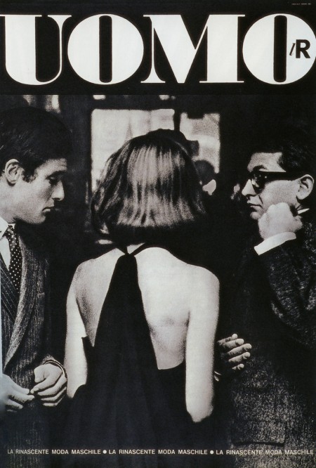
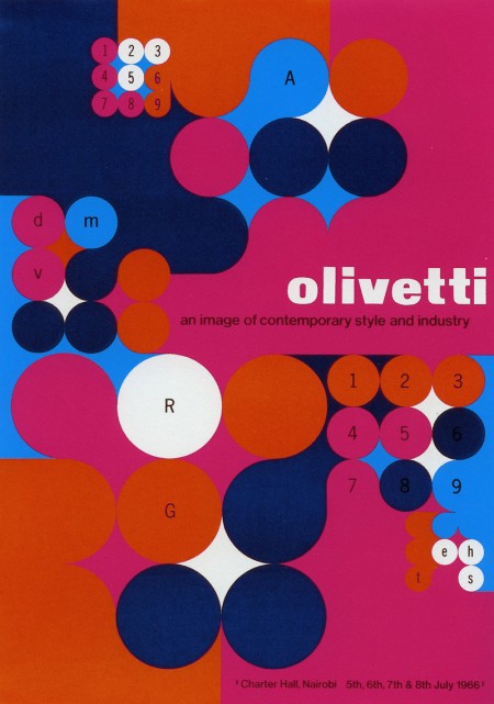
The Pirelli poster I wrote about yesterday came from this great book, Poster Collection: Zurich-Milan. Inside is a great and varied assortment of posters from the Museum fur Gestaltung Zurich’s collection. My favorite was the Pirelli tire advert, but I love the above as well. Starting from the top, designed by Max Huber, Silvio Coppola, Giancarlo Iliprandi, and Anna Monika Jost. The cool thing about the book is much of the work is rarely seen elsewhere. There is some commentary, but I recommend this book mainly for the visuals.