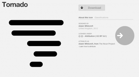
Falling in love with this site called The Noun Project which “collects, organizes and adds to the highly recognizable symbols that form the world’s visual language, so we may share them in a fun way.” I personally love the Tornado, I just keep downloading and downloading some of the great ones not even to use but just to have like some graphic design hoarder.
Posts in Branding
The Noun Project
Matt Lehman
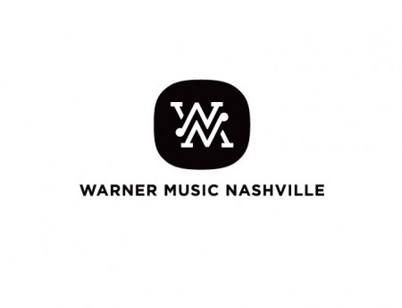
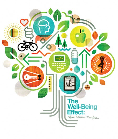

Matt Lehman is really good at logos, and illustrations. It’s been a long time since I’ve seen such a fun and well executed branding portfolio. There are some straight up classics in there, and that Warner Nashville one, wow. I’d love to see this guy get more into poster work, but simplified. I feel like some of his illustrations tend to get a little busy while minimalism seems to be his strong suit. The two included above are good examples of a nice balance of clean lines and texture.
More good stuff over at Matt’s Portfolio
Marnich Associates
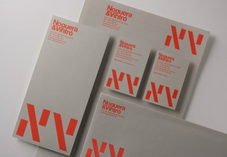
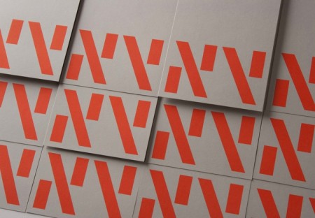
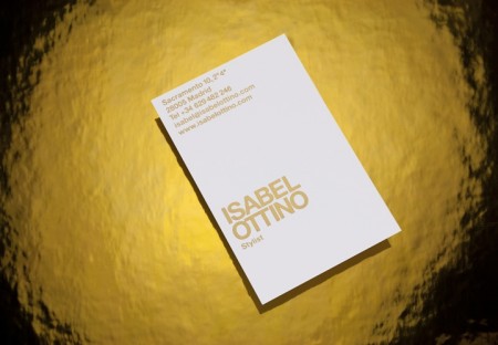
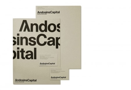
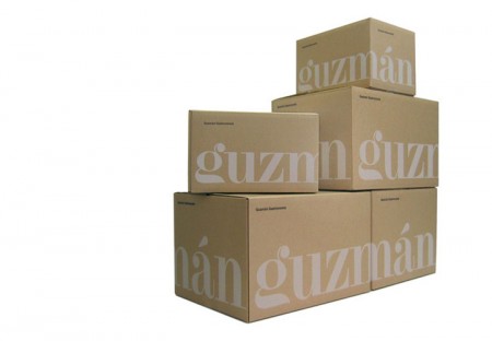
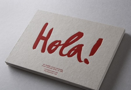
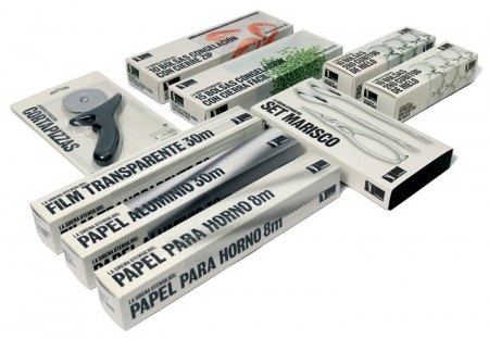
Classic branding and packaging design by Barcelona-based firm Marnich Associtates. The stuff for Noguera & Vintro is incredible. Interestingly enough — and despite that excellent branding — they’re apparently the “exclusive distributor of Hello Kitty in Spain”. Good thing you have this incredible, minimalist branding, because we all know Hello Kitty retailers and very concerned with modernist graphic design.
All joking aside, this seems like a very strange choice of branding considering the product / market. It also just plain looks weird on the site with all that garish Hello Kitty stuff going on in the middle. Do you think the client asked for this seemingly incongruous style of branding or was it foisted upon them by an overzealous design shop? Judging from a lot of the playful work on Marnich’s site, I’d bet on the former as I could see them treating this right. Odd.
Via Aisle One
CutLaserCut: We Make Your Ideas
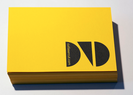
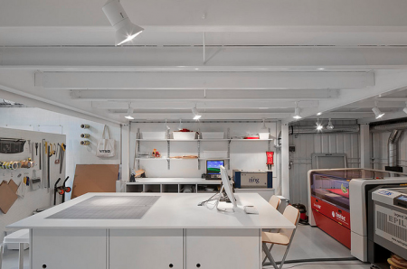

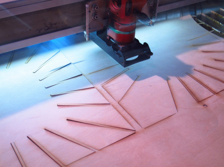
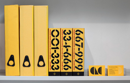
Many of us artists/designers/musicians love dreaming about our ideas becoming a physical piece that you can hold, touch, gift or make available for others to have. I really appreciate the printers, warehouses and studios that have to deal with our minds and files. So here’s to CutLaserCut, a well branded youthful laser cutting company that I dream of using someday soon, check out their Flickr and keep these physical type of companies close, I hope to see more creative uses of what they offer in the future and thats up to us.
Kyary Pamyu Pamyu – PonPonPon

I’ve tried to stop thinking about this video for months but I can’t, its got to be the most epic thing on the internet arguably speaking, I mean orange sharks, hockey goalie masks, and Kraft mac ‘n’ cheese…. < sigh > tooo much!
Moonrise Kingdom – Wes Anderson
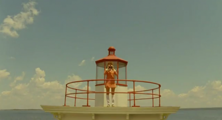
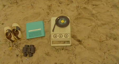
Wes Anderson did it again, he made me hunt down a release date for his newest film and add it to gCal, I only usually do that for albums that I can’t wait to buy. This hits theaters May 25th, I can’t wait to see Bill Murray’s character in this.
SVPPLY Helping You Follow Quality Brands
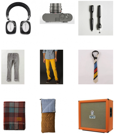
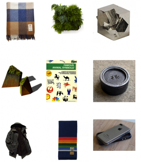
“Svpply helps you find the products you love, from the people and stores you find interesting.”
When I read that it sounded pretty appealing, then I noticed some of my co-workers using it and I dug in deeper and really enjoyed it since I want to bring in more product reviews onto the site next year, especially well designed ones.
Some people MIGHT write it off as “well this is how rich people shop” but a lot of this stuff is in a good price range plus it helps you pick something worth saving your money for.
If you guys join, let me know, here’s my acct: Heathered Pearls / SVPPLY
Brand Minimalism
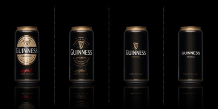
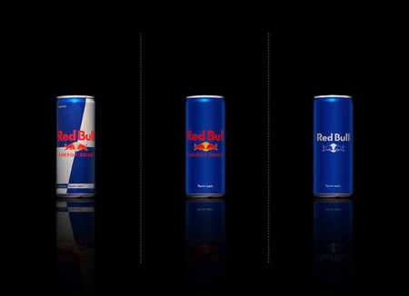
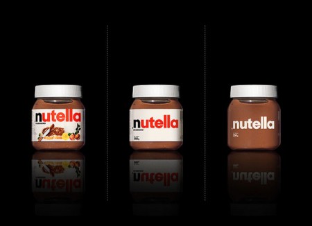
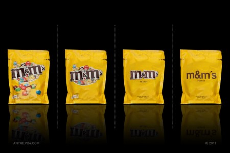
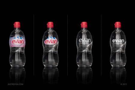
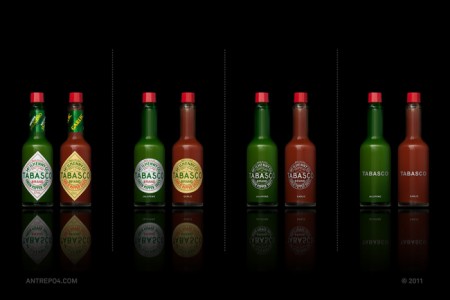
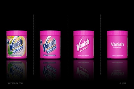
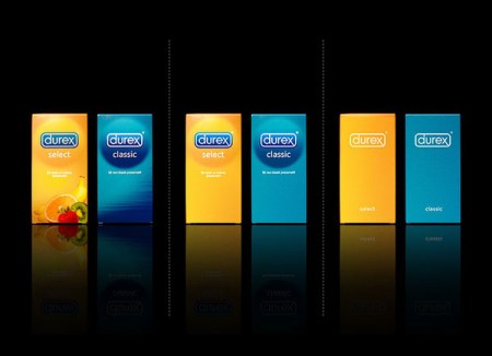
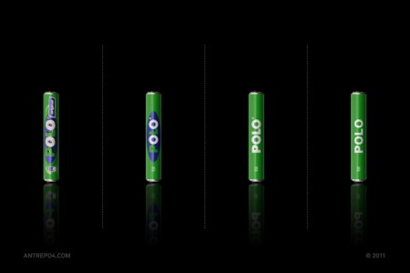
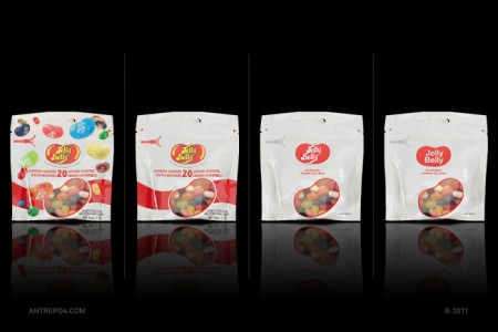
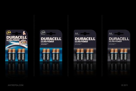
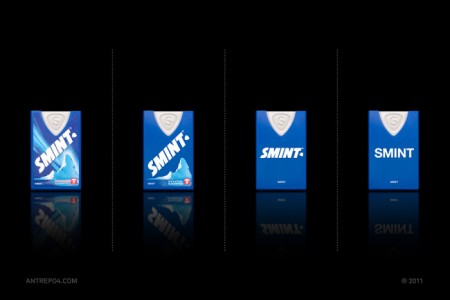
Mehmet Gozetlik decided to explore what would happen if he stripped down the packaging of iconic brands to the bare minimum. The results are fantastic and represent the kind of branding that always pulls me in. I’d love to see a real-world study on how effective these “minimal-ized” were on the general public (not just designers). Do you think they would do better?
My personal favorite results here have to be Jelly Belly, Nutella, and Guinness.
The Dieline via Jeff Toll
Trading Card Designs – Part 1
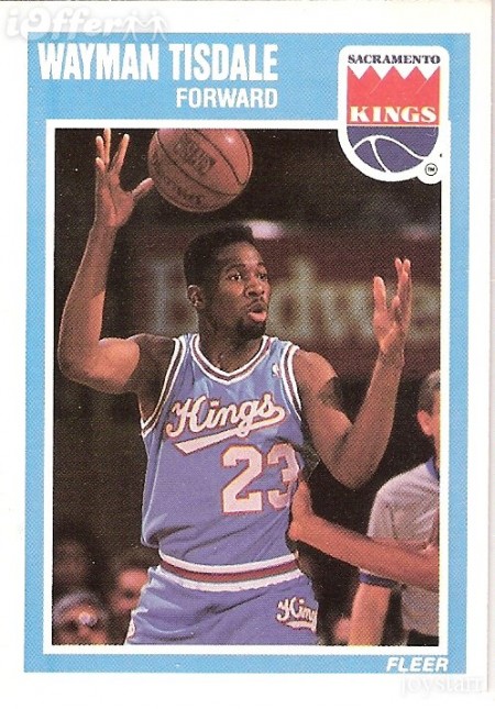
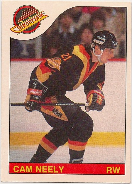
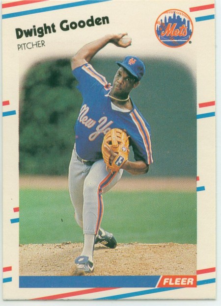
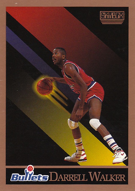
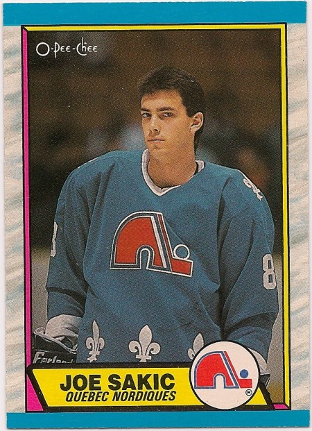
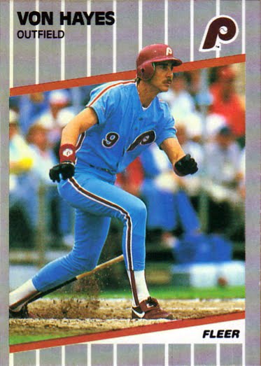
When I look back into my childhood I try and figure out why I have such a intense passion for certain layouts, design and unique printing. I’m sure some of it just stems from trying to revive nostalgia, though sometimes I think it all comes back to my obsession with collecting sport cards, I think I was at 40k+ cards at one point and every Beckett Pricing Magazine imaginable. I’m only showing the tip of this iceberg so i’ll make it a series, we’ll start with some classic O-Pee-Chee and Fleer and once we get into the deep cuts i’ll share some real favorites but pretty much that Cam Neely one is a favorite.
CN Logo
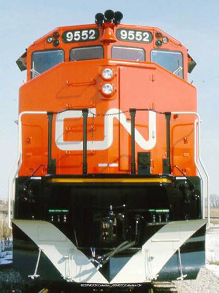

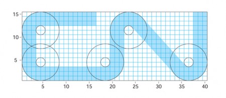

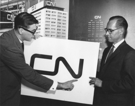
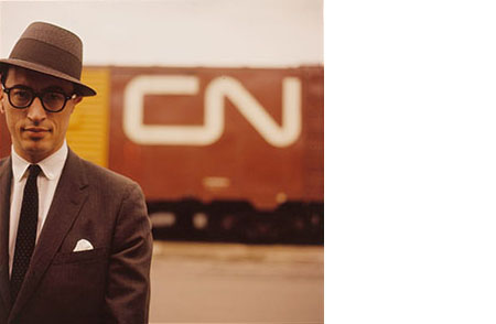
Last week I posted on the NASA logo and suggested that it might be the most iconic logo of our time. In the comments, Design+Conquer begged to differ and reminded me of an equally perfect logo. The CN logo was designed by Allan Fleming and James Valkus for the Canadian National Railway in 1960. Being an American I’ve had limited exposure to the mark, but every time I’ve come across it (usually on trains passing through when I lived in Sacramento) I’ve always been stricken by it’s minimal perfection.
