Posts in Branding

The Lovestep poster boys: Sepalcure

Artwork by Sougwen Chung


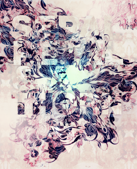
With Dubstep branching out to see how far the genre can be pushed a ton of new ideas start to surface and a fusion of appealing sounds start melting together. One group i’m really excited about is Sepalcure which is a collaboration of Brooklyn’s Praveen and Machinedrum. the duo is doing a fine job of taking hints of soulful house and dubstep to create what they call Lovestep. One thing that Sepalcure has that other dubsteppers don’t usually have and ISO50 fans might also really enjoy is fine art direction by the multi talented designer Sougwen Chung. As you can see above and below her posters and videos of her work are a perfect fit for this heartfelt music.

Sepalcure’s debut performance alongside Untold, TRG, Pole, 2562 & more is February 13th at Unsound Festival NYC.

Below is a “Lovestep” mix done by Percussion Lab Founder/Sepalcure’s very own Praveen.

TRACKLIST
PangaeaMemories
BurialYou Hurt Me
TRGBroken Heart (Martyn Remix)
UntoldDante
DFRNTTripped (Synkro Mix)
SynkroInhale
SinesMemories Are Here
DFRNTTripped (Ital Tek Remix)
FaltyDLParty
Joy OrbisonJ. Doe
SepalcureDeep City Insects
Floating PointsK&G Beat

DOWNLOAD HERE

Sepalcure – Feeling That I Know So Well from sougwen on Vimeo.

Sepalcure – Every Day of my Life from sougwen on Vimeo.

Naming Your Brand // A Tip

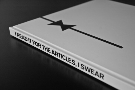
Sourced from Man About Town -- note the interesting article name


A while ago I posted on an article about different techniques for naming your brand. I’ve found that method of brainstorming to be particularly helpful, but sometimes you need an extra spark. I wanted to put another tip out there I’ve found success with recently. Maybe if you’re in need of a brand name this will help you find what you’re looking for. (Of course this sort of thing works for band names too — really any entity that you’re charged with naming.)

So if you’re like me, eventually you run your brain dry of ideas if you’re just sitting around trying to think of the perfect name. Per project, I usually have about two or three days worth of *just* thinking in me. After that I go crazy and try desperately to convince myself that something I thought of is actually amazing. One week later, when I realize I’m delusional, I am back to the drawing board, nameless. My favorite place to look for inspiration these days is no longer song lyrics or the dictionary — it’s fashion magazines.

I suppose any sort of magazine would do, but fashion magazines seem to work best. The titles of articles and photo spreads in fashion magazines are rife with clever turns of phrase and exciting word combinations. Basically anywhere they have to think of clever titles for something pretty abstract is where you want to look. A photo shoot where everyone is wearing black for example, probably has some unusual name (otherwise it’d be really boring). You don’t really see it on blogs, but print writers seem to have a insatiable desire to think of the cleverest name for every article they ever write. Some are completely useless for our purposes, but you can usually find enough of a catalyst to get on the right creative track. I like to make a two column list and combine cool words at random, in hopes of striking something exciting. Here is a short list of a few I noticed in the magazines sitting on my desk (and my thoughts on what they could refer to):

Away with Words (maybe for a publisher?)
Under Statements (minimalist clothing line)
Mind Field (think tank or angel fund)
Sharpsuiter (lame prom-type clothing line)
Her Friend the Bandit (versatile…could be clothing, or maybe a hipster joint)
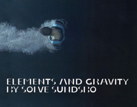
Elements and Gravity (probably for a jewelry line OR cosmetics)

Some fun ones — if you look for long at all you are bound to find something amazing. Of course it may be perfect for a project you aren’t even working on, but it’s always good to keep a running list. I have the PERFECT name for a bar if I ever decide to start one (I’m not telling). Anyway, it’s an idea, hopefully it helps out!

(I realize there are elements of creative thievery at work here. In a way, you are harvesting another person’s creativity for your own benefit, but I don’t think there are any trace elements of plagiarism at work. In most cases, the phrases or words implemented by the writer are common, and are structures you would have come across eventually, either in conversation or everyday life etc. People may disagree, but I think this is a safe technique.)
Login Forms

roboto
nike
loworks
redbrick
vimeo
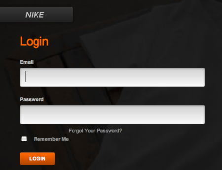
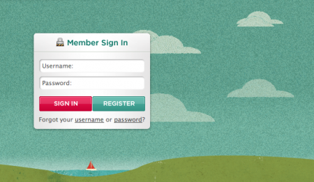
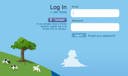
Recently I’ve been obsessing over an often overlooked part of web design: the login form. There are few sites that have aggregated examples of login forms for perusal; this one by Design Reviver is pretty good. I’d prefer the list to be more like 500 examples, but it’s easy to go in search of other cool login form designs. The ones above are fun, but I’ve yet to find one that really knocks my socks off. Anyone know of some really superb login forms?

One of my favorite trends is the use of oversized text in the forms. Tumblr was one of the first places I saw it. Scott and I discussed it a long time ago in reference to the Nike login form, pictured above. Still not sure what it is about the giant text field that feels so right — maybe it just seems to reinforce what you’re writing. Like “Yes this IS my email address. BAM.”

Rebranding Playboy: Book Production

cover
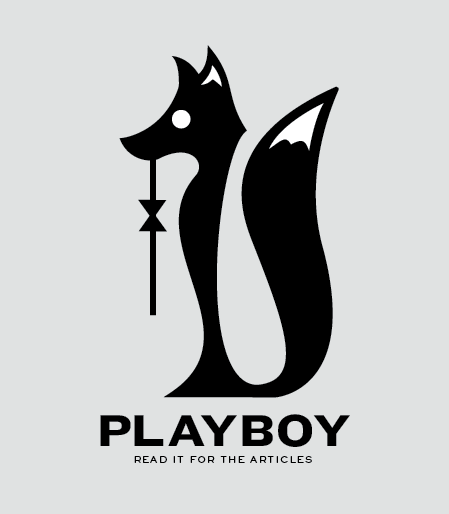
My rebranding Playboy project came to a close last week with the end of our fall semester. If you read the last article, you are familiar with the first part of this project, which was the new logo for Playboy. While it is absolutely the flag bearer of the entire project, the logo development represented a small amount of the work we were required to do for the overall project. The final deliverable for the class was a book in which we the explain history of the brand, walk through our rationale for the new identity, explore the process of the logo development, present brand standards and guidelines, and show example brand implementations and extensions. Other than this required content, there was no specific criteria for the book. Each student also gave a short final presentation explaining their rebranding and the choices they made along the way. Everything was created for the Nature of Identity class at the Academy of Art, as part of the graduate graphic design program.

I really enjoyed the conversation the first post on this project generated. I was excited to see that the new logo was as polarizing as it was — I feel like these types of solutions are the most exciting and rewarding for me. I noticed that many people were up in arms about the idea of Playboy removing nudity and becoming an all article magazine. While I would like to note that the new strategy was purely a conceptual exploration constructed in an educational environment, I actually do think they might be well served to switch things up this drastically. Playboy was once irreverent and boundary shattering. They are no longer. I can think of no better way to recapture this audacious spirit than by doing something this extreme…

(more…)

Rebranding Playboy

Playboy
A little while ago, I wrote about my current class assignment to reinvigorate a brand that is “dead, dying or defunct”. As we are nearing the semester’s end next month, I thought it would be a good time to begin describing the process of this project. The final deliverable is a book, in which we describe the history of our chosen brand (and why it’s time for a update), outline the new identity guidelines (visual standards manuals, usage considerations etc), and show potential extensions (mock ups of storefronts, products, etc). For this process post I’ll describe my brand choice and eventual logo development.
(project permalink on my site)

When I wrote the first article, I was considering No Fear as my primary option. With such a versatile name, I figured I could take the brand in a number of different directions. However, as much fun as it would have been to revisit the dominant clothing of my middle school years (along with LA Lights), I was concerned that the project would not really extend anywhere beyond a basic brand overhaul (new logo, visuals, products, etc). I saw little opportunity for humor or much conceptual work, and I opted to move in a different direction.

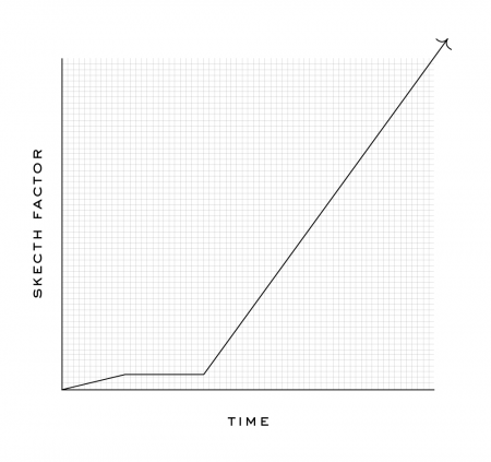
I decided to rebrand Playboy — a brand that many might say is arguably not dead, dying or defunct. Like many magazines, they actually are “dying” (financially), but for my project I focused on the decay of the overall perception of the brand. The graph below displays how I feel the brand has progressed in a more abstract fashion. Basically, these days, I would say most people would be embarrassed to say they read Playboy. A baseless assumption perhaps, but when was the last time you saw someone reading Playboy in public?

To keep up with the increasing trashiness of the American Men’s magazine, Playboy has been forced to reposition itself as “one of the boys” as it were, and is now indistinguishable from the Maxim’s of the world. Rather than hold on to the sophisticated standards of their early years, Playboy has come to embrace its unfortunately crude place in the magazine world. This evolution (rather, devolution) is tragic and the original soul of the brand has been lost. Maybe not “dead, dying or defunct”, but Playboy has certainly lost something along the way. I saw an opportunity to bring some of the original classiness and sophistication back with a drastic repositioning…

Continue reading “Rebranding Playboy”

Graph
(more…)

TCHO Chocolate

tcho17_540x367
tcho14_540x360
ed04
tcho_1-1

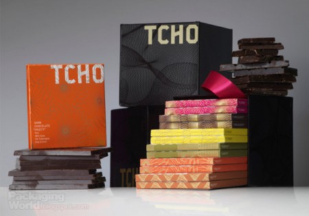
I’ve noticed these high end chocolate companies springing up left and right over the past few years. The paper-made thing seems to be the prevailing aesthetic of retail chocolate branding; employing one-color screened ink on kraft paper along with things like wax seals and cardboard hang-tags to give off that organic, handmade vibe I guess. It’s usually done to good effect but it’s nice to see a fresh take every once in a while.

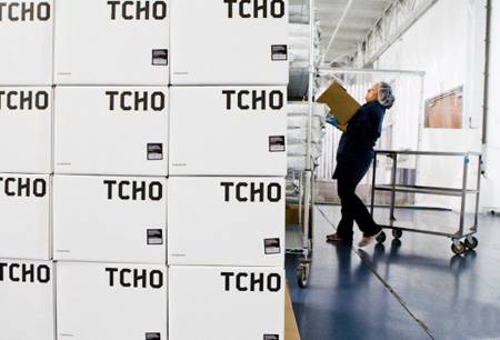
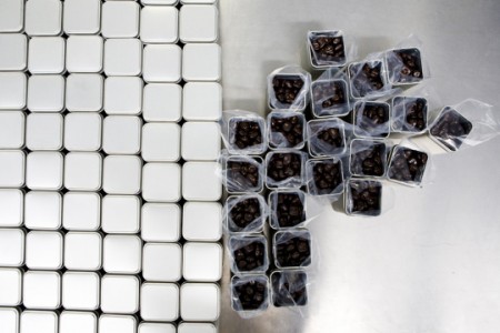
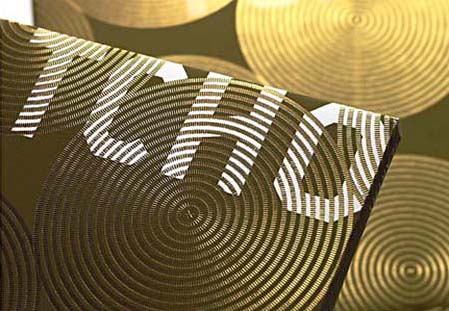
When I first saw San Francisco-based Tcho Chocolate I was struck by the name (no, I didn’t trade my studio for a chocolate factory down by the pier) and then by the design. I regrettably couldn’t find many decent pictures of the actual packaging, but suffice it to say you need to hold it in your hand to really appreciate the finer points. The letterpress and gold leaf inlay are a very nice touch that I don’t think is really captured properly in the above shots.

The video above goes over the concepts that informed the TCHO branding. I particularly like the central idea of chocolate as currency; design firm Edenspiekerman’s implementation of that concept is well executed. The result is a striking design which vaguely conjures the notion of European currency whithout making you forget you’re supposed to eat it. I don’t really enjoy chocolate on it’s own but they still had me wanting some just from the packaging.

First two images from CNET’s tour of the Tcho factory at Pier 17.

» Tcho Chocolate – San Francisco, CA

Mark Brooks For Santamonica

876031254160218
876031254351937
876031254160324

markbrooks-sm
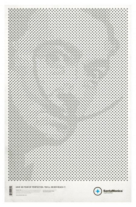
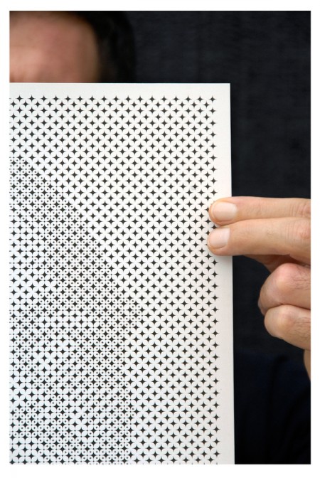
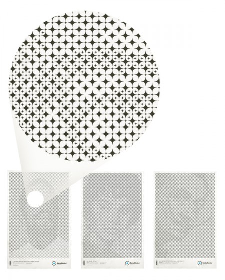
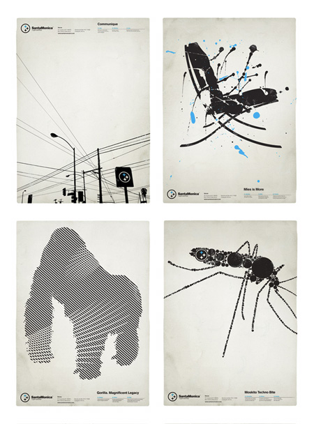
I first noticed of Mark Brooks’s work when he designed a series of very distinct black and white posters for Barcelona based Santamonica Apparel. Tonight I noticed that he’s back with a stylistically similar, but conceptually unique new series for the same company. While the originals were great in their own right, this new series — based on a grid of stars made from the Santamonica logo — takes things to another level. Very clever stuff.

Be sure to check out the rest of his work at Behance or his personal portfolio.

Brands: Dead, Dying or Defunct

panam
My most recent assignment for my MFA program is a pretty exciting one. Our task this semester is to pick a dead, dying or defunct brand and revitalize it. We are free to choose pretty much whatever we want so long as we can make a case for its need of a makeover and/or repositioning. The goal is not only to develop a new identity system for the brand, but also to extend its focus into untapped commercial avenues. For this part especially, we are encouraged to let our imaginations go wild. At the end of the project we will have an overhauled identity system, new product extensions, and an imagined history starting from wherever we picked up — the only thing that must be carried over is the original name.

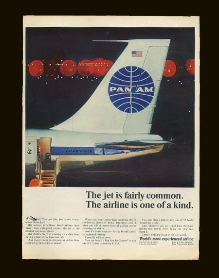
Pan Am, a most beloved brand, would be a great example of something that would work really well for this project. Picking something that is familiar to people and in the public consciousness is always a good strategic choice. Although, you do run the risk of competing with a powerful history and a previously very effective identity. Another good example that Scott and I discussed was General Dynamics.

Today in class we went over everyone’s choices and there were some pretty cool ones; some very random, and most with lots of potential for sure. I am still on the fence with my choices, but I think I’ll come round this weekend when I have more time to think of potential futures. Right now, I’m thinking it might be fun to try and make No Fear cool again. They obviously aren’t an extinct brand, but if you visit the website you’ll see there is room for some…improvement.

Anyone think of other brands that are in desperate need of a renovation or rebirth? We found this list, but most I had not heard of. I’m sure there must be some others out there just screaming for an overhaul. Sound off in the comments.

UPDATE: The brand I ended up choosing was Playboy. Read about it here.

Swisscom Rebrand: Second Look

swisscom-identity-1
swisscom-expression-15
swisscom-identity-21
sc
swisscom-identity-14
swisscom-update-1

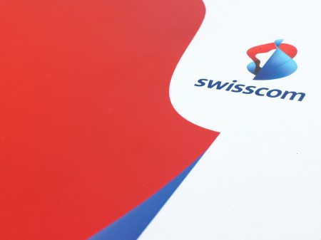
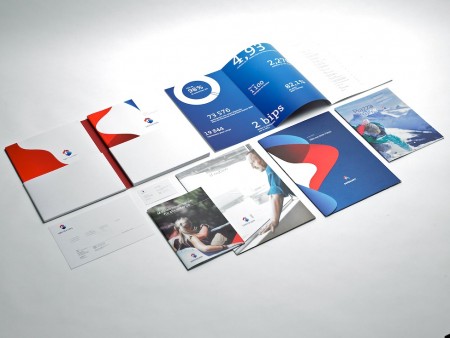
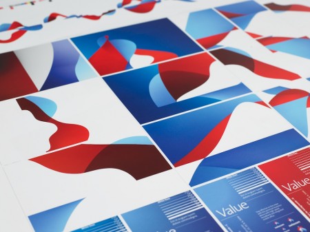
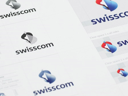
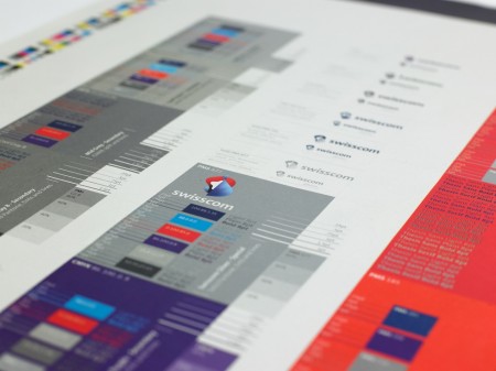
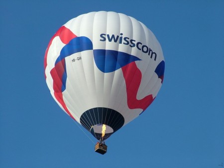
After writing last month’s post on the Swisscom rebrand film I stumbled across this page at Moving Brands’ site containing the images you see above. I have to admit that it cast the project in a whole new light for me. I still can’t say I’m a fan of the core logomark in all it’s gradient-clad glory, but on a large scale across various formats I think the branding system is very strong. I’m really enjoying how the logomark works in 1 color mode, looks sharp and far more focused. At any rate, I just thought these photos were great and really capture a nice aesthetic that I hadn’t fully appreciated the first time around. And of course the hot air balloon seals the deal. There’s something about well designed hot air balloons and sails; that’s about as good as it gets. Swisscom should all pitch in on a yacht and make a badass sail with the logo on it and they could all wear these.

I noticed some people weren’t too keen on the logo when I last posted on it, do these images change your mind? Let us know in the comments

Swisscom Re-Brand Film

swisscom

I can’t say I’m in love with Swisscom’s new logo by itself, but I will say that the overall rebrand feels right as a whole. The type treatment is solid and the logo — although downright ugly standing still — lends itself well to motion and reinterpretation on packaging. The rebrand was headed up by Moving Brands (apparently with help from Dalton Maag).

I’m not trying to diminish what Moving Brands has done — they know way more than I’ll ever know about brands and how people perceive them, and hell, for all I know this is the best logo ever made and it’s singlehandedly going to increase Swisscom’s annual revenue by 1600% — but seeing a room full of designers standing around an idea board like that and thinking about the hours and weeks and months and millions of dollars that go into a project like this… Well, I sometimes wonder why these big corporations don’t just surf Behance for like and hour or something, find the kid with the best logos, throw him like $50K (which will completely blow his mind and make him your slave basically) and give him like 6 months. I bet he comes up with something just about as good and you saved like $20 million or whatever the hell they pay huge agencies these days. Ok, that’s probably all a bit of a stretch, but it does cross my mind, and if I become CEO of a european telecom giant you better believe I’m at least going to look into the idea. Actually, Moving Brands should have just done the same thing and pocketed the difference, all those guys would be doing burnouts in Ferraris wearing whale skin jackets now instead of standing around a chalkboard.

All that aside, what’s amazing to me is that these companies had the presence of mind and resources to film the process. I can’t imagine what it must have been like for the poor designers over at Moving Brands having some guy with a camera always looking over their shoulder, sounds like a nightmare to me. Of course, a lot of this could have been compiled after the fact, but it’s still an interesting look inside the process of high level design shops. I’ve always wanted to do something similar for one of my posters — capture it from start to finish — but I’m convinced that the second I started the camera I would make the worst thing ever and as hard I tried I would never actually catch anything good happening. Maybe that would be more fun, the time-lapse frustrated designer movie. Video Link

More details and pictures over at Brand New

Via LogoDesignLove