Posts in Branding

Branding Strategy: Names

names
If you’re like me, you have piles and piles of notebooks filled with half-baked name ideas for firms, bands, and the like. When I was in college, I think I went through about 30 pages of (truly) terrible names before settling on something for my former band*. Basically I’ve never really perfected this technique. Whether it’s for a new band, new client, or my own (eventual) design studio, it is always a long and arduous process to think of the perfect name. (Herein lies the problem — looking for the “perfect” name is often the creativity killer for me.)

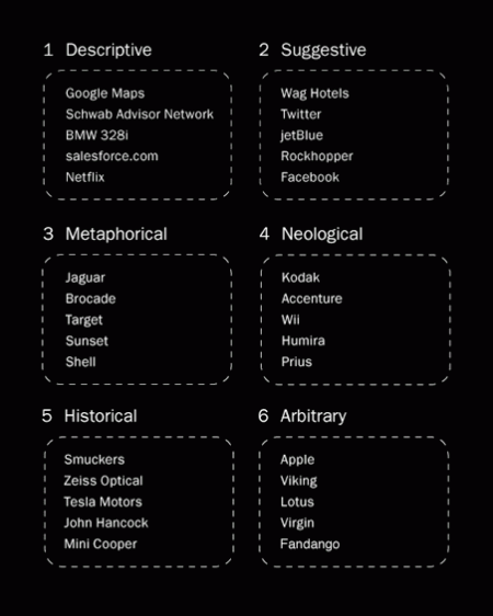
My process generally starts with a pencil, thesaurus, dictionary, and my iTunes playlist (pieces of song titles have served me well). It’s worked in the past, but for a recent project, I decided to try something new. I based my exploration off of Josh Levine’s useful chart that divides naming styles into six categories. You can see the chart above for examples and read the full descriptions here. I tried to go through the list three times, thinking of a potential name for each category on every rotation. What ended up happening was I thought of about 30 names in the metaphorical category, avoided the descriptive, and thought of one or two for each of the others. After about two hours I had my name, at the bottom of my metaphorical category list.

Of course, my normal process is not unlike this most recent one — but the added structure and formulaic approach really seemed to help me in this case. I just hope to be able to replicate it in the future. I would recommend giving this chart a try if you are looking for new brainstorming techniques. Just switching things up is really all you need to spark something cool. I’m sure everyone has their own strategies and I’d love to hear some if you’ve got them!

*Crazy story actually — the name I eventually decided on (Running Lights) was the same name my Mom had sent me in response to my plea for suggestions. We had thought of the exact same name, on the same day, without any direction or communication. I told this story to my band mates and that was that — how could we go with anything else!

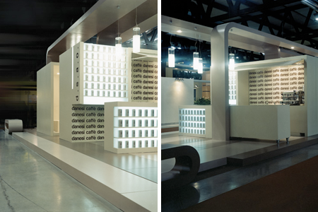
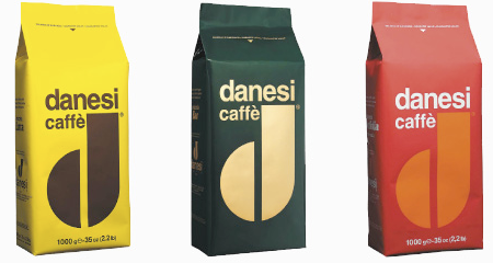
Danesi Caffe Branding

Danesi Logo
Danesi Space
Danesi Bags
Whenever I see Danesi Caffe cups I always mean to post the brand on the blog, I don’t know if its just the D logo in brown on white that grabs my eye every time but after seeing their site and looking at the coffee bag branding i’m a fan, now I just have to actually taste the stuff.

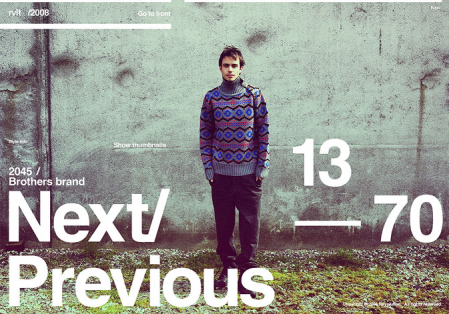
Sebastian Gram / Hello Monday

Picture 2
Picture 3
Picture 1
892641233871995
892641233932952
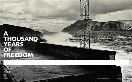
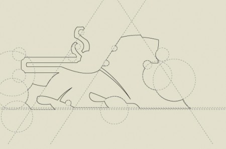
Seriously impressed by the diverse portfolio of Danish designer Sebastian Gram (currently art director of Hello Monday). The first image (interactive design for fashion brand Revolution) made the FFFFound rounds a while back, but it wasn’t until recently that I explored his portfolio further and found the rest of his exceptional work. Each project, whether it’s a logo or full blown identity system, is considered down to the smallest detail. It’s also cool to see process shots along side the finished product; gives you a sense how much time and refinement went into it.

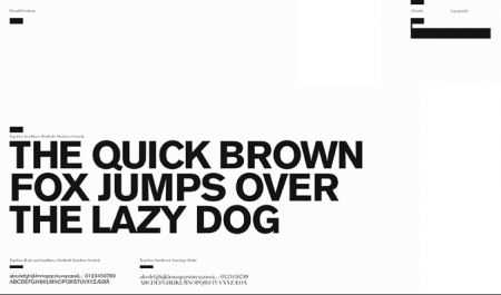
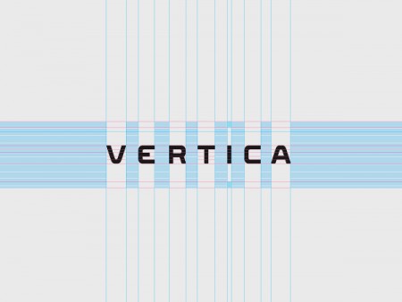
I was especially intrigued by the typeface for Vertica, developed by Gram and Creative United. My guess, based on progress images like the one above, is that it was designed as a custom face for Vertica and is not commercially available. Too bad, those are some sexy letterforms. Like much of Gram’s work, it manages to rock out with a rigid, corporate aesthetic, without being boring or common. I would love to see my name written in that font.

Jack In The Box Rebrand: Success

jib1
jackinthebox_stuff
jackinthebox_photo_01

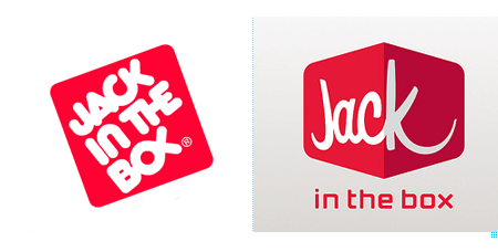
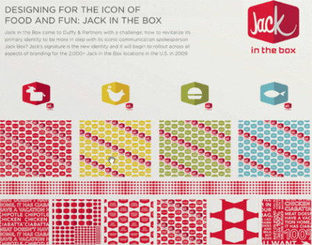
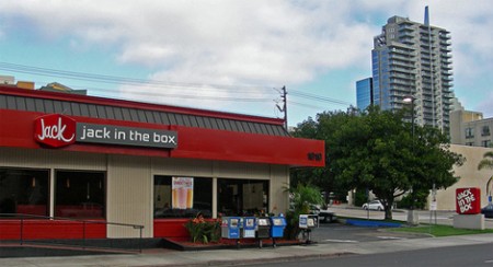
With all the fuss over the Pepsi and Tropicana re-brands it’s nice to see something that I think most people can agree on. Under Consideration’s Brand New recently ran a piece about the new Jack in the Box branding. I don’t think they have these in San Francisco, but in Sacramento they were everywhere and as much as I can’t stand their television campaigns (the exploits of their terminally unfunny and somehow vaguely 80’s-esque — in a bad way — globe-headed CEO) I have to say that they really did a good job with this new identity. The re-brand was headed up by Minneapolis-based Duffy & Partners and I think they really nailed it from a purely aesthetic point of view. The only question now is whether people will still recognize it as a fast food joint. I don’t know if everyone is familiar with Pluto’s or Jack’s Urban Eats, but that’s the sort of restaurant this branding conjures up for me. I don’t think that’s necessarily a bad thing, but you have to wonder what sort of effect it might have on what I’d have to imagine is Jack in the Box’s core demographic: people looking for quick, cheap food. So what do you think, design success or design fail?

Lego Employee Business Card

leggo
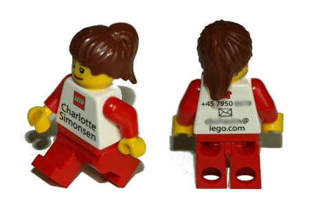
I remember seeing Lego a few years back having simple Lego pieces as business cards and thinking that was amazing but they took it a couples steps further by matching hair, gender and glasses for their employees new business cards, pretty creative, read more here.

Copyright Free Popeye

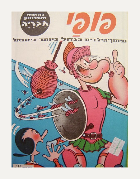
Public domain imagery is nothing new (literally), there are entire source art books for sale that are comprised of royalty-free imagery that’s outlived the “life–plus–seventy” rule of EU copyright law. But most of these images are vague and anonymous with no particular brand attached; they came from a time when the idea of branding was still a somewhat nascent concept. So it was interesting to read that the entire £1.5-billion/yr. Popeye brand has become public domain in the EU (still 15 years to go in the US) as it’s copyright expired yesterday:
The copyright expiry means that, from Thursday [Jan.1, 2009], anyone can print and sell Popeye posters, T-shirts and even create new comic strips, without the need for authorisation or to make royalty payments. ” – Adam Sherwin, TimesOnline  

It’s pretty incredible to think that such a visible icon which has fueled so many industries (restaurants, toys, television, film, etc.) will cease to be owned by it’s various copyright holders. It stands to reason that there are myriad complexities and caveats to this situation; I would imagine Popeye’s Chicken and the others will have some legal recourse to maintain their trademark when 2024 rolls around here in the US (do you guys in the EU even have Popeye’s Chicken?). Other brands soon to join Popeye in copyright-free purgatory include Mickey Mouse, Bugs Bunny, and Superman (source). More info here & here

Image via erikland

70s Hospital Iconography

picto2
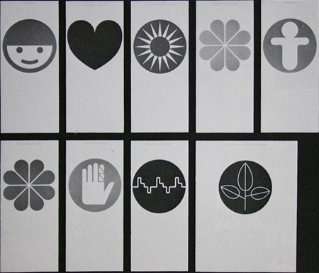
Some cool icons from crabstick via FFFFOUND.