Posts in Design Fail

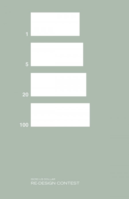
ISO50 US Dollar Re-Design Contest

A few days ago I posted a few US dollar redesigns, none of them really caught my eye but I had a feeling our readers could do better and you all responded positively so lets get this started.

RULES

1. You must submit four bills (1,5,20,100) of any rectangle dimensions.
2. You must include this letter/number combo somewhere on the bill ( I 50502012 X )
3. A signature of some sort has to be included on all the bills
4. Include the number of the bill spelled out and include or create this stamp

SUBMISSION INFO

Please submit to jakub at iso50 dot com by October 1st 2012. Judging will be by Scott Hansen and the ISO50 contributors.

GIVEAWAY

We will pick 2 winners.

1st Prize includes any ISO50 Tee along with a signed ISO50 Studio Edition Print.

2nd Prize includes a Standard ISO50 Print and a ISO50 Sticker Pack

Boarding Pass/Fail

pass-designed
pass-blue-1
boardingpass
delta
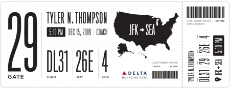
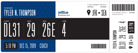
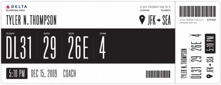
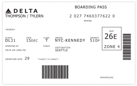
I have been flying a rather insane amount over the last few weeks. I complain about a lot of things when I’m traveling: the food, babies, people that insist on stuffing overhead luggage when it will NOT fit, etc. The one thing I have never considered is the boarding pass. Tyler Thompson has written an excellent article on why the boarding pass is indeed worthy of scrutiny. Take one look at the old Delta pass above and you’ll see why. As he states, “It was like someone put on a blindfold, drank a fifth of whiskey, spun around 100 times, got kicked in the face by a mule (the person who designed this definitely has a mule living with them inside their house) and then just started puking numbers and letters onto the boarding pass at random”.

Tyler has done Delta a big favor and redesigned their boarding pass, the design of which you see above. I think it’s obvious that aesthetically, these are much more pleasing to the eye. I would want to hold onto these after my flight was over just because they look awesome. Now of course, the design of a boarding pass has to be more than just beautiful. There are a number of criteria and limitations in place that might prevent your boarding pass from becoming a little piece of art. Worth mentioning in this regard is Timoni Grone’s response to Tylers inital designs. She runs through a meticulous process to come up with a redesign of her own, taking into account all the necessary “practicalities and priorities”.

The cool thing about his project is how he opened it up to others to submit reworkings and suggestions, a few of which he’s posted as you scroll down his page. He’s provided the Illustrator file for download and tweaking. Make sure to head over there and submit yours if you’ve got something brewing. And feel free to sound off if you too feel like the boarding pass design is indeed a fail.

I must say my favorite part of any boarding pass is the little scribbles the security guards make when you pass the initial check at the metal detectors. They do it with such purpose and apparent deliberation, that I think the scribbles must mean something. I always wonder what would happen if I augment their scribbles with scribbles of my own (or scribble before they do). Would I get sent to Homeland Security? Maybe two scribbles on your boarding pass = terrorist. Anyway. I feel safe knowing we have such a complicated system in place.

I could write a similar article about the terrible design of movie tickets, which I feel have slid drastically in the past few years. Since when is a movie ticket printed on receipt paper worth saving? I used to love hoarding all of my movie ticket stubs — now, calling it a “stub” would be an absurd misrepresentation. I call my movie tickets trash.

Thanks @rohrsh
Imaginative/Creative Design Fail

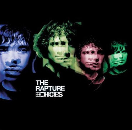
The Rapture

The Rapture – Echoes 2003

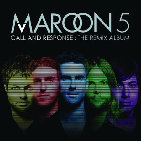
Maroon 5

Maroon 5 – Call And Response: The Remix Album 2008

There is absolutely no excuse for this, I mean I see designers rip off other designers every day – we even get emails weekly about this sort of thing – but when you do an album cover in 2008 and you know everyone is going to see it, why go this route? I don’t do album cover design but even I can see there is no sense in this. Aren’t there plenty of obvious solutions for the Maroon 5 designer to choose from that aren’t completely forgeries? One of these three things would of sufficed, and i’m going easy: 1. A different color background 2. Not using band member photos that weren’t just from the shoulder and up floating around in the background 3. Don’t use the same colors, its as simple as that, why not natural colors? I could also throw in “don’t use any stupid effect over their faces”, I mean at least the echo effect made sense. I’m no expert but I just see pure laziness, and you know this designer got seriously paid.

Design Fail Vol. 2

LogitechF
Today I was riding the subway and was dorking out a little more than usual trying to explain to my roommate kerning on a subway poster. The poster was so awful, not the kerning but the overall layout that I was almost willing to email the company and tell them I’d do their next poster for free and i’m not even a graphic designer. Then I got home and just thought about logos that I have to stare at daily, I’d be willing to do that same favor or at least hire a friend to get them an upgraded logo for free. The first one that came to mind is the biggest eye sore that sits on my desk: the Logitech logo. I mean come on, you’re a popular brand and I have no clue what i’m looking at. I’m not asking them to make something that is similar to everyone else by copying Apple branding or by making everything a glossy bubble, but I have no idea what i’m starring at day after day. Is it a gel stick figure running by a green door? because if it is then why? Am I in the wrong here?

Logo upgrade design fail Vol. 1

OLD BJ

Old Toronto Blue Jays logo

NEW BJ

New Toronto Blue Jays logo

I hope you don’t mind if I go on a tangent here? I know the baseball season is over but enough is enough on these redesigns that look like the Mountain Dew logo. Who are the graphic designers that are doing these? The new logo looks like its going 80 miles per hour. The old classic Toronto logo had such strong pieces holding it together especially the color scheme, separated shapes and the leaf. The new one strips away the only Canadian element about it the maple leaf and even the color red, what on earth was the designer thinking?