
httpv://www.youtube.com/watch?v=I5y3px4ovxE
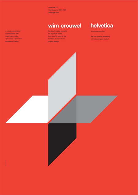
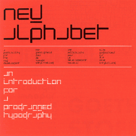
Just some random perfection from Mr. Crouwel for a perfectly random Thursday. Experimental Jetset has an interesting article about the invitation shown above (the third image down).


httpv://www.youtube.com/watch?v=I5y3px4ovxE
Just some random perfection from Mr. Crouwel for a perfectly random Thursday. Experimental Jetset has an interesting article about the invitation shown above (the third image down).
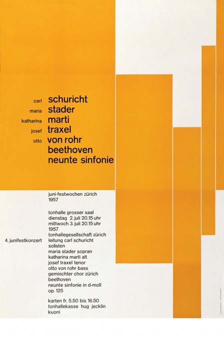
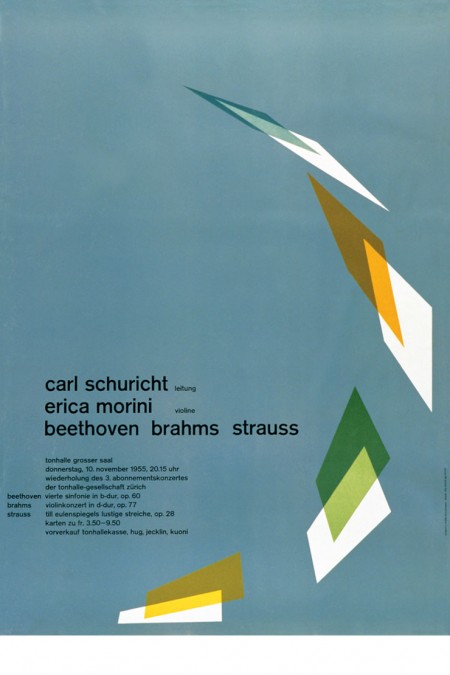
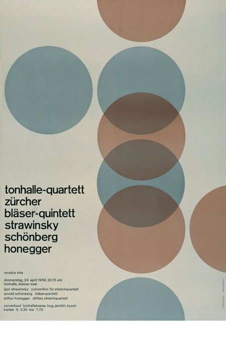
Some classics via Helloairecords. It always amazes me to see such forward thinking design from this period. It’s 1955 and design this evolved already exists, it’s incredible. Of course, this is Europe. Unfortunately, most of us in the states were too concerned with Elvis and Marilyn Monroe to appreciate the finer points of the grid system or minimalist design theory. There is something very pleasing about such simple shapes and colors modulated by the quirks and imperfections of the analog printing process, it really brings life to the composition.
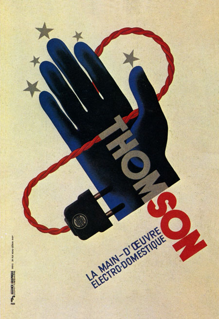
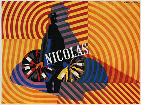
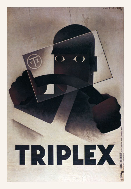
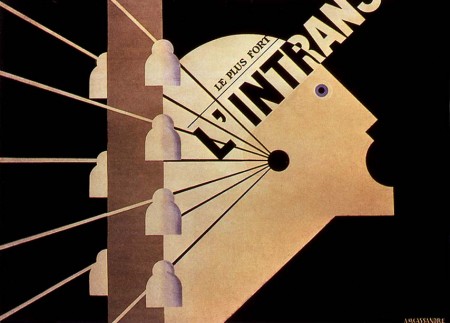
Adolphe Jean Édouard-Marie Mouron is one of my favorite commercial poster artists. Unfortunately, he went from running a successful advertising agency (Alliance Graphique who’s work includes the Yves St. Laurent logo), to losing it all and serving in the French army in World War II, to doing set design to get by, and finally suffering from depression and committing suicide in 1968. It’s very sad to think this was the fate of a man who contributed so much to design. You can find more information on Cassandre here and here.
Perhaps his most recognizable work, the Dubonet Wine poster is all but ubiquitous in vintage poster collections these days. This style of poster art is sort of a bittersweet thing for me. I really do love it, but once you start seeing something sold at Target it’s hard to take it seriously as art. I have a few old advertisement posters from this period around the house (all reproductions), but I really want to start focusing on later modernist stuff.
Images via Alki1

Some Otl Aicher 1972 Munich Olympics pins. There is nothing better than green with that deep aqua-marine (top pin in particular). If I had these I would wear a different one every day on a short sleeved white button up shirt with horn rim glasses. Speaking of the ’72 Olympics, Spitz is still the champ in my book based on style alone.
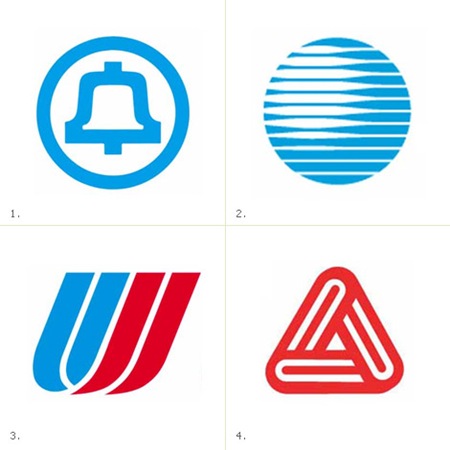
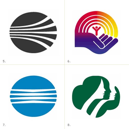
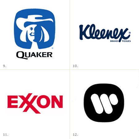
James White has posted a very nice collection of Saul Bass logos at his site, Signalnoise.com (also very nice). Going through this list, I am pretty amazed. I knew Bass did a few of them, but some of those are big surprises. Link
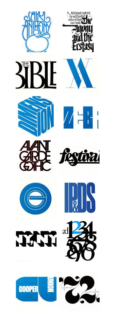
Peter Gabor has posted a Tribute to Herb Lubalin just to remind us all of how inferior our design skills really are. There are 11 pages of Lubalin’s work spanning all the way from his logos and branding up to his more conceptual art and photography. It’s a rather thorough collection and a good starting point if you’re looking for inspiration from one of the original masters of our medium. Link
On a side note, Gabor’s tribute prompted me to brush up on my Herb Lubalin Trivia by going over his Wikipedia entry. I was shocked to find that he passed away at age 63. Maybe seeing another of my design heroes, Wim Crouwel, looking fit and sounding sharp at age 78 in the Helvetica film gave me an unrealistic ideal of longevity, but I always thought of design as the sort of trade you could still be plugging away at and actually producing relevant work well into your 60’s and 70’s (desire permitting, of course). It’s a shame he passed so soon and it’s incredible what he was able to achieve in the relatively short time he had. I wonder what his thoughts on the digital revolution would have been? And perhaps more importantly, how would he have viewed the resurgence and near ubiquity of his famous typeface (Avant Garde) in the past decade of graphic design?
Update: Daniel asked a good question about Avant Garde Alts in the comments. A lot of people have asked the same thing in the past so I thought I would post up the various sources for those character sets. Click here to view the comment