Posts in Education

Typography Design and Libre Fonts

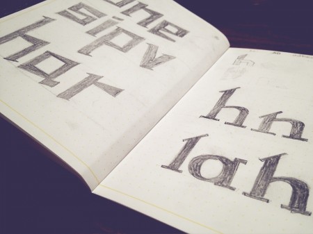
I just recently finished a five day intensive Typography course called Crafting Type. My head is still spinning a little from being so immersed into the realm of type design and fonts. I was surprised at after learning a few techniques for sketching and drawing how quick it was to get some decent ideas down on paper. I highly recommend the course if you ever get the chance to take it.

The course was led by Dave Crossland with Eben Sorkin and Octavio Pardo. Dave is a firm believer in “Libre Software” (free software) and is now creating Libre fonts. He is currently working as ‘Font Consultant’ to the Google Web Fonts project and has contributed many fonts to it. He also is a large contributor to FontForge and set each of us up with his own customized version to design our fonts.

The interesting part (that I didn’t realize) about Libre fonts is you are free to edit them and improve or make variations of them, providing you contribute them back into the Libre community. This is completely opposite of the current commercial type model (philosophically and financially). It was an eyeopener for me into the possibilities of this movement.

As web designer having fonts that I can use freely in my designs (on the web) is huge. Thinking back even a couple years, it was almost an impossibility due to Licensing. Some might argue that with the free fonts there is less “quality control” and a model more like Typekit is a better solution (both for users and font designers). Either way with a player as big as google building its free font library its exciting for me to see the flood gates on type and type creation opening up, even just a little bit.

Posted by: Seth Hardie
Instagram: @hallwood

Photography by: Rob and Lauren

Hoyle Rebranding / Process Post


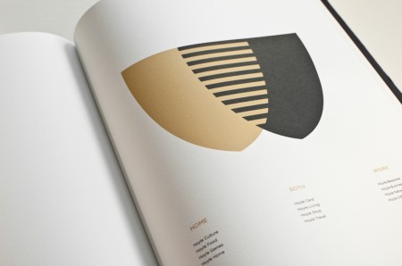
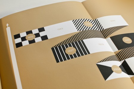
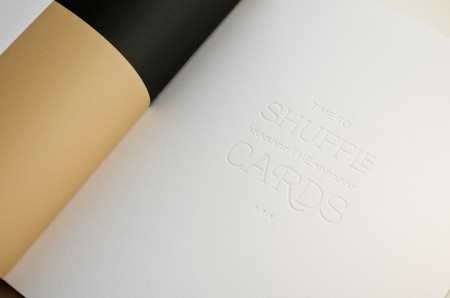
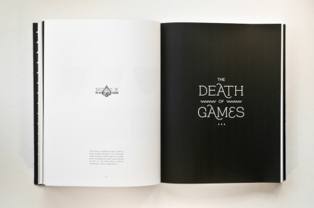
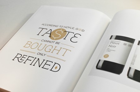
Continuing my new year’s resolution, I wanted to share my experience working on a rebranding project for school. This project was completed over the course of Spring 2011, and the assignment was to choose a dying or defunct brand and breathe new life into it. Throughout the semester we developed a logo, letterhead, visual identity, and brand extensions for the revamped company, and the final deliverable was a brand guidelines book. Alex described his process working with Playboy, and I highly recommend you check them out if you haven’t yet.

I had a lot of fun designing the deck of playing cards for Beast in a Neon Cage, so I thought it would be interesting to work with a playing card company. Once I chose my industry, I looked at brands like Kem and Copag and ended up choosing Hoyle. Hoyle is part of the United States Playing Card Company, which also owns the Bicycle and Bee playing card lines.

(more…)

Why “It” Matters


Room557 is the recently launched blog of Academy of Art University instructors Hunter Wimmer and Anitra Nottingham. I’ve had the good luck of studying under Hunter numerous times at the Academy. His advisement has been instrumental in pushing me to improve my work at every step, and I wanted to share one of his teachings that has had an important impact on my design education.

Hunter was responsible for giving me my first (but sadly not my last) failing grade, and although it was hard to stomach at the time, it was a much needed wake up call. Up to that point my barometer for successful design was how “cool” something looked. I didn’t understand the importance of having a strong concept, choosing appropriate typefaces, or using relevant materials. I saw little value in learning how to comp, bind, or print on anything other than my Epson. I didn’t understand the importance of these things because I wanted to be a designer, not a salesman, typographer, printer, or bookbinder. Thankfully Hunter was there to explain Why “It” Matters:

Would you trust a civil engineer — who’s responsible for the stability of bridges and the like — if there was a math error on their cost-estimate? Would you trust a mechanic who drives a broken-down hatchback? Would you trust a personal trainer with love handles? Now, I don’t care if my engineer has love handles or if my personal trainer drives a smoking Hyundai, but there are minimum expectations in each profession. In order for a personal trainer to convey a sense of health and well-being (and that they’ve mastered it enough to pass it on to me), they should also be fit, right?

Where does that leave the graphic designer?

When you fail you can take it one of two ways: as a rejection of yourself, who you are and your talent as a designer, or as practice, an experiment that isn’t successful… yet. Once I was able see the latter I could ask myself what was expected of my work and where it was falling short. As designers we are called to be communicators, aesthetes, conceptual-thinkers, and craftsmen. Now that the dust has settled from another semester it’s nice to go back and be reminded of what we’re called to do, why it can be frustrating, but ultimately what makes it so fulfilling when countless hours of practice result in that brief moment of success, before we go back and repeat the whole process all over again. If you are a designer or have any interest in the profession, Hunter’s informative post is well worth the read.

via Room557

How Bad Do You Want Success?


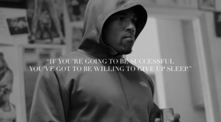
I’m not sharing this video because of the NFL or because of the athlete. I’m sharing this because of the important message related directly to success and finding it. You’ve heard it before: If you want to be on the same level as the people that you look up to, you’ll need to work really, really hard. The secrets to success are revealed through hard work.

If you’re going to be successful you’ve got to be willing to give up sleep.

This does not mean do not sleep. However, it does mean you need to prioritize. It is a metaphor for certain things in life that you do that can and quite possibly, need to be sacrificed.

Shared via Wanken

The Five Vignelli-isms


On the evening of Tuesday, March 8, The Architectural League gave its President’s Medal to Lella and Massimo Vignelli. The award (past recipients of which include John D. Rockefeller, Jr., Hugh Ferriss, Joseph Urban, Richard Meier, Robert A.M. Stern, and Robert Venturi and Denise Scott Brown) was given to the Vignellis “in recognition of a body of work so influential in its breadth that it has shaped the very way we see the world.”

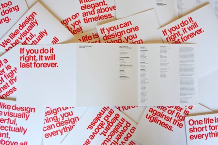
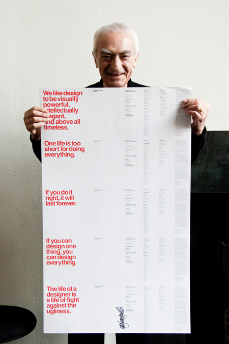
Pentagram’s Michael Bierut, an Architectural League vice president who began his career over 30 years ago as a junior designer at Vignelli Associates, designed the the program we see here. The five different covers featured a quote from Vignelli printed in PMS Super Warm Red and set in Helvetica of course.

So why are these five Vignelli-isms important?

When I first came across this I immediately saw five lessons to live by rather than just five miscellaneous quotes. They appear self explanatory but read each and give it a moment alone in your mind:

One life is too short for doing everything.

We like design to be visually powerful, intellectually elegant,
and above all timeless.

If you can design one thing, you can design everything.

If you do it right, it will last forever.

The life of a designer is a life of fight against the ugliness.

Posted via Wanken

(more…)

TED Behind the Scenes


I am headed to the TED conference this year and am unbelievably excited. I’ve been addicted to the talks for the better part of the last three years. My absolute favorite has always been Sir Ken Robinson’s discussion on creativity in education. I was excited to find the two videos above, the first of which shows a behind the scenes of Sir Ken’s talk, as well as the conference in general. A pretty cool peak into the workings of this amazing event.

Experimental Jetset Presentation


httpv://www.youtube.com/watch?v=A2pzHa6ks0M
Note: Skip to around 5 minutes in to bypass the outdated AIGA news

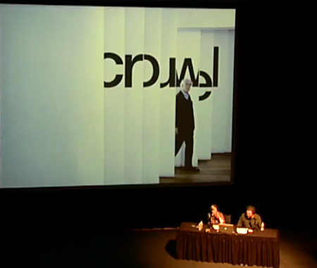
In addition to the Experimental Jetset Interview that Alex did a while back, this video should help reveal some more information about Experimental Jetset. The first time I watched the video I felt more of a connection to their work simply because I could see and hear their personality. Why?

More than once I’ve been informed of a new artists or designers but haven’t connected with them because I can’t see them talk about their work. Take David Carson as an example. During my first year at the Art Institute I heard his name once a day, five days a week and for the life of me, couldn’t see the value in his design. Now hold on here for a second, I know I’m not the only one (not trying to start a David Carson war here). Regardless my opinion has since changed. But not because I could finally comprehend his intentions. It was because when I watched a video of him speaking I started to see where he was coming from. It was almost as if seeing and hearing him talk let me see into his creative prism. Perhaps by his humor or perhaps because I could simply see him. Either way it helped me establish trust in what he was doing as a designer, or artist, whatever you might consider him to be.

Experimental Jetset didn’t need that trust or comprehension on my end. It was already there because I enjoyed their works and established an immediate connection to them. However, I still really enjoyed seeing Marieke and Danny share insight on their works. Part of it was realizing that these people that I look up to are human and part of it was that hearing those little insights into their creative process is very valuable and inspiring.

No Fear of Missing Out // Process Post


Before jumping into this process post I want to define my terms: This project revolves around the concept of ‘FOMO’, which if you haven’t come across, stands for “Fear of Missing Out”. Fomo is a very real and worrysome condition that can affect anyone at anytime. It describes that feeling of jealousy and helplessness when you miss out on something great. Typically the condition becomes more prevalent during the weekends, summer, and nighttime. For example, “When I was looking at John’s pictures from the submarine party last night, I had a really bad case of fomo.” If you are stuck at work right now and your friends just went skydiving, you have fomo.

Nofomo by contrast refers to the state of being in which you have cured your fomo. You do not have a fear of missing out because you are always the one doing something awesome. You actually cause fomo, rather than experience it yourself. If you are living your life to the fullest and saying yes to everything, you have probably achieved such a state.

This is a project about NOFOMO. (And while it may not seem like it, yes this was for school.)

(more…)

Culture Fasting


If I neglect my Google Reader for just one day, the contents build up so much that perusing them becomes more tedious than anything else. I blast through them, glancing often at only the tops of images, feeling the need to empty my “New Items” as soon as possible. I suppose I feel required to stay on top of “new things” and “new” designs — lest I become instantly irrelevant for missing a passing trend. Who knows the reason why but I surely never miss a day; my Google Reader stays empty.

Recently I read an article by one of my favorite authors, Alain De Botton. The article was called On Distraction and I found this passage of particular interest:

We are continuously challenged to discover new works of culture—and, in the process, we don’t allow any one of them to assume a weight in our minds.

I coudn’t agree more with this statement. Just think of sites like FFFFOUND, with its endless parade of sourceless and context-void images. How long do you contemplate each? Then again think of sites like this! I am as much a culprit of perpetuating this rapid culture consumption as any other blogger. I write 2-5 times per week about cool work I find, but how long do you (or I) actually spend looking at it? We glance at it, maybe visit the website, but in all likelihood it is in and out of your consciousness in less time than it took me to write the post. I’ll sometimes almost write a post on the same person twice without realizing it (this has only a few times, but is rather indicative of the problem Botton describes).

Botton’s solution to this problem is a period of culture fasting:

The need to diet, which we know so well in relation to food, and which runs so contrary to our natural impulses, should be brought to bear on what we now have to relearn in relation to knowledge, people, and ideas. Our minds, no less than our bodies, require periods of fasting.

Taking his suggestion sounds terrifying at first. It is not something I have ever been able to do by choice — usually its a vacation that puts my Reader so far over the edge that even I can’t J/K shortcut my way out — I have only hit the dreaded “Mark all as read” button a few times. It is something I would like to explore more. I remember when I grew up I was usually only aware of a few artists/musicians at one time, but I dove deep into their catalogs. My understanding of their work was broad and I can still cite examples of how whatever it was continues to influence me.

I don’t know. The article hit home for me and I am curious what you think about it all. As a blogger, I am inclined to defend my profession of endlessly posting work for the world to consume rapidly, but Botton makes a great point that seems to indicate otherwise.

Rebranding Playboy: Book Production

cover
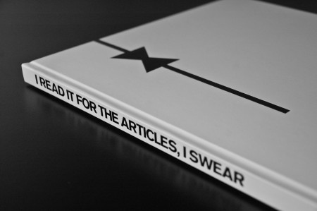
My rebranding Playboy project came to a close last week with the end of our fall semester. If you read the last article, you are familiar with the first part of this project, which was the new logo for Playboy. While it is absolutely the flag bearer of the entire project, the logo development represented a small amount of the work we were required to do for the overall project. The final deliverable for the class was a book in which we the explain history of the brand, walk through our rationale for the new identity, explore the process of the logo development, present brand standards and guidelines, and show example brand implementations and extensions. Other than this required content, there was no specific criteria for the book. Each student also gave a short final presentation explaining their rebranding and the choices they made along the way. Everything was created for the Nature of Identity class at the Academy of Art, as part of the graduate graphic design program.

I really enjoyed the conversation the first post on this project generated. I was excited to see that the new logo was as polarizing as it was — I feel like these types of solutions are the most exciting and rewarding for me. I noticed that many people were up in arms about the idea of Playboy removing nudity and becoming an all article magazine. While I would like to note that the new strategy was purely a conceptual exploration constructed in an educational environment, I actually do think they might be well served to switch things up this drastically. Playboy was once irreverent and boundary shattering. They are no longer. I can think of no better way to recapture this audacious spirit than by doing something this extreme…

(more…)