Posts in Education

Pan Am’s “Helvetica Dream”

panam
panam2
panam3
panam4
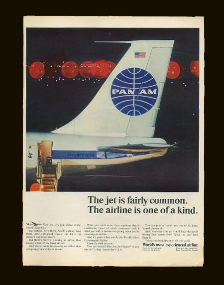
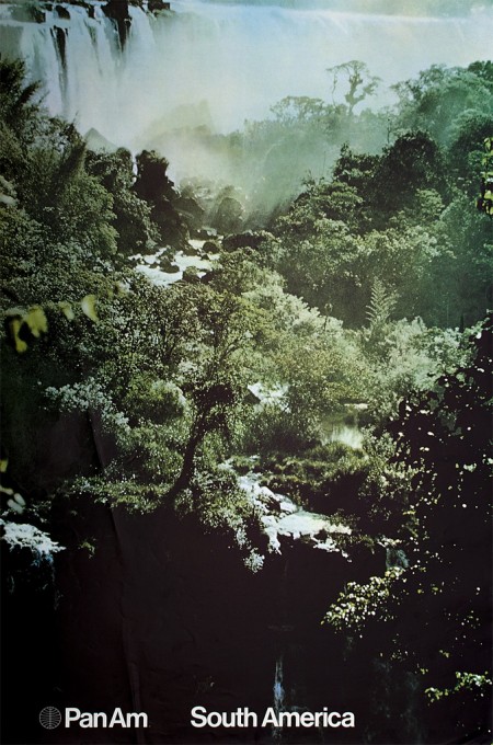
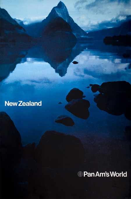
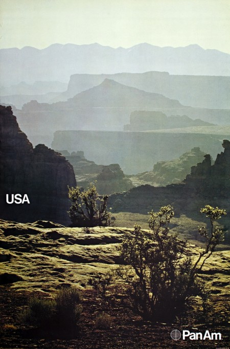
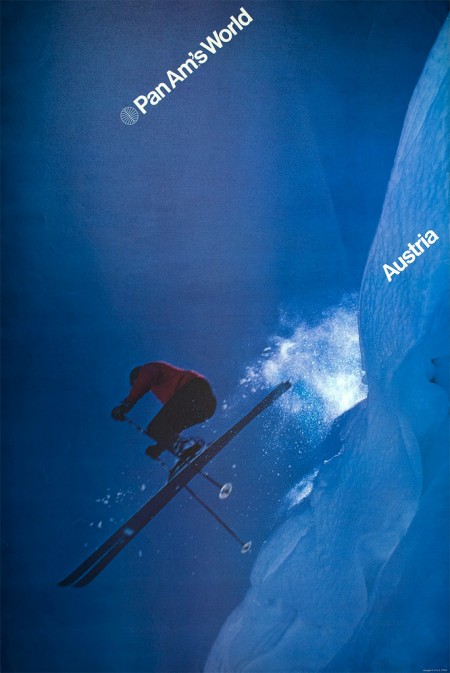
Determined to find out the history behind these beautiful posters, Frederico Duarte did some extensive research and learned how “Pan Am’s short-lived Helvetica dream” came to be. He chronicles this process over on the Eye Blog and in an article for Eye Magazine. These posters are incredible and their story is well worth the endless emails and phone calls he had to make to determine their origin.

Pan Am is no longer. But the story of its redesign, as told by the people behind it, proves personal connections, proximity and chance are all makers of (design) history. How many other great design stories are left untold?

Fredrico’s post reads like a design mystery and I lamented how little of this research I do, or even curiosity I possess when I come across work that interests me. For example: I wake up, see something amazing on FFFFOUND, then I bookmark it. End of story. If it’s especially awesome maybe I blog about it, but I rarely dive deep into whatever visual universe I’ve uncovered. I usually just absorb it quickly, then move on with a slightly augmented sense of visual understanding. This is why I both love and hate sites like Dropular or FFFFOUND. While they allow me to quickly consume lots of high quality design, they remove context and discourage the exploration that would otherwise go along with finding out about a new artist. (Of course there are many benefits to sites like these, but the removal of the ‘story’ that goes along with the work is one of the primary downsides.)

As Fredrico mentions in his article, the research was done for an SVA class where the rule is “No Google”. I thought this was interesting because I tend to use Google and “research” interchangeably, especially when thinking about design. To be stripped of my only research tool! Of course this makes sense these days, as most of us young designers primarily exist on the web anyway (which is a scary thought if you think about it…if the hardrives go, so do I). What the story hammered home for me was the importance and overwhelming benefits of a design education. What allowed Fredrico to take this much time plunging into the depths of design history (and what allowed me to spend so much time with Playboy) was the freedom and time provided by the design education environment. While you could always try and inspire yourself to do this on your own, it’s hard to beat limitless boundaries coupled with external motivation.

Debbie Millman / Design Matters

debbie
Design Matters, the long running design radio show by Debbie Millman, is making the jump to the small screen. SVA is producing a TV version of the show and will be taping the pilot episode this Friday. The first two guests are Milton Glaser and Stefan Sagmeister. To top it all off, the show will be directed by the wonderful Hillman Curtis. I’m not sure where the end result will be available, but I’m sure those details will be revealed in the coming days. I’m hoping for the Thursday 8pm slot on NBC.

If you’re in New York, the taping is open to the public — more information can be found on the Facebook event site. Why don’t I live in New York. Sometimes I want to defollow all of the New York designers on Twitter because all these cool events make me jealous.

I recently met Debbie Millman when she was in town to give a talk at school. Her talk was terrific and I’ll try to do a short write up later this week after I go over my notes. I also participated in her workshop about visual storytelling, which she led having just released her new book. She had each of us write a short story, which she reviewed and then set us on our mission of illustrating the story using all sorts of fun tools. It was fun to write fiction — I’ve become rather used to this “blog style” of writing that I forgot there was a whole other way to go about things. (My story is here if you’re feeling adventurous.) The workshop was great — I love periodically going back to the drawing board, literally, and breaking out the pencils pens and crayons. It was also great to just let loose creatively with no rules, objectives, or criteria. Something I certainly don’t do enough.

via swissmiss

GDI 09

Kirstyhole1
ricahardcarey1
EddHarrington_2
kylebean1
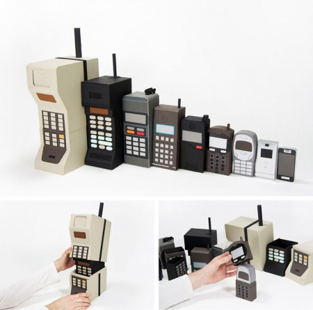
The University of Brighton has a nifty website up displaying the work of their Spring 2009 design and illustration graduates. I’ve placed some of my favorite pieces above, but there is a lot of impressive work to be seen. I think it’s great that the school puts this together for the graduates. While each student seems to be very web-capable (at least in terms establishing an online presence), this kind of collective resource allows each student to benefit from the aggregate buzz of the project. This institution-sponsored online portfolio presentation is something I think we will be seeing more and more of (in conjunction with, or probably as a replacement for, the onsite end-of-semester shows).

The work above is by the following designers, in this order: Kirsty Hole, Richard Carey, Edd Harrington, Kyle Bean. Those old school phones remind me of some of the work by Dan Mcpharlin.

via The Strange Attractor

Ira Glass on the Creative Process

Ira Glass describes the importance of producing a lot of work to endeavor through the frustrating early stages of a creative career. The first two minutes of this video should be required viewing for anyone and everyone getting into a creative field. In his case, he’s talking about video production, but his points are easily applied to any other realm. Definitely one of the most inspiring (or illuminating) pieces of advice I’ve come across.

The first couple years that you’re making stuff, what you’re making isn’t so good — it’s not that great. It’s trying to be good, it has ambition to be good, but it’s not quite that good. But your taste, the thing that got you into the game, your taste is still killer and your taste is good enough that you can tell that what you’re making is kind of a disappointment to you. A lot of people never get past that phase and a lot of people at that point quit.

And the thing I would just like say to you with all my heart is that most everybody I know who does interesting creative work, they went through a phase of years where they had really good taste and they could tell what they were making wasn’t as good as they wanted it to be. We knew that it didn’t have the special thing that we wanted it to have and the thing to do is — everybody goes through that. And for you to go through it, if you’re going through it right now, if you’re just getting out of that phase or if you’re just starting off and you’re entering into that phase, you’ve got to know it’s totally normal and the most important possible thing you can do is do a lot of work. Do a huge volume of work.

Brands: Dead, Dying or Defunct

panam
My most recent assignment for my MFA program is a pretty exciting one. Our task this semester is to pick a dead, dying or defunct brand and revitalize it. We are free to choose pretty much whatever we want so long as we can make a case for its need of a makeover and/or repositioning. The goal is not only to develop a new identity system for the brand, but also to extend its focus into untapped commercial avenues. For this part especially, we are encouraged to let our imaginations go wild. At the end of the project we will have an overhauled identity system, new product extensions, and an imagined history starting from wherever we picked up — the only thing that must be carried over is the original name.

Pan Am, a most beloved brand, would be a great example of something that would work really well for this project. Picking something that is familiar to people and in the public consciousness is always a good strategic choice. Although, you do run the risk of competing with a powerful history and a previously very effective identity. Another good example that Scott and I discussed was General Dynamics.

Today in class we went over everyone’s choices and there were some pretty cool ones; some very random, and most with lots of potential for sure. I am still on the fence with my choices, but I think I’ll come round this weekend when I have more time to think of potential futures. Right now, I’m thinking it might be fun to try and make No Fear cool again. They obviously aren’t an extinct brand, but if you visit the website you’ll see there is room for some…improvement.

Anyone think of other brands that are in desperate need of a renovation or rebirth? We found this list, but most I had not heard of. I’m sure there must be some others out there just screaming for an overhaul. Sound off in the comments.

UPDATE: The brand I ended up choosing was Playboy. Read about it here.

ISO50 Color Management: Tomorrow

iso50-color-soonb
Those who have been following along will know that we’ve been talking about doing a color management guide for a while now. Well, it’s finally done and should go up early tomorrow morning. I’ve always been annoyed that there really aren’t any consolidated, plain-english resources out there for getting your head around color management so after talking with Alex, we thought it was time to put our own together. Over the past couple years I’ve begun to focus more and more on proper color management in my workflow and with the recent addition of the Epson 9900 it’s become even more important. After Alex and I worked through the the process of getting the 9900 online I figured it was finally time to put all that we had learned into a post as a reference point for others who are struggling with maintaining color integrity in their work.

We put this guide together because whether you are designing for print or web, it is important to have a good understanding of color management to ensure that your image looks the way you intended it once it leaves the confines of your computer. After considering the many factors that go into this process, Alex has written a comprehensive guide to color managing your documents from concept to finished product. We certainly aren’t billing this as the definitive manual for color management; it’s intended to be a working guide, a condensed set of essentials based on our own experiences working with various printing companies and our own equipment over the years. To help with the finer points, we enlisted color expert Kirk Economos of Meridian Cyber who has helped edit the guide to make sure everything is correct and in line with accepted industry practice.

So stay tuned, you should see the guide pop up here shortly.