Pantone has just announced that PANTONE® 15-5519 Turquoise is the Color of the Year for 2010. I gather that they are predicting its heavy saturation throughout the fashion and interior design worlds, but I’m not entirely sure what “color of the year” is supposed mean. Besides gut feelings and casual observations, I’m not sure how on earth a color of the year would be chosen. Perhaps there is some magical color metric that I am not aware of. Personally I think the color of the year is grey but that might be a little too depressing for Pantone. Last year was yellow after all…
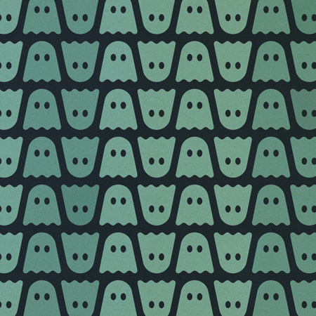
An interesting aspect of this story that I’ve been struggling with is which version of PANTONE® 15-5519 to trust when you come across it reblogged on the web. I’ve seen some pretty divergent interpretations of the color that are clearly the result of some wacky color profile. Even the one I’ve saved above looks a little darker than Pantone’s website to me. Anyway, you get the point, turquoise is the color of the year. Now paint your walls and buy a new shirt.
Combining the serene qualities of blue and the invigorating aspects of green, Turquoise evokes thoughts of soothing, tropical waters and a languorous, effective escape from the everyday troubles of the world, while at the same time restoring our sense of wellbeing.
