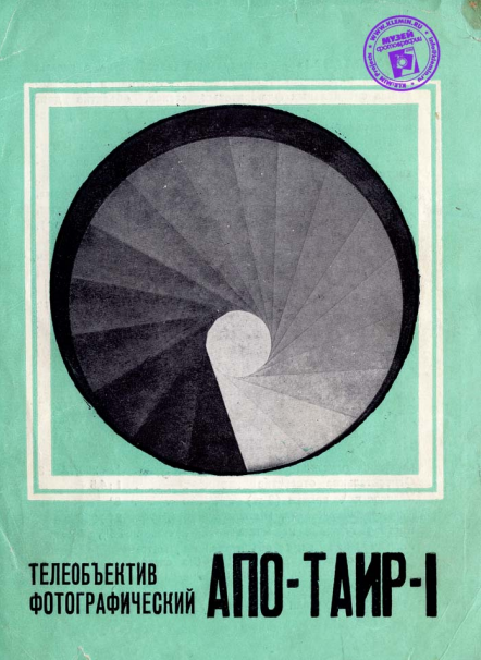
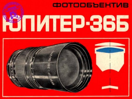
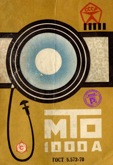
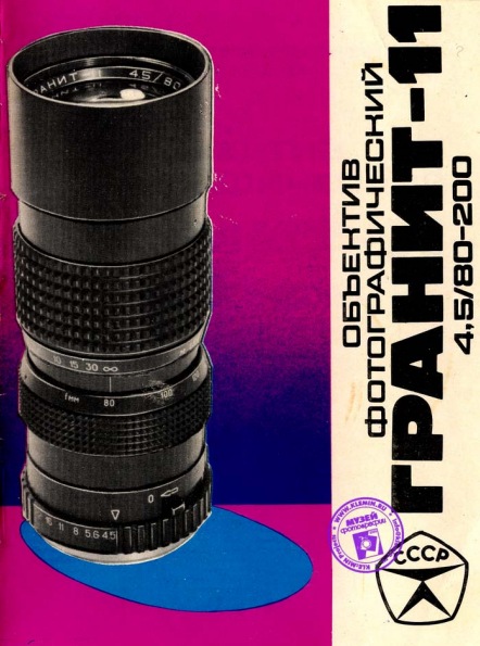
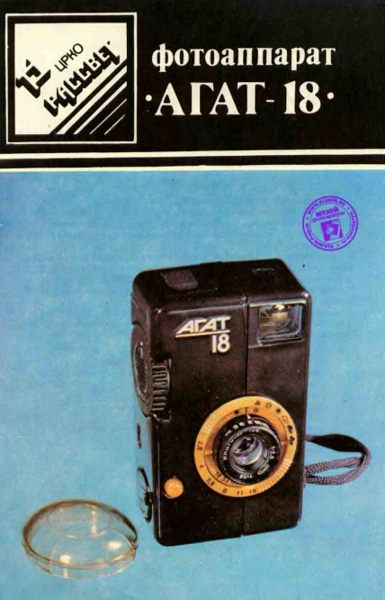
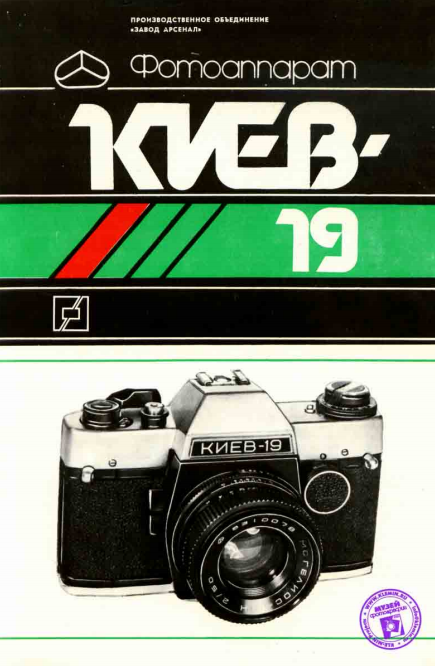
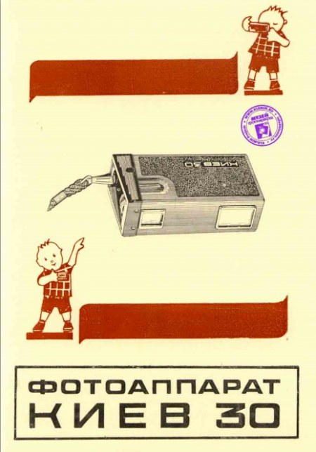
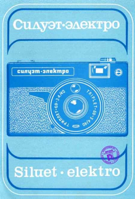
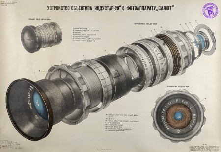
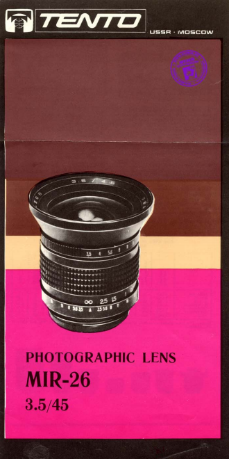
Came across a huge collection of camera and lens manuals from the Soviet Union, all of them have that DDR/Cold War feel and look. Being born in communist Poland i’ve been shown a lot of this kind of design thru my whole life, I find a strange attraction to it.
Posts in Featured
Vintage Russian Camera Manuals
Prints by Ricardo Santos
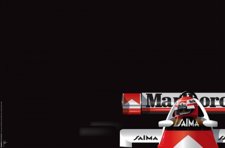
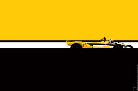
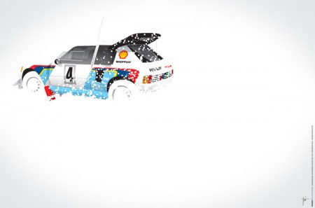
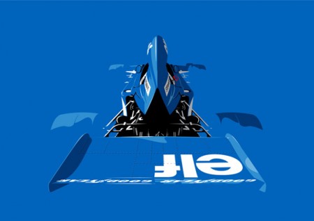
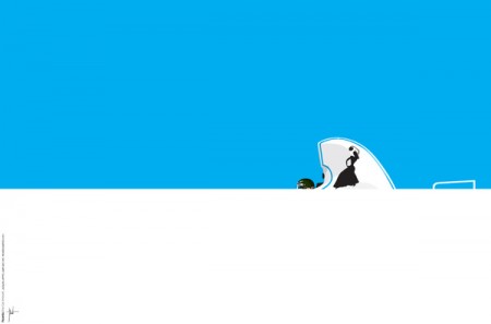
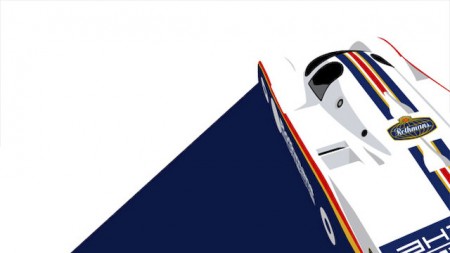
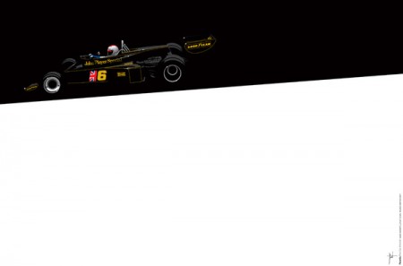
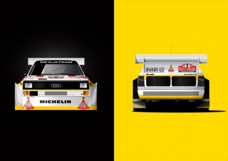
“Car art” is always a contentious subject for me, there’s alot of cartoonish colored pencil stuff out there that Road & Track likes to pass off as “fine art”. If there’s one thing i’ve tried to showcase in my livery posts, it’s that the geometric body of the car itself makes for a great canvas.
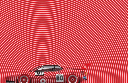
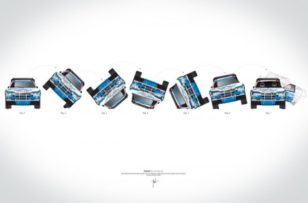
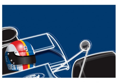
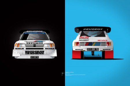
Earlier last week, fellow car porn addict (although he gets paid for his addiction) Jim Lau sent me the innocuous “you’ve seen this, right?” message. Above are some examples of Ricardo Santos’ work, and I think they’re absolutely fantastic. You’ll notice some farmilar ‘faces’ from alot of the car posts I’ve done here on the blog, needless to say I’ve solved the problem of hanging up pictures of cars on my wall without looking pubescent.
These prints all come in a variety of sizes & formats, the stretched canvas is barking at me and the moths futzing outside my window will soon find a nice warm home in my wallet. You can find all of Ricardo’s works seen above over on his Society 6 page.
Reverse Of Volume
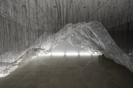
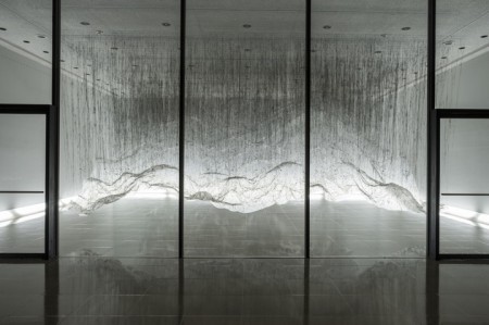
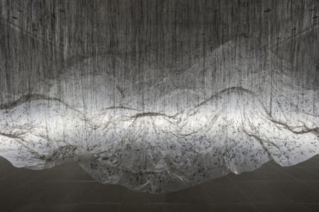
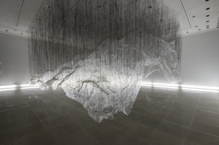
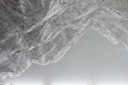
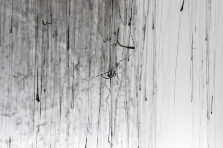
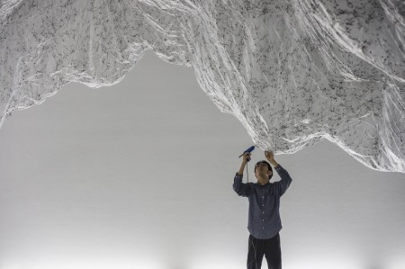
Reverse Of Volume was an installation by artist Yatsuaki Onishi commissioned by Rice Gallery, which ran from April 13 – July 27 2012. The suspended fabricated mountainscape is formed from two materials; plastic sheeting and black colored hot-glue. Onishi shaped the floating sculpture within the gallery space by first draping the expansive plastic piece over stacked cardboard boxes, then removing the piled components following the white sheet having been attached to the ceiling by the quick-drying adhesive. This creative process or method is known to Yasuaki Onishi as ‘casting the invisible’ and aids in his artistic meditation on the reality of negative space.
Designing With Photography
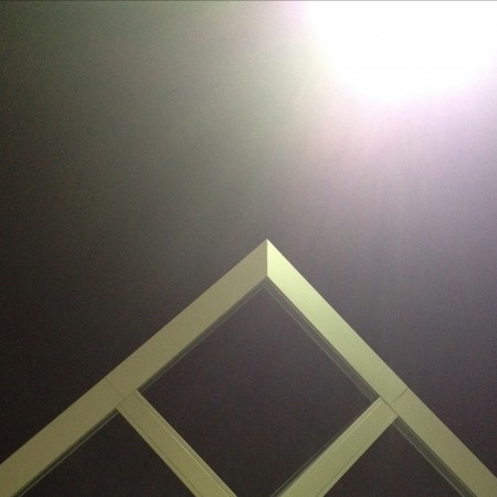
1. Initial photo (architectural feature)
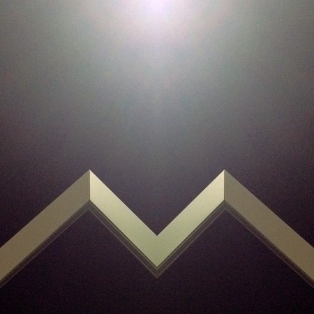
2. Cropped and mirrored

3. Cropped and mirrored and layered in Image Blender
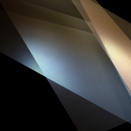
1. Initial Photo of some shadows in a corner (taken with Stilla)
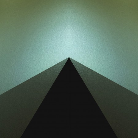
2. Cropped and mirrored

3. Final Image layered in Image Blender
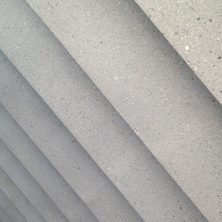
1. Initial photo of some stairs
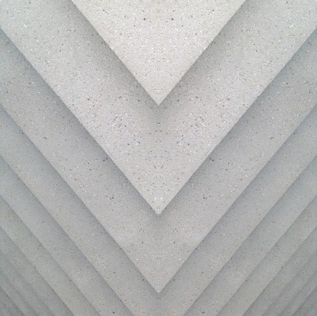
2. Mirrored (you may notice a habit here)
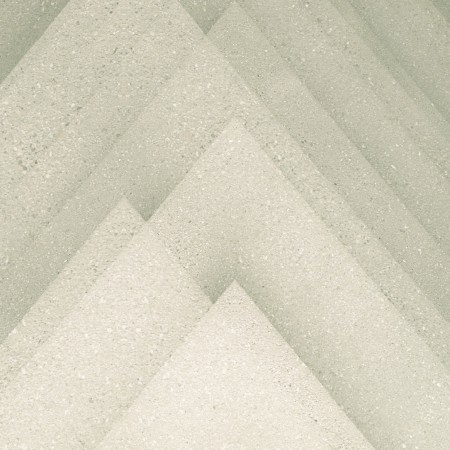
3. Final image layered in Image Blender
The first photos I started using in my designs were simple textures. (we’ve all seen the explosion of texture sites out there) but lately I’ve been using photos to get shapes that typically I would have drawn before. This has been largely driven by having a decent camera in my pocket at all times, allowing me to capture random staircases or light hitting the corner of an architectural feature just right. I find the natural light and texture in photographs have so much more depth in the final product then what I can come up with in photoshop …and its much easier to get to the end result.
Posted by: Seth Hardie
Instagram: @hallwood
Weekend Inspiration: Chloe Aftel
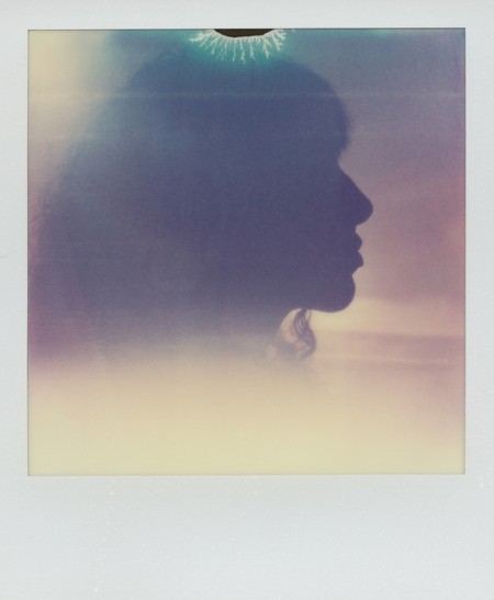
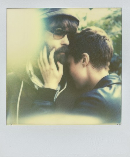
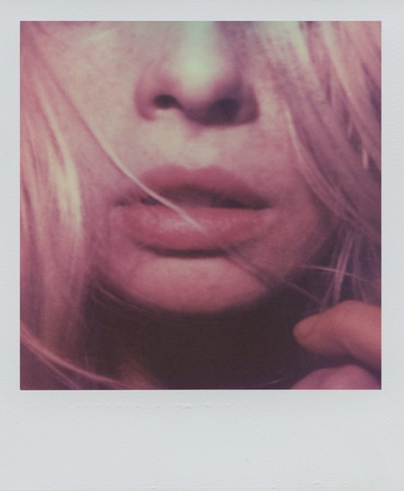
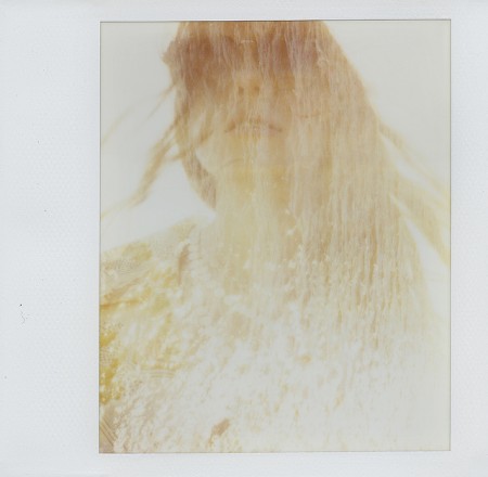
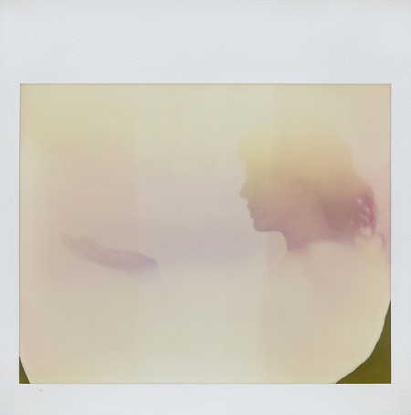
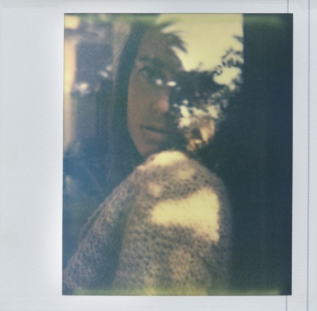
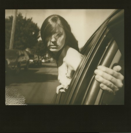
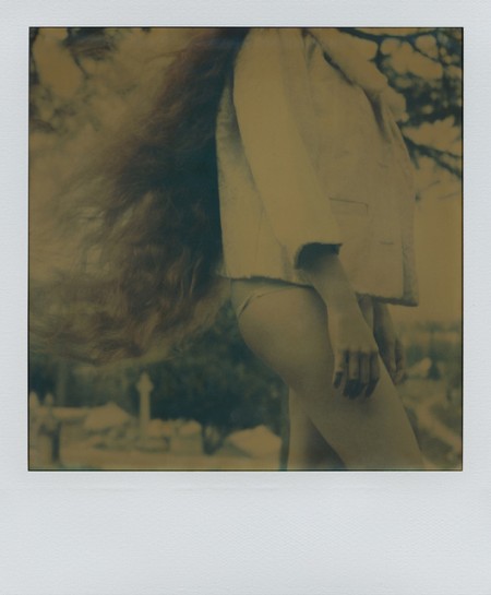
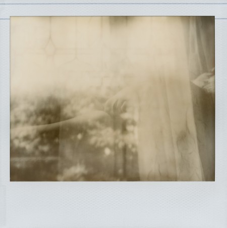
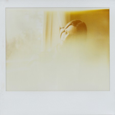
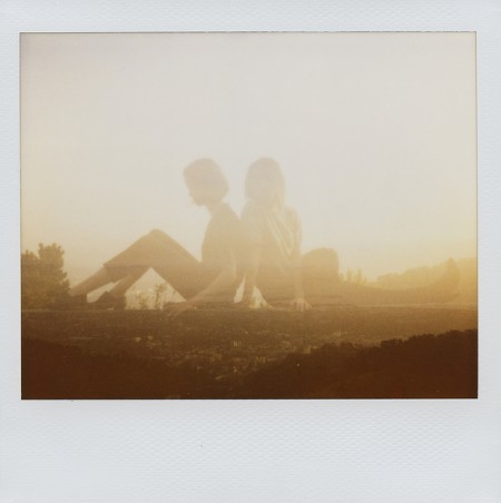
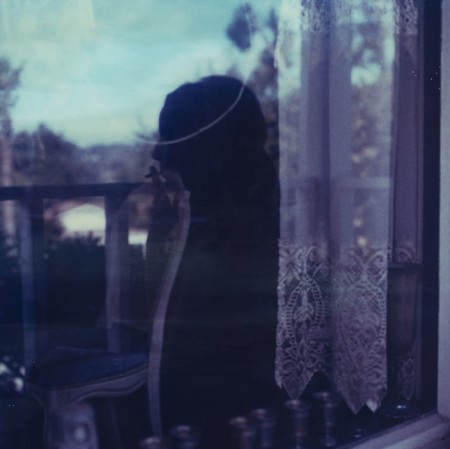
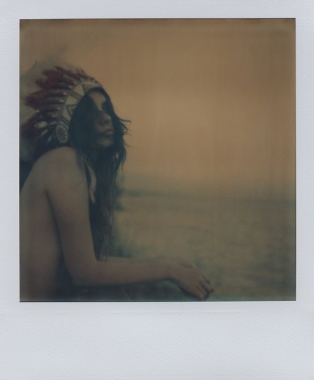
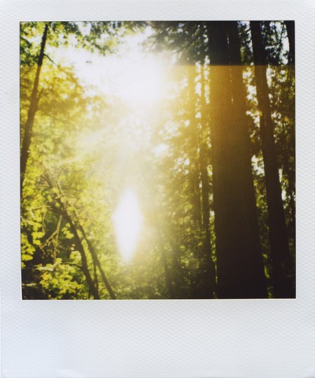
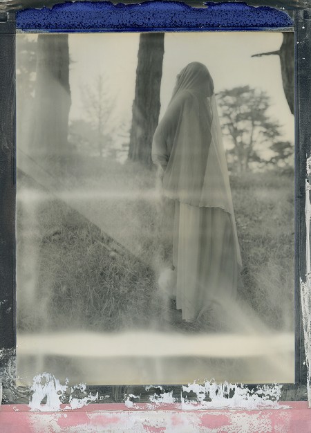
My friend Cameron Ballensky has been in town visiting for a few days, so we’ve been out and about shooting loads of film. Me, mostly 35mm, him Polaroid. After seeing some of the unpredictable results yielded by certain films he uses, I was really turned on by the idea of exploring this format myself (also two of my favorite photographers, Reuben Wu and Neil Krug, have inspired this in me as well). Cameron mostly get’s all of his film through The Impossible Project, a company that now produces Polaroid film, and as I was exploring their site, I came across the beautiful work of Chloe Aftel, a Los Angeles based photographer and film director.
Browse through her beautiful body of work on Flickr.
Chloe is also part of The Impossible Project’s launch of a new instant film material for 8×10 cameras (image below). More info can be found here.
4 Days of Sound, Art and Inspiration
The Art Directors Club CRE8 Series presents:
Ghostly International: Of Art and Artifice
Ghostly International and Art Directors Club collaborate on an exciting 4 day event in New York City this September showing the diversity in their artistic roster. Below is the information and schedule on what to catch and make sure to get your tickets soon, this site just launched today.
ABOUT THE EVENT
The Ghostly universe has been steadily expanding since its humble beginnings in Ann Arbor, Michigan in 1999.
The Art Directors Club begins its CRE8 series of music and art focusing on Ghostly International, a unique culture identity that has helped elevate the careers of visual artists including Michael Cina, Sougwen Chung, Andy Gilmore, Will Calcutt and Matt Shlian, while releasing work from musicians such as Matthew Dear, Com Truise, Gold Panda, Lusine and School of Seven Bells.
The Ghostly aesthetic and it’s accompanying ethos has always sought to cast off the restrictions of genre and form. An assertion that creativity, in its apolitical nature, is an act worth striving to achieve. Unconcerned with classification, Ghostly highlights the act of making in and of itself, no matter the medium.
In 2010, Ghostly launched Ghostly International Editions, a “label” of artwork and artists that has grown into a collective of some of North America’s best designers and artists.
Of Art and Artifice is not a retrospective—it is a comprehensive state of the union, a peek into what’s next after 13 years of creativity from Ghostly International, creating an essential selection of work from the Ghostly family into a never-before-seen collection.
ABOUT THE ART DIRECTORS CLUB
Founded in 1920, the Art Directors Club is the premier organization for leaders in visual communication, boasting one of the most concentrated groups of creative talent in the world. A not-for-profit membership organization, the ADC’s mission is to connect creative professionals around the globe while simultaneously provoking and elevating world-changing ideas.
SCHEDULE
Thursday
September 13th / @6pm
Opening Gala
Live music performances by:
→ Com Truise
→ Lusine
→ Michna (DJ)
Live projection performance by:
→ Sougwen Chung
Friday
September 14th / @6pm
Artist Talks Day 1
Hosted By Incase:
→ Michael Cina
→ Andy Gilmore
→ Will Calcutt
Saturday
September 15th / @6pm
Artist Talks Day 2
Hosted By Incase:
→ Matthew Shlian
→ Timothy Saccenti
→ Sougwen Chung
Sunday
September 16th
Open to public 12-5pm
Mikael Eidenberg’s Synthesizer
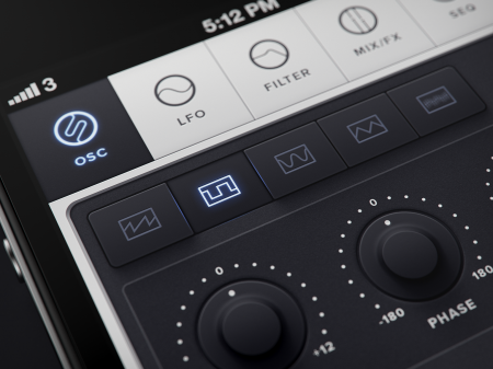
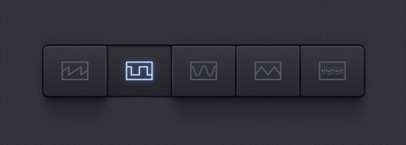
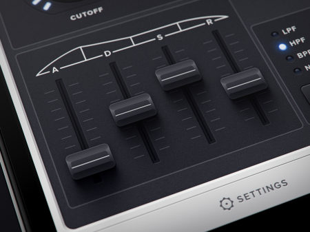
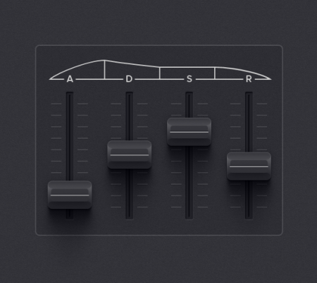
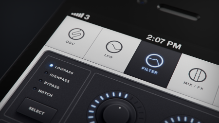
I don’t know who this guy is, or where he came from, but let’s hope he Kickstarts his app concept so we can give him a million dollars.
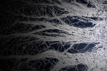
Weekend Inspiration: Motoi Yamamoto
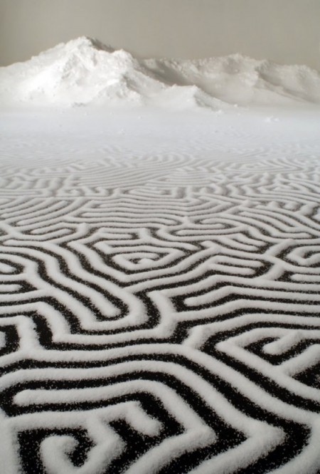
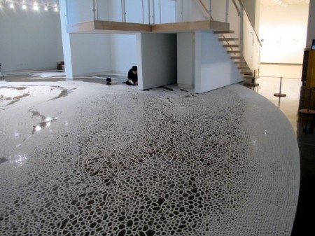
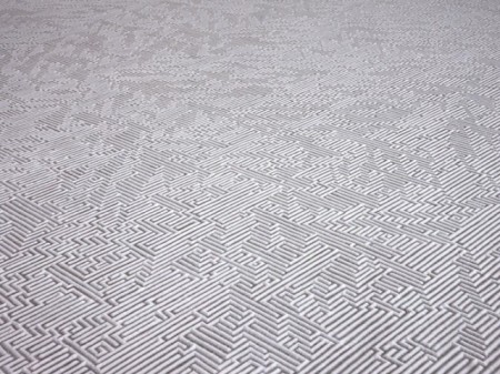
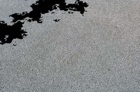
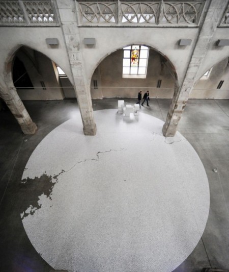
Japanese artist Yamamoto Motoi was born in Hiroshima, Japan in 1966 and worked in a dockyard until he was 22, when he decided to focus on art full-time. Six years later, in 1994, his younger sister died from complications due to brain cancer and Yamamoto immediately began to memorialize her in his labyrinthine installations of poured salt. The patterns formed from the salt are actually quite literal in that Yamamoto first created a three-dimensional brain as an exploration of his sister’s condition and subsequently wondered what would happen if the patterns and channels of the brain were then flattened.
Although he creates basic guidelines and conditions for each piece, the works are almost entirely improvised with mistakes and imperfections often left intact during hundreds of hours of meticulous pouring. After each piece has been on view for several weeks, the public is invited to communally destroy each work and help package the salt into bags and jars, after which it is thrown back into the ocean.
Via Colossal
Influences Pt.1: Logical Progression
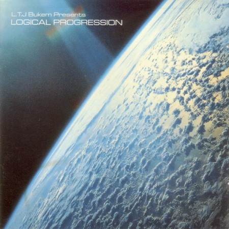
1996 was a pivotal year for me musically. It was the year DJ Shadow released Endtroducing and it was the year I was first properly introduced to electronic music, an experience that certainly altered the course of my life. Although Endtroducing probably ended up having more of a direct influence on my sound, the impetus for me wanting to create my own music was without a doubt LTJ Bukem’s Logical Progression, a continuous mix of what was later referred to as “Intelligent Drum And Bass”.
I was given the album by a friend (on MiniDisc of all things) and it served as the soundtrack to an entire semester of school. We ended up building a battery-powered backpack and walking around in the forests above San Francisco, blasting this sort of music through the mist and Eucalyptus trees; some of my best memories of this city. Sadly, Drum And Bass took some pretty hard turns a few years after this and I just couldn’t keep up. There were a few practitioners of this sound still releasing (most notably, perhaps, Big Bud) but in general things sort of devolved from here on out — to my ears at least. There were several more Logical Progression compilations released after this one (which was later referred to as Logical Progression: Level 1), but none managed to capture the zeitgeist quite like the first.
I think beyond the music, the associated artwork also had a big impact on me. One of my first forays into Photoshop was essentially just a bad ripoff of this cover. I did a little digging and it looks like it was designed by Phillip Wells (aka Basement Phil). Here is a quote from him (unverified of course) on the Logical Progression Discogs page:
I organised the deal for this compilation with Pete Tong at London Records on behalf of Dan aka LTJ Bukem.
When he was sent to an artist studio to do the sleeve, I got a phone call late in the afternoon from Dan saying he could not come up with a sleeve he was happy with and would I come and help. So I left my office at Vinyl Distribution in Reading and made my way up to London and when I arrived Dan was all flustered as the sleeve had to be done that day.
I looked through loads of pictures before coming across the picture used. I knew it was the one because of the ray of light shining down on the Earth, and remember saying to Dan that it was the perfect image as I saw the music that had been released on the label over the three previous years had been a shining light for the DnB scene. – Basement Phil
So enough background, on to the tracks. These are a few of the standouts for me. Photek’s Pharoah (referred to elsewhere as Rings Around Saturn) is far and away the best song on the album and would definitely make my all-time top 100 list.
Photek – Pharoah
httpvh://www.youtube.com/watch?v=n3hwd3A6-_M
Chameleon – Links
httpvh://www.youtube.com/watch?v=_C3iuUCZmUM
DJ Crystl – Mind Games
httpvh://www.youtube.com/watch?v=WXP9CqMrb50
Nemo 33
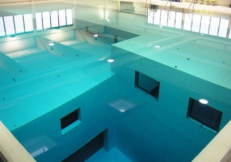
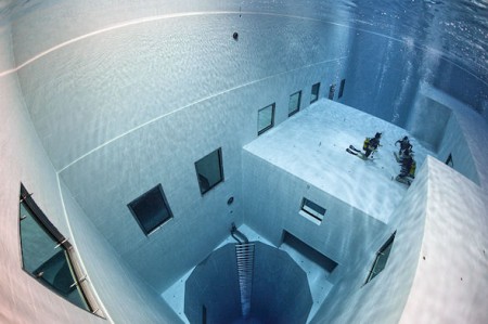
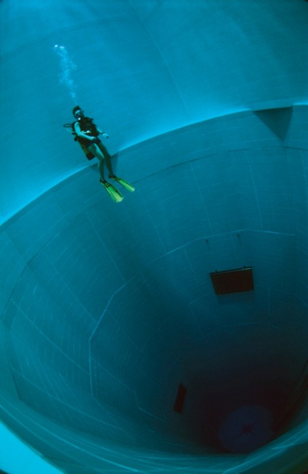
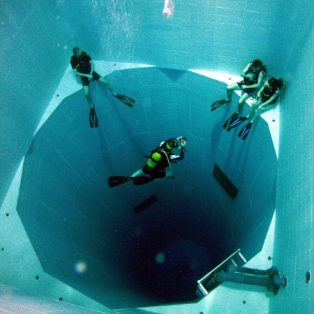
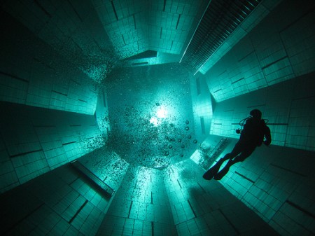
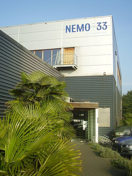
This is Nemo 33, the deepest swimming pool in the world. Located in Brussels, Belgium, the 113 ft. deep diving facility was designed by diving expert John Beernaerts for instruction, recreation, and film production.
I love the layout and colors of the space; the multi-level plateaus at the top are incredible. This really has a sort of 2001 vibe with a healthy dose of spent fuel pool thrown in. Would love to have a swim in there.
More on Nemo 33
