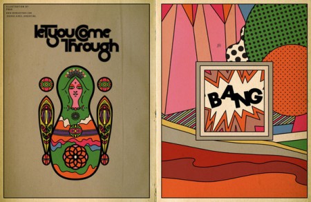
If you’re in need of some editorial or layout design inspiration, head over to the Behance site for POGO. I’ve just been cruising the archives of all issues of the online magazine SOKO. There is a ton of great typography and photography throughout each issue and I’m sure you’ll find something you like. Content-wise, it’s mostly fashion we’re talking, but it’s really just a playground for POGO to go crazy and design what they like. I also included their video Voyeur, because the color and post-processing is so good it made me forget I have to go to work tomorrow.
Posts in Film
POGO / SOKO
How to Shoot Stop Motion from Above
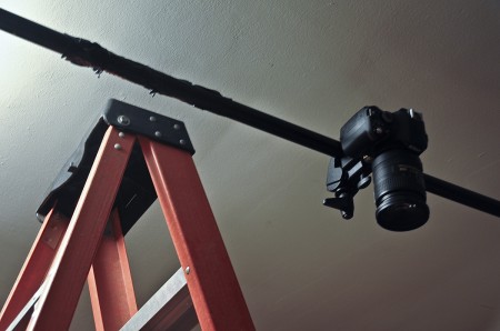
You do not want to know how long I spent trying to rig a vertical stop motion set up this week. Duct tape was flying around everywhere, lights were falling and shattering from above, and I had to take at least one ‘cool down before I break something’ walk. Surprisingly, Google was unhelpful in providing useful solutions — though this may have had something to do with a confusion in terms (is it aerial stop motion? vertical? 90 degrees?) I never quite know what to classify it as.
Anyway, I’ve written this brief process post about how I set up everything. It worked great for me, but I do not intend this to be a “this is HOW you do it” type article. Classify this as a go-to “bootleg” option if you don’t have access to one of those crazy $10,000 rigs that lets you fly above your subject etc. If you are looking for a relatively easy and inexpensive way to complete this type of project, this is one way to do it. I’ll walk through the supplies and exactly what I did that worked best for me. At the end of the day, it’s actually pretty darn easy — but it’s always nice to get a peak at a successful process just in case you’re spinning your wheels. There probably is a better way to do this, but I couldn’t find one. (And do excuse the slightly blurry photograph above…unfortunately the camera that has the external flash capability was the one being photographed…)
And in case you have no idea what I’m talking about, this video is a GREAT example of this type of stop motion done extremely well.
I’m Here / Spike Jonze
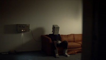
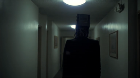
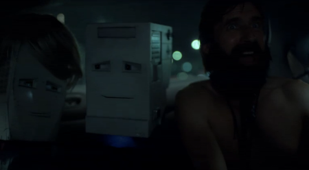
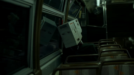
I didn’t realize the other day, when I mentioned Spike Jonze’s “I’m Here”, that the actual film had already been released. The trailer was exciting enough for me I guess. Now you can view the entire 30min film on the website. They limit the amount of viewers per day, so make sure to take a look when you can. I haven’t seen it fill up recently, but you never know. Props for a smooth web interface too — feels like a video game without being frustratingly slow or clumsy like most Flash pages.
The film itself is great; the opening sequence is especially well done. The music works really well with the visuals throughout, and of course the whole thing stars robots. They are remarkably expressive, what for being robots and all. I really like the combination of animation and lo-fi costumes; it works really well for this, just like WTWTA. The story is a nice one, a little sad/mopey, but I enjoyed it overall. I found myself more attracted to the uniqueness of the whole project rather than any specific aspect of the plot.
My favorite part is when the bearded guy in the car yells “You’re a ROBOT!!” into the main characters head. Awesome. Check it out here.
Prolost
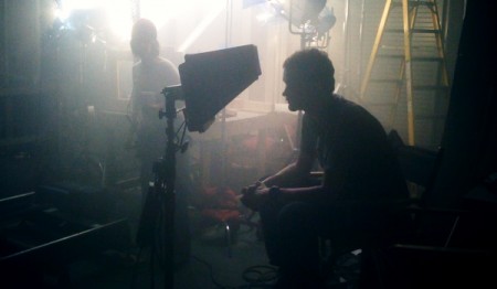
I’ve been delving into the depths of the internet over the past few weeks; reading about everything from ultra high speed video camera comparisons to the best post production workflow for the 5DMKII to FCP. One of the best resources I’ve found is Prolost, the site of filmmaker Stu Maschwitz. The blog is generally about filmmaking, with a heavy lean on post production techniques, typically as it relates to DSLR equipment.
You may have already heard of it, but as was true for The Strobist a year ago, I had not and am very glad to have discovered such an informative resource. I came to Prolost by way of an article on color correction called Memory Colors. It’s not a ‘how to’ by any means, but puts forth some interesting information on the theory behind color correction and manipulation.
With the release of the new (now fixed) firmware for the MKII, it’s been hard to escape the buzz. Finally the MKII can shoot 24p! (In case you don’t see why this is awesome.) Of course now I am lamenting the fact that it can’t do 60fps (all of a sudden I had the urge to get some really smooth slow motion). Maybe next time.
Trafic Artwork
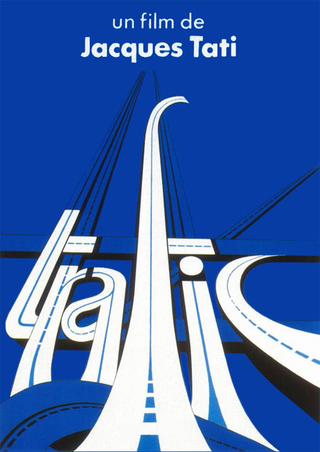
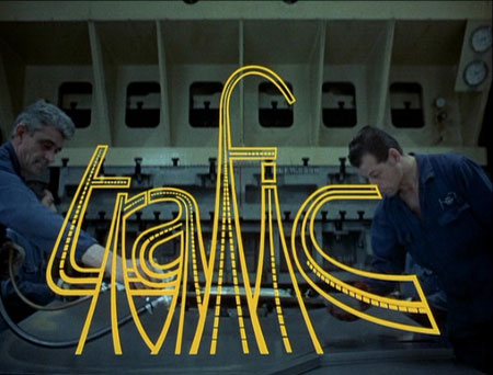
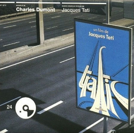
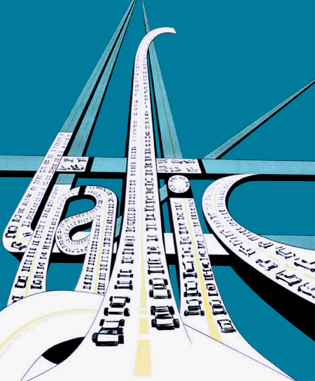
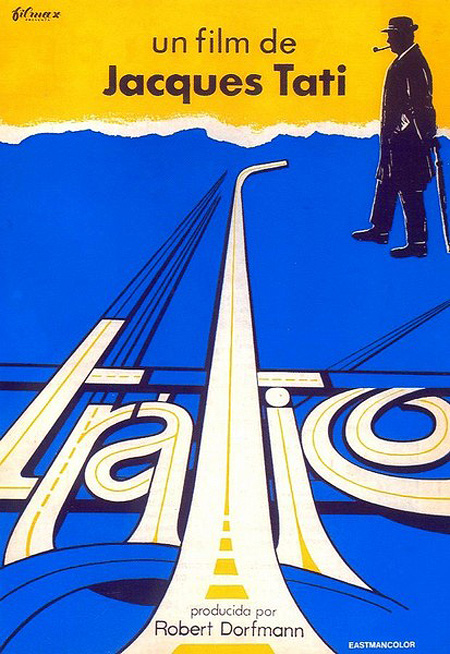
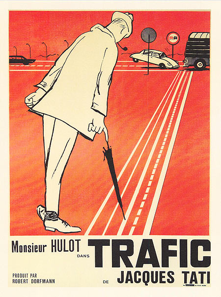
Every time I’m at Faye’s Video (btw they’re not just about VHS tapes and employee film ratings, they make awesome espresso too) I notice the cover for Jaques Tati’s Trafic. I’ve never seen the film but the cover art is striking to say the least. I finally decided to look it up to get more info and came across this post at Balduin about the various versions of the poster for international release. While the cover is great, I was really blown away by the titles (second image), that’s got to be my favorite part. Now I’ll have to rent the DVD just so I can screenshot it and print it out.
Via Balduin
Avatar (and Papyrus)
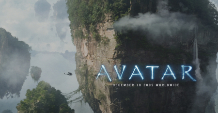
I saw Avatar last night (in full 3D IMAX glory) and really enjoyed it. It reminded me of how I used to feel when I would play video games as a kid — not so much because of the graphics or anything like that, more because of how in it I felt. I remember when I used to play Zelda for example, my imagination would just take over and for those couple hours I lived in that universe (I was a nerdy kid). Avatar is like this; it is very easy to forget you are watching a film and think you are actually physically along for the ride, as there are no visual limitations to give you any indication otherwise. There were moments when you could hear the whole theater let out audible gasps as something incredible came on the screen. The first time you see one of the giant mining machines is pretty amazing. Of course the plot follows an extremely predictable trajectory, but seriously who cares. When things look this cool I am willing to make concessions on freshness of plot.
I saw the film with a few friends, one of whom is an interaction designer. He was mesmerized by all the crazy user interfaces the characters were manipulating. The spherical and detachable computer screens were a favorite. Meanwhile I couldn’t get over the choice of typeface for the subtitles; Papyrus (or some variant, essentially the same thing). The rest of my friends thought I was a huge nerd when the first thing I said out of the theater was “What was with that subtitle font!?” It is crazy to think (in my opinion) that $280 million went into this movie and they chose the one font that is at the end of most typography jokes (save maybe for Comic Sans). I know it probably fit better than a super clean sans serif (and I can’t imagine there weren’t hours of discussion over this point), but seriously, Papyrus?
Further: Kottke describes another interesting issue, regarding the realism of the Na’vi’s technological development. I don’t necessarily agree with his point (I think they were as advanced as they wanted/needed to be given the physical and spiritual qualities of their world), but he makes an intriguing argument.
Movie Posters of the Decade
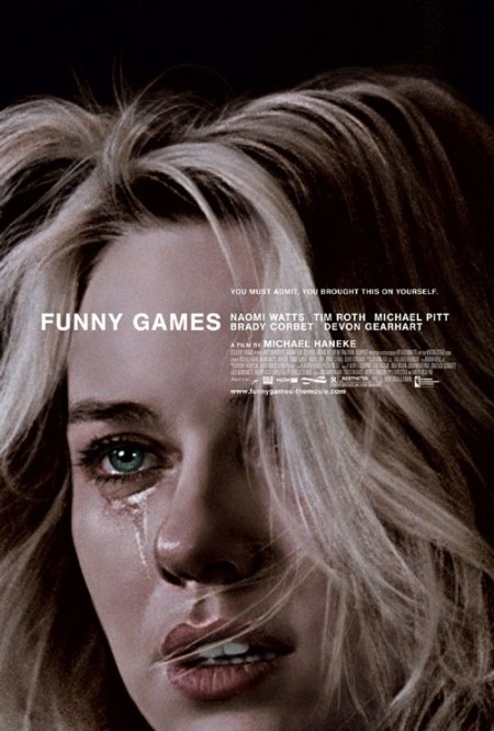
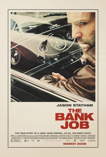
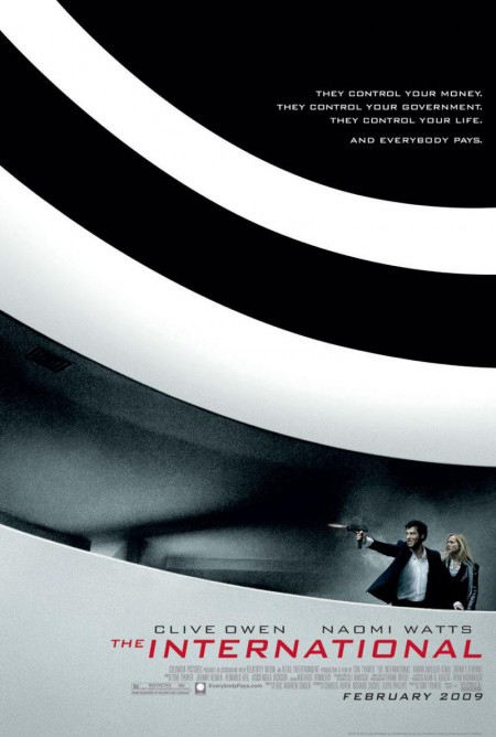

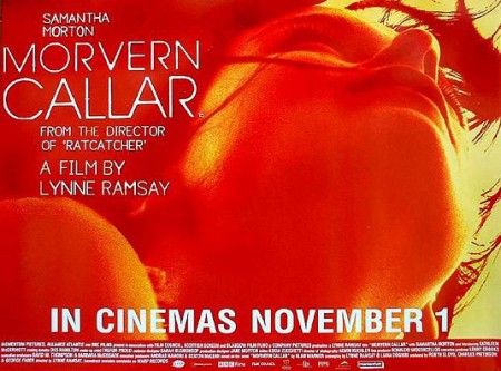
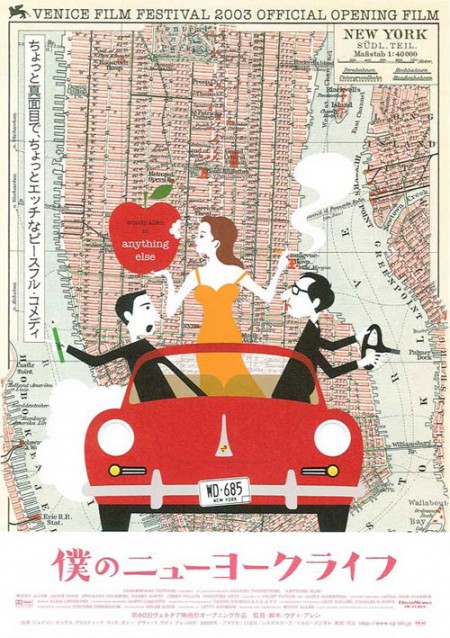
The Auteurs has a post on their picks for the top movie posters of the decade. Considering that the vast majority of modern movie posters fall short of the standards set in heyday of film, this must have been a difficult list to assemble and a boring task to complete. Nevertheless, they have managed to dig up a few gems. Good to see The Bank Job in there — always a favorite — but I was pleasantly surprised by Funny Games, hadn’t seen that one.
Can you think of any obvious omissions from this list? Let us know in the comments
For some background, more good movie posters from years past can be found in these older posts: 50 Beautiful Movie Posters, 100 Greatest Movie Posters, and, of course, SOLARIS!.
Via The Auteurs
Debbie Millman / Design Matters

Design Matters, the long running design radio show by Debbie Millman, is making the jump to the small screen. SVA is producing a TV version of the show and will be taping the pilot episode this Friday. The first two guests are Milton Glaser and Stefan Sagmeister. To top it all off, the show will be directed by the wonderful Hillman Curtis. I’m not sure where the end result will be available, but I’m sure those details will be revealed in the coming days. I’m hoping for the Thursday 8pm slot on NBC.
If you’re in New York, the taping is open to the public — more information can be found on the Facebook event site. Why don’t I live in New York. Sometimes I want to defollow all of the New York designers on Twitter because all these cool events make me jealous.
I recently met Debbie Millman when she was in town to give a talk at school. Her talk was terrific and I’ll try to do a short write up later this week after I go over my notes. I also participated in her workshop about visual storytelling, which she led having just released her new book. She had each of us write a short story, which she reviewed and then set us on our mission of illustrating the story using all sorts of fun tools. It was fun to write fiction — I’ve become rather used to this “blog style” of writing that I forgot there was a whole other way to go about things. (My story is here if you’re feeling adventurous.) The workshop was great — I love periodically going back to the drawing board, literally, and breaking out the pencils pens and crayons. It was also great to just let loose creatively with no rules, objectives, or criteria. Something I certainly don’t do enough.
Buffalo ‘66 Stills
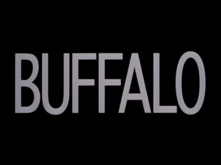
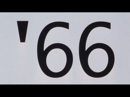
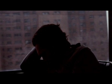
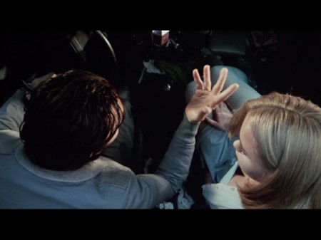
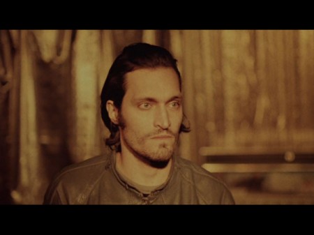
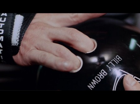
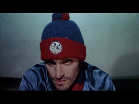
I’m posting these stills from Buffalo ‘66 partly because they’re awesome and partly because it’s a good chance to tell the story where me and Dusty saw Vincent Gallo at my neighborhood market on a Tuesday. It was surreal, I think we must have been staring uncontrollably because he was in line and had this look on his face like “are these idiots going to ask me something or stab me?” (all love knife style). We also saw him with Sean Lennon at a bar once and got some horrible blurry iPhone shot of him and Dusty. So I guess that makes us officially stalkers now.
By the way, Whatthefont says “Buffalo” is Prelo Compressed Medium. Not quite sure though.
Stills via the always incredible I Love Hotdogs.
They Live: Obey
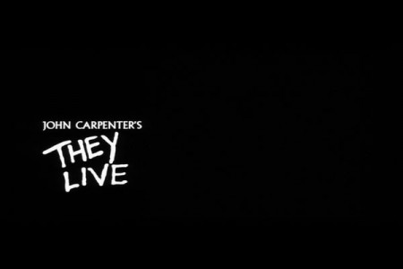
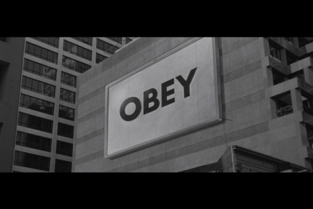
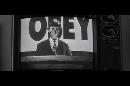
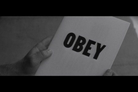
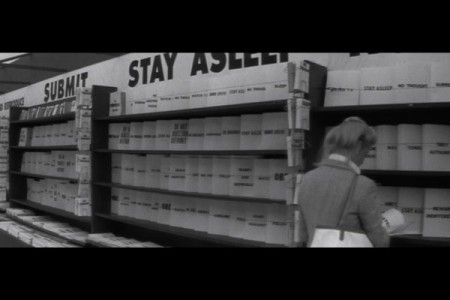
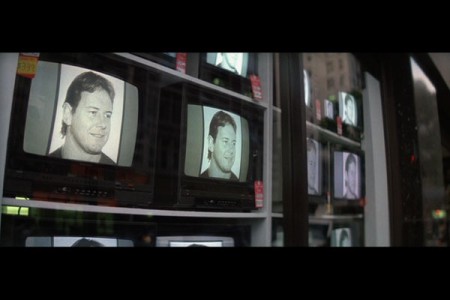
I came across some screencaps from John Carpenter’s 1988 They Live over at the excellent I love Hotdogs blog today (you may remember ILHD from the film titles post) and was immediately struck by the “Obey” scenes. Looks pretty familiar right? Cool to see the inspiration for Shepard Fairey’s Obey Giant campaign, looks like a terrible movie though. Although Roddy Piper cameos are always welcome.

