Posts in Film

Michael Pollan’s Writing House

pollan-writing-house
Michael Pollan's Writing House
pollan-writing-house-2

Michael Pollan's Writing House


Author Michael Pollan (In Defense of Food: An Eater’s Manifesto and The Omnivore’s Dilemma) spoke at U.C. Berkeley’s Zellerbach Hall tonight. If you haven’t heard of his books, you may recognize him from the recent film Food, Inc. — which I highly recommended seeing.

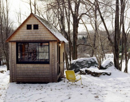
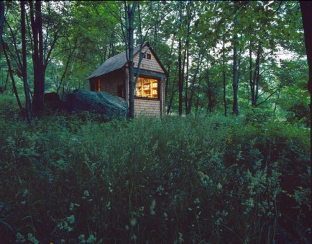
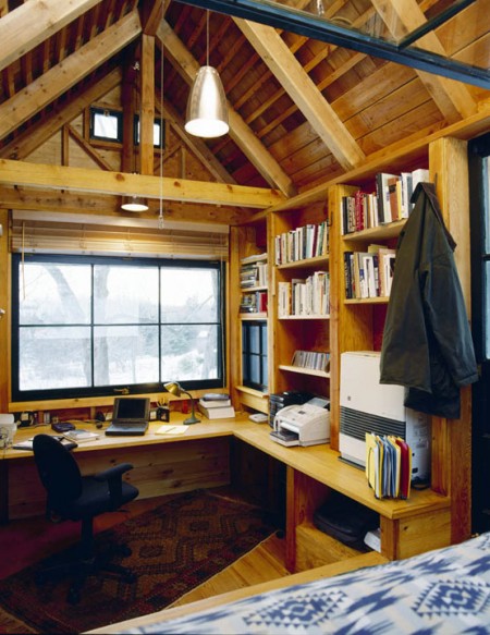
In one of his books, A Place of My Own, Pollan describes how he personally, with no carpentry experience, built this small structure behind his house in Vermont. This whole thing might be ringing a bell if you read the Linda Aldredge post, but remember her tree house is a real, fully livable home, isolated in the woods, in a tree. She definitely wins the battle of priciple, but Pollan gets the honorable mention for pragmatism. Although how many people just happen to have an acre of woods in their backyard? Or happen to own an acre of raw forest for that matter… I think this is an east coast thing, the woods always look amazing out there.

This “writing house” — as he describes it — is a great concept and I am willing to bet it’s an incredibly productive environment. I often find that working in the same space as I live presents unique challenges to motivation and focus. This seems like a cost-effective alternative to having different addresses for your working and living spaces.

How many of you work primarily from home? Do you find there to be a conflict between convenience and distraction in the home work environment? Comment
Art & Copy / Recent Design Related Films

Art & Copy is a film about advertising currently making its way around the country. The film is an in-depth look at some of the best and most creative minds in the business. As director Doug Pray states, “I felt it could be a more powerful statement to focus the film only on those rare few who actually moved and inspired our culture with their work. And that higher standard made me want to make a film that reflected the same kind of disciplined artistic approach that my subjects used.” It looks really interesting and I’m really excited to see it.

The frightening and most difficult thing about being what somebody calls a creative person is that you have absolutely no idea where any of your thoughts come from really — and especially you don’t have any idea where they are going to come from tomorrow. — Art & Copy

We’ve been watching The Persuaders in class over the last few weeks and, while it’s not specifically about graphic design per se, it’s easy to draw useful parallels between the two disciplines of advertising and design (as they are often one and the same anyway, whether you like it or not). If you are interested, you can watch all of The Persuaders on the website.

This winter is shaping up to be a pretty excellent time for designers as far as film is concerned. Art & Copy will be in San Francisco in early November, Objectified comes out on DVD on October 13th (so sad they had to push it two weeks due to a “manufacturing snafu”…how ironic), and Visual Acoustics will be here November 6th.

I think I am most excited for Visual Acoustics — I remember writing about it a while ago and have been surviving off of Shulman’s wonderful photography in the meantime. Also worth mentioning is The September Issue, the film chronicling the development and process behind the largest issue of Vogue Magazine. I saw this one recently and would recommend it, but it wasn’t quite as good as I was hoping. It’s exciting to see design related films making their way into the (almost) mainstream!

Side note: Art & Copy employs a beautiful ampersand in the logo for the film. Not sure what it is, but it’s very excellent looking.

Where The Wild Things Are Trailer #2

httpvhd://www.youtube.com/watch?v=fFDcaTI0cl8

This is the second trailer (check out the first one here) for the upcoming Spike Jonze-directed film “Where The Wild Things Are”. Can’t wait to see this.

Watch in HD on YouTube

The Cove

20090116_cove_560x300
httpvhd://www.youtube.com/watch?v=EAA_0iZTG44

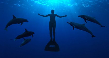
The Cove looks like it could be the most heart wrenching movie I’ll see for a long while. The documentary about the plight of Dolphins in Japan shines a light into a secretive cove where an estimated 23,000 are slaughtered annually. There are screenings being held in select US cities throughout August. If you’re in the San Francisco bay area it’s playing at Shattuck Cinemas in Berkeley on 8/7 where producer Fisher Stevens will be holding a Q&A after the screening. Hopefully this story gets some traction and will effect some sort of change.

Watch HD Trailer: YouTube | Apple

Continuous Lighting Part I

fender_room2
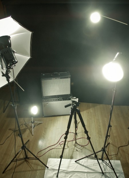
We’ve written before about photographic lighting. Another lighting arena that I’ve recently explored is continuous lighting for video. As I had absolutely no idea what I was doing when I jumped into this, I decided to start with a basic kit set up, and then go from there. I had researched enough to know that I would need at least three lights, but I was fuzzy on just about every other detail. I ended up going with the Smith Victor K84 Photoflood Kit. (Four lights: two A80 flood lights and two, smaller A5s.)

Now to this point, the kit has satisfied my requirements. I haven’t felt like I needed any additional lights on my projects and everything is lit well and looks (more) professional. That said, I have learned a lot in the process about what not to do.

First, these lights get unimaginably hot when they’re on for an extended period of time (more than 5 minutes). I use them in an enclosed room without a lot of ventilation and it can become unbearable really quickly. If you are interviewing someone, or performing under these lights, you need to either get things done fast, or have some way of cooling down your room. I broke a sweat just snapping the above picture, and they had only been on for 10 minutes.

Second, despite the benefits of using continuous lighting for photography (no camera syncing necessary, always see where you’re lighting etc), this kit is not powerful enough to really work in this regard. Unless the lights are right up on your subject, you’ll have to adjust the shutter speed significantly to get satisfactory results. It’s also impossible to get good portrait shots, mainly because your iris gets smaller as it gets used to the continuous amount of light; doesn’t look as cool as strobe. It works for some photo things, but I am mainly attempting to use this kit for lighting video. So far the footage has required a significant amount of color correction to make things look natural. The kit is a tungsten set up, which burns yellow/orange, and that is the color of the footage upon capture. Luckily I’ve been working a lot with Color and have been able to work around this.

The biggest positive to the kit is that it’s cheap (relatively). It helps to know some basic lighting strategy (three point etc), but the kit really doesn’t require much know-how to get up and running. It is a great starter kit and I feel like I have a much better idea of what I need, now that I have fumbled my way around with this one. Of course it will be a while before I can afford a real set up, but in the mean time I am having a good time experimenting and making mistakes. This probably wasn’t the kit of me at the end of the day, but it sure beats lighting things with assorted desk lamps and flash lights.

Wes Anderson: Fantastic Mr. Fox


I’m pretty sure that i’m not alone when I say i’ve been waiting for this trailer for a long time. Looks really good, seems a tiny bit more mainstream that I would of imagined BUT there are definitely some unique parts and a great cast. I really like the detail on the animals and the background, should be an amazing film to see in the winter.

Kevin Dart / A Kiss From Tokyo


kisstokyo
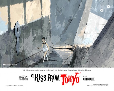
You are probably familiar with the illustration work of the exceptionally talented Kevin Dart. His most recent project is the trailer above — promoting a hypothetical film and his new book Seductive Espionage: The World of Yuki 7. The film was a collaborative effort between Dart, animator Stepahne Coedel and composer Cyrille Marchesseau. I have a soft spot for trailers of films that don’t exist, and this one is truly amazing.

Art of the Title Sequence recently posted an in depth interview with the three creators. They walk through a lot of process and really go into the fine details of the production. Very interesting read if you enjoyed the trailer.

via Kitsune Noir

Tron Legacy Trailer

“We used a brand new generation of the Pace/Cameron system developed by Vince Pace and James Cameron,” says Kosinski. “I think we’re the first film to use full 35mm sensor cameras in a 3D rig.” – Joe Kosinski, Director of Tron

Datasette vs. Jason Cawood

1095283097_1e27c35a37_o
1084698290_dba5873798_o
1084693828_9721f2be4d_o
2263661853_9c5bf19592_o
2199008738_15082cabd2_o
1767802686_71f2972f3a_o
1423362601_8d1fe72d26_o
449080925_9e331b85d8_o

Dusty was over tonight and we were listening to some Datasette. That along with Jakub’s mention of Jason Cawood’s excellent “Salvaged” set on Flickr got me thinking I need to do a post on both. So it is; most of the songs were cut from Datasette mixtapes by Dusty so they don’t really have official names that I know of.

Datasette – Business Funk 1

[audio:datasettte-dsht1.mp3]

Datasette – Business Funk 2

[audio:datasette-dsht2.mp3]

Datasette – Business Funk 3

[audio:datasette-dsht3.mp3]

Datasette – Minus Fourteen

[audio:datasette-14.mp3]

Film the Blanks

Picture 3
Picture 4
Picture 7
Picture 6
Picture 2
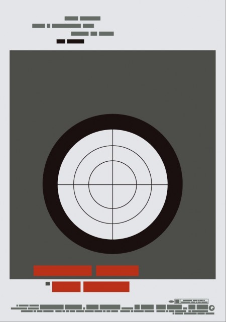
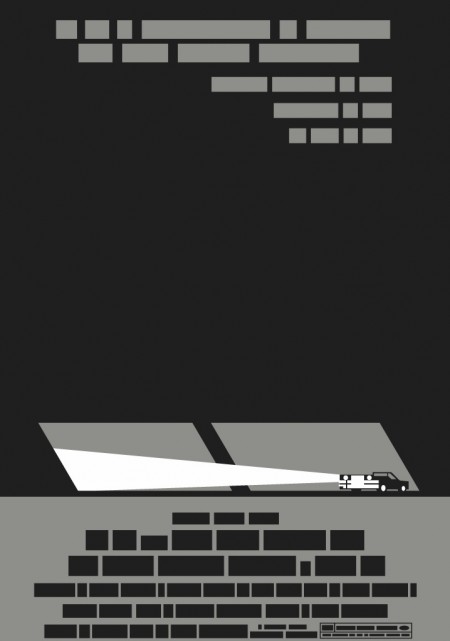
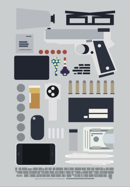
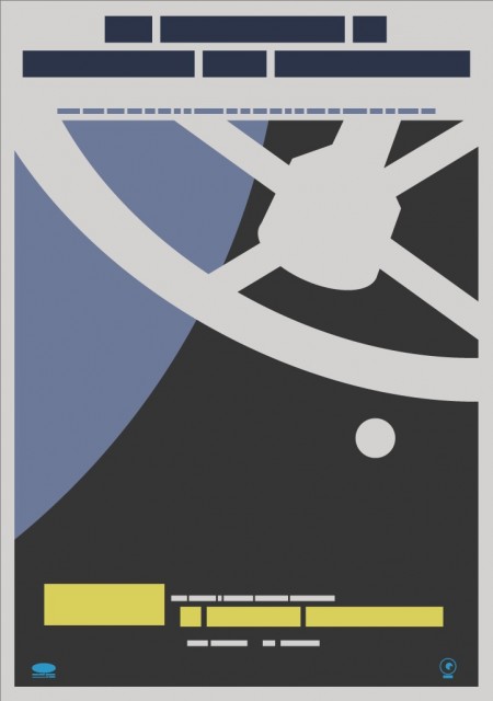
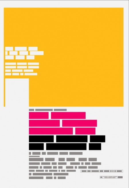
Film the Blanks is an ongoing design experiment that takes existing film posters and abstracts them down to their core elements. The project has garnered much press over the last few months, and I figured I’d post up some of my favorite pieces. I like the work because of the visuals, but there is also a strong participatory component that sets it apart. Each time a “blank” is uploaded to the site, users are invited to guess which film the abstraction represents. In some cases the solution is obvious, but it’s often remarkably difficult to discern which poster is hiding behind the blocks. Eventually clues are released and points are awarded to the successful guessers. It’s an exciting format for a design project; one that takes a strong concept, built around a fairly standard medium (poster), and twists it into something unique and engaging.

You can find all the posters in the Flickr set. You can also buy a few over at the Buy the Blanks store.