Posts in Fine Art

Mercedes x Pinakothek der Moderne


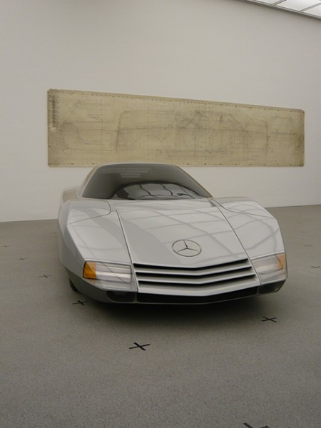
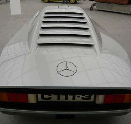
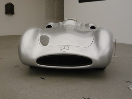
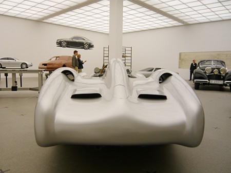
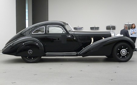
Stylepark has some beautiful photos (shot by Thomas Wagner) from the Mercedes collection at Pinakothek der Moderne, Munich. The show goes until Sep. 14 and features some incredible examples of the German auto maker’s inspiring creations.

I love the wall treatments, and the license plate in that second shot is incredible. Now compare that to this, and you start to understand why so many great designers come from Germany. It’s like those stupid faucet commercials (which I hate simply because of how the piano starts playing when she pulls a faucet out of her purse all dramatically and slams it down on the guy’s desk like it’s the most profound thing he’s ever seen when somebody starts throwing plumbing components around his office. What the hell does it even mean. Did you see how confused her husband looked? I felt the same way. She damaged the finish of that desk and I bet it wasn’t cheap considering how pretentious successful architects are.), I could seriously design a car around that license plate. I bet if you told the Mercedes designers they had to design the car for the US style plates they would just quit and throw a wrench or some molding clay or something. Also, if I moved to the states from Germany and had to do this, I would just drive the car of a cliff because the whole thing is ruined. I have a feeling the “California” font only looks like that because the state couldn’t afford to license Papyrus.

Also check out these posts for some more vintage Mercedes action

Stylepark via Simon Smith
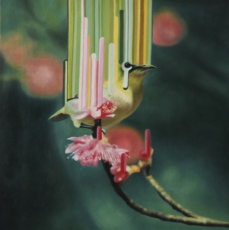
Maurizio Bongiovanni


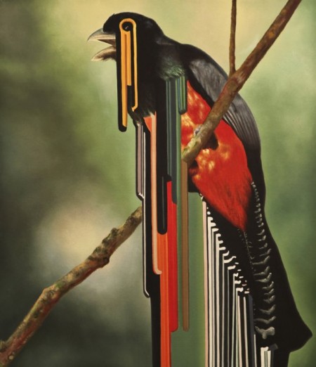
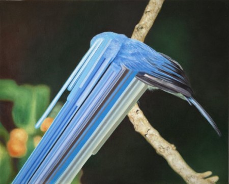
I’m not to up on the world of fine art but these paintings by Maurizio Bongiovanni really caught my eye. For a split second I thought they were manipulated photos, they look very Photoshop-ish with that stretch out effect.

Via Supersonic Electronic

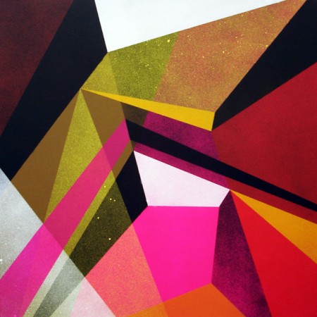
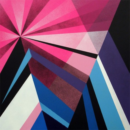
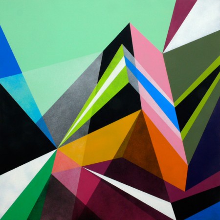
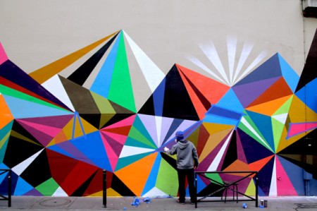
Matt Moore / Crystals and Lasers


The ideas for the artworks have actualized while processing time spent absorbing French Culture, exploring the City Of Lights, the vibrant colors, the exaggerated geometry, and the diverse architecture and fashion of Paris. These paintings were created entirely with spray paint, one of Matt’s favorite mediums. But the designs are very clean, and appear almost digital in their precise details and craft. An honest, analog attempt to achieve the same depth and abstract geometry of his digital “Vectorfunk” style. [Link]

Color! What more do you want? These paintings are by Matt Moore and are called Crystals and Lasers. At the bottom of that page he also has a cool collection of iPhone photos that he took of inspirational items while in Paris creating the series.

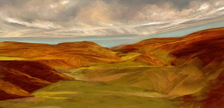
Thomas Scholes


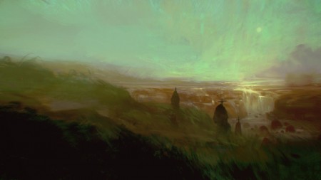
Thomas Scholes is a digital artist out of Seattle who uses Photoshop to create painterly landscapes sort of in the vein of Roger Dean and more recently, Dan McPharlin. I love his color use and the texture; it’s really incredible that this is all being done within software.

Thomas also does a lot of process videos showing how he works with various imagery and textures to get these effects. I particularly enjoyed this one which shows him modeling a landscape from a photo of a woman (see video below). I love the idea of incorporating unrelated imagery into a composition as texture or distressing — or, in this case, as a framework.

httpvh://www.youtube.com/watch?v=3f9D9Fvh2pM

You can check out more of Thomas’ work and videos at his blog

Tauba Auerbach


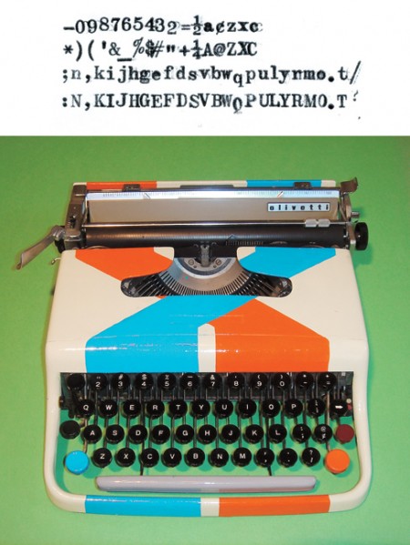
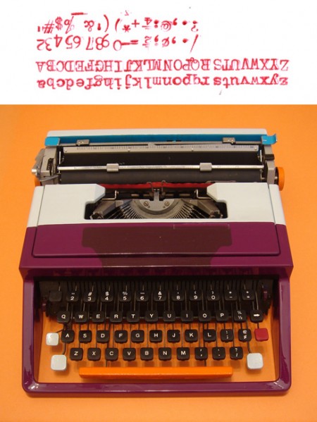
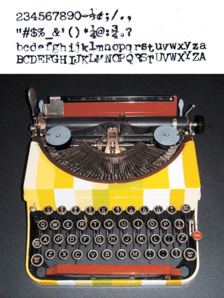
These reconfigured typewriters are by Tauba Auerbach. Olivettis looks awesome to begin with, so these souped-up specimens take it to the next level. I can’t make sense of the altered readouts of these machines, but apparently there is a system at work:

Auerbach often bases her work on these sorts of solvable codes or systems. In one of her works, a series of reconfigured typewriters, she alters the keys so that their letters and symbols no longer correspond to what appears on the paper. The typewriters are painted with clues to the logic of their new operating systems; once each code is cracked, the machine becomes functional again. Link

She’ll show in the Whitney Museum in NYC until May 30th 2010.

Phil Ashcroft


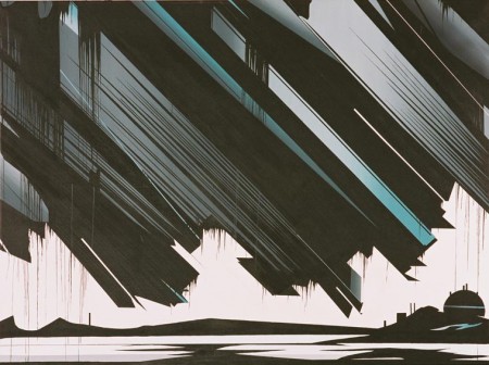
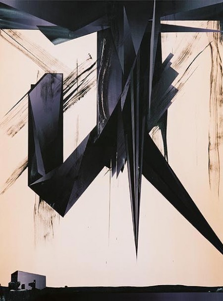
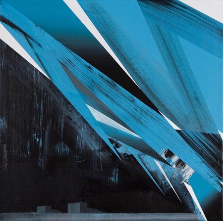
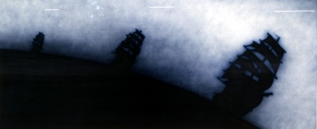
Big fan of these paintings by Phil Ashcroft

The unknown is a space at once fascinating and fearful by mankind’s technological advances and the romantic notion that there still lies undiscovered elements to the world in which we live. A derelict hospital, oil depots, nuclear power stations, the abominable snowman; collectively these semi-surreal settings and cartoon-like motifs appear as mysterious manifestations, phenomena both real and imagined. link

via Changethethought

My Favorite Work of Art


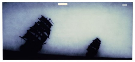
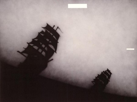
I’ve never really posted on fine art before, but these are works by Ed Rucha are my absolute favorites. I’ve seen one of these in person before but I have no memory of where I was. I am pretty sure the NYC MOMA has Ship Talk. I do remember that when I saw it, I froze for about five minutes in front of it; incapable of moving or verbally expressing why I was frozen. All I could think about was how much I needed to own it so I could stare at it all the time. I imagined fantastical scenarios where I would make a lot of money and purchase it instantly. I have never felt that way about any other work of art. It was simultaneously a great feeling (to have found something I loved so much) and a horrible one (for reasons I still don’t understand). Pictured above:

Ship Talk
Man Wife
Brother Sister
Untitled (not pictured, though similar)

Like the Richard Misrach pictures I posted on a while back, I hesitated posting these in a 450 pixel wide scenario. You really need to see these in person to get the full effect. If I can remember where they are I’ll include it here. (And if anyone knows where these can be found, let us know in the comments.)

Michael Johansson


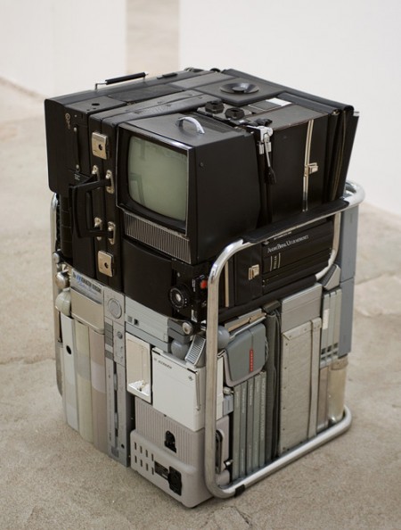
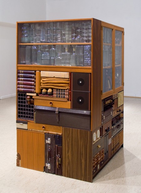
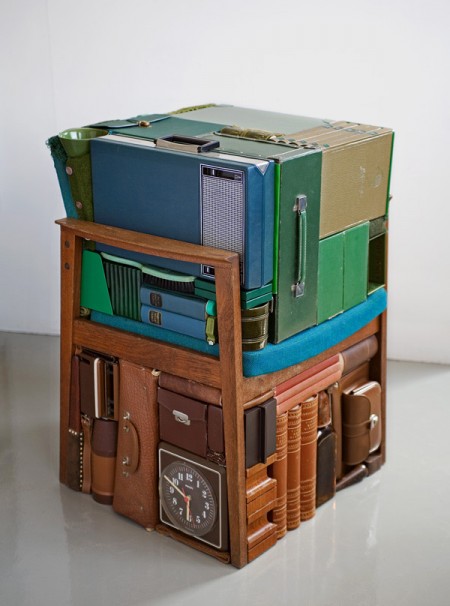
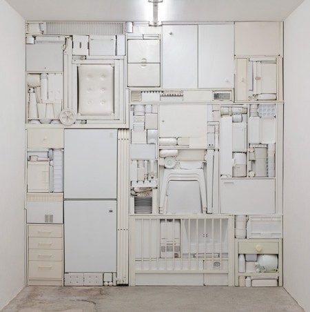
This is what might happen if a trash compactor had impeccable taste and color sensitivity. The work of Michael Johansson is unique and impossible to categorize. You really have to look closely to see how random and unrelated the objects that make up these blocks actually are; yet they still match up perfectly. I can’t imagine how long it must take to source materials and eventually place and align them so precisely. Would be like building a puzzle where each piece was made by a different company and then scattered throughout the world.

via bdif

Matthew Barney

Cremaster Logo
Matthew Barney’s attention to detail and elegance has always grabbed me because I have always felt that he’s the man that can help the art world grow. The logo for the Cremaster Cycle series is gorgeous, if you ever get a chance pick up a copy of the book.

Matthew Barney – Drawing Restraint 9 feat. Bjork

Wireframe Lamborghini

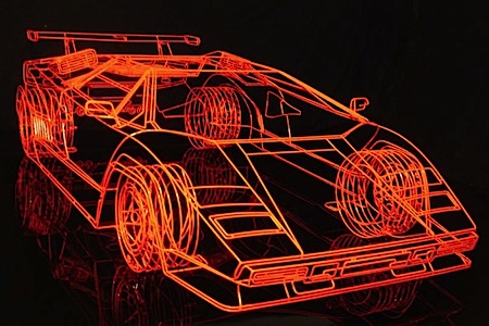
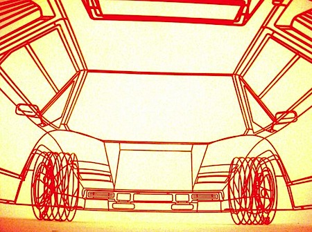
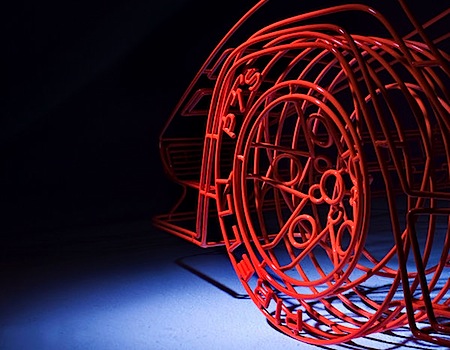
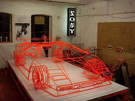
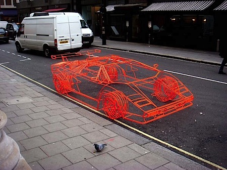
Benedict-Radcliff-Lamborghini-Countach.jpg medium_3073951975_4132270957_o.jpgmedium_3074787688_957e387c98_o.jpg medium_3073953213_48898e16aa_o.jpgmedium_3074788768_de1e743bfa_o.jpgThis is for all the 3D artists out there. It’s hard to tell from some of the photos, but what you’re seeing is a real model and not a computer generated wireframe. Benedict Radcliffe crafted this model of Lamborghini’s iconic Countach supercar from steel tubing. It’s incredibly detailed, right down to the Pirelli text on the tires. I can’t imagine the time that went into this, it would probably take me a year just to make this in Maya. There are a bunch more photos over at Jalopnik.