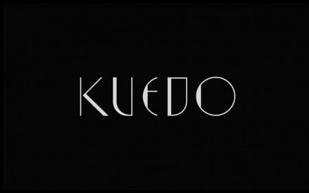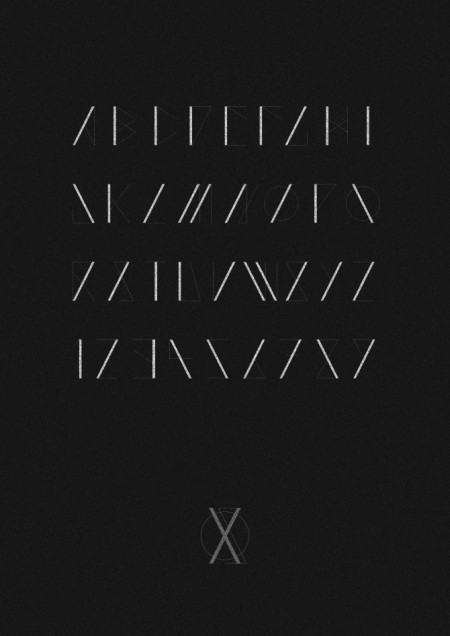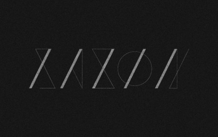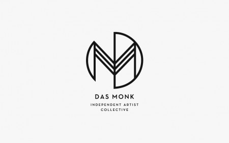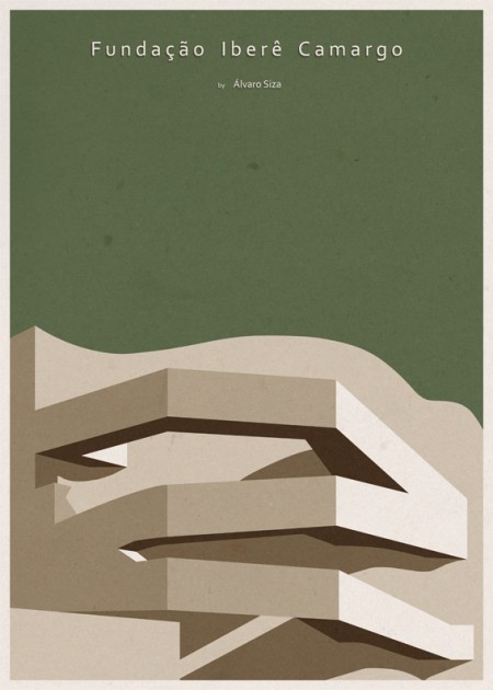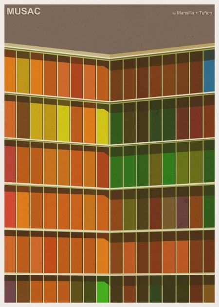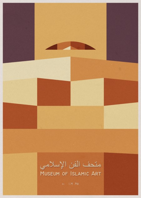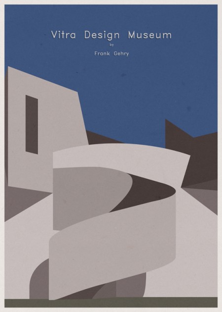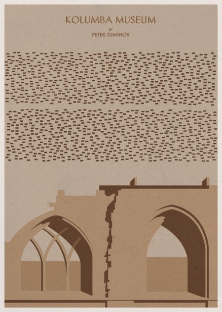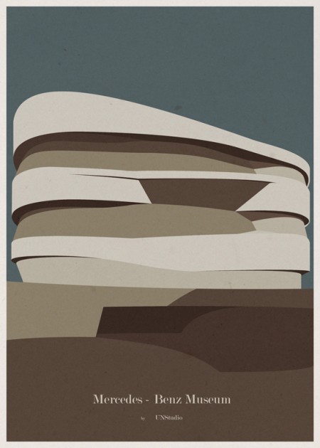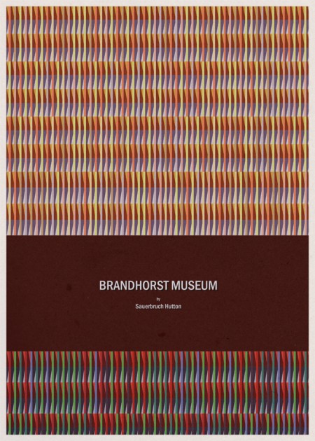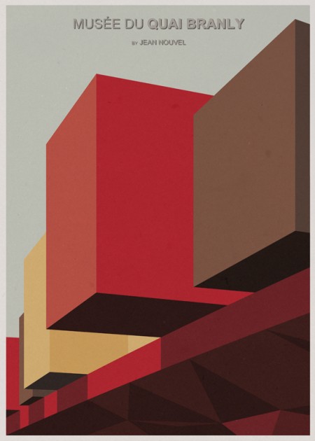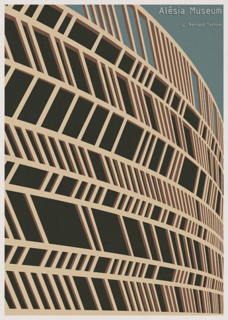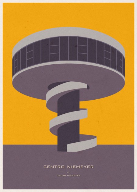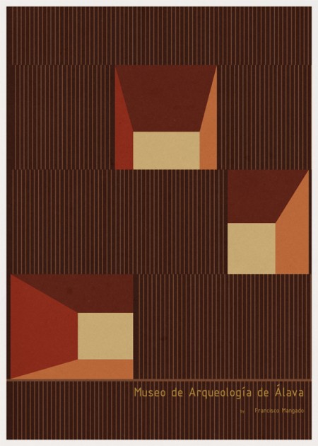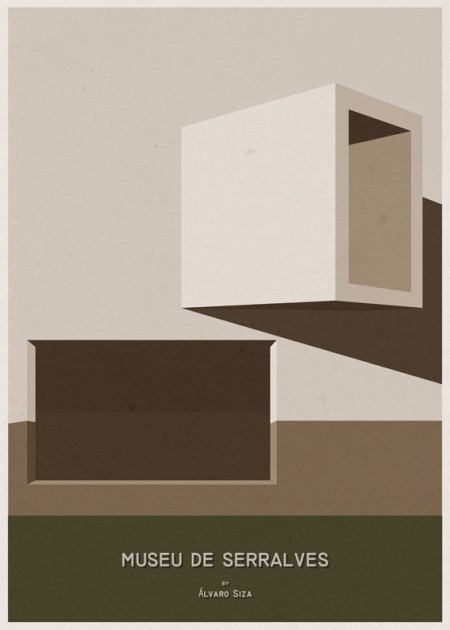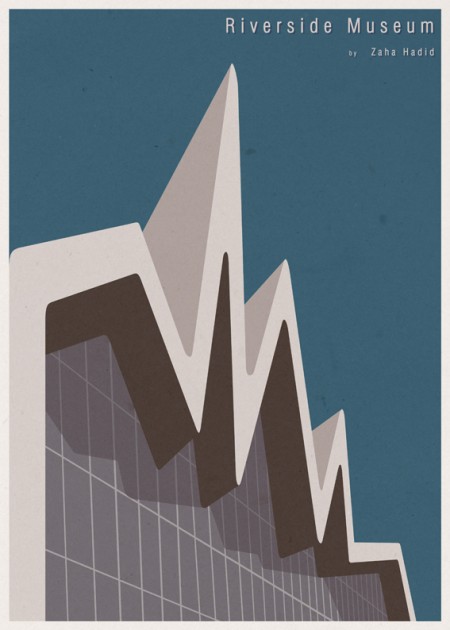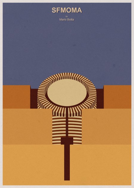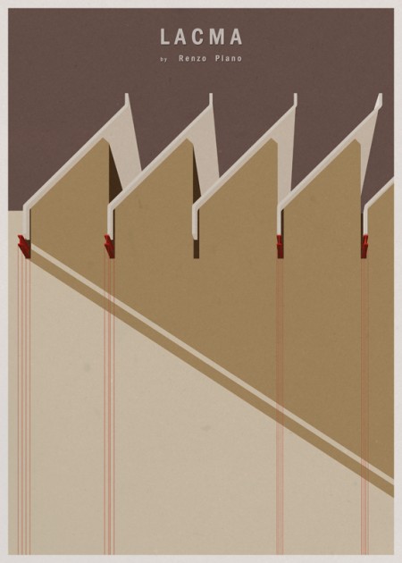
Sam Chirnside does some great font branding for musicians, I dug a little deeper into his catalog and grabbed up most of them. My favorite has to be the AVOCA type, its those subtle clean changes that takes the uniqueness up more than just a few notches.
Posts in Graphic Design
Sam Chirnside: Font Branding
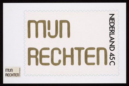
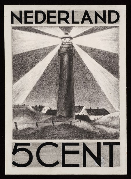
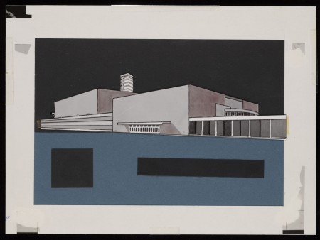
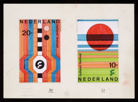
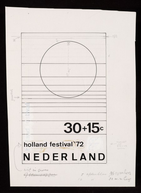
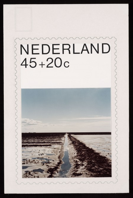
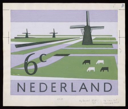
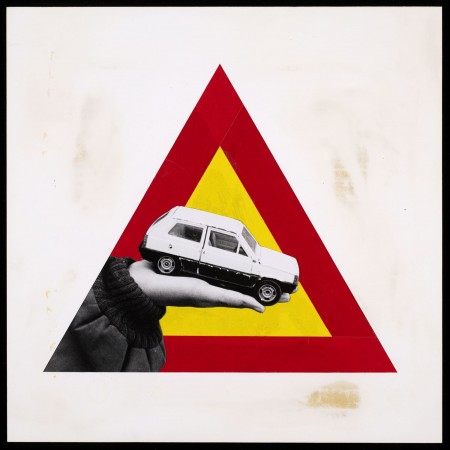
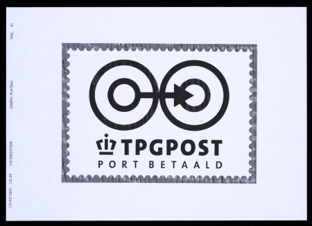
150 years of the Dutch Postal Service
If you have about 2 hours to kill i’d suggest going thoroughly through the 150 year history of the stamps and imagery from the Dutch Postal Service.
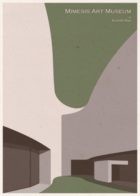
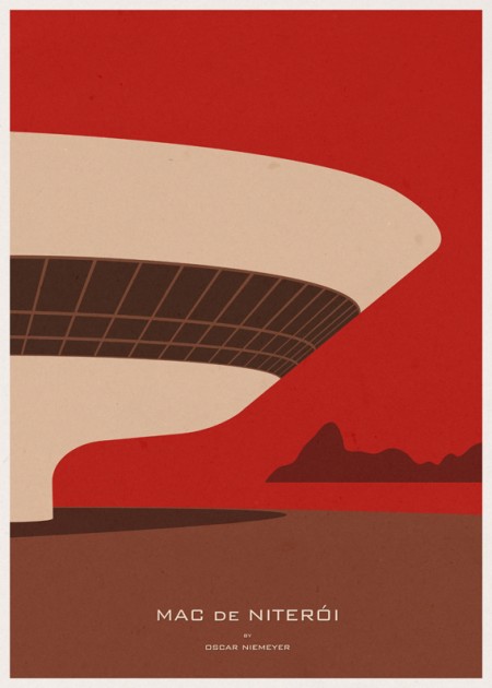
Museum Illustrations
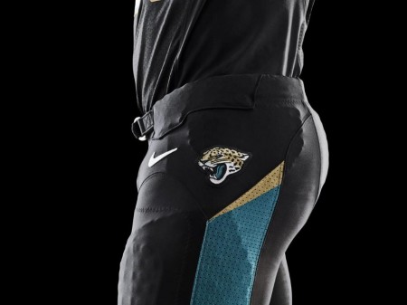
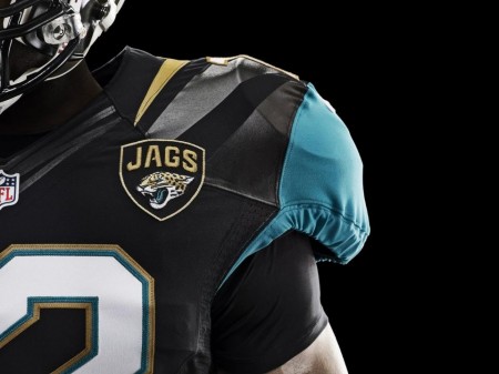
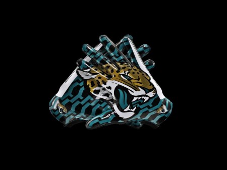
Dolphins + Jaguars 2013 Logo Redesign
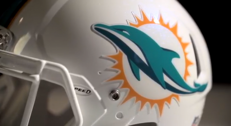

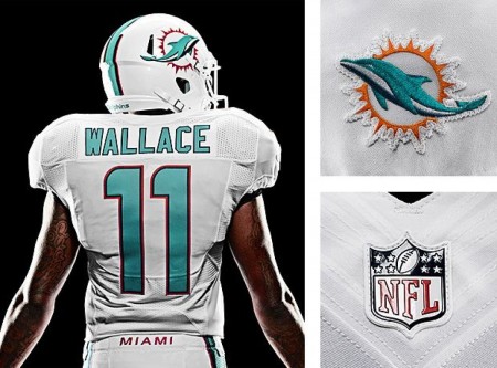
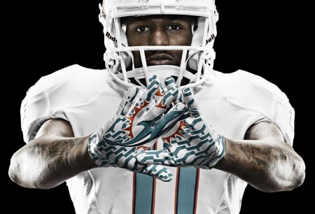
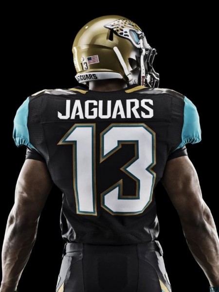
If you know me personally i’m a huge sports fans, i’ve always wanted to bring design and music fans together with sports fans anyway I can. If I had a dream job it would be hopping around in-between all the major sports teams and redesigning uniforms and logos. Nike did a great job here BUT… there’s a problem, a HUGE problem in my opinion, this doesn’t seem like what a passionate design would design, i’m in love with the fabrics, Nike always nails that department out of the park. The issue is that everything is completely evolving from the early 1990’s expansion boom, that gooey round 3D look or the Sin City “we’re the bad guys” thing. Both of these new logos suffer from that influence and thats the big bummer and the color scheme the designers have to work with. Also, i’m not going to lets simple designs get away with it either, look at the Minnesota Wild logo, you would think ISO50 might like it but no way, look at those trees, what a horrible effort.
To end on a positive note, I love what Nike did for the Oregon Ducks. I hope some of you comment in the comment section because i’d love to have a conversation about all of this.
Karezoid Michal Karcz



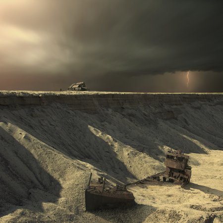
Polish born Karezoid Michal Karcz stepped away from the paintbrush and canvas years ago and focused on photography, only until recently has he started painting again but digitally this time, here’s some of the photos he’s taken further into fantasy using his altered technique.
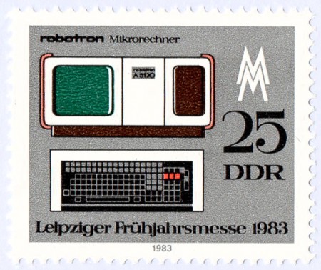
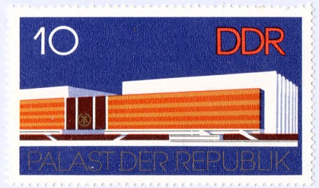
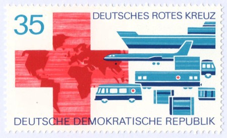
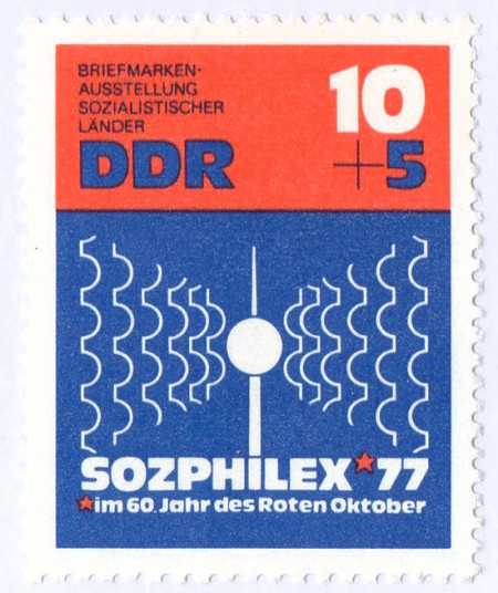
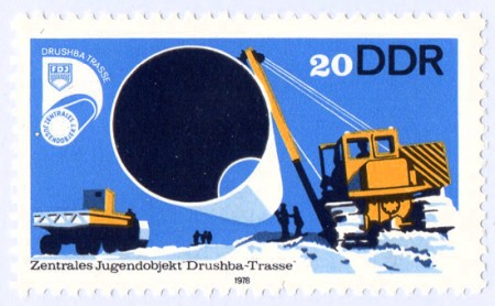
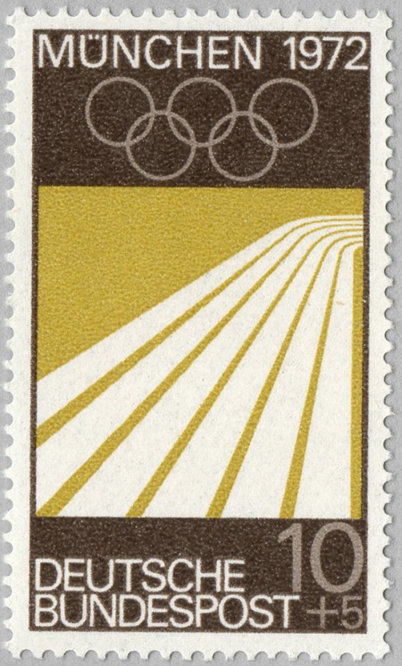
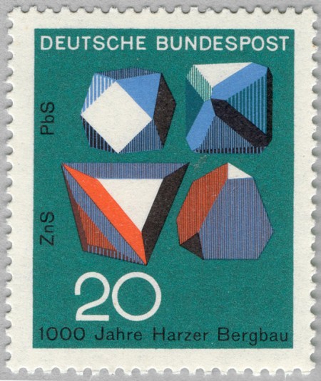
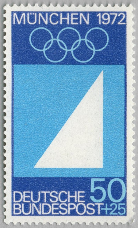
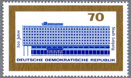
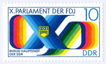
DDR Stamps from Berlin
Geometrie [1923]
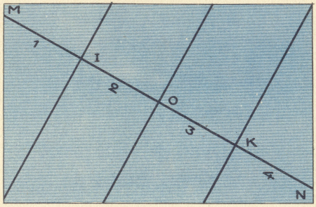
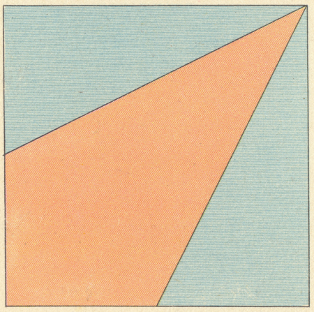
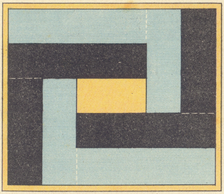
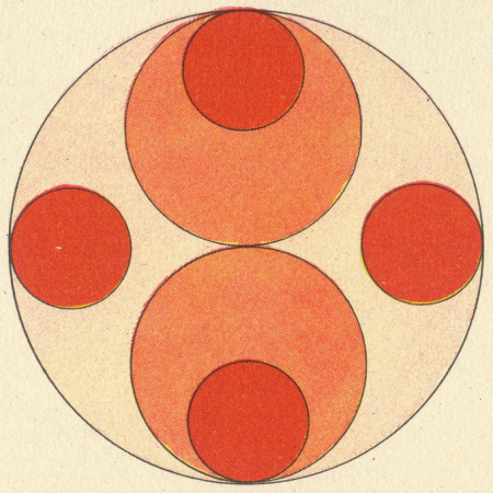
I’ll always be a sucker for “Cold War Design” its usually the color then the paper that does it for me. Makes me want to tear down walls in old Polish apartments to look for printed patterns on decaying dry wall.
via present&correct
Flight Tag Prints by Neil Stevens
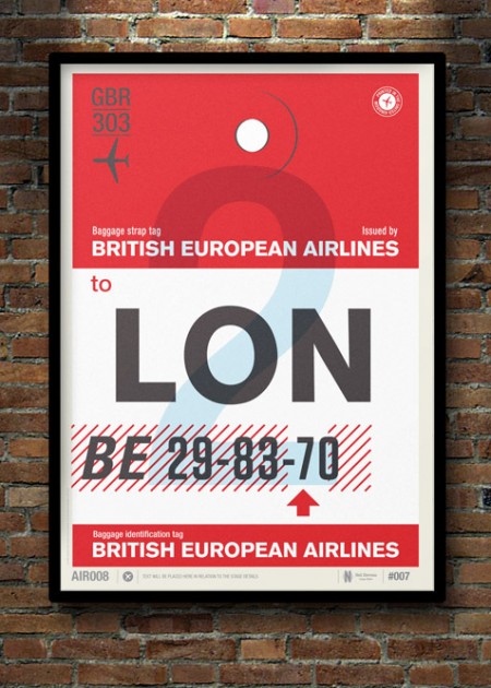
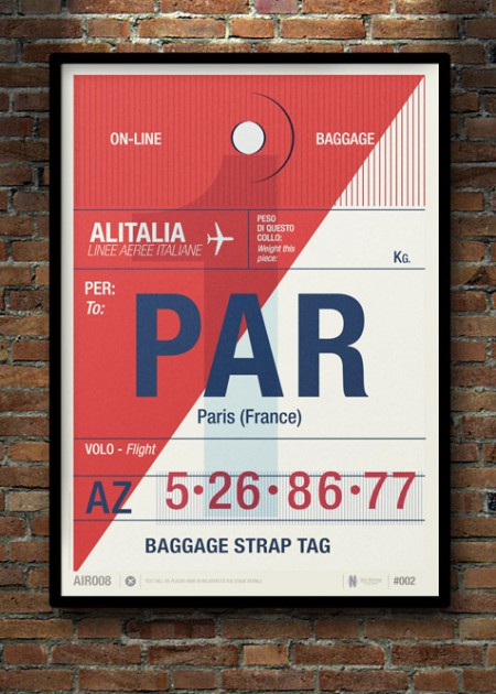
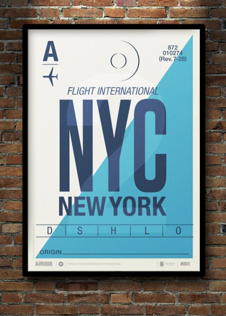
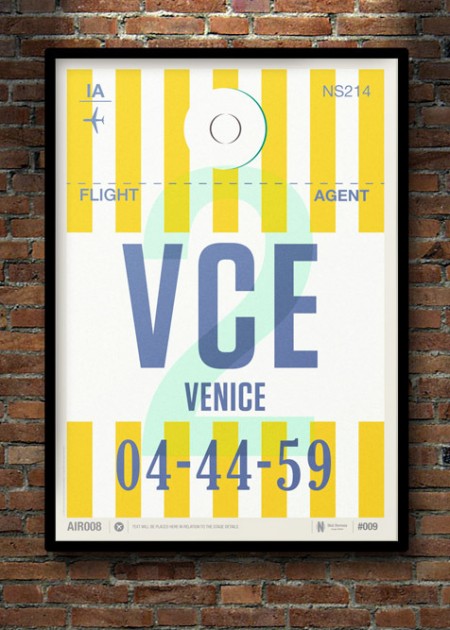
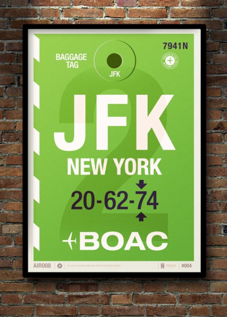
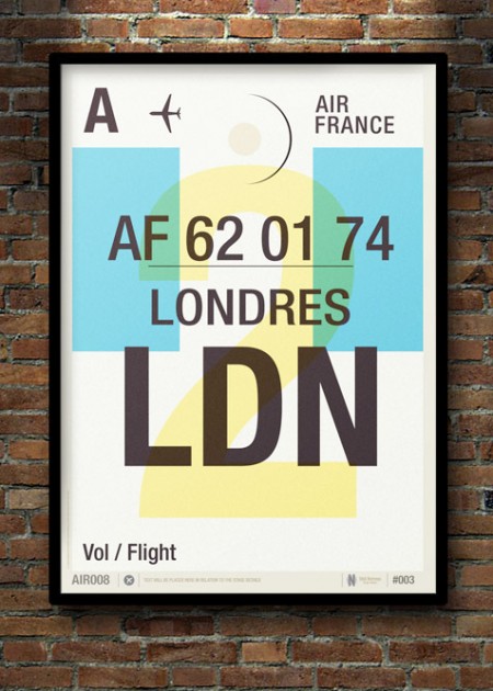
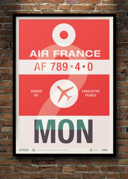
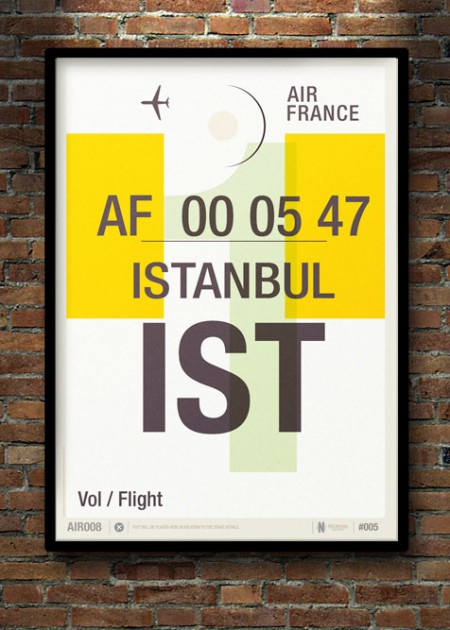
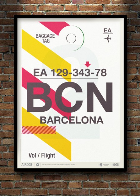
UK illustrator Neil Stevens a.k.a. crayonefire designed these beautiful prints inspired by vintage flight and baggage tags.
Also, check out his great set of cassette tribute prints titled Don’t Forget the Cassette, that Owen and I are drooling over.
Bryan Olson aka Glass Planet
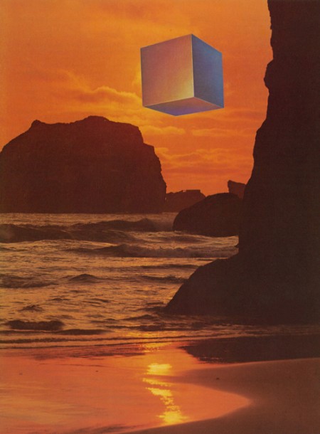
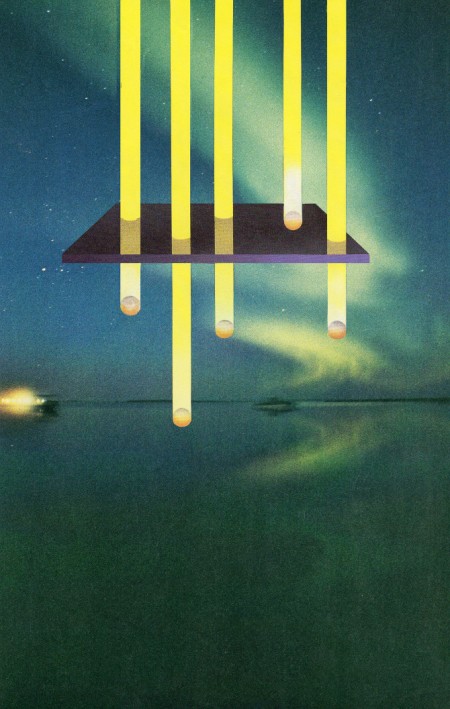
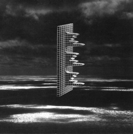
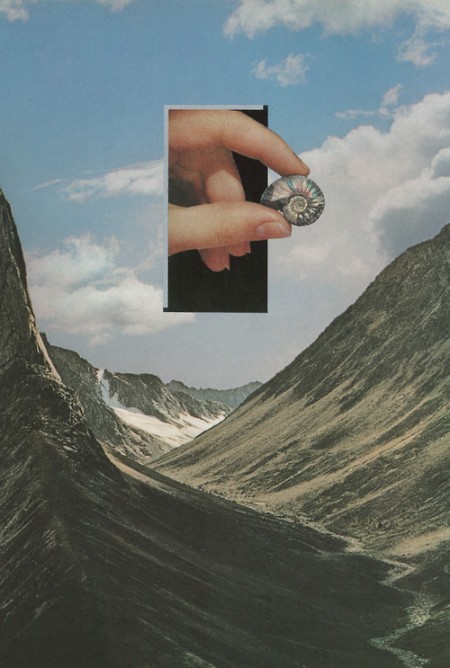
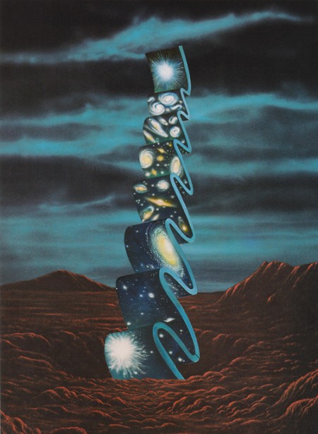
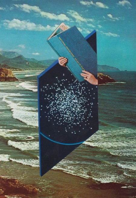
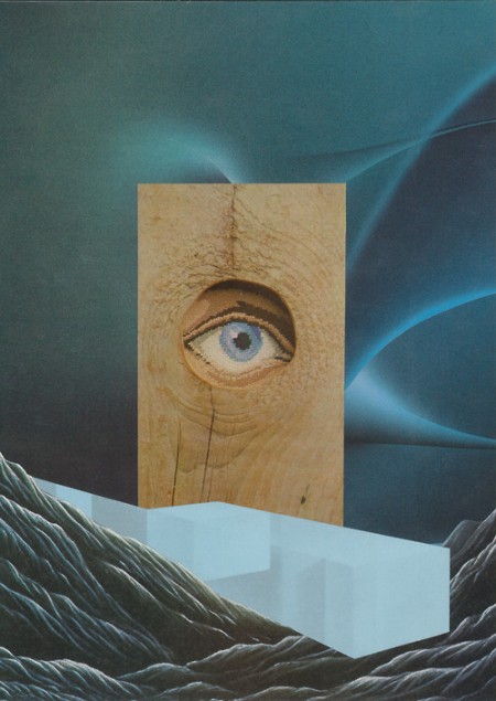
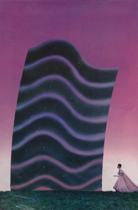

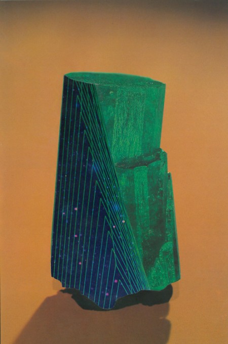
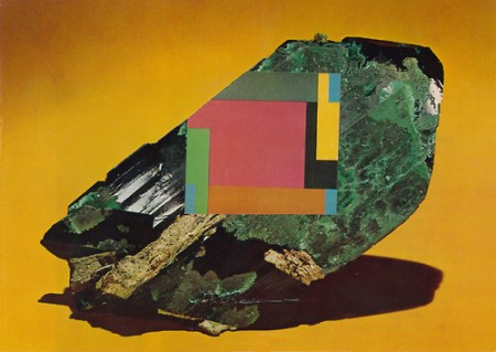

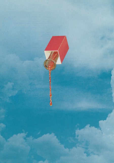
Beautiful handmade collages from Bryan Olson aka Glass Planet.
Via MELT
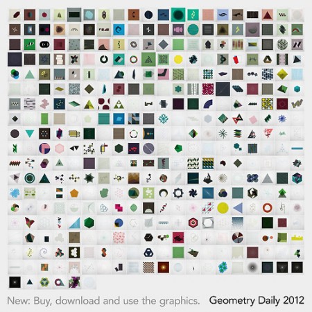
Geometry Daily: Buy + Download + Use
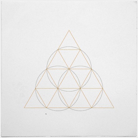
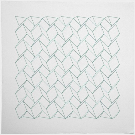
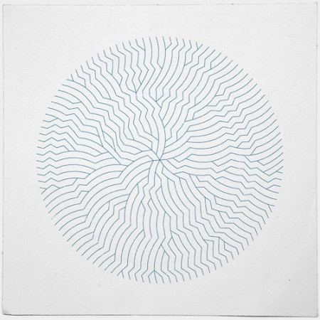
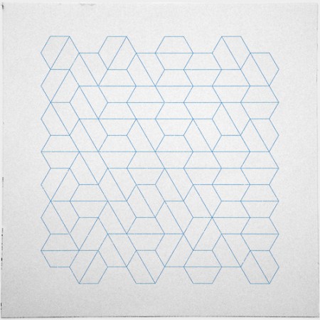
Awhile back we featured a Tumblr called Geometry Daily by German designer Tilman, which has since then become quite popular among many of us that enjoy minimal-geometric designs. So popular in fact, that Tilman says he has been receiving quite a few requests for the use of his designs:
In the last months many people asked if they could use some of the Geometry Daily graphics. As a logo, a cover for their music release, desktop background, even as a tattoo. In fact so many that it became a pain to send it all out manually. And I love to get my graphics out and let them be used!
To cope with the overwhelming response and demand, he has decided to make available for purchase, download and non-commercial use (although you can pay more to use a design commercially) of his Geometry Daily source files, which will be released in monthly installments and set at €69 euro or roughly $100 US dollars.
You get the complete data of all the Geometry Daily posts of a certain month. For each graphic this is:
– A higher resolution JPG (1770 x 1770 px)
– The fully layered Photoshop file (.PSD, same resolution)
– The clean vectors in an Illustrator file (.AI)
To purchase, visit HERE.
