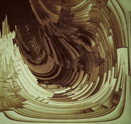


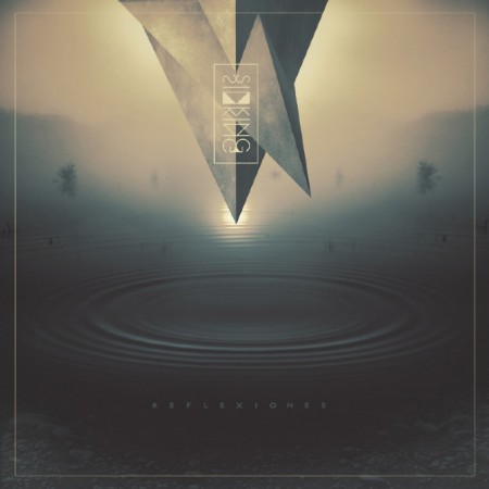
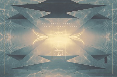
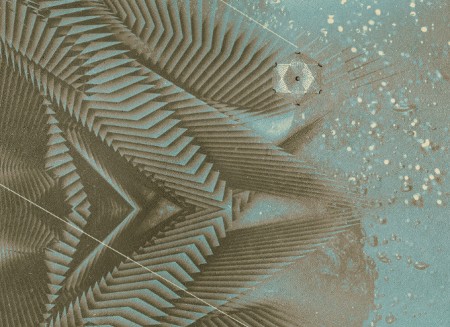
Some great digital art from Rositsa Gorolova. I was immediately drawn to her style and aesthetic. Be sure to check out her portfolio on Behance and Cargo Collective
Posted by: Seth Hardie | Instagram: @hallwood


Some great digital art from Rositsa Gorolova. I was immediately drawn to her style and aesthetic. Be sure to check out her portfolio on Behance and Cargo Collective
Posted by: Seth Hardie | Instagram: @hallwood
I recently travelled back to Santiago, Chile (where I grew up) for one of my best friends wedding, and while there I was amazed by how many good local bands I was exposed to and how good of a music scene that city has.
Amongst them was Zebra, a dream-wave trio formed by DJ/Producer Sebastian Roman (Roman/MKRNI), Miguel Irarrazaval (Treboles) and Enrique Escala (Treboles), who with their first EP “AD Portas I” caught the attention of Picnic Kubun’s label Endemika Records. I was instantly blown away by the level of sophistication in their arrangements and catchy hooks, not to mention how virtuosos they are in regards to live instrumentation, so when they asked me to design an album cover for their upcoming release, I was honored (I’m also working on an official music video…more on that later).
Today, Zebra unveiled the title track of that release, which carries the name of “Summer Love” and is set to drop early March, 2013.
My old buddy Nick Felton spends a lot of time tracking his every move. After years of hanging with him knowing at the end of the year my stats would also in some way be immortalized in that years annual report, I decided to make use of one of the tools he created to track all that data: Daytum. It might be old news now, considering he’s moved on from Daytum, but it’s taken a while for the type of data I’ve been tracking to reveal something, hence the late-to-the party post.
I started obsessively keeping track of all of my music purchases via Daytum mostly just to keep tabs on myself – to make sure I was in fact supporting artists like I claimed I was.
But most telling to me is how the formats break down. Having moved a few times recently with a pretty hefty record collection – and a slow shift to “digital djing” (cue the purists), my buying habits have have clearly shifted towards downloads.
It may be a hold over from the vinyl and cd days, but no matter how hard I try, I can’t commit to the Rdio’s and the Spotify’s out there. I need to have the thing, be it physical or digital. I need to know it’s with me here, preferably in lossless format, taking up space somewhere – even if it’s just bits on an external hard drive. Loads of them.
I’m excited to see the label roster over at Drip.fm grow – it’s the perfect subscription based, lossless downloads model in my opinion.
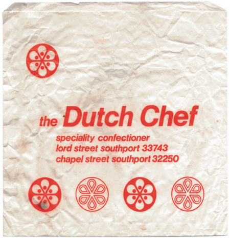
Its sad to see that we don’t have bags designed this well these days, some pure nostalgia here, head over to the To Have And To Hold tumblr and just scroll down for 5 minutes, its soo satisfying.
via Present&Correct
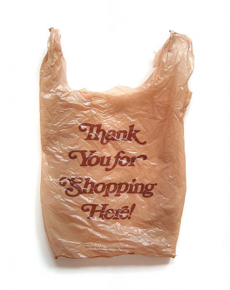
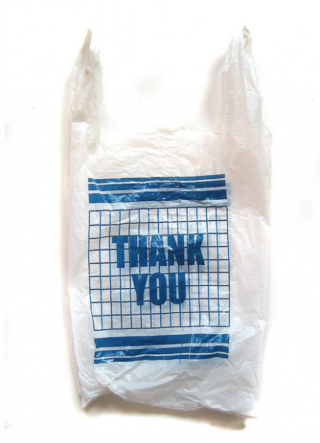
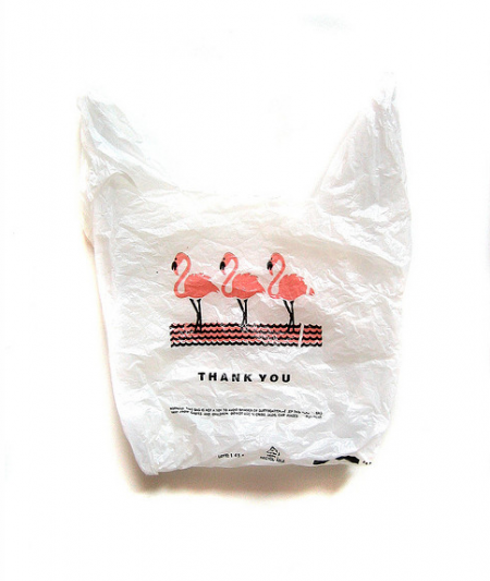
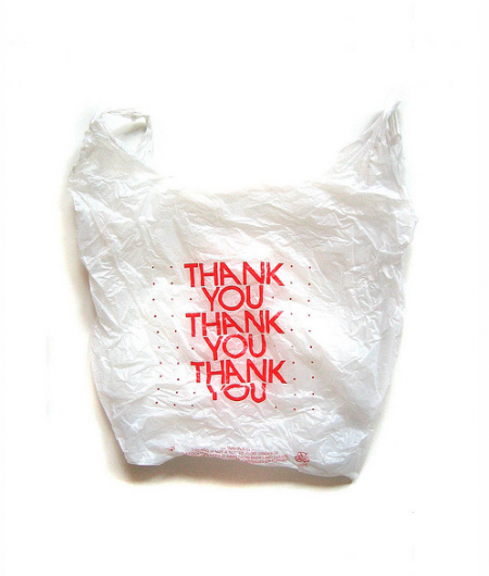
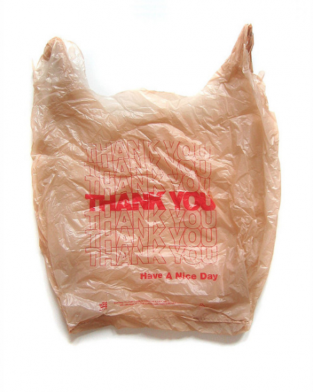
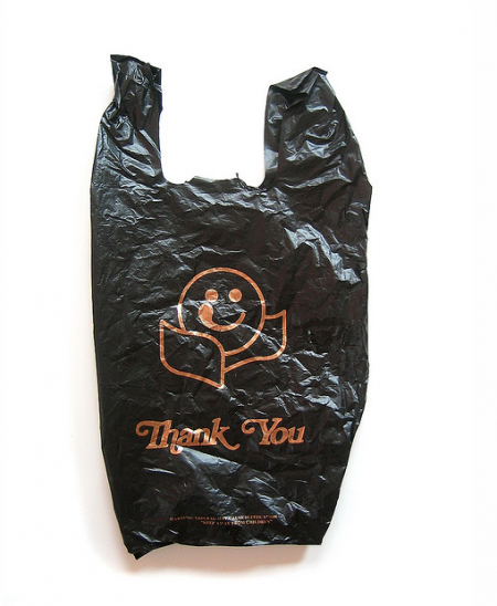
The Thank You bag is never really looked by anyone that doesn’t do design, it usually just gets thrown away but for me there has always been this appreciate for it. Like most things that are simple and that get tied into DDR/Cold War design, I somehow kind of enjoy the layouts of these.
via Mary and Matt
We’ve discussed Vitsoe around here before, primarily focusing on what they are most known for: Dieter Rams’ furniture designs, including the 606 Universal Shelving System and the 620 Chair Programme. Founded in 1959, they have worked with arguably some of the most influential mid century graphic designers in Germany, and their attention to detail in the company graphic identity and literature has always been just as impressive as the furniture itself. Now, Vitsoe has started to release some of it’s amazing archival material via it’s newly created Tumblr page, and it’s worth a visit.
I find myself most drawn to the posters and graphic identity that Wolfgang Schmidt created for Vitsoe early on. Being a record collector, I’m obviously obsessed with this 7″ that they pressed in the 1971 for one of the various live performance events in the showrooms.
The poster he designed in 1972 for the 620 Chair Programme is genius – it really captures the idea of ‘furniture as a system’ that both the 606 and 620 embody. Each unfolding of the poster reveals a new layout, ultimately culminating in a whimsical layout featuring the Vitsoe employees as the models.
Schmidt’s book of invitations for the Frankfurt fair in 1971 delivers humor via his iconography combinations.
Finally, Günther Kieser, most famous for his jazz and rock posters, art directed various photo shoots for Vitsoe. This is a postcard featuring one from 1968.
Bookmark the Vitsoe Tumblr page or follow the twitter feed for daily updated content.
Posted by Rob Fissmer
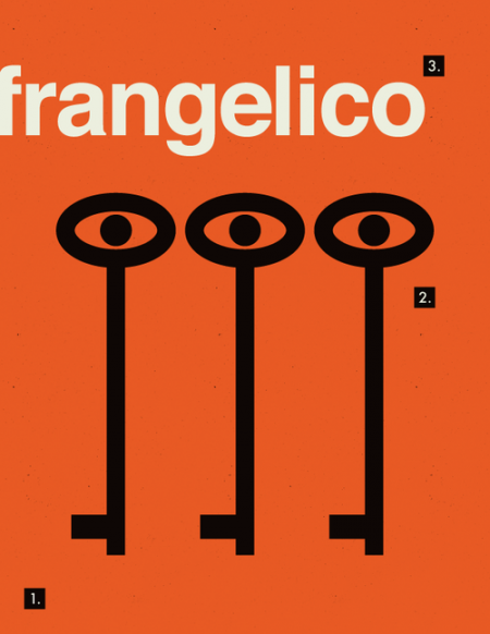
A poster a day is a task you never want to take on unless you like to frustrate and stress yourself out, instead take the energy you started off with and figure out a way to keep yourself motivated and plan a finishing point. This series from Coloradore is starting off great, I can’t wait to see more.
via coloradore
A few days ago I posted a few US dollar redesigns, none of them really caught my eye but I had a feeling our readers could do better and you all responded positively so lets get this started.
RULES
1. You must submit four bills (1,5,20,100) of any rectangle dimensions.
2. You must include this letter/number combo somewhere on the bill ( I 50502012 X )
3. A signature of some sort has to be included on all the bills
4. Include the number of the bill spelled out and include or create this stamp
SUBMISSION INFO
Please submit to jakub at iso50 dot com by October 1st 2012. Judging will be by Scott Hansen and the ISO50 contributors.
GIVEAWAY
We will pick 2 winners.
1st Prize includes any ISO50 Tee along with a signed ISO50 Studio Edition Print.
2nd Prize includes a Standard ISO50 Print and a ISO50 Sticker Pack
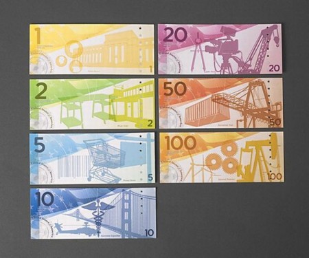
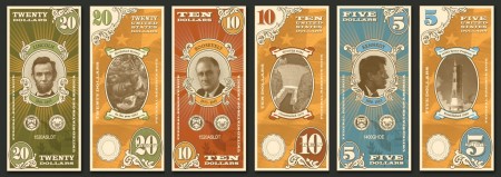
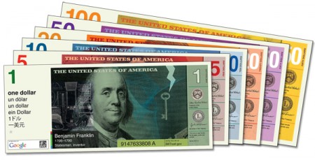
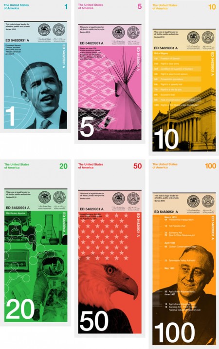
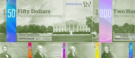
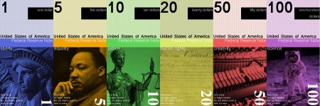
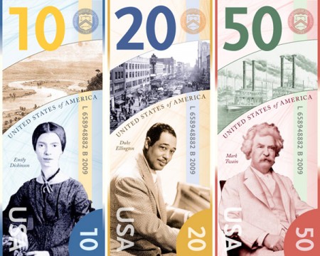
A great practice idea for graphic designers is redesigning the US Dollar, compared to Canada and many European countries I feel we just got screwed a bit, while the detailing in the US dollar is classy I feel like the overall collection from coin to paper is not the best it can be, I don’t think any of the designs above are the answer either. I was thinking would anyone be down to submit redesigns to ISO50 and we can have a contest with giveaways? Let me know below if its a good idea and i’ll get together a submission post.