Fantastic cover designs by Gregory Vines for Swiss typographic magazine Typografische Monatsblätter.
via The New Graphic
Fantastic cover designs by Gregory Vines for Swiss typographic magazine Typografische Monatsblätter.
via The New Graphic
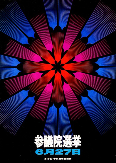
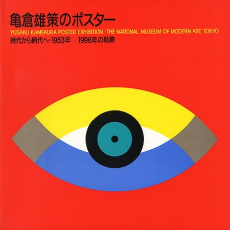
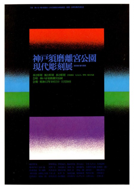
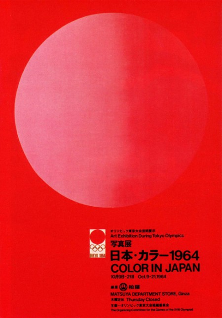
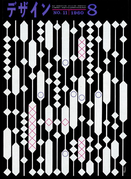
Gurafiku has an extensive archive of Japanese graphic design from the 1800s to today. In particular, the vibrant work of the 60s by greats like Yusaku Kamekura and Ikko Tanaka caught my eye.
Check out the rest of the set here, or see the previous post on “Graphic Design” magazine for more of their work.
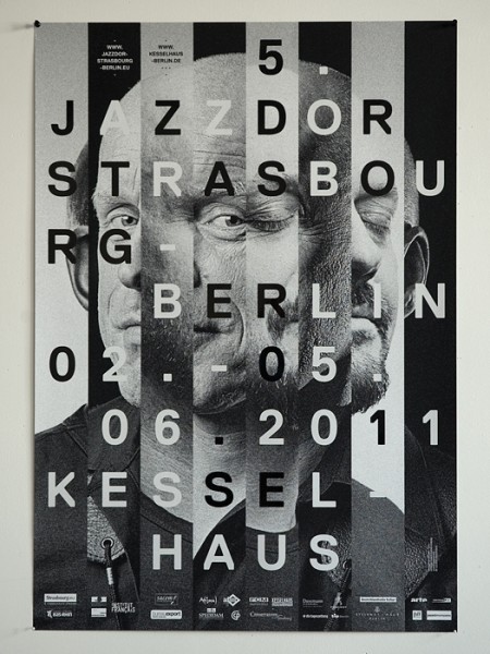
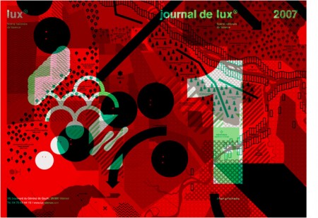

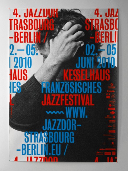
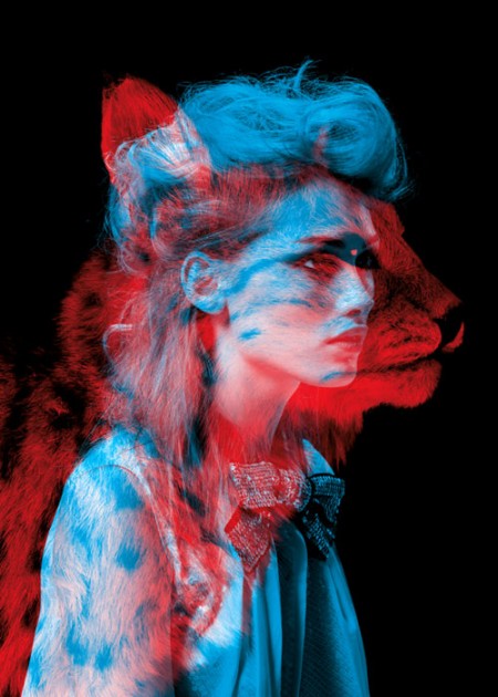
Some great work by Helmo from France. I especially like their Jazzdor 11 and Beast Mode Fashion Animals projects. The type and imagery in their work seem to complement one another just right.
You can check out more of their work here.
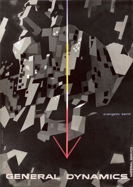
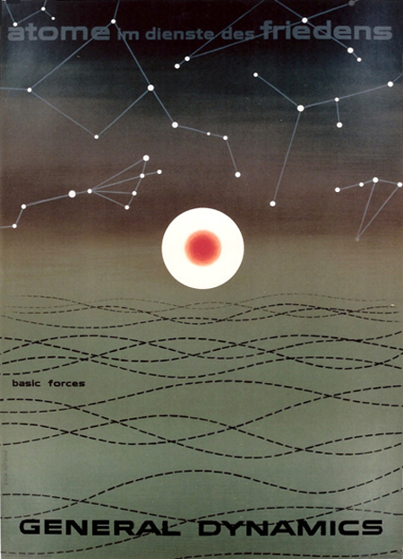
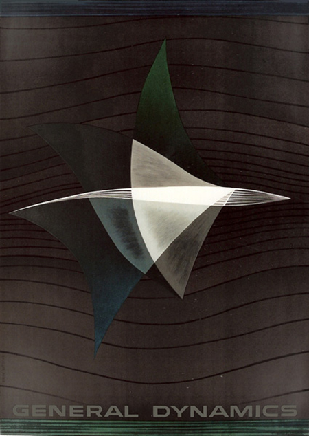
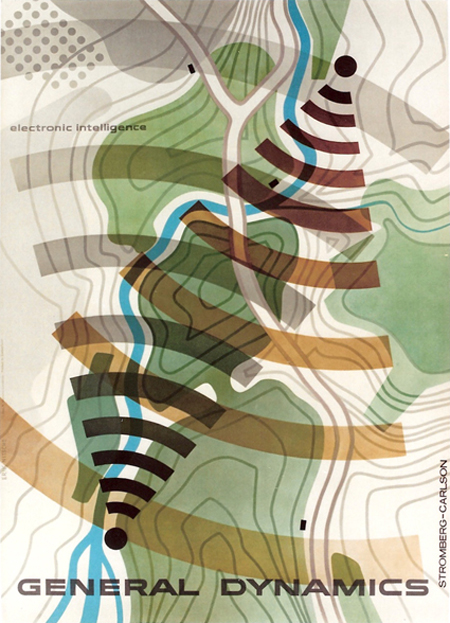
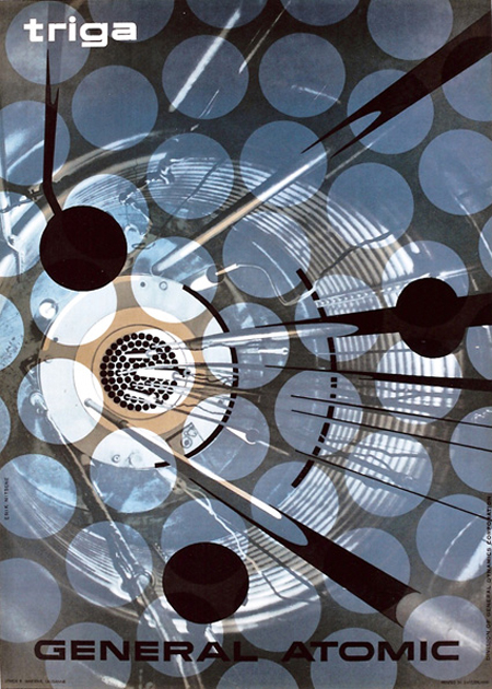
Erik Nitsche is a favorite at ISO50 (see posts here, here, and here), and I was disappointed when the Flickr stream compiling his work went down (mainly because I missed the chance to check it out). Luckily, Matthew Lyons and Galerie 123 (where you can purchase some of his original prints) are here to lend a helping hand.

You may have noticed I’ve been a little less prolific around here lately; finally I can tell you why. I’m very excited to say that as of last November, I dropped out of my MFA program and am a cofounder of Firespotter Labs, a startup funded by Google Ventures. As cool as the concept of “stealth mode” sounds to me, I am decidedly *not* used to *not* writing about what I’m doing. Finally my sneakiness is over! In this post I want to talk a little bit about what it’s been like working full time at a startup, as well what went into the decision to drop out of my design program five months away from graduation. I really couldn’t be happier.
Of course all this would be more interesting if you knew exactly what we were doing. I wrote our About Us the other day and it’s spectacularly vague, so if you want to find out a little more, there were nice articles in The New York Times and Techcrunch last week.
(more…)
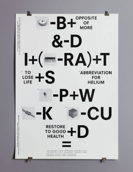
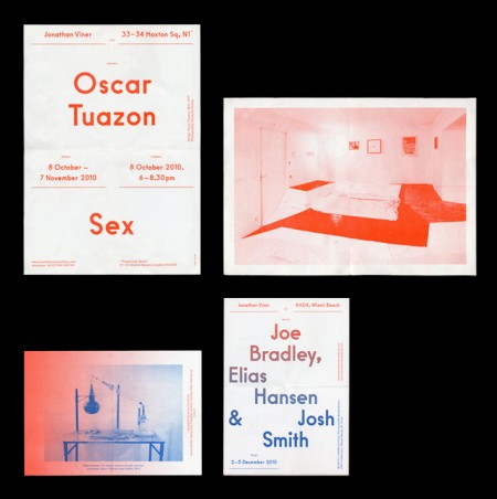
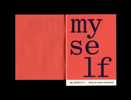
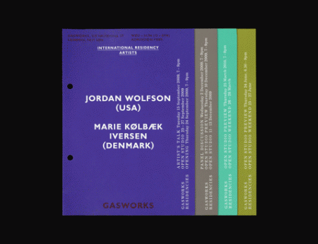
This is the work of OK-RM, a London based design studio. The style reminds me a lot of Sulki and Min and maybe a little bit of Qubik. I enjoy this style; where type is placed all over the page, in a seemingly gridless manner, while still maintaining a sense of balance and proper hierarchy. To me it shows a kind of fearlessness, and a clear love of letterform.
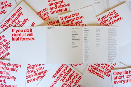
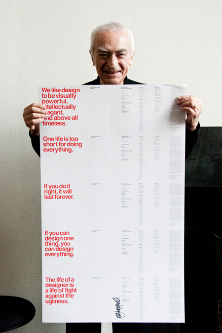
On the evening of Tuesday, March 8, The Architectural League gave its President’s Medal to Lella and Massimo Vignelli. The award (past recipients of which include John D. Rockefeller, Jr., Hugh Ferriss, Joseph Urban, Richard Meier, Robert A.M. Stern, and Robert Venturi and Denise Scott Brown) was given to the Vignellis “in recognition of a body of work so influential in its breadth that it has shaped the very way we see the world.”
Pentagram’s Michael Bierut, an Architectural League vice president who began his career over 30 years ago as a junior designer at Vignelli Associates, designed the the program we see here. The five different covers featured a quote from Vignelli printed in PMS Super Warm Red and set in Helvetica of course.
So why are these five Vignelli-isms important?
When I first came across this I immediately saw five lessons to live by rather than just five miscellaneous quotes. They appear self explanatory but read each and give it a moment alone in your mind:
One life is too short for doing everything.
We like design to be visually powerful, intellectually elegant,
and above all timeless.
If you can design one thing, you can design everything.
If you do it right, it will last forever.
The life of a designer is a life of fight against the ugliness.
Posted via Wanken
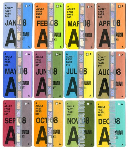
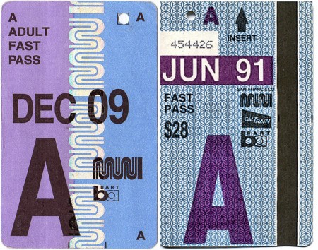
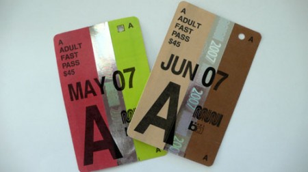
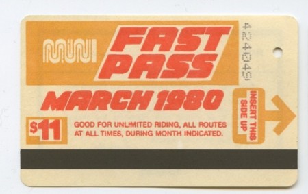
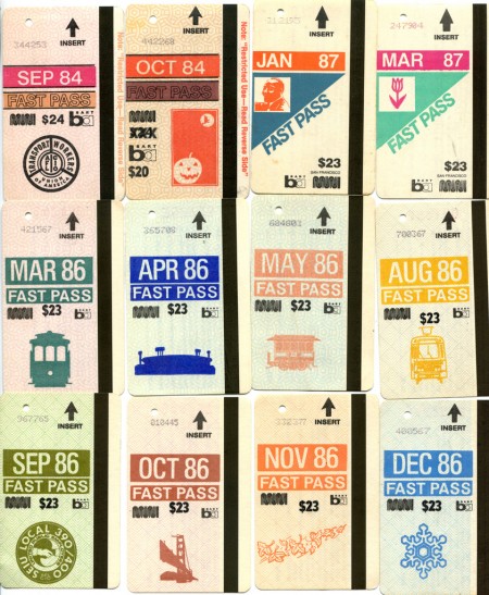
Its a shame that Seattle doesn’t have transportation passes as beautiful as these Muni Fast Passes from San Francisco. The muted colors and typography of these have really caught my eye.
Found via Flickr
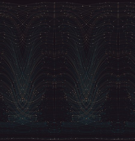
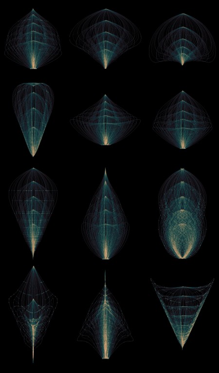
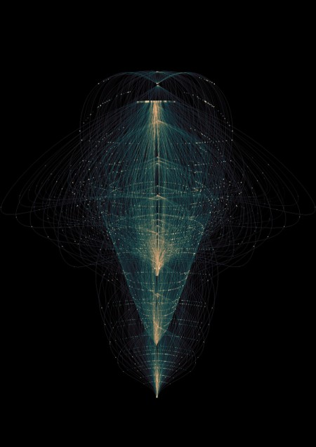

Tatiana Plakhova has some beautifully complex work at her Behance page. Loving the complexity and color scheme of these, very dark but still a lot of life.