Posts in GUI

UberConference: Process Post


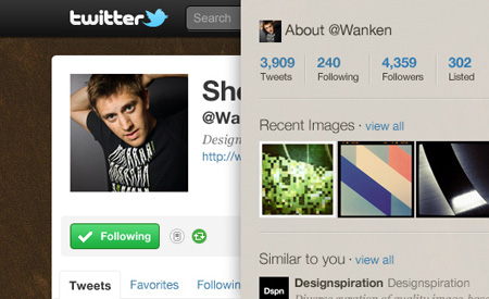
It’s been such a long time since I posted! This is largely due to the fact that I’ve been head-down on my company’s most recent product, UberConference, for the last few months. UberConference is basically a visual interface for audio conference calling. You can see who’s talking, who’s on the call, and control it completely via the desktop (and soon mobile) UI. We recently won the TechCrunch Disrupt Battlefield competition — you can see our pitch and presentation here.

I haven’t written a process post in a very long time so I wanted to talk a little bit about the UberConference process here. I’ll talk about the UI development as well as the video work. Keep reading to see the rest of the process. You can follow me on Twitter here for more frequent updates. Oh also, for a good time, call (424)-226-3111.

(more…)

Twitter UI Background Template PSD


Giving back to the community isn’t always as easy as finding and sharing great design. Sometimes it requires spending time doing tedious details of a Photoshop document… and that is exactly what I’ve done for you.

Here for your use is a Twitter UI Photoshop template perfect for mocking up your page before updating it live. The template is spot on with Twitter’s current layout. In the Psd, each of element set is grouped into its respective area based on the page. Each layer is also labeled and color coded. Twitter mockups should be a whole heck of a lot easier now, enjoy!

Twitter UI Photoshop Psd (4.9 MB) | Version 1.2Share this

Download the PSD

For updates to the PSD you should follow @ShelbyWhite.

Hiring: UI/UX Designer


I’ve written about a few of my recent projects (404 Film, Nosh Promo, Firespotter Logo). These were all completed for Firespotter Labs, which is the startup I cofounded earlier this year. We started out with four of us and we are now thirteen, primarily engineers. Up until now, I’ve been the only designer. We are growing fast and the design needs of our company are such that one visually-minded pixel crusher is no longer enough. We are looking for another full-time interface designer.

Firespotter Labs is a startup. We are looking for someone that enjoys this kind of atmosphere. I’ve written a little bit about what it’s like and I couldn’t endorse it any more positively. Our first app launched about one month ago, so we are primarily working on it, but we have a couple other products in development that will need a lot of love.

If you’re interested, please email me at jobs[at]firespotter.com and use the subject line “Design Position”. We are looking for someone with a strong skillset in user interface design. Usability is key. If you can make things that look awesome as well, rock and roll. Please include a link to your portfolio and/or Dribbble. If you’ve worked on sites or apps in the past, it would be very helpful if you could link these as well.

We are hoping to fill this position as soon as possible.

Left School, Joined a Startup


You may have noticed I’ve been a little less prolific around here lately; finally I can tell you why. I’m very excited to say that as of last November, I dropped out of my MFA program and am a cofounder of Firespotter Labs, a startup funded by Google Ventures. As cool as the concept of “stealth mode” sounds to me, I am decidedly *not* used to *not* writing about what I’m doing. Finally my sneakiness is over! In this post I want to talk a little bit about what it’s been like working full time at a startup, as well what went into the decision to drop out of my design program five months away from graduation. I really couldn’t be happier.

Of course all this would be more interesting if you knew exactly what we were doing. I wrote our About Us the other day and it’s spectacularly vague, so if you want to find out a little more, there were nice articles in The New York Times and Techcrunch last week.
(more…)

LiveView


LiveView is a nifty app for your iPhone or iPad that allows you to instantly screencast from your computer to your mobile device. It works over your network connection in conjunction with a desktop app. it was created by Nicolas Zambetti, a San Francisco based interaction designer.

I’ve found LiveView extremely useful over these past couple weeks during iPhone app development. To be able to quickly see how your graphics look in the intended environment is priceless, especially when compared to the alternative option, which usually involves dev simulators, wires, syncing, and TIME. This app essentially allows me to view Photoshop on my phone, live, while I make adjustments. Amazing.

Frank Chimero recently wrote a great piece on his hardware/software set-up. If I were to write my own, LiveView would be the most recent addition to the “essential” category.

New Feature: Like


Just a quick note on a new feature we’ve added to the site. You may have noticed that little heart icon and number at the bottom right of each post. It’s pretty self-explanatory, if you enjoy a post just click the heart button and it will bump the number up. We tested on most of the major browsers, but let us know if you have any issues or suggestions.

Ivan Sutherland’s Sketchpad

fig1a.big
sage_f1693_web
Sketchpad_01
httpv://www.youtube.com/watch?v=mOZqRJzE8xg
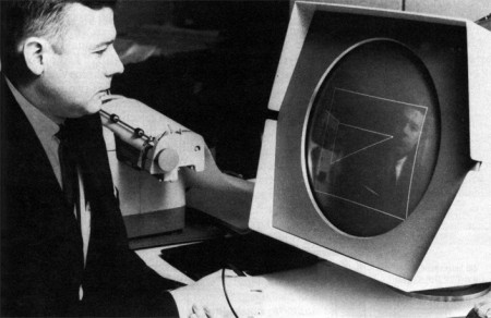
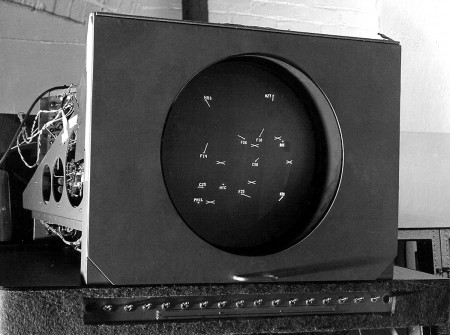
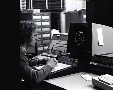
Dusty sent me this video the other day and a quick image search yielded some pretty interesting stuff. It’s incredible to see the Sketchpad system in action; remember it’s 1963 and this is basically Illustrator or AutoCAD 0.01a. Here’s the video description:

Alan Kay presenting Ivan Sutherland’s Sketchpad, one of most influential programs in the history of graphical user interfaces.”

I love when the narrator says that light pens have since been discovered to be terrible input devices, leaving your hand numb. The funny thing is that the first mouse was invented the same year that Sutherland developed the Sketchpad system. It’s crazy that our primary input device is still the mouse, that’s almost a 50 year run. In computer time that’s just too long and I want my Minority Report screen asap. Although I often wonder if a big touch screen would really be that great. The fact that Microsoft seems to be the front runner in the field (multi-touch) doesn’t bode well for it either.

Video Link

Delicious Library

mmm_delicious.jpg

So, I’m sure most of you have heard of Delicious Library already, but the mastermind Wil Shipley released the iPhone companion this morning (iTunes link), along with v2.1.

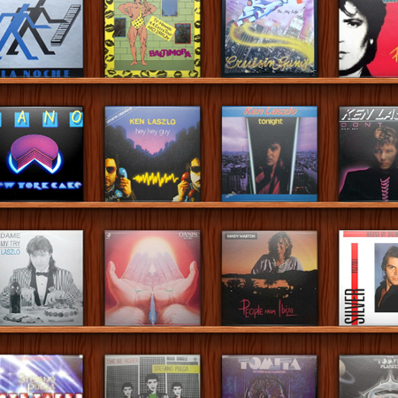
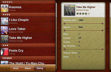
Delicious Library has a lot of neat features that I simply don’t use, but the best use I’ve found for it so far is cataloging your vinyl collection. Unfortunately you have to manually enter everything, as well as find the album art yourself… but it’s really handy to have your collection in a lusciously designed searchable beast in your pocket.

library_iphone.jpg

It’s $40, but the demo let’s you add 25 items so you can play. The iPhone app is free.

Also, be sure to check out this fun stop-motion video introducing the iPhone app.

The GUI Godfather

p10-lg1
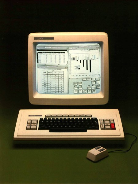
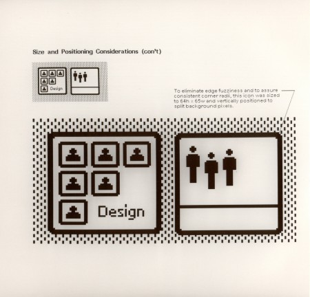
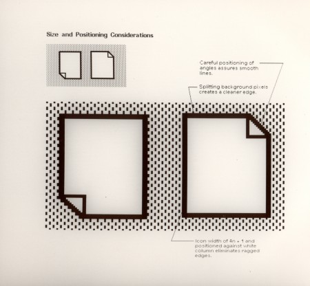
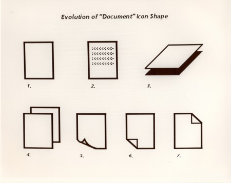
You’re looking at the Xerox Star which “represented the most complete implementation of the ‘Desktop Metaphor’ of any system until the advent of mature Desktop graphical interfaces later on the Mac and PC/Unix/Linux in the 1990s” [source:digibarn] Digibarn has posted up several Polaroids from 1981 depicting the various facets of the Star 8010’s interface (a few of which are shown below). I don’t know what’s more amazing: how ahead of it’s time this GUI was, or how little the OS interface has changed in the past 28 years. This was nearly three decades ago and we’re still clicking folder icons and using archaic pointing devices. Where’s my Minority Report interface!? My wrist hurts.

xerox-star-8010-131
xerox-star-8010-151
xerox-star-8010-14

Check out all the rest of the hi-res Polaroids here.

Ted: BumpTop

I remember seeing the BumpTop desktop concept making the rounds a while back but today I came across a bit more interesting version. In it, BumpTop creator Anand Agarawala walks us through the interface and it’s various features during his presentation at the 2007 TED conference. The concept is obviously in it’s early stages and while this demonstration seems to highlight some of the more frivolous features of the interface, I think a lot of the ideas could be very useful in a future OS. My favorite part is when he dares to insult the sacred cow of OS X, pointing out that it’s essentially a more “lick-able” version of the “same old crap we’ve had for years” (i.e. Windows). You gotta love the audience reactions. Video Link

Note: Since this video is now almost 2 years old, a multi-touch interface is notably absent from his presentation. In the time since the original video Agarawala has updated and has a nice multi-touch BumpTop demonstration here.