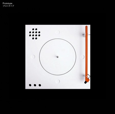
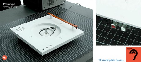
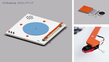
You probably remember Teenage Engineering from their beautiful OP-1 Synthesizer and now they’re at it again with the Styrofoam Turntable Prototype. So clean, Beamer probably has his order in already.
Posts in Industrial Design
Styrofoam Turntable
Images From Where? and By Who? Part. II
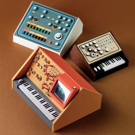
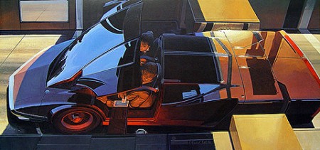
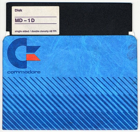
Here is the second installment of Images From Where? and By Who? where we try to figure out who did the original design, photograph or product and if that becomes too easy then its hopefully just a nice small collection of images that might be inspiring for your day of creating.
The first image I just found yesterday and it had nothing attached and the link was generic. I would love to know if these are miniature or full size because i’d save up and buy that small brown one on the right.
The second image i’ve shown Scott once and told him if I could ever have any special power it would be being able to draw the way this car is drawn, incredible work in my opinion.
The third image is just of this generic floppy disc sleeve, you see I use to be a buyer sometimes for a few thrift stores back in Michigan and i’d spend a lot of time looking for a lot of things that looked exactly like this, to most it looks like whatever 80’s junk but i’d probably frame it.
Brionvega Doney
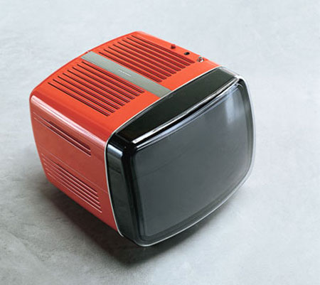
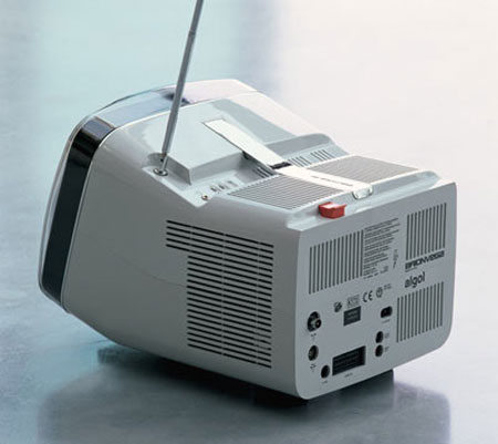
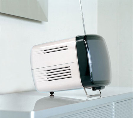
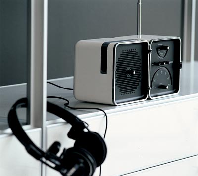
I posted on the Brionvega TS522 portable radio a while back. Now here’s the perfect companion, the Brionvega Doney TV. It is, of course, way expensive (edit: apparently not, around $300 actually, thanks sean) and way hard to get a hold of. And if you’re looking for something even more future-retro, there’s also this concept (if that’s the remote laying there, I’m sold.
Here’s another shot of the TS522 for good measure…So Rams-esque:
1980 Citroen Karin
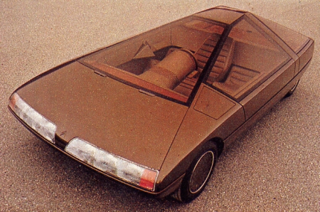
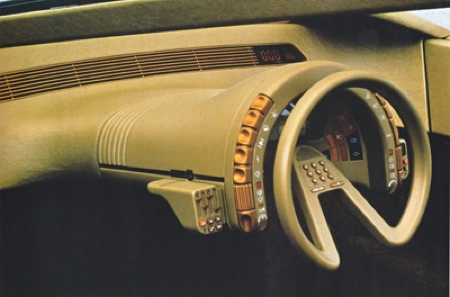
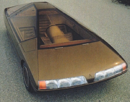
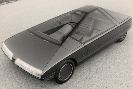
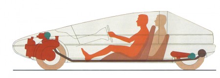
Having no new models to reveal at the 1980 Paris Salon, Citroën stylist Trevor Fiore was given the go ahead to build a model (not a driveable car) for display. The result was the trapezoidal Karin, clearly inspired by Michel Harmand’s design for a GS Coupé. A three seater with the driver being seated centrally and ahead of the two passengers, this layout pre-empted that of the McLaren F1 of 1992. – Citroën
Objectified – San Francisco Premier
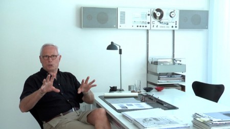

I had the chance to go to the San Francisco premier of Objectifed last night. It was the first of four screenings here in the city, and part of the film’s journey as it makes its way around the world, showing in over 100 cities. After the screening, there was also a short Q&A with the filmmaker Gary Hustwit and a few designers from the film. It was sold out, as it is for the two showings tonight, but if you’re in the area, it’s definitely worth going to check out anyway. There were more than a few open seats and I think they release a few tickets at the door. If not, Gary mentioned it would return in June to the Yerba Buena Center, and possibly release on DVD later in the year (though this seems really soon).
I feel like it takes two viewings for me to really formulate my opinion on a film, but my initial reaction to Objectified is very positive. I really enjoyed it and came out a lot more inspired than I was going in. Hustwit has a very accessible style; he is able to quickly engage the viewer regardless of prior knowledge or experience. His subject choice is fantastic as well, and he captures some poignant and salient remarks from incredible minds working in the field. My favorite segment was probably the one on Marc Newsom (or maybe Rob Walker) but it’s hard for me to remember. I wish I could have taken more notes!
When I posted on the film a while back I didn’t really have any idea what the film was actually going to be about. I had heard it was about industrial design but that was about it. After the screening tonight, I’d say it’s really about everything; design in a general sense. (Interestingly, the term “industrial design” only occurs once or twice.) As with Helvetica, what is said about the chosen arena of (industrial) design can really apply to all design fields. Discussions of utility, objectivity, and efficiency come up regardless of whether or not you work on paper or in steel. The film is really about design thinking and the creativity designers bring to whatever problem they are solving. There was a mention, and I forget by whom, that designers are the philosophers and intellectuals of the future. For me, this sums up the film. Sure it focuses on industrial design, but the real takeaway is that designers are becoming increasingly valuable to society for their way of thinking and problem solving, not just for making pretty objects.
Comparisons with Helvetica are inevitable, and the one thing that Objectified was missing was an opposing perspective. Erik Spiekermann had an unforgettable segment in Helvetica that pretty much made the movie for me. His passionate hatred of the typeface was not only hilarious and entertaining, but also extremely valuable in that it provided a counter-argument to make the film more well rounded. Objectified is very optimistic and hopeful, and it stays this way throughout the entire film. As one of my classmates pointed out, there is no downer interview that provides an alternative perspective. Everyone is drinking the Kool-Aid so to speak. Regardless, it was fun to discuss this issue with my classmates after the film, and I would really recommend seeing it with fellow designers.
Seeing it in San Francisco was definitely a treat. The design community here feels very small, and I love it when there is an event which brings a lot of us together. After the film, everyone emptied out onto the street and hung around discussing the film and design in general. You could really feel the energy of so many people being creatively inspired all at once. I felt really excited and proud to call myself a Designer.
Vitsoe Shelving
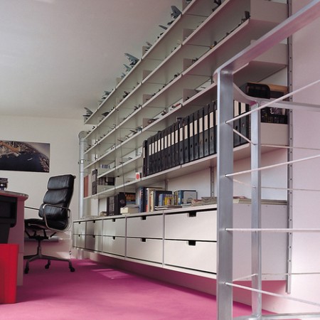
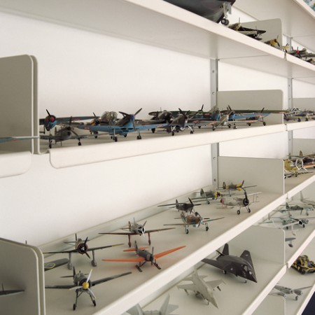

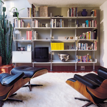
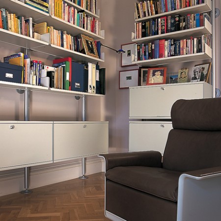
Since we’re on the subject of Dieter Rams this week, I thought I’d post on his Vitsoe Shelving series. You may remeber the name Vitsoe from the Name That Chair post a while back, but it’s not enough just to have a Rams chair, you must also surround it with his amazing shelves. The Vitsoe site features a nice gallery of the shelves in their natural habitat, and you’ll also catch a few 620 chairs in there.
If course, a setup like those in the gallery will no doubt cost you an arm and a leg, but it’s nice to look. It’s always funny, whenever I somehow randomly find myself in some rich guy house, they never have anything as cool as this. It’s either gaudy old classical gold leaf stuff dripping with ornament or garish nouveau riche style with white carpets and bad marble floors. Apparently you have to be broke or German to appreciate this stuff.
Calculators: Japan vs. Germany
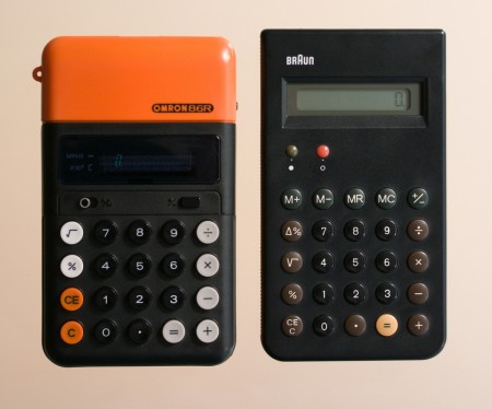
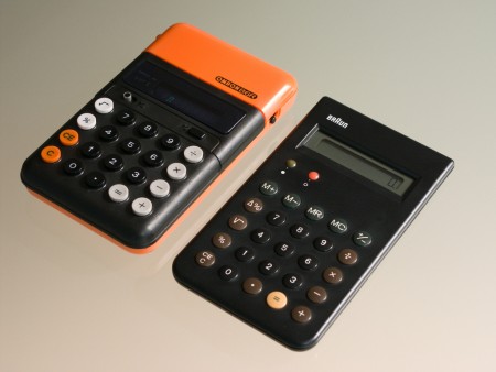
“Omron 86R & Braun 4 776 calculators. Interesting similarities and differences, especially layout, letter forms, color and shapes. The Braun’s 12.5mm total thickness versus the Omron’s 25mm is a clear sign of the 10 year age difference between the two designs.
Omron 86R & Braun 4 776 calculators. The Braun’s font is clearly Akzidenz Grotesk, but the closest I can find for the Omron’s font is Univers 53 Extended. Any better ideas? “
Dieter always wins out, but that Omron still has it’s own thing going.
Via faasdant
Vintage Etsy
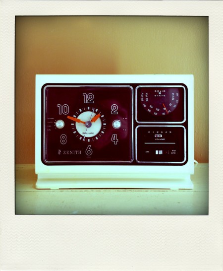
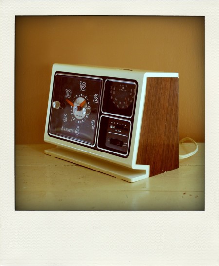
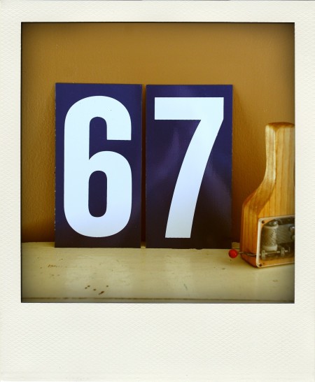
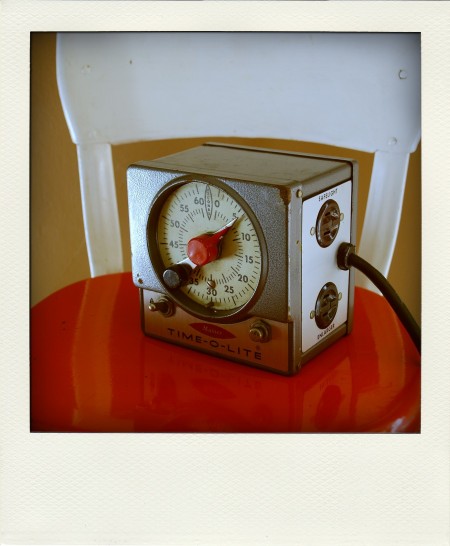
@McCrothers pointed out the fact that you could find some very interesting vintage items on Etsy. I thought it was all about handmade accessories and trinkets, but the above examples suggest otherwise. They’re from the 26 Olive Street shop where you’ll find a few other interesting odds and ends along with a lot of nicely Poladroid-erized product shots. This comes via a Valet article breaking down the Etsy second-hand market.
Mastering Tycho At Monsterlab
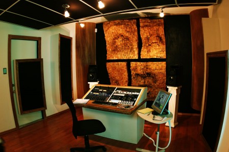
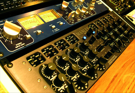

I made the drive out to Sacramento this morning to have the next Tycho single mastered by Eric Broyhill at Monster Lab Audio. In case this is sounding familiar to you, it’s because this is my second pass at this song. I mixed and mastered it last month but after repeated listens, something just wasn’t quite right so I did another mix over the past week and it’s finally wrapped. It’s been a long road, this particular track is sonically very dense and it’s been a very difficult one to mix. For those of you who aren’t familiar with the idea of mastering, it’s the last stage in the production process in which an engineer puts the finishing touches on your music and gets it into the form it will take for the final release — be it CD, MP3, vinyl, or otherwise. That is, of course, a gross oversimplification of what mastering is, if you’re really interested in the details here’s the Wiki article on the subject. It’s a vital step in the process of moving a recording out of your studio and into the real world where every stereo and every room is different, and you hope that your music sounds good on and in all of them. I think most importantly it puts another set of critical ears on your music. By the end of the production process your own ears can become deaf to the subtleties (or not-so-subtleties) and details of the material so it’s vital to have some fresh ears hear it for the first time and recognize it for what it is, not what it has become for you through infinite listens. Ideally, those ears belong to a capable person who knows waaaay more than you’ll ever know about the science and nuance behind how people perceive sound. Mastering can be heavy-handed or light and transparent, and therein lies the problem. Because the process can have such a profound effect on the final product, you have to trust the person doing it. You must have faith that they get what you’re trying to do with a song. It’s a very difficult thing to hand over the reigns to something you’ve put so much of yourself into, to another person who may or may not understand the essence of what you’re trying to do sonically with a song.
I was fortunate enough to meet Eric Broyhill back when I was finishing up my first album and he’s mastered all of my releases since. He’s great at understanding what I am going for and I am always amazed at the night-and-day results when I compare his versions with the raw material. The shots above are from his space which is located inside Hangar Studios (John Baccigaluppi’s studio and the home of TapeOp magazine) in Sacramento. I took these shots during a session a while back so they aren’t really up to date, I think he’s replaced a few pieces in the rack but the interiors are the same and that’s the really impressive thing about the place (unless you’re like me and you can’t stop staring at the Manley Massive Passive). A mastering environment has to be acoustically treated to ensure accurate monitoring of the material. There are many ways to go about this, most involve fiber sound absorbers and diffusers. I’ve always admired Eric’s solution to these problems from both a technical and aesthetic perspective. He was able to build much of the treatments into the structure so that they’re almost unnoticeable but the most prominent element is definitely meant to be noticed. The primary diffuser on the front wall is a giant face he had built by a local artist out of wood blocks set at varying heights (see picture above). This randomly redirects reflected sound waves to avoid phasing issues that can be caused by parallel surfaces. It looks amazing and sounds even more amazing when paired with the incredible Earthworks Sigma monitors he uses. I honestly don’t think I’ve ever heard a better sounding system than this one.
Now it’s time to finish up the album. I really can’t wait for the day I get to drive back out there, it’s always like a celebration for me at the end of the months spent in the studio slaving away on the music. You get to hand it over and then watch it become complete. If you’re in the market for mastering — which any self-respecting musician should be — definitely check out Eric at Monsterlab, he does incredible work at very reasonable rates. And if you’re not in Northern California I know he can do the work remotely as we did a couple sessions that way. Monsterlab Audio
Neve Sidecar
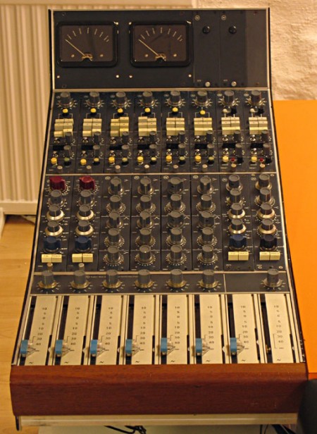
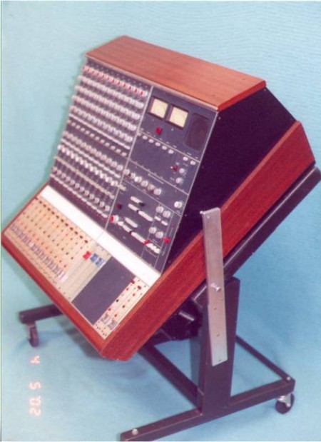
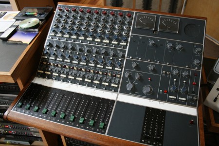
In the world of audio engineering, the name Neve has become almost mythical. Rupert Neve was responsible for a very popular EQ and preamp circuit design that helped produce many a hit record over the years. I personally love the Neve sound and record everything through a set of four Neve clones. While clones are great and can approach the sound of the original, they’re still not truly a Neve. So to see an actual Neve Sidecar show up on Ebay was a surprise. Just seeing pictures of these is pretty intense, I can’t imagine what it would be like to actually use one. To me, the color and design inspire a sort of reverence, kind of like the Futura of the sound engineering world; classic, refined, and functional. At any rate, a $40k mixer is just a dream…but what a nice looking dream.