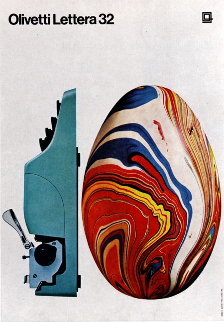
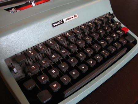
“The Olivetti Lettera 32 is a portable mechanical typewriter designed by Marcello Nizzoli for Olivetti in 1963 as the successor of the popular Olivetti Lettera 22. This typewriter was popular amongst journalists and students.
The typewriter is sized about 34x35x10 cm (with the carriage return lever adding about 1-2 more centimeters in height), making it portable at least for the time’s standards, even though its 5.9 kg weight may limit portability somewhat.”
– Wikipedia
Posts in Industrial Design
Olivetti Lettera 32
Volvo Chair
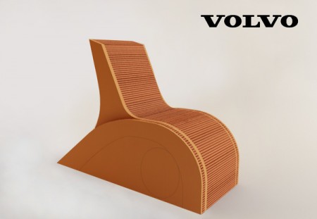
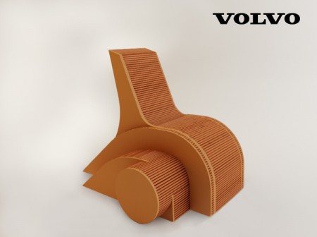
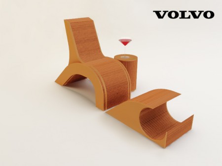
Apparently the tail lights of the Volvo C30 have inspired industrial designers to construct a well thought out 3 piece chair set.
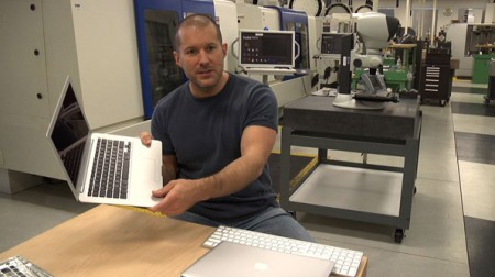
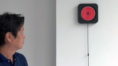
Objectified Film
 httpv://www.youtube.com/watch?v=S9E2D2PaIcI
Objectified, the upcoming documentary on industrial design by Gary Hustwit, will be premiering soon at the South by Southwest Festival in March. It will take an in-depth look at the designers and creative processes behind some of today’s most popular objects, and should provide a great introduction into the field of industrial design.
I enjoyed Hustwit’s last film, Helvetica, and I thought it was a great way to give the general public some perspective on the world of graphic design. I am constantly asked what graphic design “is” by friends and family, and it was nice to have a film I could show them that pretty much summed it up. It was also interesting to see how the film’s release affected the use of Helvetica at school. Despite the fact that it was ubiquitous already, students suddenly became afraid of using it at all, for fear of further saturating the design community with more Helvetica, or doing something predictable.
I’m sure a lot of you will have heard of the release by now, but be sure to keep an eye out for a screening in your area. The fantastic Sundance Kabuki Theater, here in San Francisco, will be showing it on April 21st, with a Q&A with Hustwit to follow. More dates and screening information can be found on the Objectified site.
Name That Chair

Can you name this poor, unidentified chair? Some people were asking that same question in the comments of today’s Dieter Rams post so I thought I’d put it up in the hopes that someone out there can solve the mystery because, as Joe Clay put it, that is a damn sexy chair. Sound off in the comments. First correct answer gets a Tycho single!
By the way, how badass is Univers LT Std 39 Thin Ultra Condensed? Completely, is the correct answer.
Update: That was quick, Vito called it, it’s a 620 Chair by, of course, Dieter Rams. Here’s some very nice high res shots from the link vito Provided.
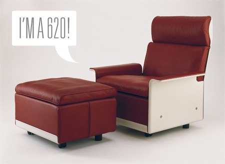
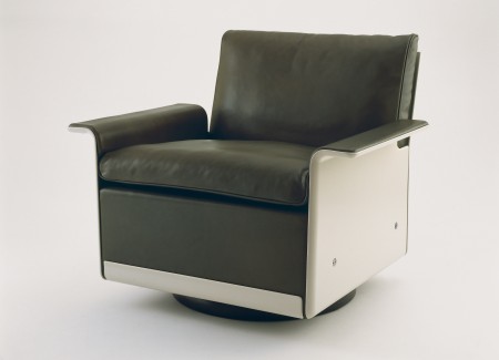
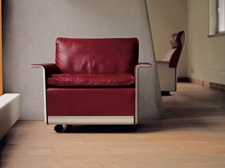
Images via Vitsoe 620 Chair Program
Matthew Donaldson: Dieter Rams
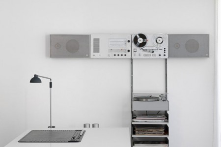
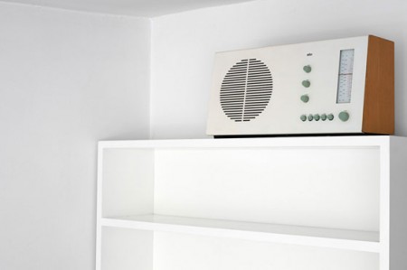

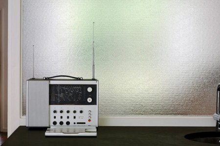
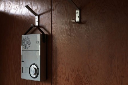
Plastolux posted up these wonderful shots by Matthew Donaldson of various Dieter Rams artifacts in their natural habitats. Unfortunately though, if placed in my house — being the cluttered mess that it is — most of these poor creatures would wither and die in a matter of days. There just aren’t enough clean lines and pristine spaces to support their minimalist German sensibilities. Someday… Although seriously, can anyone get anything done in an environment like this? I’d love to see Jonathan Ive’s work space, I would bet it doesn’t exactly mirror his design aesthetics.
2009 McLaren F1: Not Ugly


Wired has an interesting article about the new F1 rules and the resultant car designs (McLaren MP4-24 pictured above). It details how new rules for the sport — which many expected to create a significant design challenge — have actually served to beautified the new models. These things are starting to look like they can fly and if it weren’t for the fact that your work would be ruined by about 800 ads, designing the paint for one would be a lot of fun. Check out the Wired article here.
Razer Death Adder Mouse
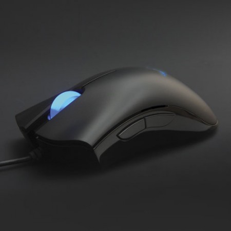
So I was at Best Buy the other day and I happened upon the mouse isle. I wasn’t really searching for a new mouse so much as an alternative input device (more on that later) but I remembered a few of you had recommended the Razer mice in the comments of the design mouse round-up so I thought I’d give them a shot. I played around with both the higher-priced “Lachesis” model and the “Death-Adder” (yes, only “gaming-grade” products are allowed to have names this bad). The Death-Adder felt the best in my hand so I focused in on that one. After playing around with it for a little while I liked it enough to pick one up. I think it was around $60, not cheap, but certainly not as bad as some of the Logitechs which can push the $100 mark.
Once I got it home the first thing I noticed was how light it was compared to my old Logitech which I had weighted with some quarters. I don’t know how I missed that at the shop but I was starting to think it was a deal breaker, I really like heavy mice. But as I used it I started to realize that the extreme precision of the Death-Adder more than compensated for it’s lightness. I think before I needed the weight to make up for how imprecise the Logitechs can be, in this case there was no need. The Adder floats effortlessly across my desk surface and the resolution is incredible. What I really love about this thing is the width, I don’t have to cramp my hand to hold on to it, it fills out the palm nicely.
It’s really a small issue, but this thing looks really cheap. The industrial design department over at Razer Inc. must be comprised solely of 15 year old FPS enthusiasts because this thing is damn ugly (I know it doesn’t look so bad in that pic up top, but you have to see it in person to truly appreciate it’s tackiness). And to top it off, it has a glowing blue thing in the middle of it that looks like some sort of tribal tattoo from 1998. And no jokes, it actually pulsates! WOW….I can just imagine that design meeting… Designer: “Hey, how about we take the ugliest, most tacky part of the design and then draw as much attention to it as possible by mounting a blue light underneath!” Product Manager: “Make the light pulsate and you’ve got yourself a deal.” Overall, the materials look pretty chintzy too but I guess I don’t mind since they seem to have spent the cash they saved on making this thing look good on making it work better.
As for real issues, I definitely miss Logitech’s Micro-Gear wheel and there are only two extra buttons on this thing, back and forward. Other than that, it’s definitely a winner, I certainly prefer it to my Logitechs at this point and I’ve only been using it for a couple days. They have several models to choose from, some with more buttons/features I’m sure but since their site doesn’t have an index it was really hard to see all the mice and compare them at a glance. I would give you a link to the website, but that too seems to have been developed by high school students so I’ll spare you. Seriously Razer, I know your demo is gamer kids, but that doesn’t mean your site has to be completely non-functional.
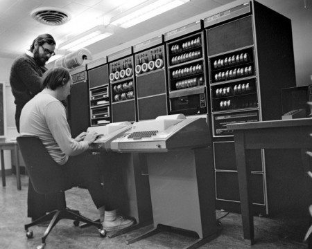
Columbia’s DEC PDP-7
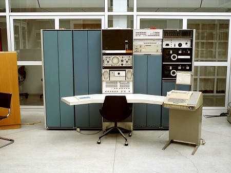
The DEC PDP systems never cease to be a source of inspiration for me and the above example of a PDP-7 system at Columbia’s Electrical Engineering department is no exception. I am not sure who took this photo as there was no credit included (source: Columbia Computing History). It would be tempting to gut the cases and fill them with modern studio equipment if you could find a nice used example. Also, if you have an oscilloscope in your computer you win.
For you Mac heads out there, this is your great-grand daddy. A PDP-7, referred to as the “Unix Genesis Machine”, was used by Ken Thompson and his team in 1969 to develop the Unix OS (a very early precursor to what would become Mac OS X).
Old New Tech
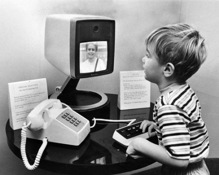
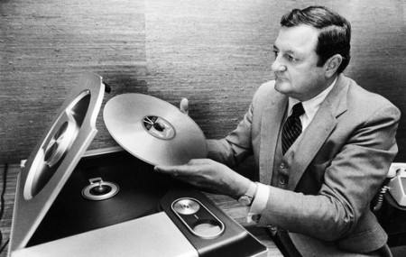
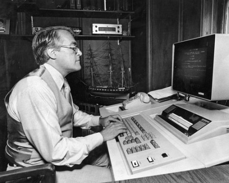
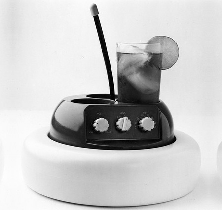
The Chicago Tribune has posted a nice collection of old gadgetry. Yes, we do have all of this stuff now, but none of it looks this cool. My favorite is the inlaid computer keyboard, I’m trying to do something similar with some recording equipment my desk right now but somehow I doubt it will be that clean.
Vintage Sony Radio
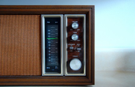
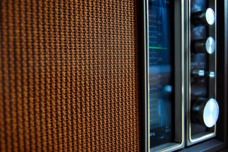
Saw these nice shots over at the Mid-Century Modernist today. In high school I worked at this place called “Good Guys” in Sacramento, it was a consumer electronics place and they had this really nice vintage Sony replica radio. If I’m not mistaken, it was modeled after this one. I remember it being pretty nice, but now looking at these shots, it really didn’t do the original justice.
Images by 33 and a Third via Mid-Century Modernist.
