Posts in Industrial Design

Big In Japan: Foldable Rooms

200810020200.jpg

This video for Toshihiko Suzuki’s Kenchikukagu first struck me as sort of funny just for the fact that it’s highly reminiscent of those “Kitchen of The Future” type ads from the 50’s showcasing a bunch of “innovations” most of which were either highly impractical or just downright ridiculous. But after watching it, I want the whole set. Suzuki’s folding rooms are just that, rooms that fold up when not in use. They’re quite well designed and actually seem very practical for the space-challenged and/or OCD level organizers among us. I don’t think I would go as far as to outfit my entire home with these but one or two for choice tasks would be nice. The best part of the whole deal is that these aren’t just concepts, you can actually buy them from Amazon Japan. The worst part? They’ll run you around $7,500 each.

Via Complex
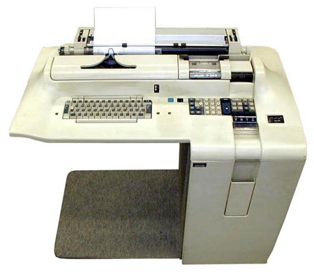
Mario Bellini Addendum

Bellini1
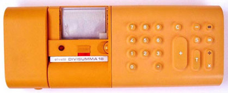
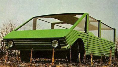
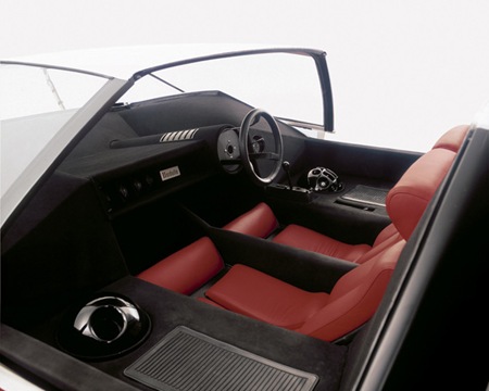
Bellini2Bellini3Originally we posted the Sutra which is the vehicle above but digging deeper I find the typewriter workspace is just as fascinating.
Da Vinci Alarm Clock

davinciclock2 davinciclock3
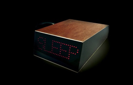
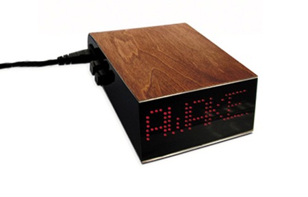
It is said that Leonardo Da Vinci lived by the principals of what is now called polyphasic sleep; basically meaning he followed a rigidly structured sleep schedule allowing for only 3-4 hours of sleep per day. Sounds pretty crazy, but it does net the faithful around 21 waking hours per day. Apparently you take several naps during the day as opposed to one big sleep at night and somehow your body adjusts to this and thrives. I must admit the concept is appealing, all that extra time each day. But judging from how I perform off even 6 hours of sleep I am pretty sure I’m out of the running as a candidate anything like Da Vinci’s system.

That doesn’t change the fact that I want this alarm clock. Designed by Marc Owens, the clock operates on a very simple system that makes adhering to the polyphasic cycle easier, and better looking. More info can be found at Yanko Design.

A contributor to this very blog swears by polyphasic sleep and seems to thrive on it. Anyone else getting by with this system? Do you get more work done? Let us know in the comments

Eton / Porsche P’9110

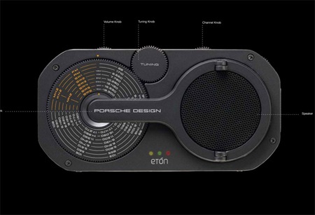
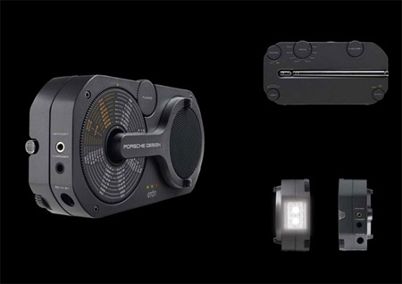
p9110bp9110 I posted a while back about the Porsche-designed Etón P’9120 clock radio but today we’ve got the 9120’s more utilitarian little brother, the P’9110. This hand-cranked emergency radio sports the usual fare: flashlight, siren, etc. but that’s where the similarities between this and that plastic Coleman you got at Target end. Once again Porsche has succeeded with a classic, functional design; clad in cast aluminum, the 9’9110 sports clean lines and color scheme to match. I am loving the tuning gear design, and the tuning wheel/chart design is wonderful.

Once again though, I could do without the cheap looking and poorly placed Etón logo. The top image is from the Porsche Design site who have wisely left out the logo in their press shots, so much cleaner. They have a shot of the 9120 sans-Etón logo up there as well which makes me wonder if you can buy these direct from Porsche instead of going through Etón and getting stuck with the extra branding? At $200 it’s more than a stretch for functionality that can easily be had for under $50, but can you really put a price on maintaining your design standards even during a disaster scenario?

Marco Zanuso

Marco Zanuso
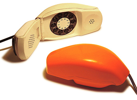
Lately, i’ve been getting back into going into the modern furniture shop again, you know more then just window shopping. I took a break awhile because i just felt like i wouldn’t find any original pieces to gawk at and then slowly make my way to the price tag to find out how much money something is that i’ll never be able to afford. Recently though my newest fascination again are simple mod plastic phones, portable TVs, and alarm clocks. This one by Marco Zanuso really caught my eye.

Ross Lovegrove “Captain Organic”

TED
Design that nature creates. One of my favorite TED speakers. i love his ideas, passion and direction, i’m not the biggest fan of the design, it’s a bit too curvy and futuristic like some bigger budget Karim Rashid piece.

Porsche Design / Eton Radio


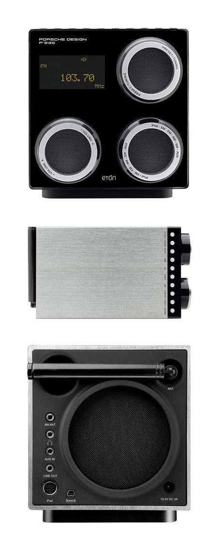
Etón’s Porsche-designed P’9120 clock radio is a must for any self respecting minimalist / design aficionado with a schedule to keep. I’m loving the knob / speaker combo, so efficient and a great interaction metaphor to boot. This thing could sit comfortably beside some the the jewels of Braun modernism and Porsche even kept it old school with the remote.  My only gripe with the design is the sore thumb Etón logo that breaks up the clean lines of the face. It feels misplaced and cheapens the aesthetics; it also clashes badly with the wonderful typography of the Porsche Design logo. I guess that’s what Sharpies are for though. Now if DWR would just make a matching Herman Miller walnut pedestal I’d be set. Unfortunately, at $600 it’s prohibitively expensive; but then again, dedicated design geeks wouldn’t let half a grand stand between them and waking up to such a specimen of functional art.

Via Dvice

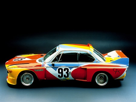
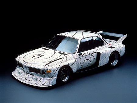
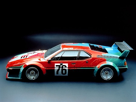
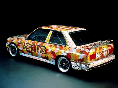
BMW Art Cars

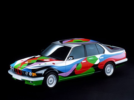
1986-BMW-635-CSi-Art-Car-Robert-Rauschenberg-SA-1600x120070_calder 70_stella 70_warhol 80_nelson 90_manrique
As Michael J. pointed out in the comments of the previous Sharpie Lamborghini post, Robert Rauschenberg was way ahead of the game on the whole "drawing all over badass cars" thing with his photo transfer 635 Csi way back in 1986 (first car pictured above). As it turns out, he wasn’t alone either. Among others, but perhaps most notably, Andy Warhol took a shot at the concept (see videos below) as part of the BMW Art Car program. More Info and pictures on all the Art Cars can be found at the US Auto Parts Art Car Site. You can also find some nice big wallpapers of the Rauschenberg car over here.

And no, this site isn’t switching format to an automotive blog; regardless of the recent spike in vehicle related posts. Thanks again for the heads-up on the Rauschenberg car Michael.


Benedict Redgrove: Pininfarina

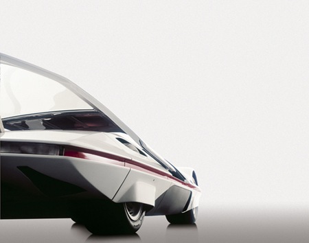
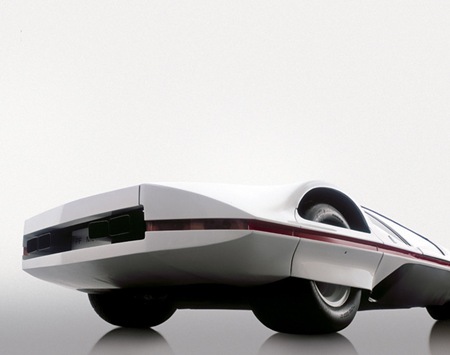
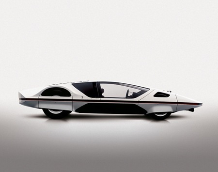
FRONT_LOW_ANGLE_12_ROOFOPENINTERIOR REAR_LOW_34_B SIDE_ON_B
A Pininfarina concept photographed by Benedict Redgrove.

Logitech MX1100

lgmx1100
Logitech’s new MX1100 mouse has been getting some glowing reviews and I’m pretty excited to get my hands on one. I have been using an MX Revolution for a couple years now and the battery is failing, so this new model with replaceable batteries will be a welcome addition. The ergonomics on the Logitech mice are great, but the hyperscroll wheel is reason enough to switch (so handy when you’re way zoomed in on a PSD and want to move around quickly). I have tried to make the switch to Wacom pads before without much success. How about everyone else? Do you use a mouse or a tablet, or both? Do you find either is more conducive to design or is it just a simple issue of ergonomics? Let us know in the comments