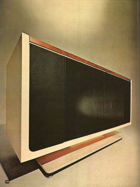
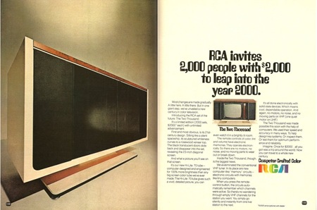
Caught this ad on Paleofuture. The RCA Two Thousand was a TV set released in 1969 with a price tag of $2000 (roughly $12,000 in today’s market). It leveraged then nascent computer technology to, among other things, store favorite channels electronically and automate tuning. The interesting thing to me is how much it resembled a modern flat panel when the cabinet was closed (top and bottom left). Unfortunately, those are just doors; when in it’s opened state the Two Thousand looks a lot like any other old tube set from the 70’s. At any rate, the top image is wonderful to look at and downright prophetic when you consider this was designed in the late 60’s. It seems ripe for some sort of Ive-esque re-purposing a’ la the Dieter Rams inspired iMac.
Posts in Industrial Design
RCA Two Thousand
B&D Messenger
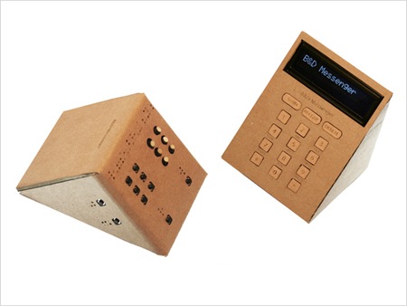

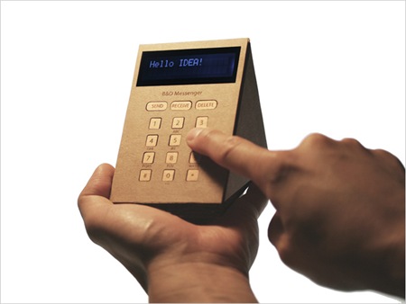
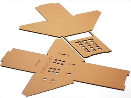
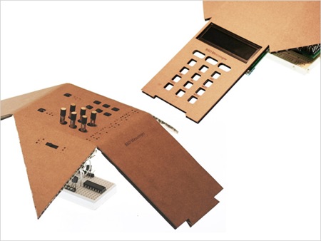
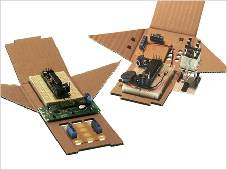 The Okada Noriaki-designed B&D Messenger is a device that helps blind and deaf people communicate via SMS text messaging. I love the design of this thing, the cardboard housing they used to bring costs down ends up providing a very nice looking surface while keeping it inexpensive. They’ve also made the unit much smaller than other Braille phone devices currently on the market. The system is based on a set of twelve points that raise and lower to create braille letters which are translated from SMS texts received by your computer (USB connection required). It’s great to see someone using technological innovation to make a device that benefits people more accessible. More info and pictures can be found at the B&D site.
Via Gizmodo
Lotus Concept Ice Vehicle
HP Elitebook: MBP Killer?
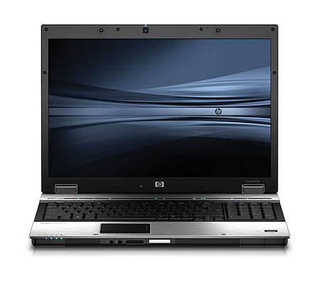
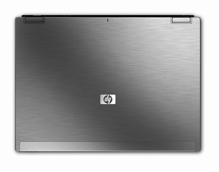 HP has announced several new notebooks, but one in particular has a design-centric feature set that has really piqued my interest. I have been using HP notebooks for years now, it’s not that I’m really in love with them, it’s just that they are so damned powerful and ridiculously cheap. Of course that has come at a cost, the construction is downright shoddy; both of mine have broken at one time or another, luckily I had warranties on them. I travel with a TX-1000 series for internet / email chores and a hulking DV-9000 series for on the road video / graphics duties (along with running the visuals for live shows). I am really tired of the sub-par display quality and power management of most PC notebooks so I have been looking at replacing mine with a MacBook Pro. I really like the physical construction of the MBPs and the the power management of OSX (my HPs both have abysmal battery life stats). But HP’s past offenses aside, I may have to reconsider my switch in light of this new breed of designer-targeted notebooks.
The recently announced HP Elitebook 8730w comes with a Dreamcolor display. That’s pretty impressive for a laptop; the specs on the Dreamcolor displays are amazing (1,000,000,000 colors?!) and to have that kind of color reproduction on the road would be a huge advantage. Add to that a dual-SATA drive option (two physical disks for Photoshop Swap Drive duties or RAID-0/1 configurations) along with dual DVI outs (one onboard HDMI/DVI socket, one external via the optional dock) and docking capability (something the MacBook inexplicably lacks) and you have yourself a portable graphic design powerhouse. Another incentive is the anodized aluminum "Duracase" which is hopefully better than the brittle plastic they made the previous models out of. Given the specs (Quad Core Intel / 8GB RAM / 1GB VRAM!) you could get away with using this as your desktop machine as well.
My only concerns with this new offering are the lack of a 15" screen option (17" is a bit too large to really be portable in my opinion) and the fact that HP is gloss-happy when it comes to screens. On both my laptops the screen is so glossy that the glare prevents me from seeing the screen in most outdoor environments (and many indoor environments). The don’t seem to specify whether the screen on the 8730w is glossy or matte, but if they end up offering a 15" matte screen option they can put me down for one.
And the real kicker? It’s $1699. That’s US dollars, and it’s not a misprint. $1699!!! A comparably equipped MacBook Pro doesn’t exist, but even a lesser-equipped MBP would run you over double that figure. It’s times like these I feel lucky to be so entangled in the complete disaster that is Windows. I learned on Windows and really can’t fully divorce myself from it and therefore am at it’s mercy, so when a great hardware option like this comes along I have to be thankful. Oh yeah, and a Windows XP downgrade option is also available on the 8730w; this is opposed to the earlier HP / MS bed-buddy policy of forcing you to use Vista on new laptop purchases. They went as far as to remove the XP drivers from their site for my DV9000 when Vista came out just to force me to upgrade. To tell the truth, XP has matured into a remarkably stable operating system. I have tested it extensively versus OS X and it’s stood up to the challenge. I will admit that OS X is overall a more stable and reliable OS, but when configured properly, XP gets the job done and gets it done faster.
So here’s to hoping that the 8730w lives up to the hype and eventually spawns a 15" incarnation; it would be a valuable addition to any designers arsenal and a very cost-effective one at that.
Have you used or do you own a Dreamcolor display? What do you think? Any other potential Mac switchers swayed by this recent development? Let us know.
PDP-8/I/S
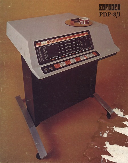
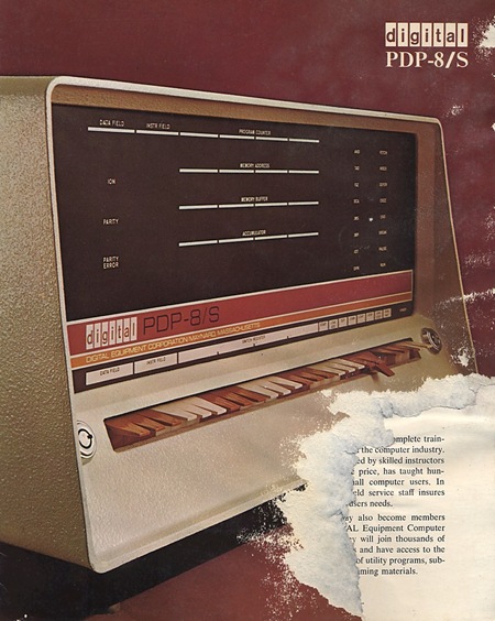
Here are a couple old DEC ads, one for the PDP-8/I and one for the PDP-8/S. The 8/I would make a wonderful piece of furniture or a nice synthesizer stand. Unfortunately you rarely see these in good shape; here’s a banged up 8e on the bay.
Nikon D700
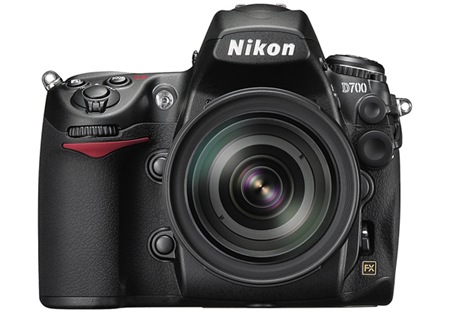
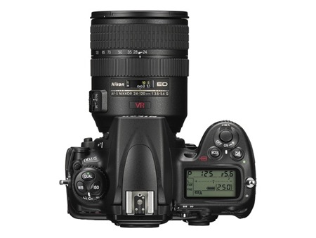
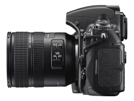
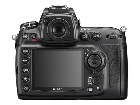
In case you haven’t heard, the long rumored full-frame 12.1MP Nikon D700 is now official. It’s sports it’s older brother the D3’s vaunted CMOS FX/DX sensor but in a smaller form factor and with a smaller price tag. In regards to the price, however, the word "smaller" is a relative term. In the case of the D700 it equates to roughly $3000 USD (as opposed to $5000 for a D3). As a hobbyist that’s a pretty had price point to justify so I don’t think I’ll be ditching my D80 just yet (as much as I’d like to).
When I was in Bangkok I had the chance to try out a D3 with a fixed focus 50mm lens and it was pure bliss. The thing had almost no noise even at ridiculously high ISO’s and it could acquire focus and blast off frames faster than I could comprehend; it sounded like a silenced machine gun when you held down the shutter release. The knowledge that I can have that kind of performance for $2000 less and won’t have to lug around the nearly 3lb. weight of the D3 body makes the 700 pretty hard to resist. It’s supposedly available but none of the usual online outlets have it in stock. Has anyone managed to use / buy one? If so, what do you think?
PDP11 Handbook
![11_02[1]](https://blog.iso50.com/wp-content/uploads/2008/07/windowslivewriterpdp11handbook-1c7d11-021-thumb.jpg)
![11_03[1]](https://blog.iso50.com/wp-content/uploads/2008/07/windowslivewriterpdp11handbook-1c7d11-031-thumb.jpg)
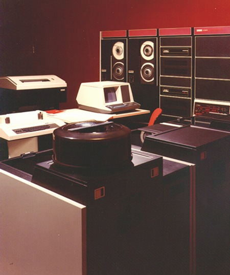 Up top is the original handbook for the Digital PDP11 Microcomputer (front and back). This was a successor of the PDP8 line I covered earlier. This time around we’ve got a liberal shift into the magenta range for the interface. The lower image depicts the machine in use; funny how they’ve dubbed it a "microcomputer" yet it’s peripherals fill an entire room. Makes me realize that for all the ills of the modern world, we as digital artists certainly live in a fortunate time for our chosen profession. The great irony here (considering the proliferation of computer based desktop publishing) is that these brochures for computers were all set photographically, by hand. I’m not sure what typeface that is, it looks rather custom so perhaps it never made the leap to the digital realm as a font. Let us all know if you have any ideas about it’s identity.
Really liking the cream border on the handbook and it looks to be intentional in this case as opposed to being an effect of aging like we saw in the Blue Note covers. Also, here’s an interesting example of a programming card from the PDP, unfortunately it’s a bit cut off.
Three G’z
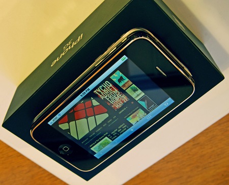
Unless you live in an actual cave or have an actual life, you know / care that the iPhone 3G is now available and that the entire world is completely freaking out. When the first one came out I tried to play it cool and pretend like I didn’t want one; but once the lines died down about a month later, I caved in and got it. I was planning on doing the same this time around, but thanks to a bit of luck I was able to get one at an overlooked AT&T store by my house after only 30 minutes of waiting. Apparently everyone thought the only place that was selling them in San Francisco was the downtown Apple Store, because there were like 15 people in line at the Mission AT&T.
I always really enjoyed the original one, it’s a huge help while traveling, and as a designer, the slide show functionality is invaluable for client meetings and giving impromptu portfolio viewings. There were definitely a lot of little (and not so little) problems I had with the old one, and while most have been addressed in the new version it still leaves a bit to be desired. Regardless, it’s without a doubt a major triumph of design and usability; the user experience Jonathan Ive & Co have delivered is light years beyond anything else out there. The original iPhone was the first Apple product I ever owned and the experience led me to switch over to Mac for my work. It’s a pretty major feat to distill an all-encompassing user experience like that found in OSX and nearly replicate it in the form factor of a phone. That was enough for me to take a harder look at OSX as a design / work platform.
There are countless articles written about the iPhone by far more informed people than myself, so I won’t go into detail about my opinions (but needless to say I am loving this one even more than the last). But I am interested to know what the design community thinks of it: Do you have one? As a designer, do you feel devices like this benefit your workflow / business? Do you see it as a successful design? Do you want to bang your head against a wall every time you hear about the f&*$%ing thing? Let us all know what you think.
Luigi Colani

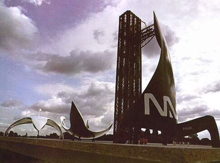
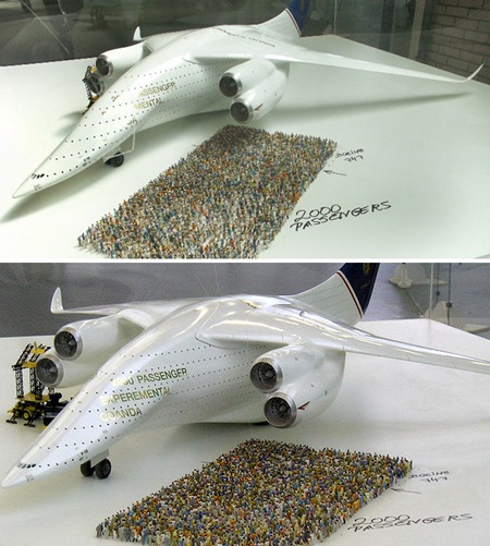
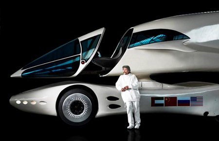
Some amazing designs by German Industrial Designer Luigi Colani. I particularly enjoy the aerospace stuff, reminiscent of the Soviet Ekranoplan. I can distinctly remember seeing that truck design when I was younger; funny how things like this make their way back to you. Via Dark Roasted Blend
