Posts in Industrial Design

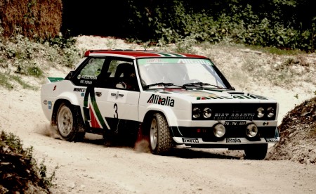
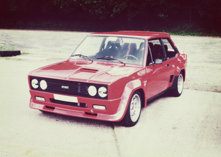
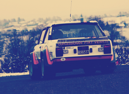
FIAT/Abarth 131

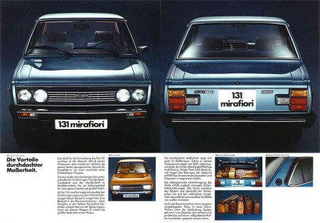
Fiat (Italian Automobile Factory of Turin) released the 131 to little fanfare in 1974. It was aimed at the family demographic, offering sedan, avant, and coupe layout. They were modestly powered and featured nothing truly ground breaking. So why bother featuring it? In all honesty, I think the 131 was one of the better looking economy cars of the day. It nearly stole the 3-series’ thunder, with a very evolved and elegant design for a mid-seventies car. Its proportions are pleasing, it has geometric, minimal shapes between the pillars, and anything with fog lights framed in a boxy fascia, I’m a fanb0i of.

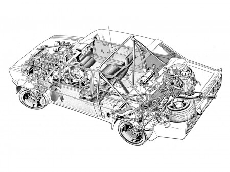
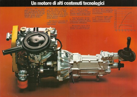
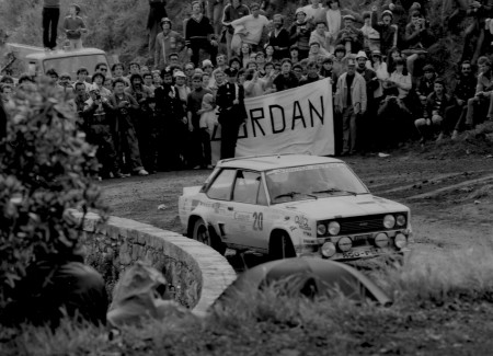
While a lot of the cars I feature in my posts have some sort of tie-in with rally racing, I’m more a fan of european car design from the 70’s and 80’s in general, and in those days the WRC was a cost effective way for carmakers to achieve a global presence in motorsport. BMW has M Sport, Mercedes-Daimlers has AMG, Nissan has NISMO; Fiat’s tuning division was called Abarth. And in 1976, Abarth turned this mellow grocery-getter into one of the last great carbureted, rear-wheel driven rally cars. It took the World Rally Championship 3 times in ’77, ’78, and after a 2 year drought again in 1980, with a total of 18 victories over 5 years.

As good as the road-going model was, the Abarth 131 is truly a work of purpose-built art, everything from the bespoke brake ducts and flared wheel wells to the subtle spoiler lip added to the boot lid puts this particular variant in my top 10 list of best looking cars ever produced. Whenever I look at an E30 M3, I can’t help but think it looks a little sterile compared to the Abarth.

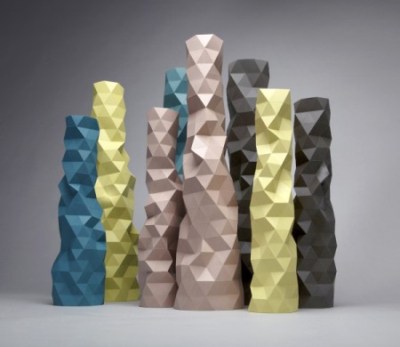
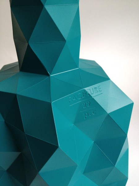
Phil Cuttance: FACETURE series

[vimeo 35912908 w=450&h=253]

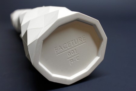
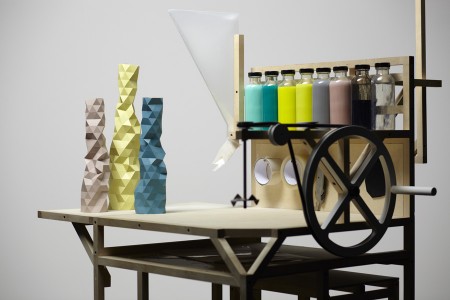
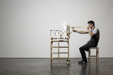
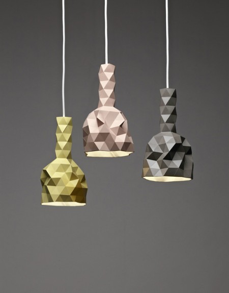
Really beautiful pixelated looking vases from Phil Cuttance. Now based in London, the New Zealander’s FACETURE series consists of vases, side tables and lightshades, all handmade using his custom FACETURE machine and molds. The reusable molds are made from an extremely thin polypropylene sheet, which when handled, allow him to reshape the form due to the malleability created by his “live hinge” system. The results are that no two objects cast are the same.

In the era of stereo lithography and other 3D printing methods, Phil’s analog workflow is inspiring, and the process seems just as important as the results, which are impressive to say the least. Head over to his site for a more in depth look at the process.

Posted by Rob Fissmer

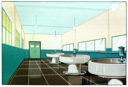
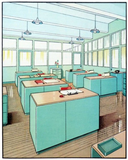
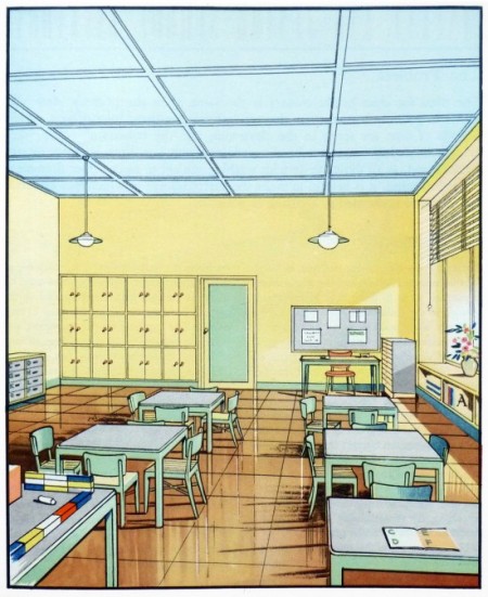
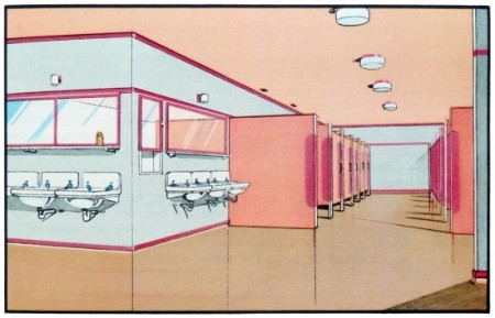
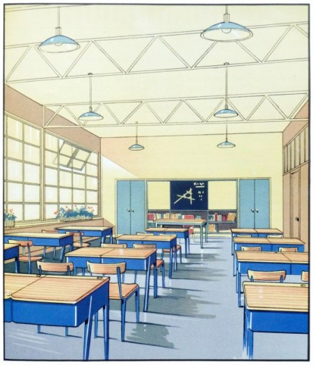
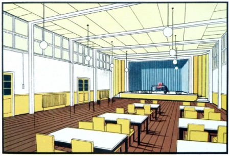
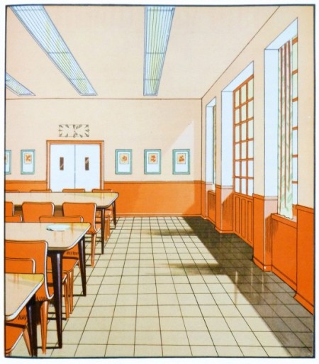
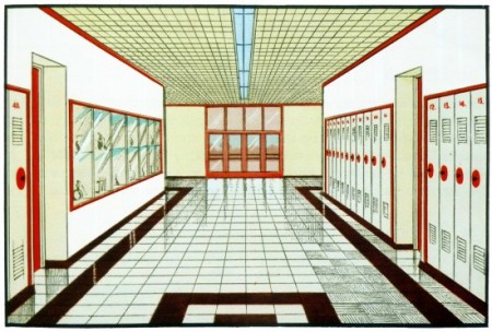
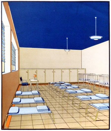
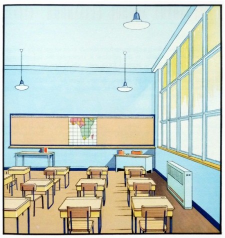
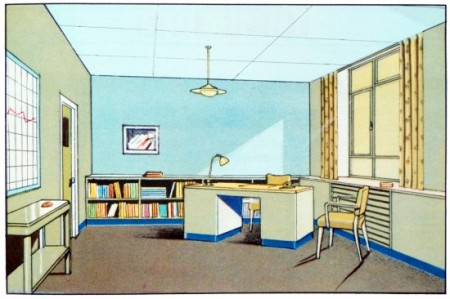
1930’s Interior Architecture Illustrations


Stunning coloring on these illustrations from the 1930’s, making what some people find mondane very eye catching in my opinion.

“Scans from The function of colour in factories, schools & hospitals; 1930”

via Present & Correct

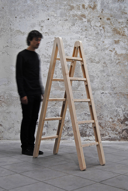
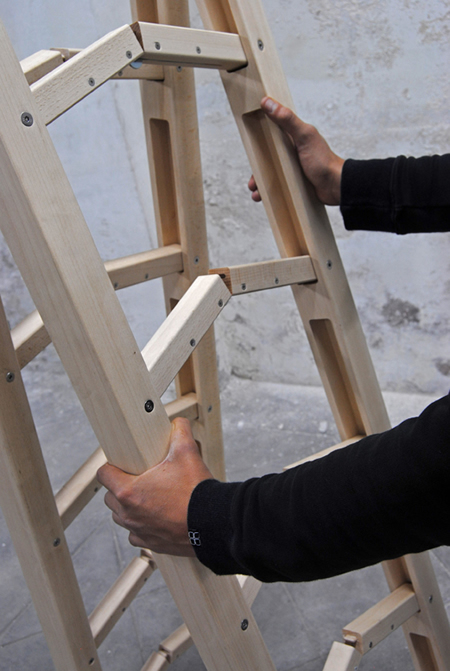
Jakub’s Ladder

The perfect ladder concept by Co & Co. I don’t care how much weight it doesn’t support, where’s my order form.

Vitsoe LA: On music & media storage


[audioplayer post=28265]
I’ve been an ISO50 reader for a long time—long before Jakub and I put on Ghostly International Roller Hockey Team jerseys and took to a rink in rural New Jersey to embarrass the label—and so when Jakub invited me to take a whack at a guest post, I naturally jumped at the chance. (Meanwhile, does anyone want my (priceless) jersey?)

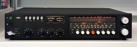
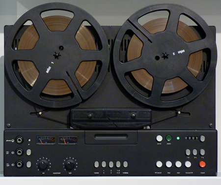
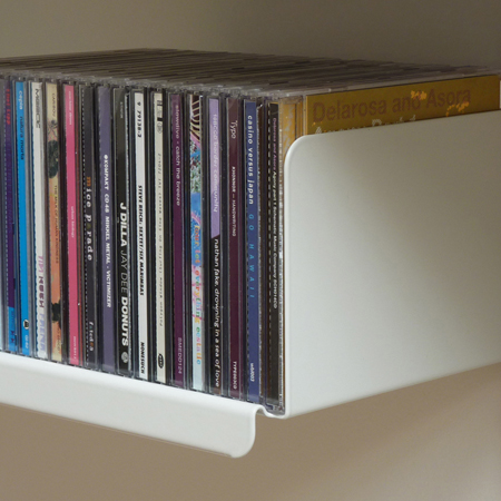
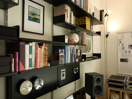
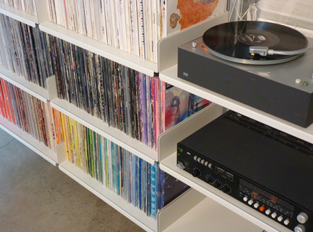
I’ve since moved to California, where I work out of the Los Angeles “Vitsoe apartment,” which is both the home I share with my wife, and a unique space where we show Dieter Rams’ 606 Universal Shelving system deployed in all ways. From straightforward bookshelves, to workstations, to room dividers, kitchen shelving, and closets, it’s pretty much all represented here (we specifically chose an apartment without any built-in storage).. As a former dj and avid collector of music, my favorite use of the system is for media storage. After all these years of collecting vinyl, I’m finally able to put it all on shelves that will not bow under the weight. Vinyl collectors: contact me, it’s more affordable than you’d think!

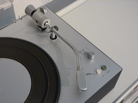
I thought it might make sense to do a first post about some of the songs that have been keeping me going while working out of the apartment—and since it’s a Vitsoe apartment, share some images of the shelving put to use for various media, plus the beautiful Dieter Rams equipment we listen to it all on.

LornWeigh Me Down (Illum Sphere Remix).
Unbelievably beautiful reworking of one of my favorite tracks on Lorn’s new album “Ask the Dust.” I’m huge fan of his heavy hitting beats, but this is a nice change of pace, skillfully re-tooled by Illum Sphere. For a taste of Lorn’s own softer side, check out ‘Pause’ from his ‘Self Confidence Vol.2’ unfinished / unreleased / demo tracks over at the Brainfeeder site. A strange anomaly in a very dark oeuvre.

YppahBlue Schwinn.
I’m a huge fan of Joe Corrales’ work as Yppah, it’s sort of a shoegazy version of Bonobo, a combo that is pure win in my book. This track is from his third and most recent release on Ninja Tune, “Eighty One.” Anomie Belle’s vocals are a great addition in an instrumental sense, I love how she’s just swirling around in the background and I’m unable to make out the words.

Lost TwinSoothing Words.
There’s no shortage of great producers in Brighton these days. I can’t remember exactly how, but I found him via Bandcamp, and to my pleasant surprise, he’s offering the whole ‘Birds’ album for free. I would have no problem paying full price (and then some) for his work. Although obviously entirely different in tone, there’s something a little Burialesque about the auto-tuned quick vocal snippets.

DextroRing Cycle.
I’m not sure exactly why Dextro has stayed off most people’s radars for so long: He deserves far more exposure in my opinion. His first release was on Border Community, then the subsequent releases were through his own imprint, 16K Records. Maybe that’s why. I don’t know. What I do know is that his sound manages to successfully bring together elements of Ulrich Schnauss, Slowdive, and dare I say it, BOC. His last album, Winded, from 2009, is a real gem. I’m hoping he follows it up soon, it’s been too long.

A Sol Mechanic[Almst(Touching)].
I’ll never tire of a good “Everything in Its Right Place” sample. In his own words “it’s less of a remix and more of a branch off. N E Ways.” That’s a good way of describing it, because after that amazing initial drop, the sample gets filtered into the background and the minimal stutter beat takes over.

Geskia!Melamine.
Geskia’s sound is unabashedly Scoott Herren influenced, and most of his work occupies a space dead center between Prefuse and the long gone DeLarosa & Asora projects. This is a compliment, as he pulls off what so many other fail to do successfully.

Jai PaulBTSTU.
There’s been a lot of buzz about this kid from London, and deservedly so. I saw a tweet from Four Tet that said simply: “that Jai Paul track,” which of course sent me into a Google frenzy. What I discovered is that there are literally only two tracks under his belt to date. It sounds like he’s in good hands over at XL, in a recent NPR spot I heard them describe how they are giving him loads of space and time to do what he needs to do, because that’s just how he rolls. He really has a grasp on the “Less, but better” approach.

AutechreSee On See (Pixelord Remix).
The thing I like about this unofficial Pixelord remix of ‘See on See’ from 2010’s Oversteps is that it brings me back to the Tri-Repetae days, when the tracks were grounded in dark emotion, and they would hit you in the gut with crisp, hard beats. They lost me long ago, but it’s nice to be brought back if even for a few minutes.

Rob Fissmer

CHM Artifacts


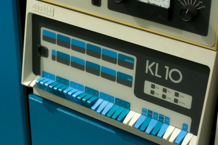
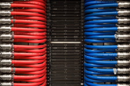
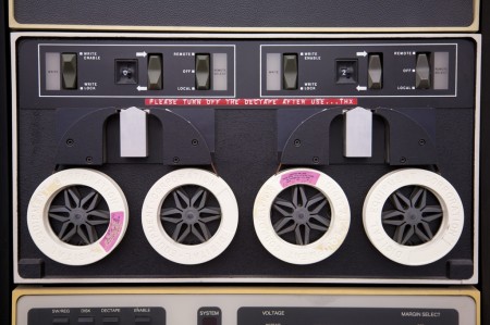
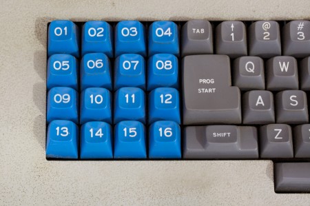
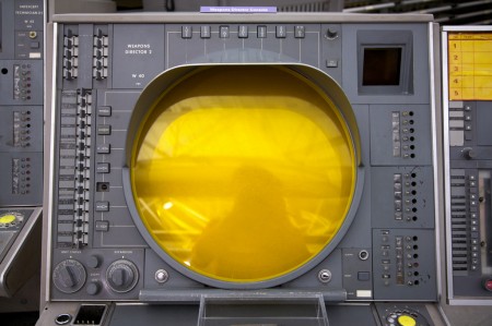
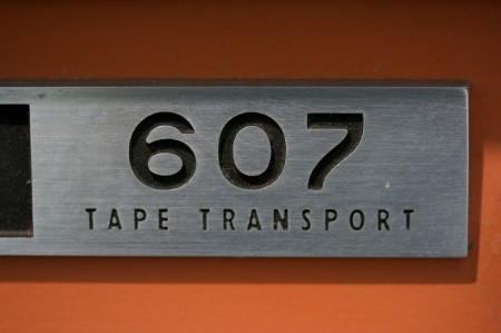
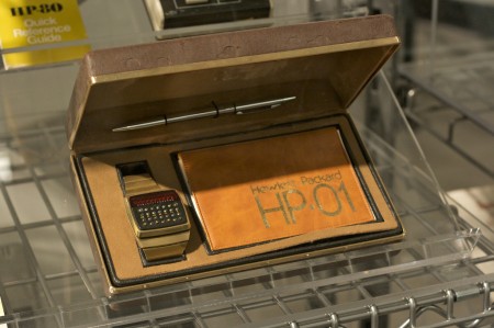
Great set of photos from the Computer History Museum. So great that someone is preserving this incredible hardware. Required reading: Core Memory. And that watch! Amazing…
via CHM: Artifacts

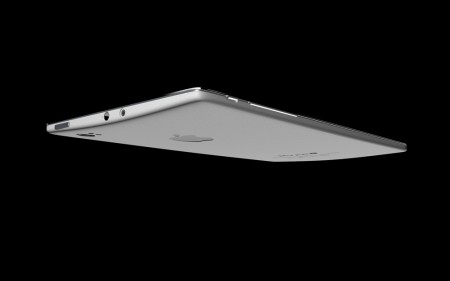
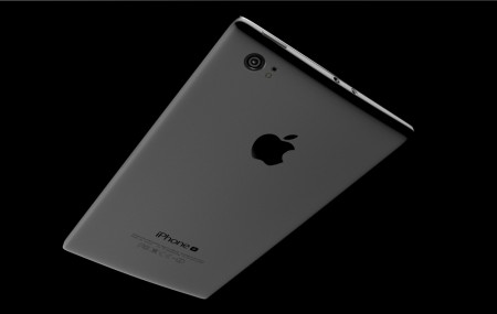
Apple iPhone 5 “Plus” Concept


It’s about that time when iPhone 5 rumors start ramping up. Fortunately I have one right here for you to feast your eyes upon. This iPhone 5 concept or as the creator calls it, the “iPhone Plus”, was created by the same guy who dreamed up the Instagram Camera.
Here’s a quick feature list for you dreamed up by the creator:
– Liquid metal Body: thermoformed on a single plane, no junctions needed
– Screen with double alkali-aluminosilicate sheet glass
– 4.3″ Retina Display with In-Cell technology
– A6 Quad Core processor
– Rear Camera: 10.0 Megapixel, f/2.4, 1080p Full HD video at 30 FPS
– Front Camera: 2.0 Megapixel (VGA), 480p VGA video at 30 FPS
– Rear motion sensor
– Top pico-projector to beam photos and videos on any surfaces
– Slim design for an edge-to-edge thinner profile
– New slim-dock connector
– Fully “Capacitive” home button

What do you think about this iPhone Plus concept?

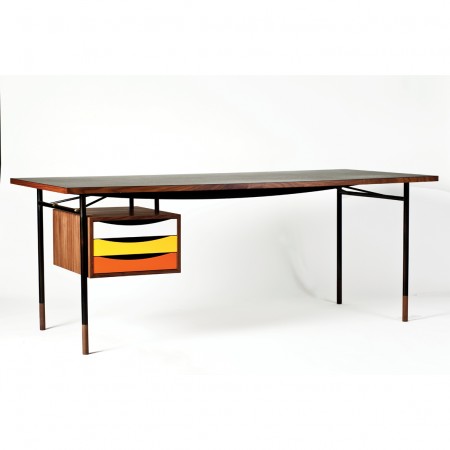
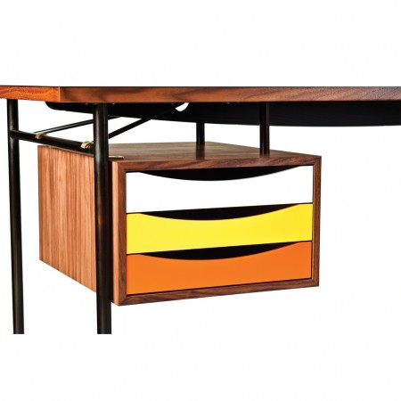
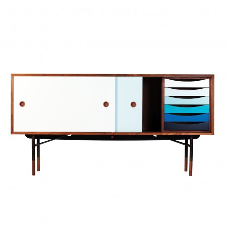
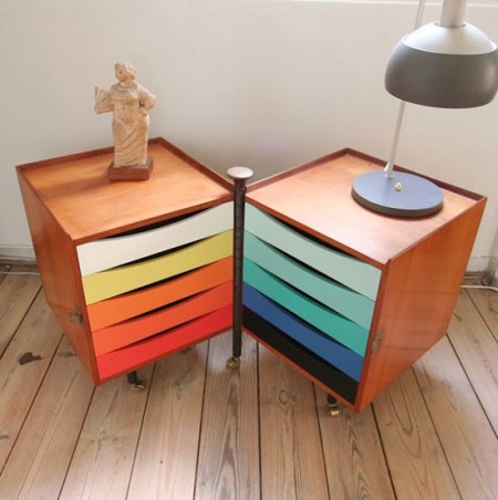
Drawers by House Of Finn Juhl


Lately we haven’t done much furniture postings which when we started I thought would be something we’d beat into the ground with an abundance of posts. Now that the blog keeps getting more and more great posts from the collective i’ll do my best to keep an eye out on some vintage furnishings and new work like these drawers from Finn Juhl which is classy mid modern design with a semi brighter color palette.

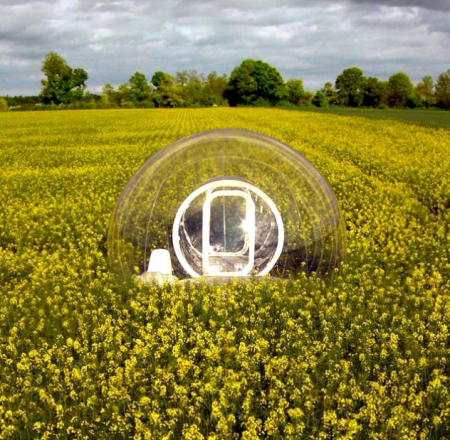
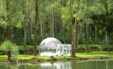
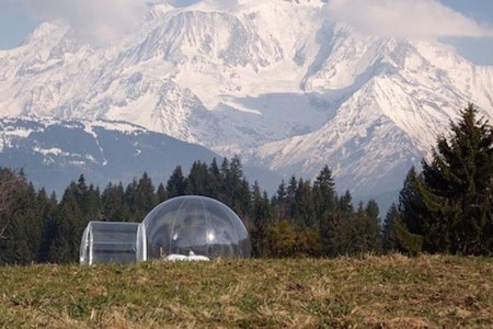
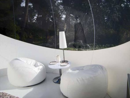
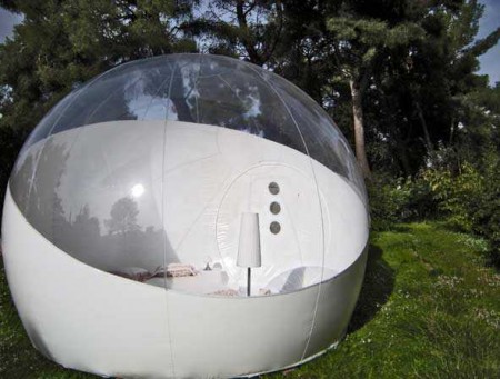
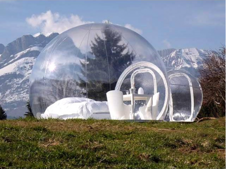
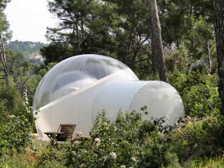
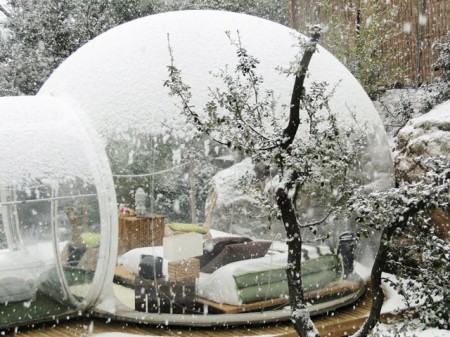
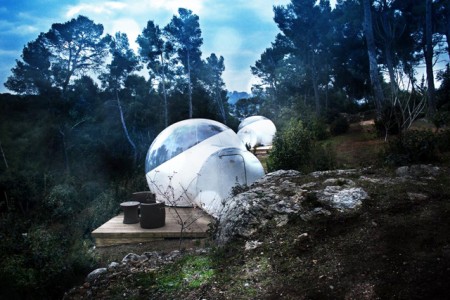
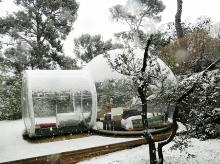
Bubble Tents


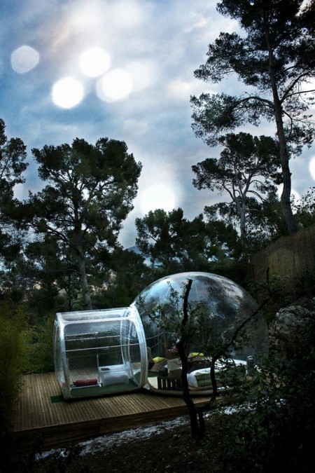
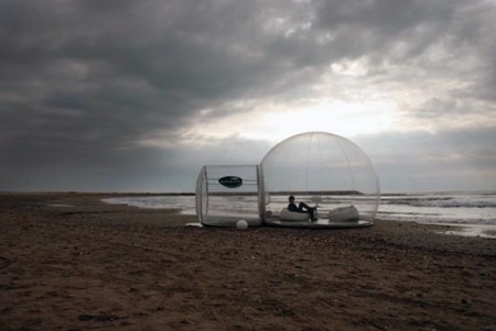
I’m always drawn at the site of micro structures, pods and/or any type of compact-living unit. I guess you could say it’s the kid in me who always loved his club house (I took over a shed in our back yard, and turned it in to my personal headquarters). Also, a few years back, while living in Chile, I took a trip with 3 friends out to Pan De Azucar, a Natural Park where the desert meets the ocean, for what was supposed to be a 2 week camping trip. Fascinated by the sense of community formed by the “tent metropolis” we encountered and later experienced, we extended our stay to close to a month.

At the time, I couldn’t help but think that we were witnessing what ultimately all living communities and societies would end up turning in to, so when I came across French designer Pierre Stéphane Dumas Bubble Structures, I was brought right back to those thoughts.

Pierre wanted to create a Eco-friendly space, following a single charter:

Proximity to nature, minimum environmental impact, landscape integration, economic integration of social aspects.

He also says his “creations” are “unusual huts for unusual nights”. He explains:

Having a night under the stars or seeing the sun rise and set is not something that many people experience anymore.
A normal tent or camper van means people miss out on these things, so I designed this eccentric shelter with the aim of offering an unusual experience under the stars while keeping all the comfort of a bedroom suite. The ceiling of the bubble has the Milky Way, guests will be able to enjoy this as well as the extraordinary light variation of the sunset and sunrise.

What started off as a few tents that could be found scattered around France, has now turned in to a couple of hotels in the same country, Attrap’Rêves in Bouches-du-Rhone (near Marseille) and Sky River outside of Loir-et-Cher.

Also, if you’re looking for inspiration or a good read on microstructures, I personally recommend Micro: Very Small Buildings by Ruth Slavid. Great projects, photos and layout.

Posted by B3PO

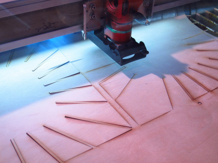
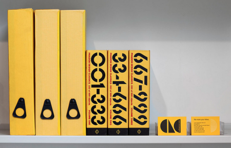
CutLaserCut: We Make Your Ideas


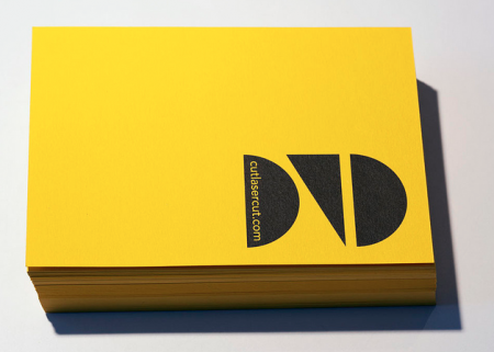
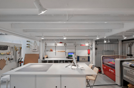
Many of us artists/designers/musicians love dreaming about our ideas becoming a physical piece that you can hold, touch, gift or make available for others to have. I really appreciate the printers, warehouses and studios that have to deal with our minds and files. So here’s to CutLaserCut, a well branded youthful laser cutting company that I dream of using someday soon, check out their Flickr and keep these physical type of companies close, I hope to see more creative uses of what they offer in the future and thats up to us.