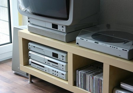
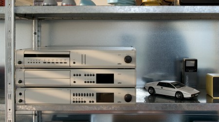
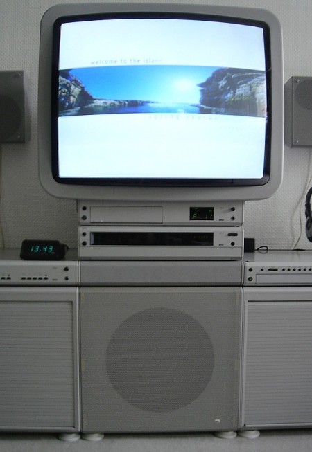
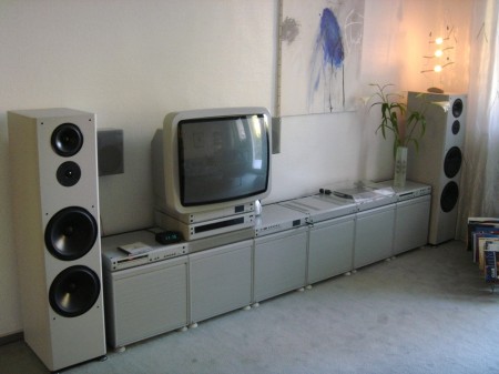
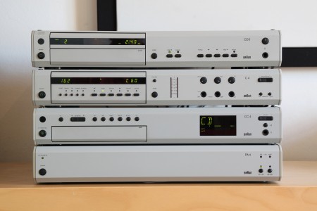

Various shots of the late 80’s incarnation of Braun’s Atelier system in the wild. I don’t have much info on this, which seems to be the series 4, as all of the google results are in German. Perhaps someone can shed more light, translated page here. Absolutely love the TV monitor; that’s a work of art in itself.
Posts in Industrial Design
Braun Atelier
Last Look Inside Atlantis



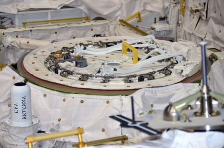




CollectSpace gives us one last look at the now defunct Shuttle Atlantis. Incredible detail in these interiors, I can’t even imagine the level of engineering and testing that went into even the smallest components on this spacecraft. More images here.
Further reading / viewing – Discovery: A Visual Eulogy
Colani Kitchen Satellite

httpv://www.youtube.com/watch?v=JnrSG19fR4s
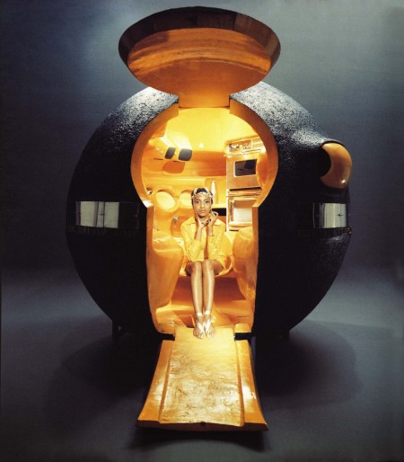
The “Kitchen Satellite” by Luigi Colani, 1969. An exercise in extreme ergonomics, Colani’s kitchen was designed to have everything at arm’s length. The kitchen pod would connect to the main house. This is sort of the domestic equivalent of Vince Clarke’s dome studio, which it is my dream to replicate in my backyard, should I ever have one.
Afghtiga Product Design Collection
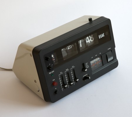
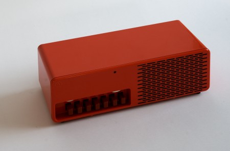
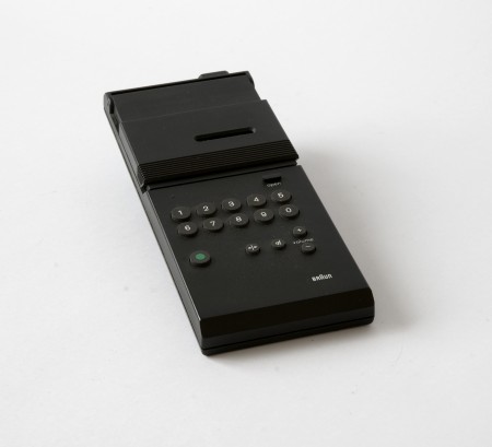
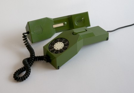
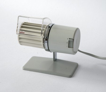
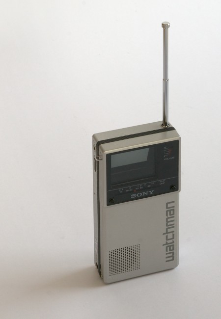
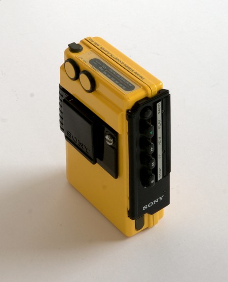
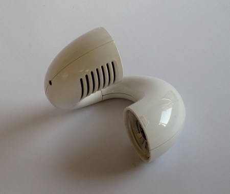
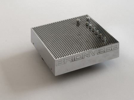
So apparently there is this guy in Switzerland who either owns or has access to many of the most iconic product designs from the 60’s and 70’s. He also takes amazing pictures of them, and posts them in high resolution for us to enjoy / print. This man is a hero.
I always wonder though, would having these artifacts make me happy? Would being surrounded by the objects of my desire actually fulfill my need for order and beauty? Or would I obsess; constantly dusting and arranging them symmetrically on walnut desks made by George Nelson? Probably all of the above, but for now one can only dream.
Whenever I get to lusting over design like this I start thinking about the nature of appreciation. What abstract facet of the human condition allows us to seek and covet objects which may not necessarily provide any meaningful function or benefit our daily lives? I can’t tell you how many fellow designer’s homes I have visited to see various defunct or otherwise unused products neatly displayed on shelves, never again to serve their intended purpose. Why do we surround ourselves with these relics? Devices which through some perverse twist of fascination have been stripped of their intrinsic usefulness and rendered as some fetishized monument to our personal design sensibilities, gathering dust on a mantle.
That’s probably reading way to deep into things so I’m going to take the easy answer and say it’s simply the act of art appreciation. There is just something about the fact that these were originally designed as functional objects that throws a wrench into the whole concept of approaching them purely as works of art. At any rate, I want every single thing up there, in my house, now.
Sony TR-1825 Radio
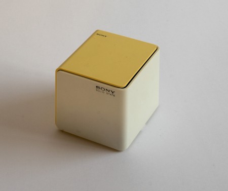
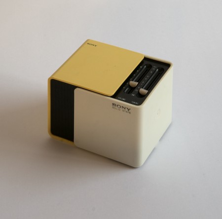
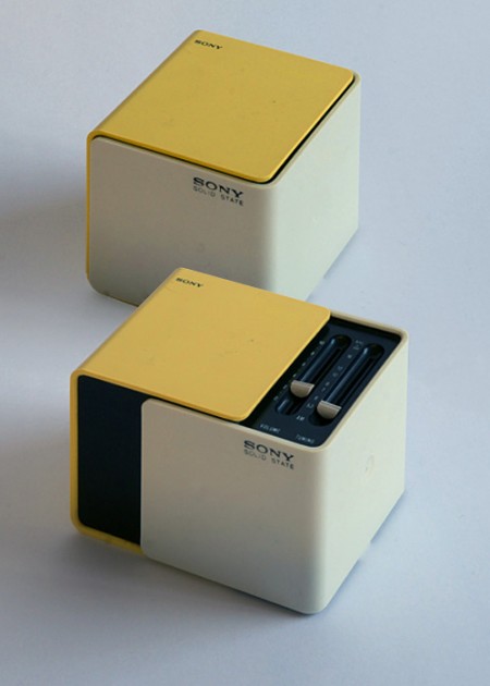
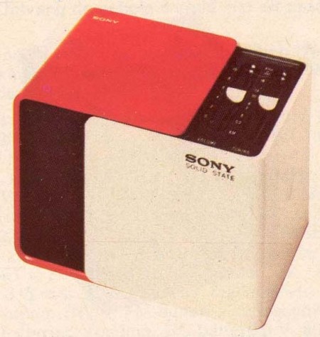
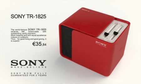
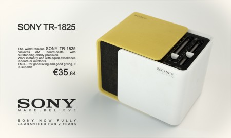
For some reason I’ve always had Sony radios, I’ve had two my entire life and both were Christmas gifts from relatives. Design-wise they have both stood the test of time; the one I had as a kid still sits in my studio as an artifact of quality ID. But neither are anything compared to the TR-1825. Would love to track one of these down, what a great looking piece. My lifelong fascination with all things Braun/Rams has sometimes left me blind to a lot of the other great ID from the 60s/70s, should probably start doing more research on Sony stuff, they definitely have a great design legacy.
Released in 1970, when Sony had become the first Japanese company to list shares on the New York Stock Exchange. Sliding the faces on this cubic radio reveals a speaker in front and controls on top, a unique design at the time. One version of its packaging commemorates the World Expo in Osaka, held in March that year, and many expo-goers picked up the radio as a gift. – Sony Product Design History
Steinberg CMC Modular Controllers

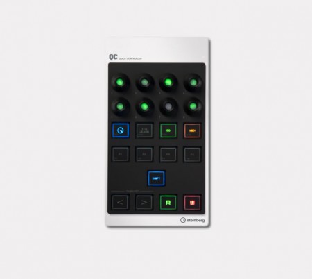


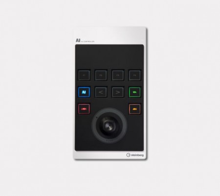

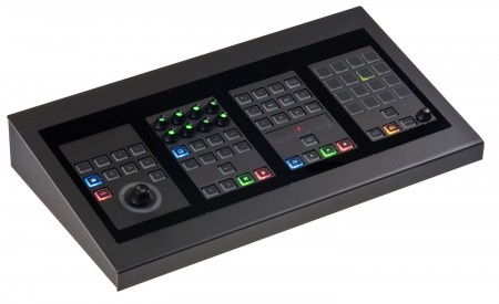
Those of you familiar with midi controller surfaces will know that, by in large, the product design associated with them leaves much to be desired. They are usually garish, overstated affairs seemingly designed to catch the eye of 18 year old ravers passing through Guitar Center. So I was pretty surprised when I saw the new line of Cubase control surfaces from Steinberg. The CMC line of modular controllers allow you to build a control surface using only the modules you deem necessary to your workflow. They even offer a frame to hold up to four modules of your choosing.
Of course, upon seeing these I was immediately reminded of the question I have been asking myself for years: why don’t we as Photoshop users have a system like this? There is something that comes close; the Avid Artist Color, but it isn’t compatible with Photoshop. Can you imagine having a modular system like the CMC that you could customize to run actions, edit color on the fly, manipulate images? Perhaps I’m being a little presumptuous, but I would think a lot of Photoshop users (and creatives in general) could benefit from an open standard for controlling software like Photoshop, Lightroom, and After Effects. The funny thing is that the standard exists already in MIDI, Adobe just needs to implement it and allow us to map controls to functions within their software. I guess after working with music software for so long and having hardware control surfaces as a given, it’s hard to understand why they’ve never made the leap to the world of visual production.
Would you use a hardware controller to work with Photoshop?
Also, here’s a pretty annoying video detailing the CMC system:
httpvh://www.youtube.com/watch?v=iOtaD2rwW5I
Braun Product Collection

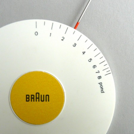
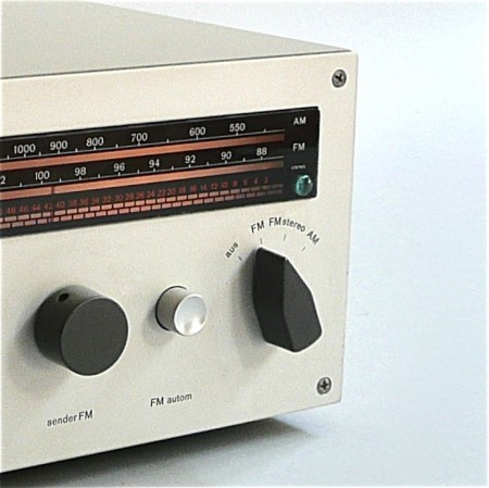
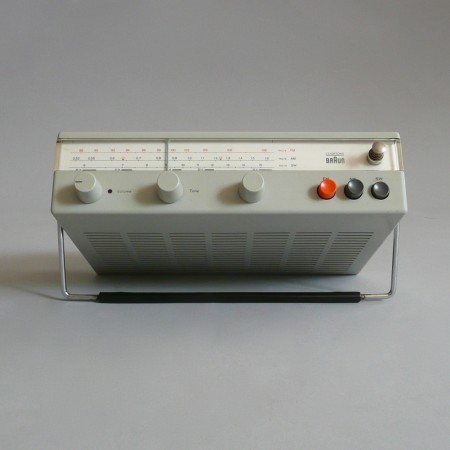
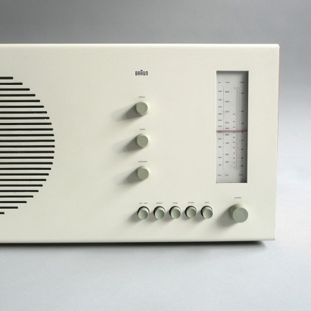
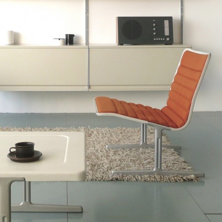
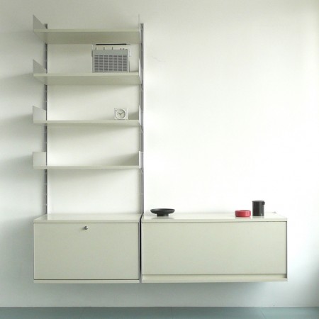
Shelby picked out some really nice shots from Das Programm, which features beautiful images of various classic Braun design icons. Can never get enough of the old Braun / Rams stuff. Alex got me Less and More and I’ve been meaning to scan some of the shots in there and blow them up on the Epson 9900. Soon!
Das Programm via Wanken
Bang & Olufsen Auction
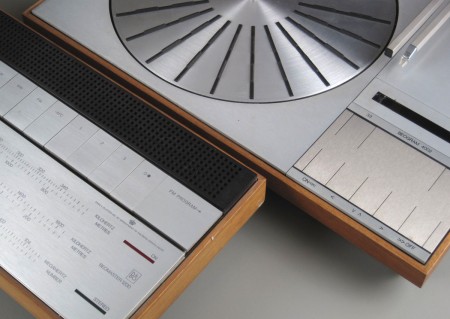
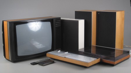
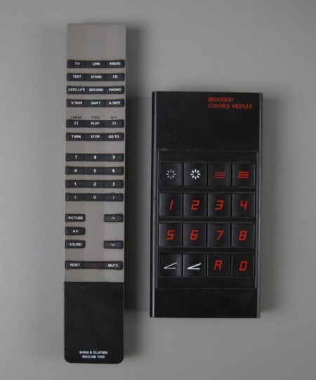
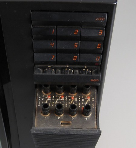
Unfortunately it’s closed, but this auction for various Bang & Olufsen pieces includes some great shots of the iconic stereo equipment.
Images via Lauritz
Futurefarmers
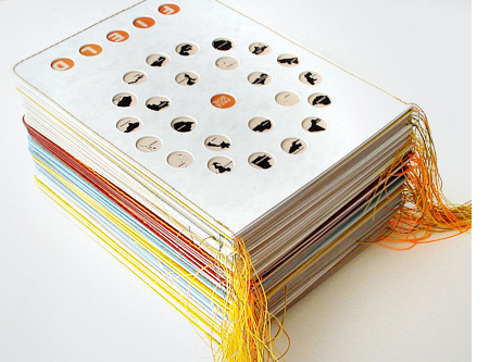

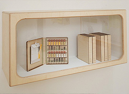


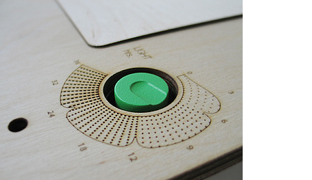
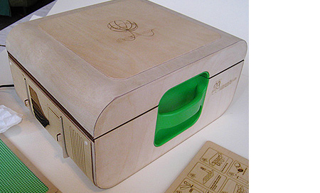

I had the pleasure of meeting fellow San Francisco artist Amy Franceschini yesterday. Amy is from the design studio Futurefamers, a group of people who create “platforms for sociability within new media spaces; internet, wireless devices and public space”. I remember being aware of — and influenced by — their work when I was starting out in design but this recent meeting prompted me to take a look at what they’re been up to in the years since.
As you can see, their output doesn’t exactly fall within the scope of your average design studio — although they did design the Twitter logo. This excerpt from Amy’s bio sums up the themes I find most interesting in the work “[she] creates formats for exchange and production that question and challenge the social, cultural and environmental systems that surround her. An overarching theme in her work is a perceived conflict between humans and nature.”
Aesthetically pleasing and challenging at the same time, really great to see people doing work like this.
MoMA Jacob Jensen Collection
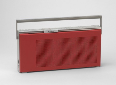
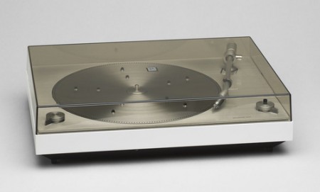
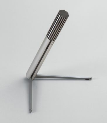
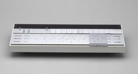
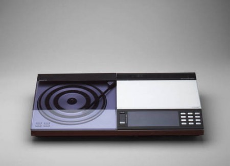
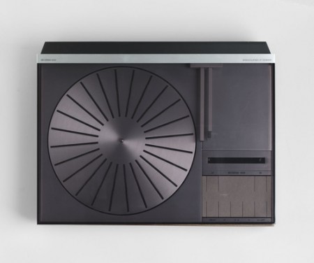
The MoMA has a collection of some of Jacob Jensen’s forward thinking product designs for Bang & Olufsen during the 60’s and 70’s. That red Beolit 400 is incredible.
Some more pics and info at the MoMA site