Posts in Industrial Design

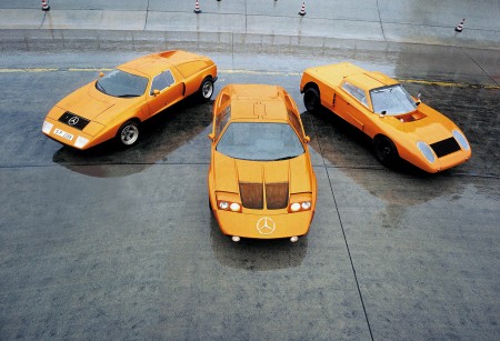
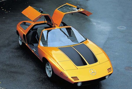
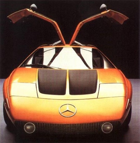
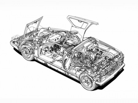
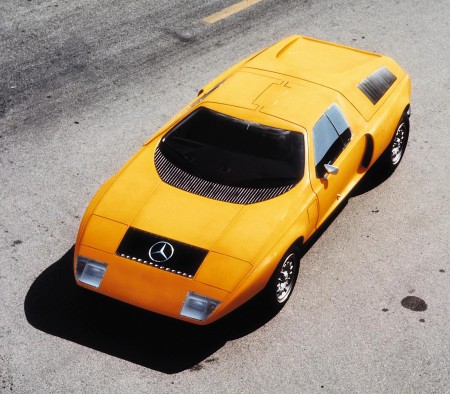
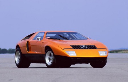
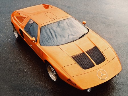
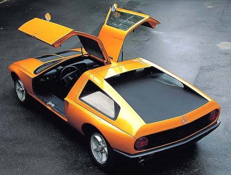
1969 Mercedes C111


httpvh://www.youtube.com/watch?v=mXES_GP36wI

Was reminded of Mercedes’ beautiful 1969 C111 gullwing design after their recent concept unveiling. Beautiful Pictures; I’ll go ahead and file this under “things you can’t have, ever”. I’ve always loved cars; I used to collect die-cast models when I was a kid. I guess I picked the wrong thing to be obsessed with though because it’s becoming increasingly apparent that a 1959 Testa Rossa just isn’t in the cards for me.

I suppose it’s for the best though; nice cars are so impractical and besides, this is the sort of thing that has me dreaming these days. ($8700 MSRP!!! why do you torture us?) I feel like we as designers sort of got a raw deal; we’ll never be able to afford what our taste dictates as acceptable to us (except for that one guy who redesigned the Louis Vuitton monogram maybe? He could probably buy the car and the guy driving it). And then you see MTV Cribs and these people’s houses look like they hired Scarface and the set designer from Full House to do their interiors.

More images here

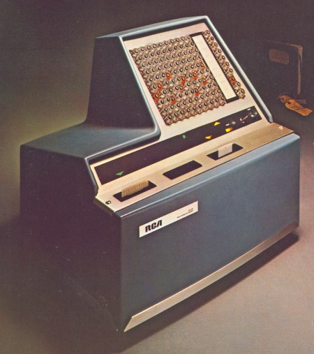
RCA Spectra 70


Beautiful shot of the RCA Spectra 70 computer (1965). They need to start making ATX cases that look like this and the DEC PDP-8; people would start putting their computers in the middle of the room.
These are the same guys who later brought you this (unrelated but awesome commercials — including Superman Peanut Butter — follow):
httpv://www.youtube.com/watch?v=6g5FpYvaGy0

Also, apparently “pause” was once known as “stop action” and qualified as a “special effect”. Wait’ll Quigley sees this!

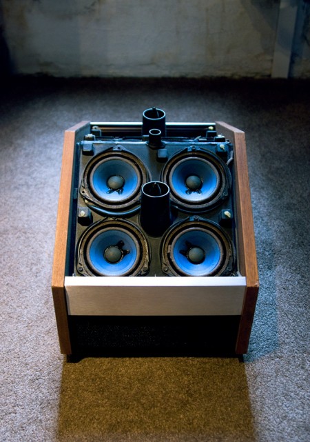
RIP Bose 901 V


Opened up my Bose 901 Series V’s today and found that all the driver foam was completely disintegrated. So sad, such a beautiful set of speakers. Apparently you can re-foam them but seems time consuming and I’m not sure I have the skills anyways. Anyone have any experience with this? Mr. Coles?

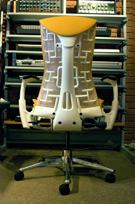
Herman Miller Embody Review


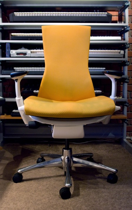
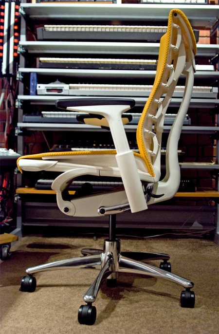
It’s been about 4 months now since I was able to get my hands on the Embody — Herman Miller’s latest flagship work chair — and now I feel like I’ve spent enough time in it to give a proper review. The Embody seems to be the logical successor to the throne of the ubiquitous Aeron chair and I have to say it’s a worthy one. I’ve had various repetitive stress related injuries throughout the course of my career so I’ve always been very sensitive to ergonomics. I’ve had Aerons and various other chairs but I’ve never really been truly satisfied with any of them. So it was with a healthy dose of skepticism that I approached my experience with the Embody.

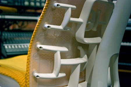
Before I got the Embody, I had a hard time finding any definitive information as to whether it did in fact live up to the initial hype surrounding it’s release. I guess chairs are pretty subjective, there’s never really a one size fits all solution. I heard a lot of people debating whether it was better than the Aeron and Humanscale’s Freedom Chair, and still more debating whether it was worth the decidedly high price point. But everything I had read pretty much went out the window when I sat in the Embody. It really is as incredible chair, it’s the first one I’ve had that I’m not constantly aware of. It acts almost as an extension of your body allowing for much longer periods of sitting without the common issues I’ve had with most chairs in the past. The unique seat back isn’t just there for looks, it does wonders for my back which was usually the biggest issue when working for extended periods. The arms are very flexible and can be easily dialed in for a perfect height which goes a long way to alleviate wrist pain issues. All in all, the fit and feel are top notch and honestly like nothing I’ve ever experienced. The bottom line is that this chair allows me to work longer and focus better. And the Embody is definitely a step up from the Aeron and light years beyond the Freedom Chair (which I really don’t like at all) or the Mirra (which many recommended as a cheaper alternative to the Embody).

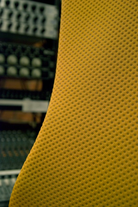
As much as I love the Embody I do have a few issues with it, none are deal breakers for me, but you should be aware of them if this chair is on your short-list. First up is the design. Yes, I ordered the orange/white which in retrospect was a mistake. It can really overwhelm the space visually. The chair is also rather large so between that and the color, it certainly is a presence in the room. I have since seen the black on black version which is much more subtle and highly recommended. Second is the mobility of the chair. In the studio I have to move around from station to station a lot and the sheer weight of the Embody makes this difficult. The thing is build like a tank which is great for durability, but it’s not a chair you’re going to be gliding around the office in. Or course, this would be less of an issue on hard surfaces, but the downstairs at the studio is carpeted and you almost have to get out of the seat to move it around. I do have the optional chrome base and I would imagine the standard plastic base is a bit lighter. Finally, at around $1100 (which is at least better than the insane introductory price of $1700 and can be much less with an industry discount, see below) it is prohibitively expensive. But as they say, “buy it nice or buy it twice”. As someone who makes a living sitting in a chair all day it’s not hard to justify spending a chunk of that living on a high quality chair. It allows me to get more work done and avoid injuries that in the past would put me out for a while making it well worth the premium.

All things considered the Embody is a huge winner in my book. It’s the most comfortable and functional chair I’ve ever used and will be in my studio for a very long time.

I am told that discounts are available on the chair through Herman Miller. I got mine direct and at the time they had a promo deal going on that brought the price down to $800 fully loaded. You might try contacting them directly to find out whether they have any promotions going on or whether you can get a designer discount.
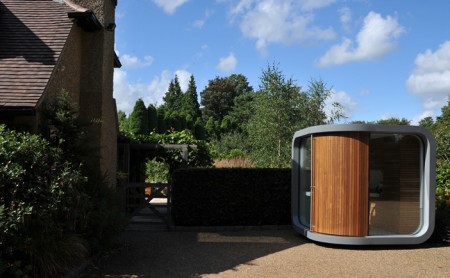
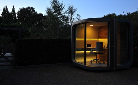
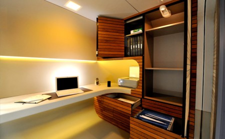
Prefab Office Pod


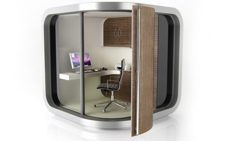
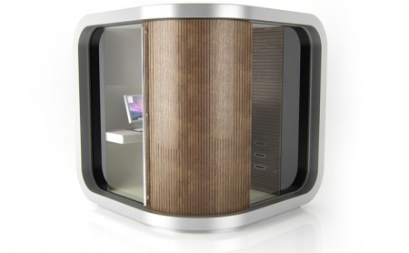
My dreams have been answered, the good people at OfficePod are keeping the hopes alive for prefab dreamers by making more Prefab shelters. For a measly 15,000£ you can have this beautiful office space, seriously I want this, maybe they have layaway? or need someone to display it in Brooklyn? count me in.

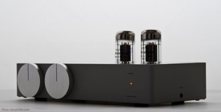
Elekit Tube Amplifier


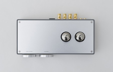
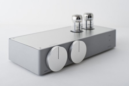
This gorgeous piece of hardware is the Elekit Tube Amplifier, designed by Koichi Futatsumata. I’ve always been obsessed with tube amps but I’ve never seen one look this good. Of course, it would look best if the rest of your furniture is of a similar spec — which is not the case for me — but maybe this is so amazing that it can elevate even the most drab of living spaces with its sexy minimalism. The only problem is that I want to buy it right now and it appears to be impossible. I find way too many concept pieces that look amazing but never find their way into the marketplace. At least this one looks like it might eventually be for sale. (But by then Apple may have released their “newest creation” and I won’t have any money left…)

via Kitsune Noir and Minmalissimo

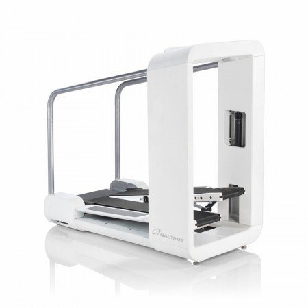
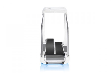
Surprisingly Good: Nautilus Mobia


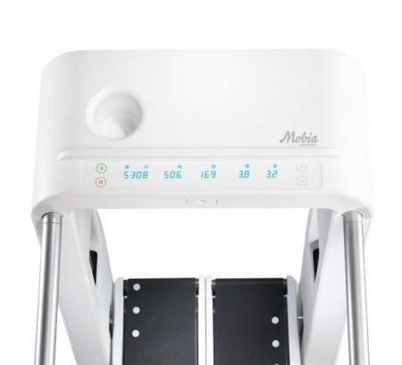
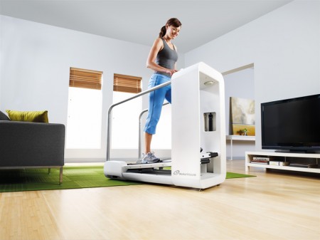
I saw a commercial for the new Nautilus Mobia today and was pretty impressed. Considering the fact that it comes from an industry not exactly known for aesthetics, the Mobia sports some nice lines and an overall iPod-esque (the designer’s own words) vibe that’s pretty attractive. Designed by famed ID firm Frog Design, the elliptical/treadmill hybrid even scores in the interface department with a clean, no nonsense display.

Unfortunately, the Mobia branding falls flat on it’s face. Perhaps another firm designed the logo and Frog was forced to apply it to their creation, I don’t know. I do know that it just about ruins the entire experience. The logo — which appears to have been designed by a marketing team years before the unit itself and completely independent of any input from the product design team — fails to align stylistically with any of the machine’s physical characteristics. And what’s with the name? Mobia? It sounds like a new VoIP solution or some sort of dolphin harness. It doesn’t sound athletic or sleek at all. Oh well, I would still take one and just scratch off the logo. Then I really wouldn’t have to leave the studio again.

Less and More


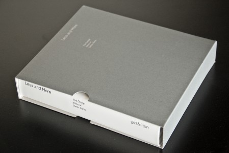
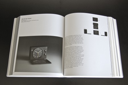
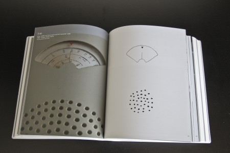
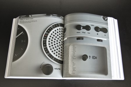
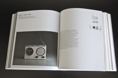
Less and More is the new book about the work of Dieter Rams. The book itself is massive — 808 pages of images and descriptions of Ram’s ground breaking designs. It’s bound beautifully and comes in a really nice display box. Publisher Gestalten wins again. I just received mine from Vitsoe, but you can preorder it from Amazon if you prefer. If you go the Vitsoe route, I would also suggest this poster displaying Ram’s 10 Principles of Good Design.

Less and More elucidates the design philosophy of Dieter Rams. The book is the ultimate collection of images of all of Rams’s products as well as selected sketches and models – from Braun stereo systems and electric shavers to the chairs and shelving systems that he created for Vitsœ and sdr+. In addition to the complete visual presentation of his designs, the book contains new texts by international design experts that explain how the work was created, describe its timeless quality, and put it into current context.
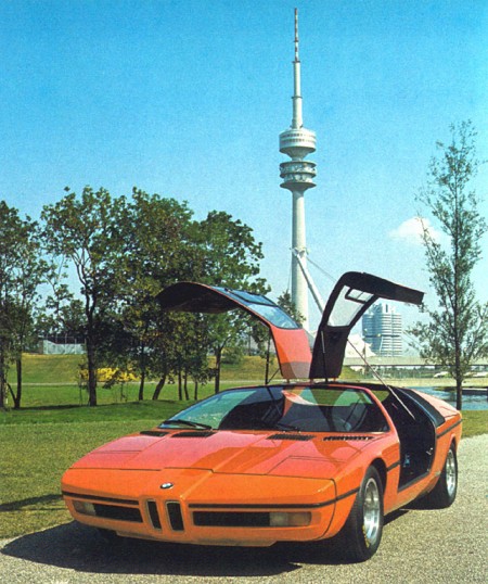
1972 BMW Turbo & The Munich Olympics

iso50-bmw-turbo1
iso50-bmw-turbo8
iso50-bmw-turbo7
iso50-bmw-turbo5
iso50-bmw-turbo9
iso50-bmw-turbo6
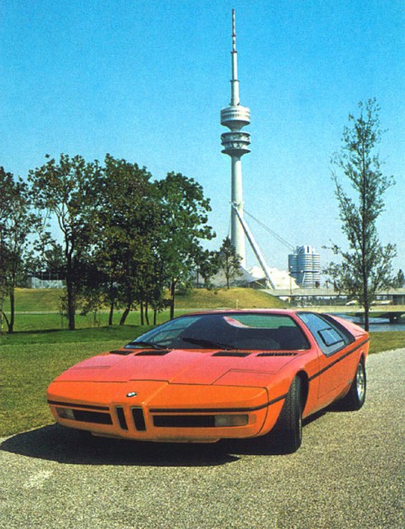
I’ve been geeking out on ’70s supercars lately and came across these gems depicting a BMW concept from 1972. The “E25 BMW Turbo” was commissioned to celebrate the 1972 Munich Olympics. BMW tasked famed automotive designer Paul Bracq to create the concept of which only two were ever built. Honestly, I love the front angles, but not really feeling that rear end. It feels very hatchback/kit-car-ish and the doulbe logos are killing me. Thankfully some of the finer points made it into production in the form of the M1 and some others.
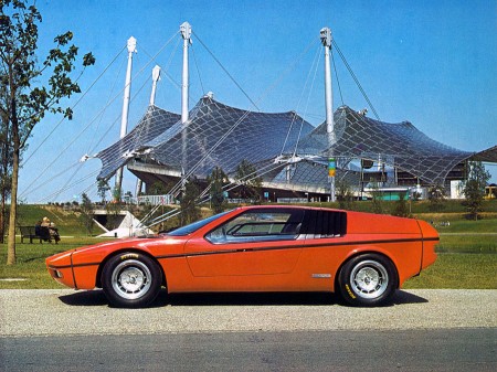
That first shot is just off the charts; in the background you can see BMW’s Munich headquarters which was designed by architect Prof. Karl Schwanzer shortly before his death in 1975. In the other shots you can catch the games tent and the communications tower providing apt backdrops for the Turbo.

Christmas = Linn Sondek LP12

Sondek_LP12_Retro
LP12_SE_FINAL_e-brochure-4 copys
linnkeelmain
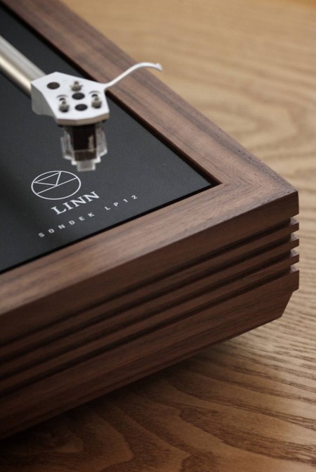
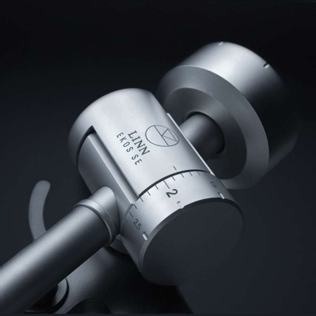
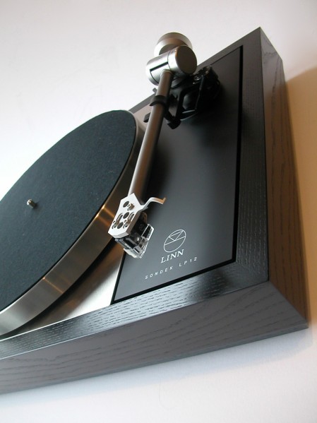
Every year around this time I like to pretend I have a rich uncle or something and then think about what they would get me for Christmas. This year rich uncle would get me a Linn Sondek Limited Edition Retro LP12 with the walnut finish. I’ve been thinking a lot about home stereos lately, I really want to build a solid system for listening. For a long time I’ve lived by a rule that I’d only spend money on things related to making music or graphic design. This means I have a great set of monitors in the studio, but in my living room I listen to music on a $200 set of Logitech speakers. For some reason I never really thought about how ridiculous this was, especially considering how much enjoyment I get out of listening to music.

So I was walking down Market street the other day and stumbled in to San Francisco Stereo & Theater Systems where they had a pair of B&W 683’s on the floor. I plugged in my iPhone (I know, MP3 is not worthy of a hi-fi system, but it’s all I had), cued up Beyond the Wizard’s Sleeve’s rendition of Midlake’s Roscoe and proceeded to melt into the seat. I’ve never heard sound like this. Yes, I have Adam’s in the studio, but that’s a near-field system designed for professional use. They’re meant to sound very flat and honest, they’re not necessarily supposed to sound pretty and warm and they’re certainly not designed to fill up a large room.

So this all got me thinking, I need to build a proper hi-fi. I have an old (but powerful) Denon hand-me-down amp in storage that I could dust off, just add some B&W’s and I’m set. But then I started thinking that I couldn’t bring myself to play MP3’s through a system like that so I would have to start rebuilding my music collection based on FLAC and WAV, which could take some time. Finally I realized this would still involve D/A conversion at some stage (which I was thinking could be handled by a spare MOTU 828MKII) so it still wouldn’t be ideal. This is when it finally occurred to me that I need to get a proper turntable and expand my vinyl collection.

Enter the Linn Sondek LP12, which apparently sounds incredible and — as you can see from the photos above — is absolutely gorgeous. Unfortunately it’s about $2500 so it’s never going to happen. There’s got to be some less expensive alternatives out there, guess I’ll have to dig around a little. At any rate, if my long-lost, wealthy second cousin is reading this, you can ship it all direct or I’ll take a personal check.