Posts in Industrial Design

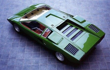
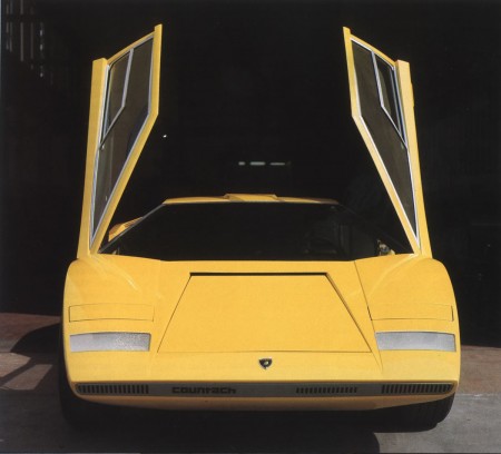
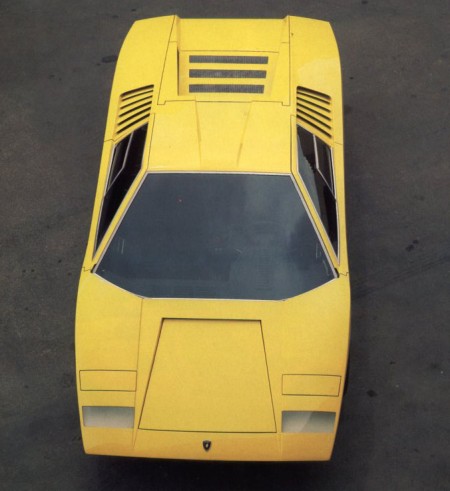
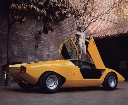
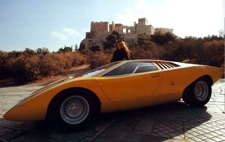
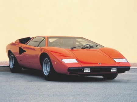
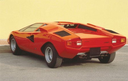
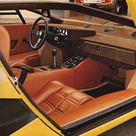
Lamborghini Countach Concept & LP400

Lamborghini_Countach_LP400_02
Lamborghini_Countach_LP400_01
Lamborghini_Countach_LP400_Prototype
Lamborghini_Countach_LP500
Lamborghini_Countach_Prototype
Supercars_Lamborghini_Countach
Lamborghini_LP500_Prototype
1976_Lamborghini_CountachLP4002
1973-Countach-LP-400
lamborghinicountachp2c
lamborghinicountachp2d
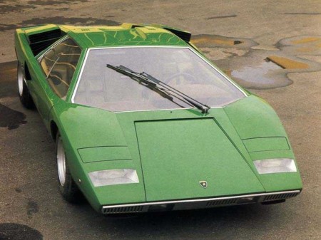
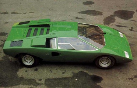
Beautiful shots of the original LP400 and concept models of the Lamborghini Countach before Crockett and Tubbs got back from Kragen with all the wings and spoilers. You may recognize some of the lines from the Bertone post, that’s because Bertone designer Marcello Gandini also designed the original Countach concept in 1971.

This is such a beautiful design, shame they had to go and muck it up with all the over the top junk. Although I guess if it didn’t have all that stuff we wouldn’t have such a perfect cliche ’80s car as a reference point in video games and movies.

Via Lotus Esprit Turbo

Dieter Rams Interviews

6a00d8341c796653ef0120a6f628c6970b-500wi

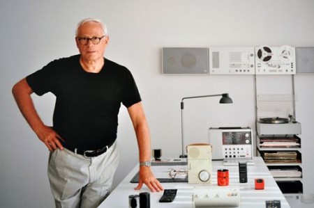
Mid-Century Modernist posted a couple interviews with Dieter Rams. One is by Gestalten and the other by The Design Museum. It’s great to see this pioneer of product design is still getting the recognition he deserves.

By the way, can you believe this guy is still around? He’s the true definition of a living legend. That’s one of the coolest things about graphic design, our heroes don’t overdose on heroin at 27. They seem to live long, healthy lives, maintaining productivity well into later life. Must be all the sitting, or maybe all the designer reading glasses.

“Weniger, aber besser”

Via The Mid-Century Modernist

Sketching and Design

spencer
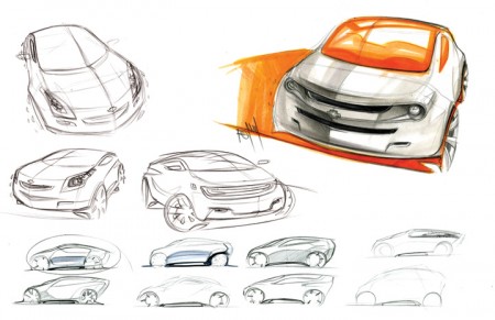
Spencer Nugent posted an interesting article on the Levels of Sketching over on IDSketching (that’s his image above). I don’t know a lot about industrial design, or the complex role sketching appears to have in the field, but I was really interested to read a little more about it. What came to mind immediately was the sketching process we are constantly encouraged to go through at graphic design school. I am always terrified of this part and try my best to avoid it (which is impossible). Of course, though the role of the sketch is different in this case — as it serves as a rough internal mock up rather than a deliverable for a client — it’s importance remains of a high level (for a number of reasons, many of which Milton Glaser explains in this video that’s been floating around the last couple weeks).

The sketching process for the project I mentioned a while back has been pretty intense. Recently I’ve been working through countless concepts and designs, sketching my hands off. I was lucky to figure out my direction/concept early on, but it’s taken me forever to figure out the right way to render it. This has meant ENDLESS amounts of sketches and crappy little mock ups. I guess I lack the patience to sketch well, and my process book looks like I was drawing blindfolded, drunk, and with my off hand.

Seeing the way industrial designers sketch, I am truly envious. To be able to render something that detailed and precise, without a computer sometimes, I can’t imagine. Of course, I am reacting this way because I grew up designing with the computer. “Process” to me has always meant keyboard and mouse, not pencil and paper. I recognize this as a potential weakness in my workflow, and have been trying really hard to incorporate sketching into this project. Results have been here and there so far, and I wonder if I will ever be able to develop my sketching ability to where it’s consistently worthwhile.

I know David Airey for one is a big proponent of sketching, and has written many interesting articles on the subject. How do the rest of you feel about sketching when it comes to the graphic design process? When starting a project (especially a logo design for example), do you start with pencil or mouse (or the hybrid, Wacom Tablet)?
Ripoff Failure: HP Envy 13

500x_IMG_2821
500x_IMG_2796_01
500x_IMG_2792
500x_IMG_2775_01
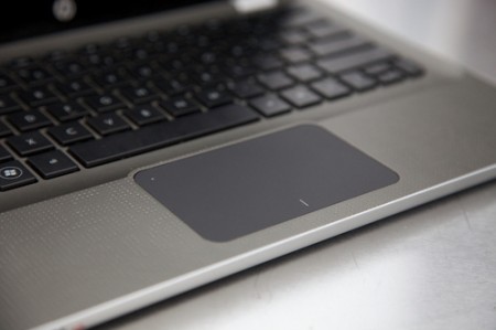
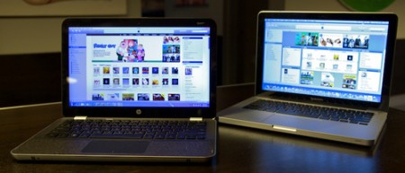
I talked about the HP Envy a while back as a potential alternative to the Macbook and now it’s finally out. I’ve always been a fan of HP laptops, they’re fast and cheap and I’ve had three which have all served me well. But they were all ugly as hell and covered with useless add-ons and blue LEDs; not exactly objects of desire, just practical alternatives to the pricey Macs. So when I heard about the upcoming Envy line I was pretty excited at the prospect of a PC laptop alternative that didn’t suck. Unfortunately, as hard as HP tried to clone the Macbook experience, the Envy seems to have fallen short of the in almost every way. I guess it comes as no surprise, nobody does it like Mac. Gizmodo has all the details on the Envy, including more pics and a review. I think I’

Braun Catalogues

Braun-Design-M.JPG
Braun-DesignTax5-M.JPG
Braun-Aspekte-M.JPG

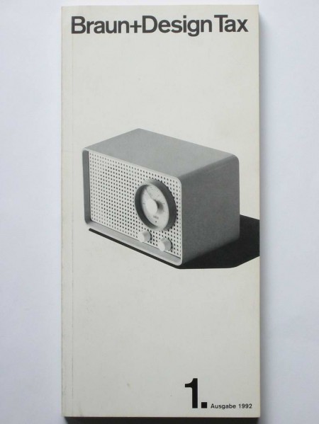
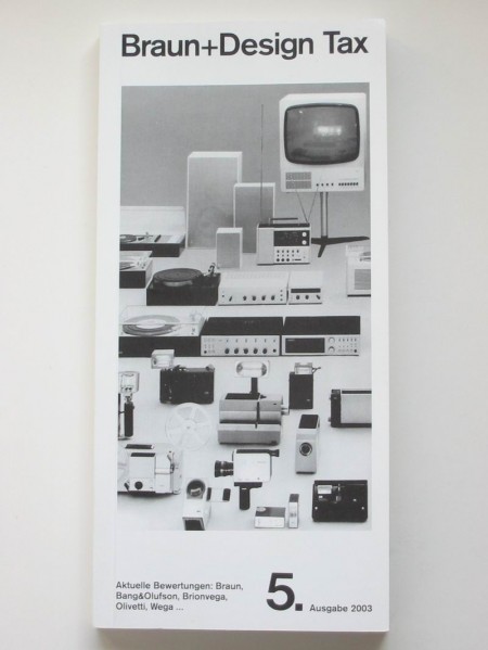
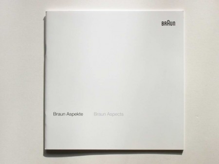
Some very nice vintage Braun Catalogues from Thimet. Looks like Braun’s influence on Apple extends beyond just hardware; I’m pretty sure that last one came with my Macbook. The site also has some great shots of classic Braun calculators (bottom of page) —one of which you will recognize if you’ve ever used the iPhone calculator. My favorite will always be the ET11 though, which clearly influenced the Omron 86R’s design.

The iPods of the 70s

70's iPods
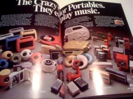
As a collector of 70’s-80’s knick-knacks this selection of portable music players is a dream come true, the thing that makes it for me for the non 70’s fans that might not understand is the color selection and that plastic. It’s almost unbeatable sometimes when in today’s market i’m choosing from gross colors like Beetle shell neon lime green and Bratz doll shiny purple.

Walkman Turns 30

147721300_abbfe3554b_o
0507Walkman_x600
491259365_3d8792a561_b
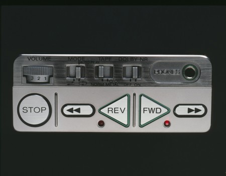
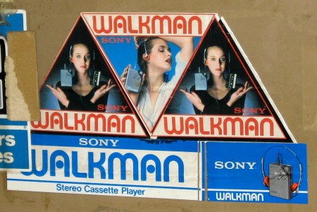
Create Digital Music has a nice piece on the Walkman’s 30th Birthday. Pretty surprising actually, I don’t think I became aware of the Walkman until ’85 or so. Peter Kirn makes a good point: “Sony once had iconic design..” Link

Nakamichi 550

48d8bd455e4ed55148ff02d54392c54e-orig
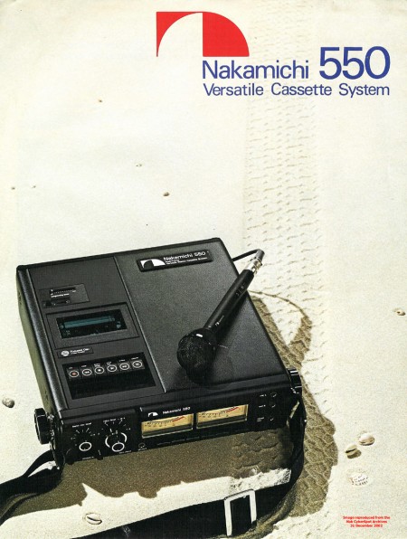
Always loved the Nakamichi logo.

Lost In Time

wsmk map
pinballride
pinball operator

In response to Jakub’s post on 1970’s shopping malls, I’ve long wished I could travel back in time and visit some of these spots, again or for the first time. Vacated malls and abandoned theme parks sit lodged in the subconscious as Ithaca-like pleasuredomes. The idea of all-inclusive commerce appealed to/terrified great men like J.G. Ballard and George A. Romero (who set his gorefest Dawn Of The Dead uncoincidentally in a vacated mall) and continue to haunt the collective imagination.

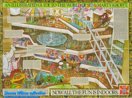
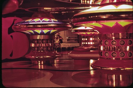
One example of a great lost park is Atlanta’s The World Of Sid and Marty Krofft which opened in 1976 and featured attractions based on the characters of their popular shows and rides like the Pinball one seen in the included pics. The place seems unbelievably spooky and surreal and it’s lack of document only increases it’s eeriness. WSMK might was dubbed the first indoor theme park, which was based inside the Omni International Center (now CNN’s news headquarters) and featured the world’s largest freestanding escalator. Surprising little can be found online but this article sheds some light on the idea for the park. WSMK cost $14 milllon to build (Over $50 million in 2009 money) and closed within six months.

VW 23 Window Bus

23window
I saw this on This Isn’t Happiness today and it reminded me of my friend’s brother who used to be way into restoring VWs. He was always talking about “23 Window” buses like they were the holy grail of VW collecting (well, that and a split window Bug). I’ve seen one of these on the street in my lifetime — here in San Francisco — and one restored and sitting in a garage back home in Sacramento. I always wanted one, but at this point I think I’d settle for a new school one with the pop-top and sink and all that.

On another note: I love VW’s old adverts; they were always simple and to the point. They are all over my old Newsweeks from the 60’s, I’ll have to post some up soon.