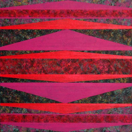
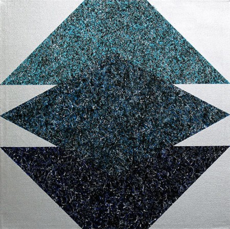
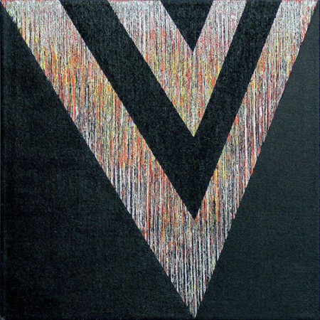
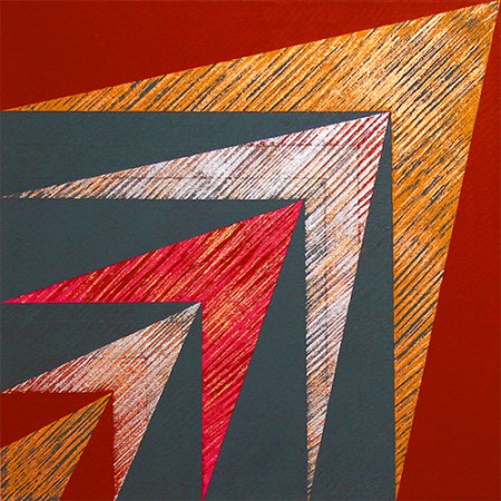
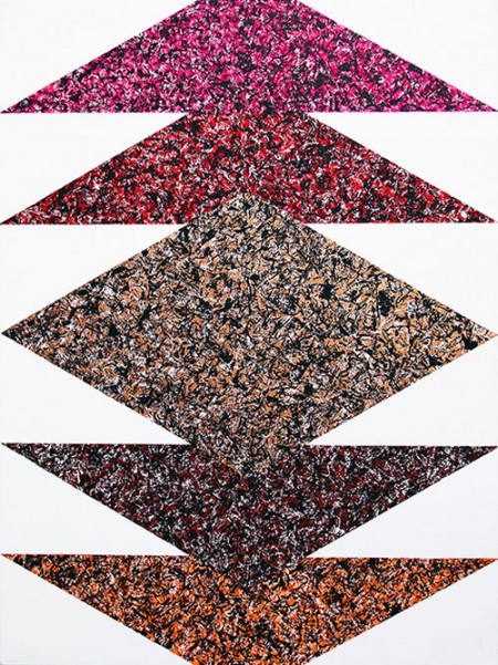
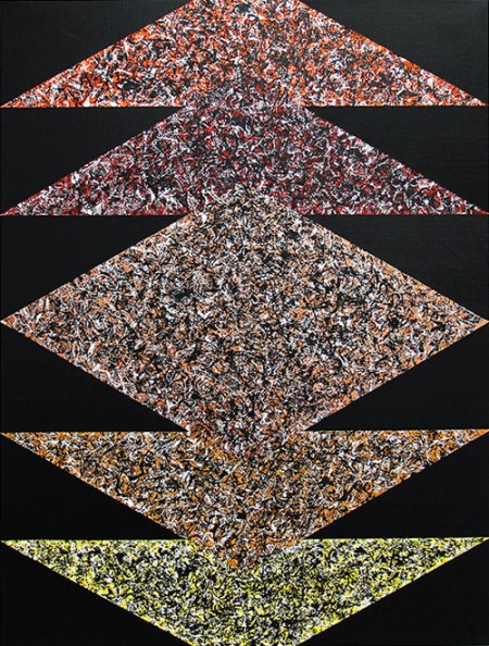
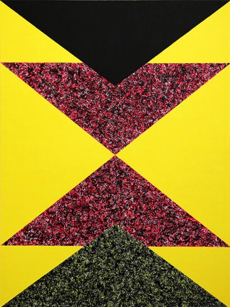
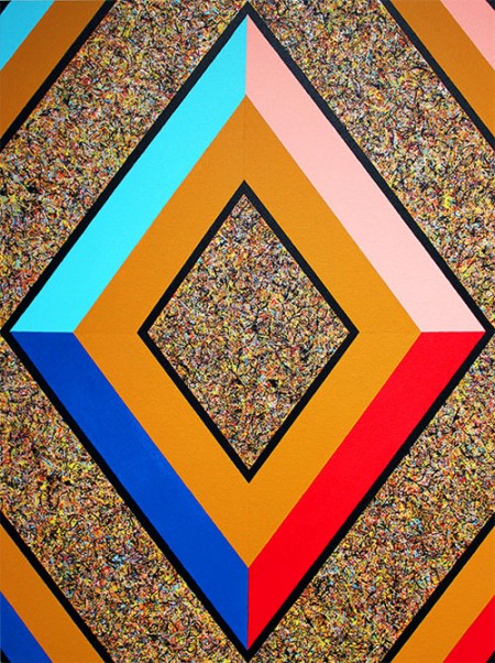
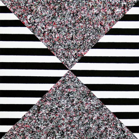
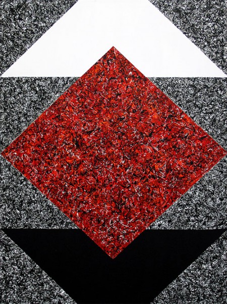
New York City based Sarada Ravindra creates these colorful 80s-inspired paintings that are full of texture and dimension using metallic paint.
Posts in Inspiration
Sarada Ravindra
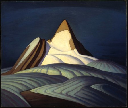
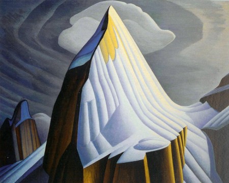
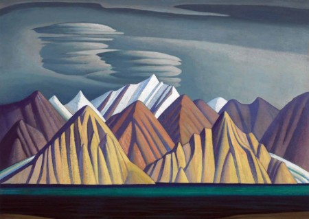
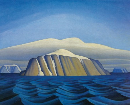
The Group of Seven: Lawren Harris
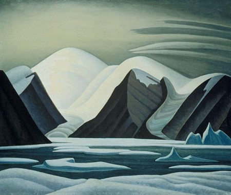
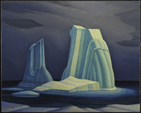
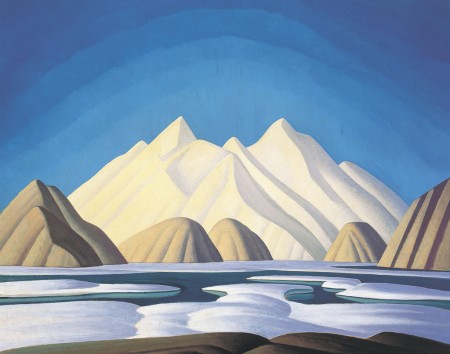
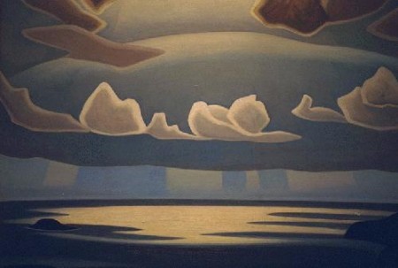
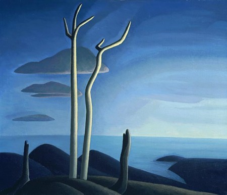
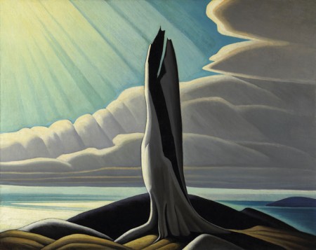
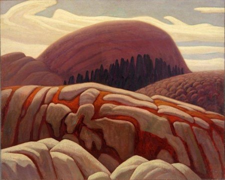
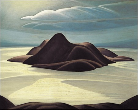
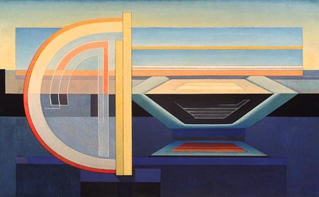
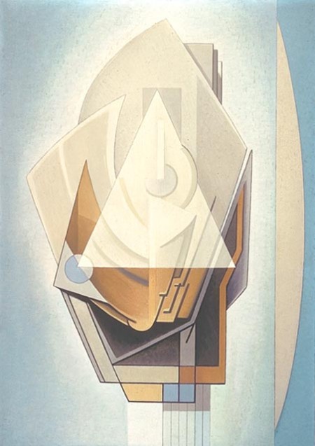
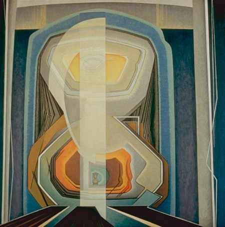
It would be difficult to understate the influence of Lawren Harris’ abstract landscapes on Canadian identity. As a founding member of The Group of Seven, Harris pioneered a distinctly Canadian school of art that departed from European contemporaries of the same era. Minimal in texture and detail, his grandiose landscapes use sweeping curves and simplified abstract forms to capture a wider, almost spiritual representation of a landscape.
Fairly covering Harris’ entire career in a single blog post is tricky, but what I’ve presented here are the some of his best known works from Northern Ontario (Lake Superior) in the 1920’s and the Rocky Mountains and Arctic during the 1930’s. I’ve also provided a look at some of the more abstract, but less celebrated work he painted during the late 1930’s and 40’s. Overall, I find most of what he painted during these years to imbue a remarkable sense of modernism, and something I’m hoping readers of ISO50 can appreciate.
I know some of you are most likely familiar with the Group of Seven and Lawren Harris, but if not I would love to know what you think and if you find the work inspiring.
Posted By: Owen Perry
Instagram: @circa_1983
If you’re interested watching a black and white interview with Harris, here’s something from the CBC Archives (c1961). Please excuse the commercials.
Weekend Inspiration: Michael Murphy
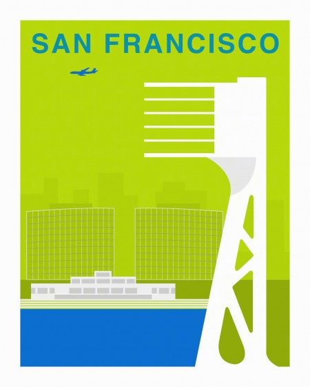
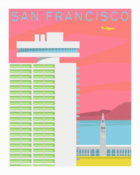
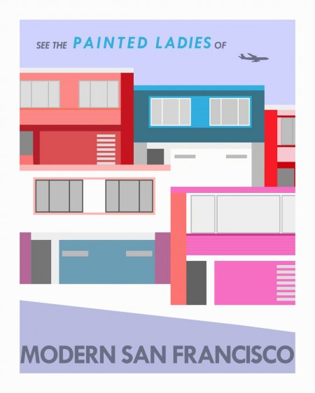
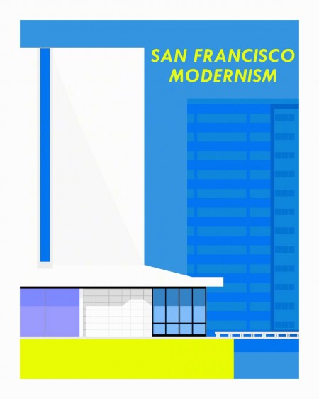
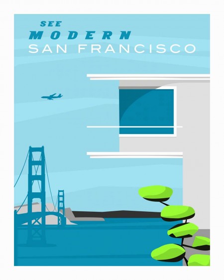
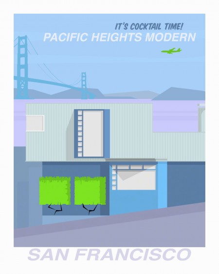
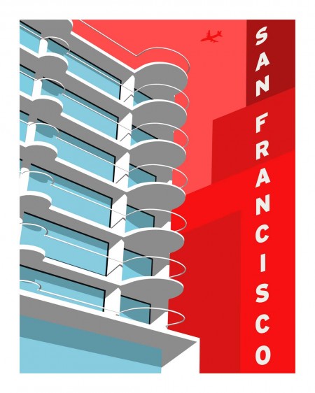
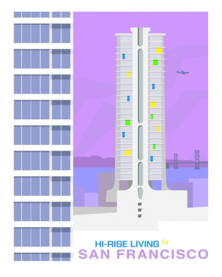
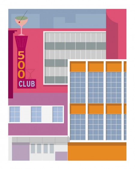
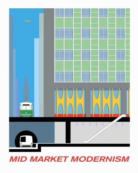
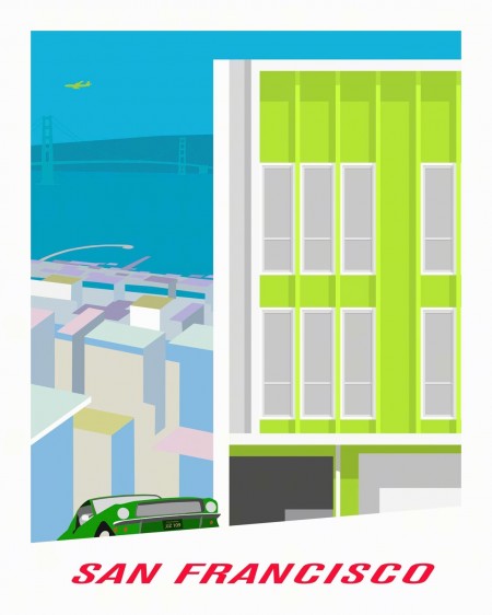
“Forgotten Modernism” is the title of an ongoing visual exploration of San Francisco’s rich catalog of modern architecture by Michael Murphy:
Often overlooked, Modern architecture in San Francisco has played an important role in the ongoing Modernist Movement, and this work is an attempt to acknowledge the contribution that these stunning buildings make to the visual landscape.
Using bold colors and a stylized graphics, I portray this architecture not as something that quietly blends into a background, but rather elevating achievements that embody the best and highest principles that Modern architecture has to offer all of us.
Wish these were sold at every gift shop here in San Francisco.
Adrift on the Hourglass Sea
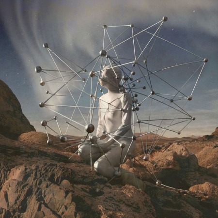
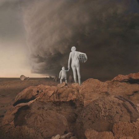
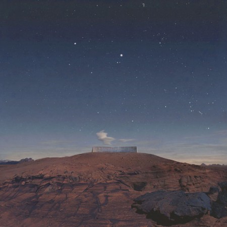
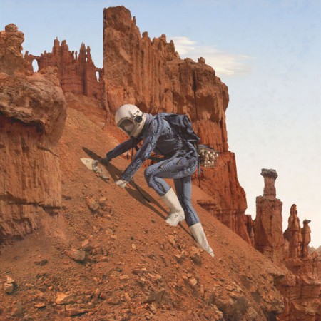
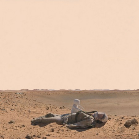
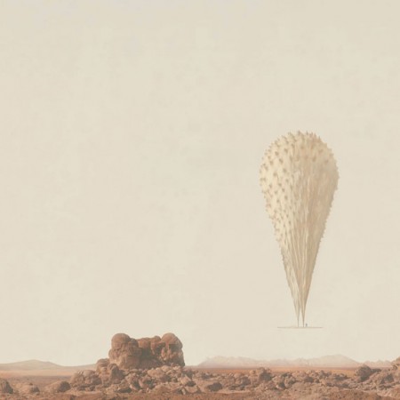
Kahn & Selesnick’s amazing martian-inspired photo series, gluing actual photos of the martian landscape taken by NASA’s Spirit & Opportunity rovers, with WWII bunkers, concrete sculptures, vintage russian space helmets, and landscapes in Nevada and Utah. Mmmm.
Weekend Inspiration: Alberto Seveso
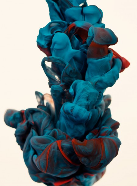
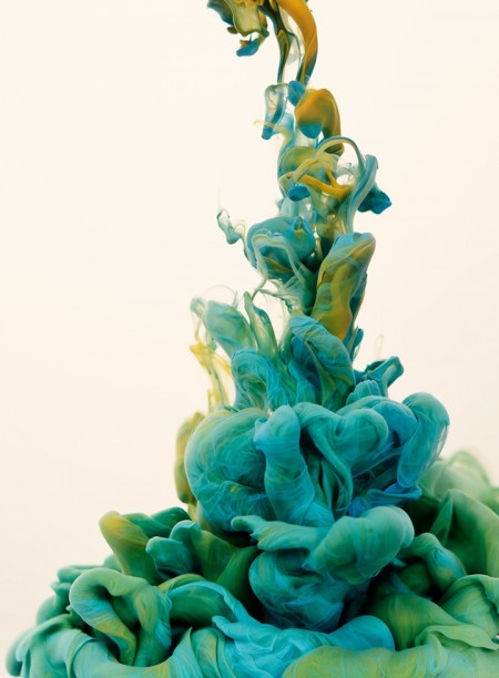
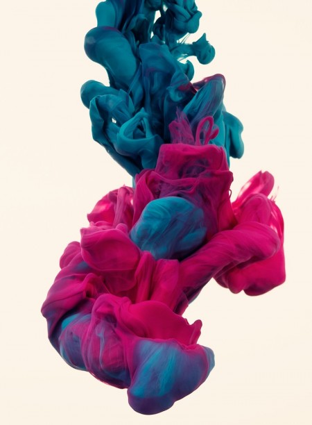
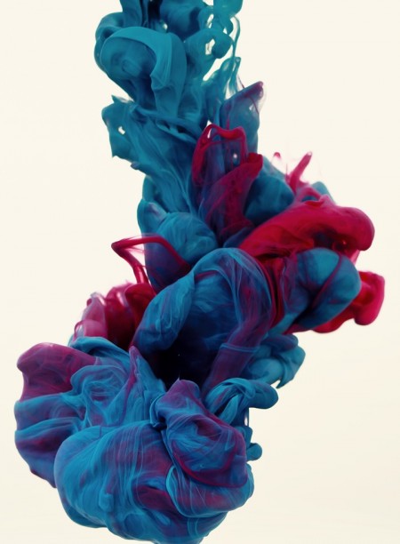
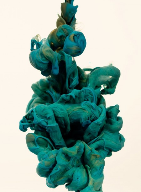
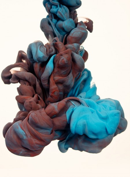
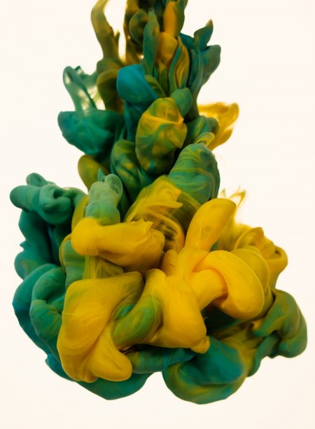
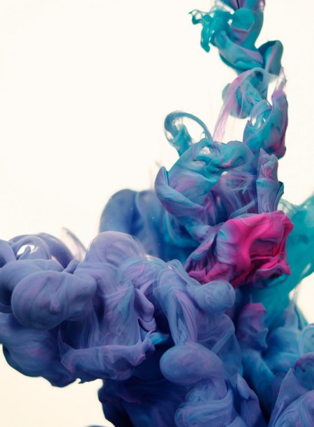
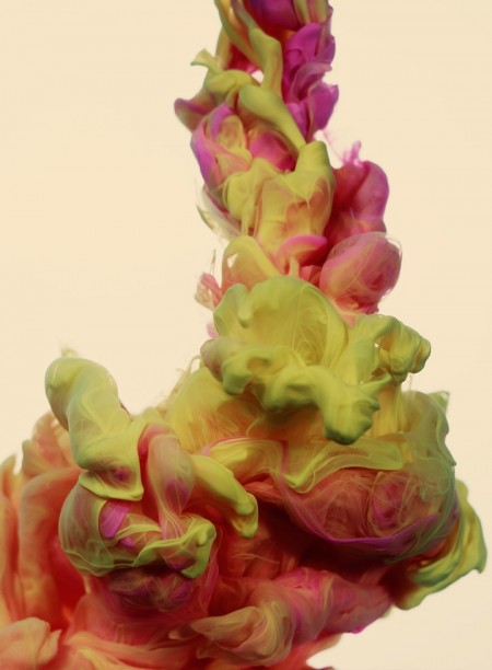
Italian artist Alberto Seveso was born in Milan, but is now working as a freelancer in Portoscuso, Sardinia-Italy. In his series a due Colori Seveso experiments with high-speed photography while trying to find a new way to make something beautiful using ink and water. Loving to play with colors and tones, this series embodies the concept of stopping time through ink in the image.
Found via Ignant
Weekend Inspiration: Nick Frank
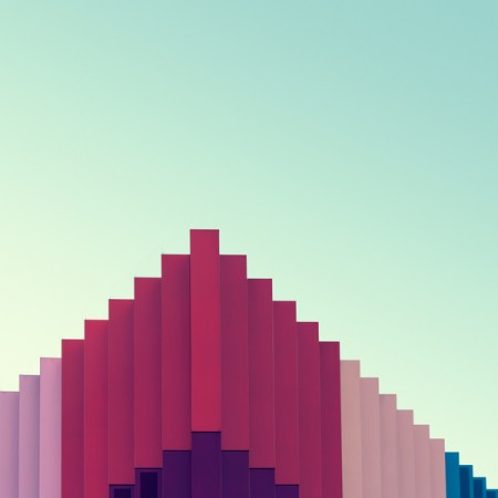
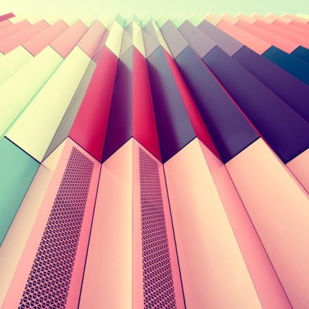
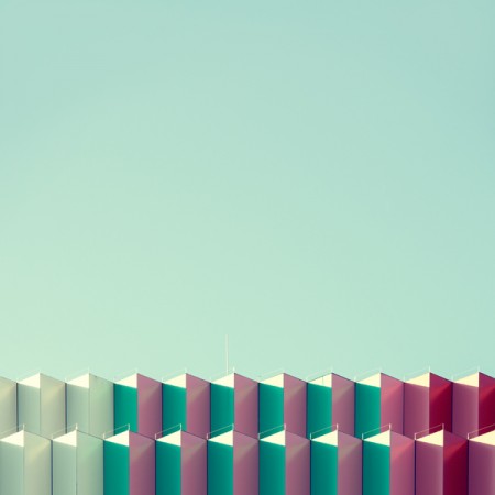
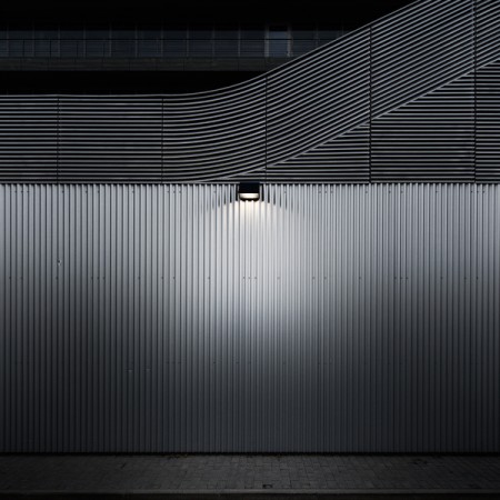
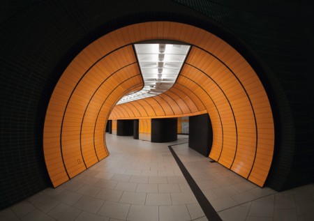
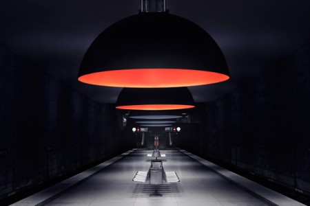
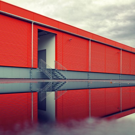
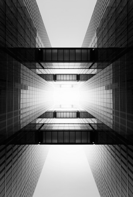
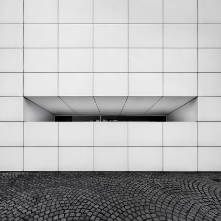
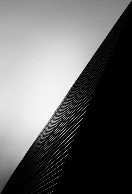
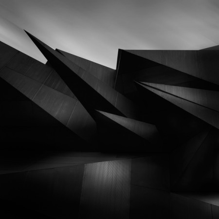
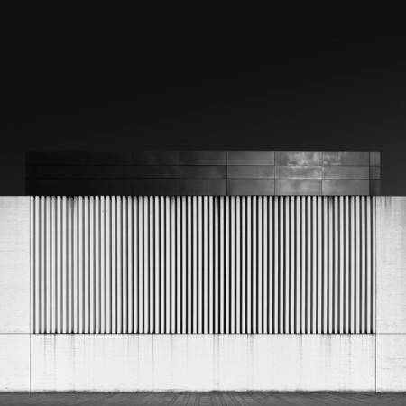
Beautiful abstract urban photography by Munich based artist Nick Frank. Reminds me of blog favorites Matthias Heiderich & Kim Høltermand.
Pablo Delfos
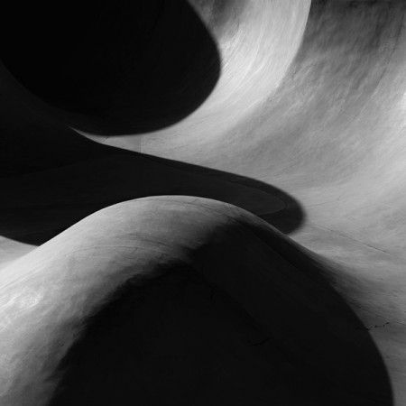
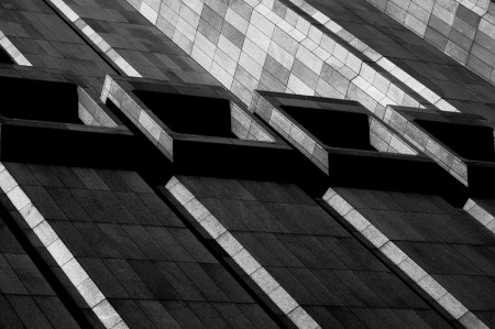
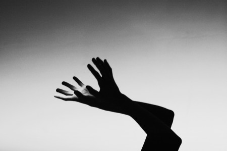
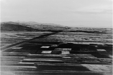
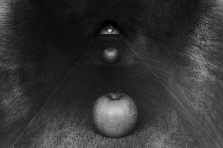
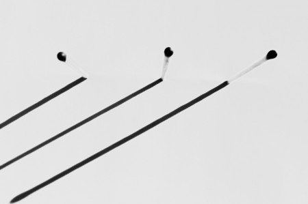
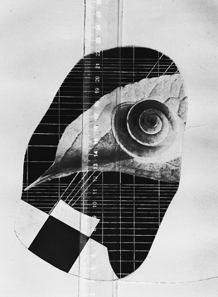
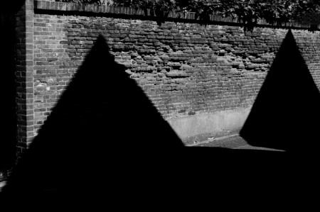
Great black & white images by Photographer Pablo Delfos.
Undone by scntfc
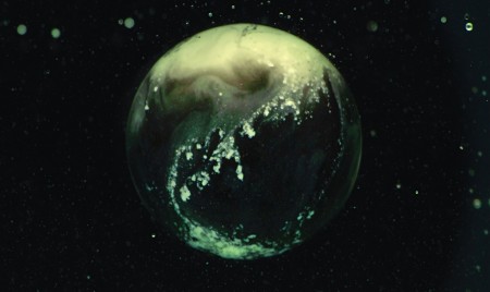
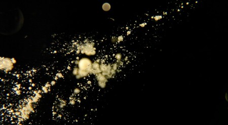
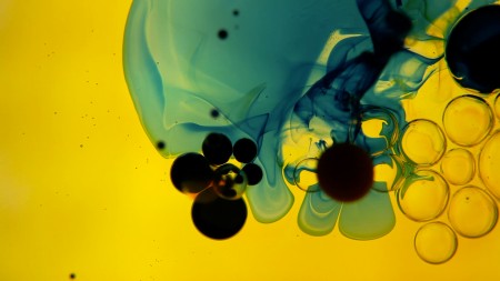
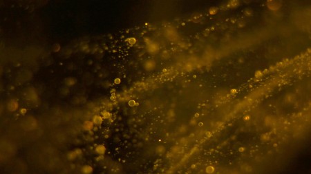
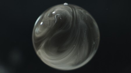
C Andrew Rohrmann or scntfc is a Seattle based multi-disciplinary audio + visual artist. He has been working in music, design, and media production for the past fifteen years. Rohrmann has completed many successful commissions including feature film scores, large scale audio installations, and art direction for commercial clients. The above is his series Undone:
Undone is an experiment in ambient cinema, comprised of an ever expanding series of short films revolving around the depiction of artificially constructed macroscopic environments. The intent is to evoke a sense of space that is ambiguous in terms of scale: simultaneously microscopically small and astronomically large.
Take a look at this amazing Flickr set of Undone stills.
Weekend Inspiration: Li Hui
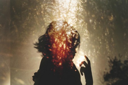
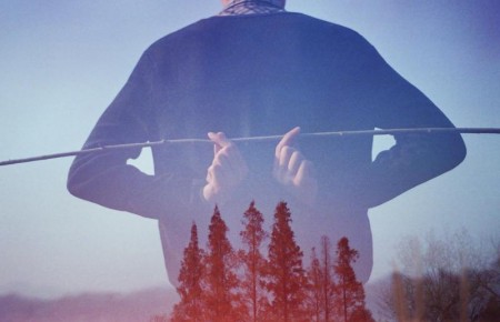
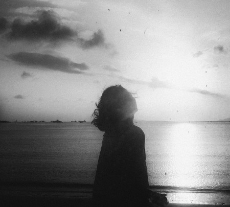
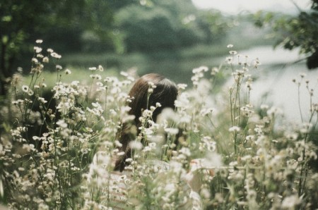
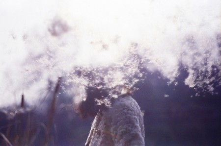
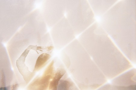
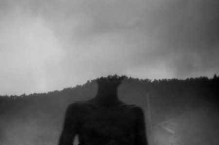
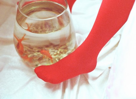
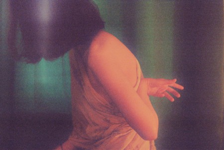
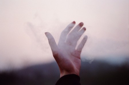
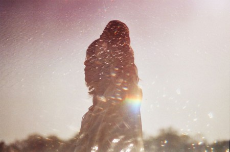
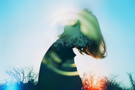
Li Hui or Hui+ as I’ve also seen referred to as, is a self-taught Chinese photographer who creates moody, often double-exposed, dreamscapes using a couple film cameras: Nikon FM2 & a light-leaked Canon AT-1. What apparently started off as a hobby to fend off loneliness, has turned in to a career.
For more images, take a look at Li Hui’s Flickr.
Herman Miller Why Design Series
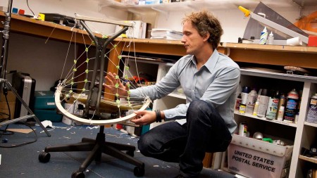
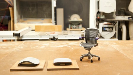
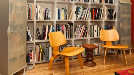
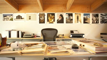
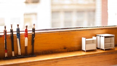
Why Design is a great video series by furniture company and all around design icon Herman Miller, which profiles some of it’s best designers:
At Herman Miller design is the language we use to ask questions and seek answers to the problems our customers face. The design process is a journey into the unknown—or as George Nelson once quipped, “I have never met a designer who was retained to keep things the same as they were.” Before we decide what we do and how we do it, we like to begin by asking the question “Why?” In Why Design, a new video series, we explore the world through the eyes of our designers, and share something of why we value their point of view.
Each Monday morning, from September 10th through October 29th, Herman Miller will launch a new designer profile at Why Design. The series includes:
9.10.12 – Yves Béhar – “Surfing Is Like Improvisational Jazz”
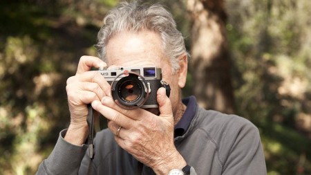
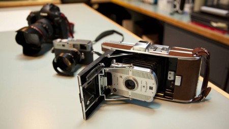
9.17.12 – Don Chadwick – “The Camera Becomes an Extension of Your Eyes”
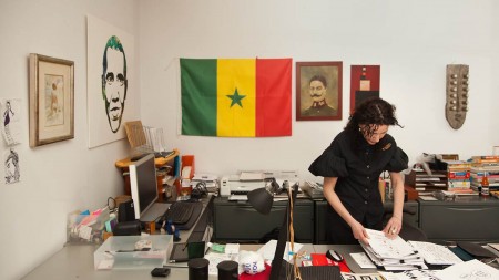
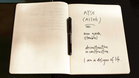
9.24.12 – Ayse Birsel – “Your Life Is Your Most Important Project”
10.1.12 – Irving Harper – “Paper Is a Versatile Medium”
10.8.12 – Gianfranco Zaccai – “Great Food Should Be Like Great Design”
10.15.12 – Studio 7.5 – “Design by Its Nature Is Collaborative”
10.22.12 – Steve Frykholm – “It’s the Breaks That Allow My Mind to Refresh”
10.29.12 – Sam Hecht + Kim Colin – “We Need Contrast and Tension to Be Able to Create”
