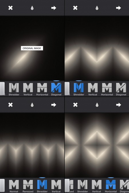
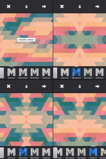
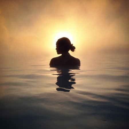
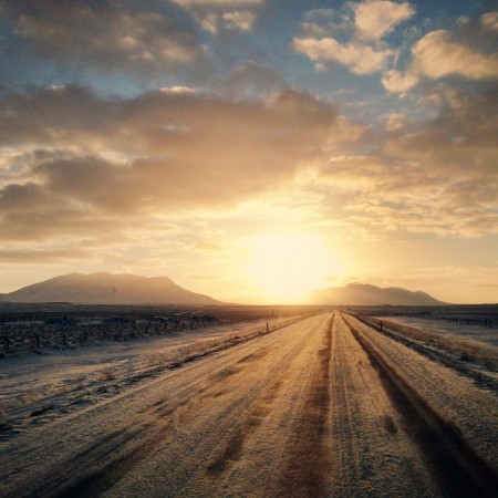
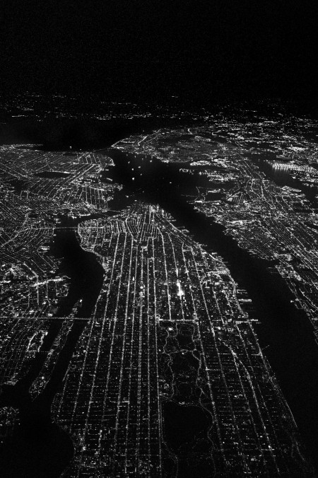
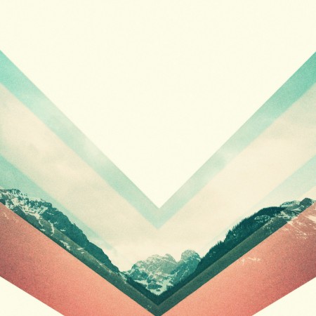
If you are interested in mirroring on the iPhone at all and you haven’t heard of Mirrorgram you are missing out. It’s just about everything you could ask for in a mirroring app. You can snap a photo in the app or load one in, but the real beauty of it is once you are mirroring an image you can move it around to get the mirror just right. Above are a couple images I ran through Mirrorgram. The first one is a photo of a hanging light in my living room. I then mirrored it on a 45 degree angle to get the slit of light and then brought it back in to Mirrorgram again. The second one is a photo I took of a type poster and then ran it through PXL to get the jagged triangle pattern and then through Picfx to get the colour and the grain. I brought it into Mirrorgram to get the different patterns you see above.
Posts in iPhone
Mirrorgram
App Review: Photoforge 2
If you’re even remotely serious about editing photos on your phone, Photoforge 2 will quickly become your mainstay. Here’s why:
It’s the best, fully-featured photo editor for mobile.
After years of trying every photo editing app across Android and iOS, I have yet to find anything better. Like Photoshop, it gives you full control over your image with features you thought you could only get on desktop. It’s not for quick edits, so if you’re in one-stop filter kind of mood, or less familiar with terms like “adjusting curves” or “soft light,” Afterglow is probably the way to go. If you are familiar with those terms, it’s easy to spend hours fiddling away on the go just as you would in front of a bigger screen at home. Just be careful not to get car sick.
Layers, layers, layers.
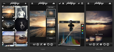
If anything, layer support is what sets this app apart from the rest – you can easily overlay other photos, create 50% Gray layers to add film grain, textures & vignettes, or drag to re-arrange layers as you please. It even supports layer masking, so you can edit-out imperfections or localize adjustments similar to how you would in Photoshop.
Powerful color curves.
Yep, same color adjustments as you would expect in popular photo editing software for desktop. In fact, many of the Instagram filters (Rise, Amaro, Sierra, Willow) were initially designed with this app, using this feature.
You can always undo with the edit history list.
As project management goes, Photoforge 2 preserves every stage of your edit across multiple projects. The one downside is how much space this takes up on your phone. Since we’re dealing with multiple versions of many full-resolution photos, this app will quickly become the heaviest app you have installed. Be sure to delete the photo projects you won’t be revisiting.
Grab the app for iPhone & iPad on iTunes for $3.99: Photoforge 2 [iTunes Link]
iPhone Wallpaper: Scott Witt
What do you get when you mix a Leica M9 Rangefinder with night flying? A killer aerial shot by photographer Scott Witt. Best used in conjunction with your phone – it even has a broken screen feel at first glance. Sourced from his photo blog Range Findings.
Masking tricks in Image Blender
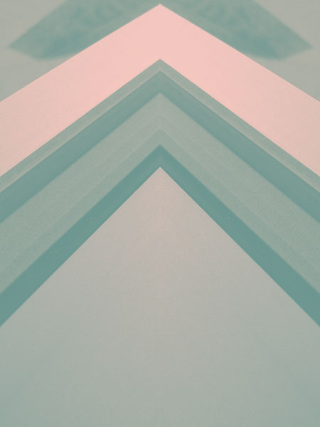
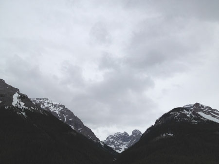
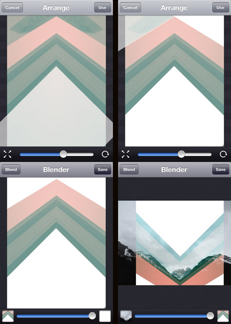
Image Blender is my go to app for blending and masking but I was getting frustrated using the brush tool to mask a straight line, then it dawned on me that I could use a solid black or white image to “knock out” the part I wanted to be transparent (or in this case to be opaque). Once I blended down the solid black or white I could bring the image back in and use the blending modes to get the transparency.
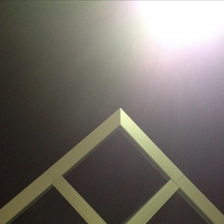
The screenshots above show this process. The original photo was the edge of a window frame. I overlaid a blank white image at four different angles. I then flipped it and blended it over the mountain photo. Tip: Swipe to the right to move and rotate the image and then from the main screen tap and hold to flatten down, switch images or copy. I did the final color adjustments in picfx, another go to app for me. If you have any other Blender tricks post them below!
Posted by: Seth Hardie
Instagram: @hallwood
Impossible Project Instant Lab
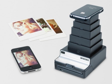
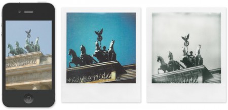
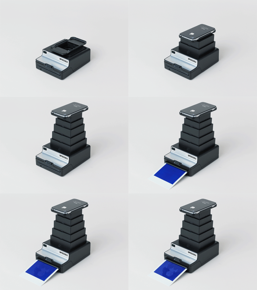
The Impossible Project launched the Impossible Instant Lab via Kickstarter, which is designed to transform any digital image via your iPhone into an instant photo that is exposed using only the light from the display, then processed and developed by chemicals. A photo that no longer needs an electronic device to be seen.
What are everyone’s thoughts on this? Is a photo just a photo, or…?
Designing With Photography
1. Initial photo (architectural feature)
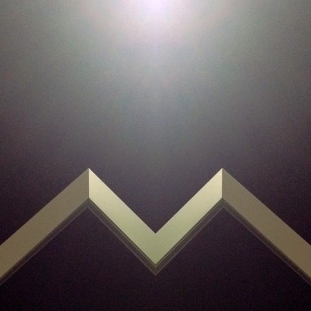
2. Cropped and mirrored
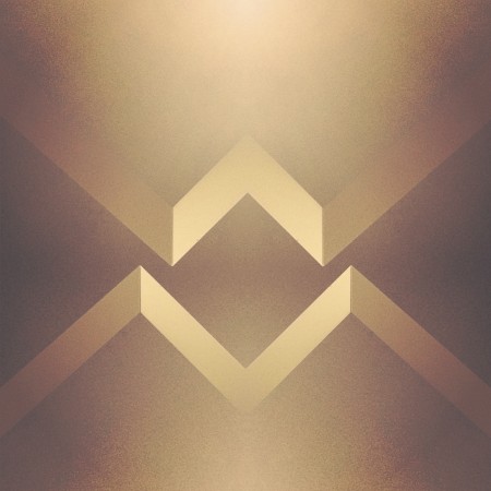
3. Cropped and mirrored and layered in Image Blender
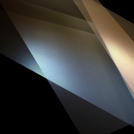
1. Initial Photo of some shadows in a corner (taken with Stilla)
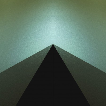
2. Cropped and mirrored
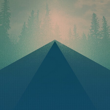
3. Final Image layered in Image Blender
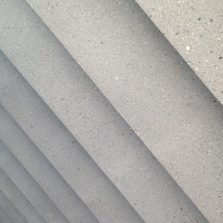
1. Initial photo of some stairs
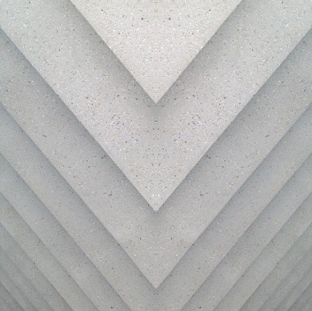
2. Mirrored (you may notice a habit here)
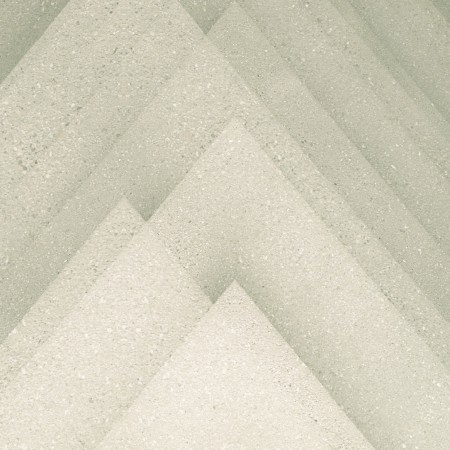
3. Final image layered in Image Blender
The first photos I started using in my designs were simple textures. (we’ve all seen the explosion of texture sites out there) but lately I’ve been using photos to get shapes that typically I would have drawn before. This has been largely driven by having a decent camera in my pocket at all times, allowing me to capture random staircases or light hitting the corner of an architectural feature just right. I find the natural light and texture in photographs have so much more depth in the final product then what I can come up with in photoshop …and its much easier to get to the end result.
Posted by: Seth Hardie
Instagram: @hallwood
Mikael Eidenberg’s Synthesizer
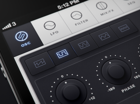
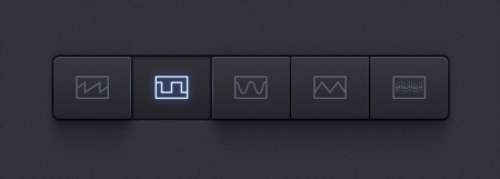
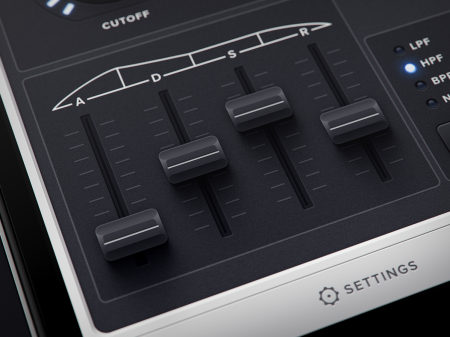
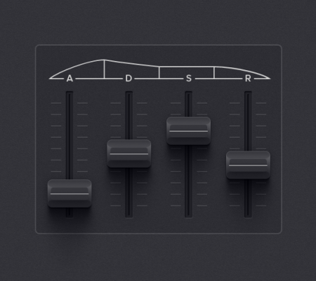
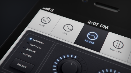
I don’t know who this guy is, or where he came from, but let’s hope he Kickstarts his app concept so we can give him a million dollars.
Tired Of The Mouse
 One of the reasons I enjoy creating on my iPhone, is it takes me out of my usual process. The image above I created with Fuzel It’s similar to Grid Lens but lets you make your own slices that you can load up with images. The lines are the slices I made and then I added a tringle to each slice. (I added the clouds with Blender). This is all fairly simple to do in Photoshop with masks but not nearly as simple to manipulate. Being able to tap points and change their size as I’m moving them around feels much more “organic”. I find the results are less forced and there seems to be a more natural progression of the design. I recently switched from a mouse to a tablet which I find much more natural, but you really cant beat direct contact with the screen. Posted by: Seth Hardie Instagram: @hallwood
Geometric Design
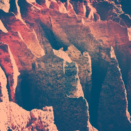
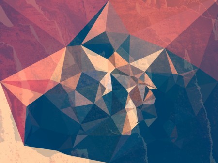
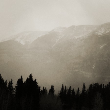
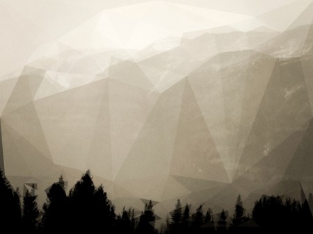
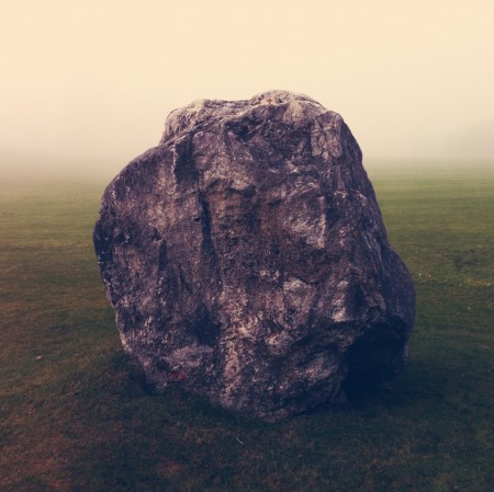
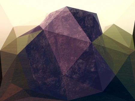
Its hard not to notice the growing popularity of geometric shapes in design these days. A quick search on Behance and you really cant deny it. My laundry detergent even has a pattern of colored triangles on it (which is probably why I bought it). So at the risk of flooding the design community a little more, I have to share an iPad app I stumbled on the other day. Its called Poly.
Some before and after examples of what the app can do above.
All images by Seth Hardie
Instagram: @hallwood
Poly app Here
Iphone Wallpapers by Marius Roosendaal
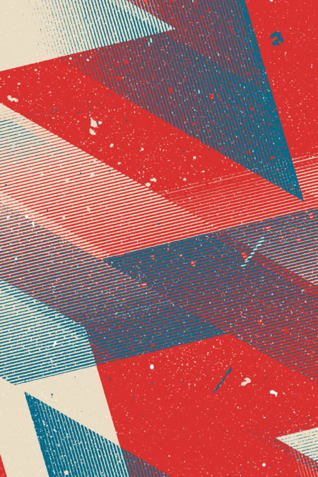
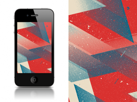
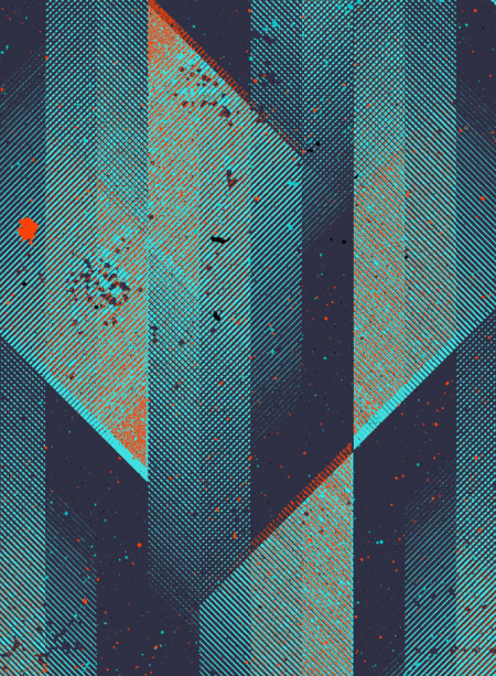
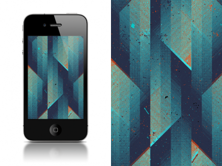
Great set of iPhone Wallpapers by Marius Roosendaal, whom we’ve covered before here on the blog. Always great surprises await when re-visiting this prolific designers portfolio from the Netherlands.
You can download directly by clicking HERE or by visiting his portfolio.
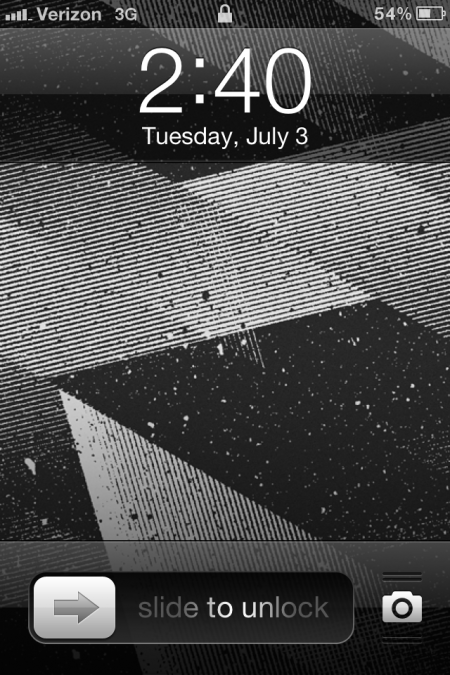
I personally chose to go with one of the black and white designs included in the pack:

