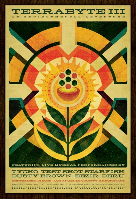
 The poster print from the Terrabyte show in LA this summer is now available at the ISO50 Shop. Quantities are limited on this first pressing so get some while they last!
Posts in ISO50
Terrabyte 3 Poster Now Available
Terrabyte Poster: Back
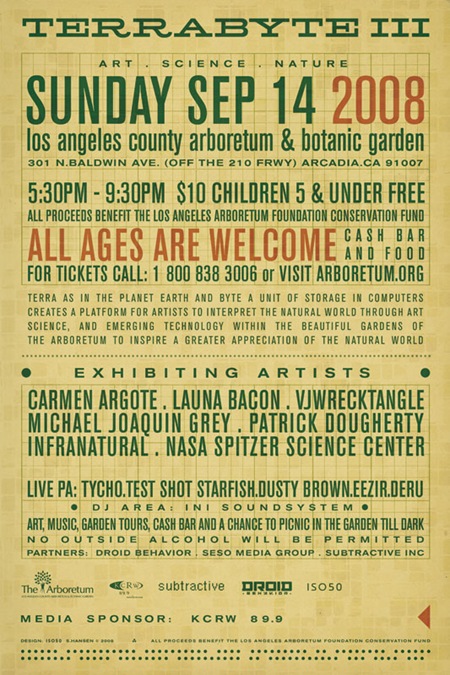
Above is the back side of the Terrabyte 3 poster from last week. Since this is only going to be on the small format hand flyer it was sort of a tight squeeze given all the info they wanted to include. I wanted to carry over the 60’s programming punch-card concept from the front, and considering the amount of text, I decided to use it as the central design element. Most of the type is set in Berthold Akzidenz Grotesk (at various weights) and is all grid aligned with a piece of graph paper I scanned in and set on Color Burn overlay mode.
Incidentally, a couple people had mentioned an alignment issue with the left arrow on the front side. Thanks for the heads up, it’s been fixed and the finalized version is now up on the original post. There’s also more info on Terrabyte 3 now available at the Arboretum site.
Terrabyte 3: Tycho / ISO50 Live in L.A.
Update: Tickets & info are here
Update: Poster Image updated (see above) and back posted here
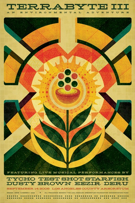
I just finished up the poster / flyer design for the third annual Terrabyte event (click the above image for a large version). This is the first work I’ve done since the Obama poster and it was a nice chance to get the wheels turning again. The spec was pretty open, just had to include the themes of Nature / Technology / Art. I went for a sort of 60’s modernist infographic approach, like a page from an old physics textbook maybe. This was also the first chance I got to use one of my favorite new fonts: Hellenic Wide. The face was really a pleasure to work with, it cuts a nice line and sort of acts as it’s own divider so there wasn’t much need for all sorts of lines and spacing. Time permitting, I’ll post a small "making of" on this in the coming months. The poster will be available for purchase online in the next couple months and I am hoping to have some early copies available at the show itself.
For those of you into nuclear physics, the imagery is supposed to represent a critical mass, as in everyone coming together and then and explosion (of the aural/visual kind, not atomic). Poster design aside, try to make it out to this event if you’re in the Southern California area, it’s sure to be a great evening of music and visuals, I’ll be playing a set as Tycho and doing some live video / visuals as well.
Terrabyte is officially described as a "unique celebration of nature, technology, and art". Translation: A great evening in the Los Angeles Arboretum out on the green listening to live electronic music and viewing visuals on huge screens. All ages are welcome; it’s a $10 donation to get in and all proceeds go to the Arboretum preservation fund. There’s a bar for those 21 and up and a lot of exhibits to check out. An architecture school builds this massive array of projection surfaces that stand about 30 ft. tall to fire the visuals on to; it’s a pretty amazing sight. Needless to say, it’s a great time and well worth the ticket price. If you missed the past 2 years, now’s the time to make it out, this will be the best one yet.
Here’s this year’s live lineup:
Tycho (+ISO50 Visuals)
Test Shot Starfish
Dusty Brown
Eezir
Deru
More info at the Arboretum’s site
Date: September 14, 2008
Location: L.A. County Arboretum & Botanical Gardens
Time: 5:30-9:30PM
Entry: $10 Donation
ALL AGES SHOW
See you out there!
Comment on this post
ISO50 OFFF-AP Print Now Available
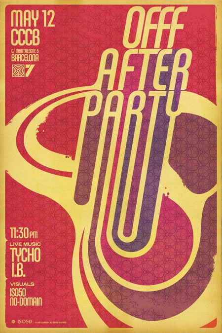
There’s a new print now available at The ISO50 Shop. This is the poster I created for the 2007 OFFF Festival in Barcelona. A small number of full size posters were originally printed to support the event (the rest were handbills) so there aren’t many floating around (if any).
If you’ve ever been to the after party for OFFF you’ll know it’s always a pretty amazing event; lots of audio visual input going on. I tried to capture that vibe with this poster, making a foray into a color spectrum I rarely use. Given that the event was more of a party than a live show I felt a little more free to pursue a different vibe than usual. If you’re wondering, the fonts are mostly from the Chalet Family with some Trade Gothic thrown in for good measure. Get one at the shop for a closer look.
Printing Posters + Restocks
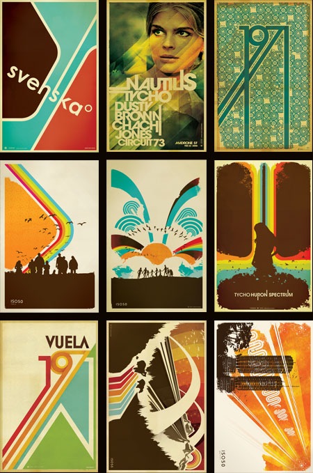
The prints you see above have all been reprinted and restocked over at The ISO50 Shop. Many were out for quite some time and they usually move fast once back on the shelves, so if you’ve been holding out for your favorites to be in stock, now’s the time.
I often get asked where I get my prints made so I thought now would be a good time to touch on that subject and go into a little more detail about the process. I have all of the small format posters done at a print shop in Sacramento, CA called Blue Moon Printing & Graphics. I found the place back when I used to live in Sacramento and even after moving to San Francisco I still use them as my primary printer. They are a relatively small shop so the service and attention to detail is far beyond anything you’ll find at some of the larger printing companies. I’ve found that personal attention to the output is the key element in getting your prints back looking the way you intended. It’s very difficult to make the transition from what you see on your screen to a printed piece of paper and no matter how well calibrated your equipment is you’re always going to experience a shift in color, saturation, contrast etc. The trick is to tweak the original file and the printer itself to try and compensate for these shifts and it’s important to find a print shop that is willing to work with you through this process.
I have the prints made on a digital thermal press which is essentially a toner-based process. I really like the output of this process because in the darker areas the toner builds up a thicker layer, giving an almost screen-printed effect when viewing an area of high contrast (such as a transition from cream to dark brown; the dark brown will appear to be painted on top of the cream background). The other advantage of the digital press (as opposed to offset) is that there are no plates involved so proofing and tweaking is a much quicker (and cheaper) process. You can adjust the file and run off a new proof in about 5 minutes as opposed to etching new plates and resetting the press as you would in an offset scenario. The only real downside of this process is the format limitation, the prints can only be 12"x18" at the largest. You are also limited to the type of paper you use as the toner won’t adhere to coarser papers; although I like to use a natural tone cover stock which is pretty smooth so this is not a big issue for me. The natural tone stock also has a yellow cast to it so that the yellow range in the lighter areas of the image is boosted. It gives the image a sort of aged, authentic feel which I think takes a bit of the edge off the digital output.
Blue Moon does have a traditional offset press but they just recently got it and I’ve yet to test it out. If you’re looking for a good printer I highly recommend them, and since they can do the whole proofing process via mail it doesn’t really matter where you’re located (my friend in New York does all his printing through them). You can find more information at their website: http://blumoonprinting.com.
I’ll be doing a post on monitor calibration soon in which I will go into more detail about preparing work to be printed and working with color profiles and printers…stay tuned.
Current: Ghosts of Techno
While I was in Detroit for DEMF last month I taped a segment for Current TV as part of a feature on Ghostly International (the label which I record for as Tycho). The feature is a good introduction to what Ghostly is about and includes some interviews with a few artists (Osbourne, Kate Simko, and myself).
Yes, it was a bit early and I think I’d had one coffee too many for that interview; no, I don’t know why there are random clips of me taking pictures of dumpsters. A couple of the pictures I was taking in those clips are included in the Detroit DEMF post. There’s also a clip of some of the actual DEMF set towards the end. The whole experience was a bit surreal; I played the opening set at DEMF around 1pm after a long night, was weird to be playing outdoors, in the early afternoon like that. The coolest part was that you could see Canada from the stage (look across the river in the shot from behind).
Making of The Obama Print
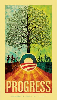
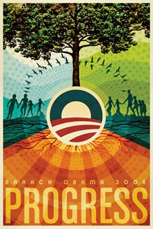
As regular visitors to this site may know, I created a print (Fig.1) this past May as part of a fund-raising effort for the Barack Obama campaign. The campaign approached me earlier this year about creating a poster based on the theme of "Progress" and I decided to take a stab at it. Once completed, the poster was printed in a limited edition of 5000 and has since sold out. I had intended to write this article earlier, but I’ve been rather busy so it had to wait until now.
Overall, the process was something of a roller coaster ride and certainly left me with some valuable lessons learned. It’s been a little over a month now since the dust settled on this whole thing (the final copy sold around June 7th) so I’m hoping that the time passed will lend a bit of clarity and result in a more insightful analysis of the journey from start to finish on this project.
This is, by far, the longest post I have ever written. As such, I wasn’t able to spend as much time as I usually do worrying about the writing. This is mostly just a stream of consciousness recap of the process and is primarily nuts and bolts commentary; I’ll leave the job of deriving the meaning and symbolism of the piece to you.
So here it is, the long and the short of it: everything that went into the making of the Obama print.
Initial Stages
When planning out an image I usually like to dive right into Photoshop as a first step, just to try and establish a color-scheme and basic structure. Only later do I usually start to work with physical objects and pen and paper to try and work out the main elements, keeping in mind the initial digital mock-up. I sometimes hear people talking about always using pencil and paper as a first step in design, but I personally find the computer a much faster and intuitive way to concept things out so I like to leverage that power right off the bat as a good way to kick-start the project.
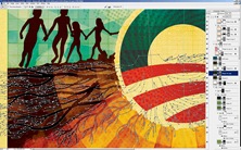
The campaign had asked that I pursue a style in line with my earlier work as they felt it would make the most sense for this poster and I agreed. So I set out working with various elements from earlier works (you may recognize the people from the Skyway print). I also had an old book about trees with a very nice illustration I had always wanted to use so I scanned it and placed it in the mock up as sort of a framework for the illustration I would later create over it. As you can see in Fig.2 above, the early mock-up was already looking a lot like the final product. At this stage I am usually just trying to find an overall form and color arrangement that works, the details always follow, but if I am feeling inspired I’ll often find myself creating the bulk of the piece in the early stages and then later working with that and refining things.
The message of the print had to center around a handful of concepts that the campaign was using, "Hope", "Progress", "Change". Shepard Fairey had already created two prints for the campaign that each featured an image of Obama so I knew I wanted to pursue another theme for the imagery. The fact that this was a fund raising poster and not intended as a campaign poster also made it easier to interpret the imagery more liberally. My initial idea was to metaphorically represent the core themes of the campaign in a collage, some more literally than others. I also wanted to vaguely communicate the concept of peace by configuring the main elements into a somewhat subdued peace symbol and working off of that shape for the core structure of the image.
Comping & Approvals
After a couple nights of working through ideas and pasting things together, I came up with the comp you see in fig.2. I ran this early mock-up by the campaign and they gave me the go-ahead to start production on the final product. This was a relief as the campaign was wanting the as soon as possible and now I’d have a bit more time to work out the detailing.
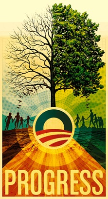
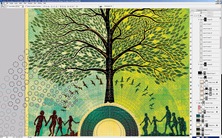
Now that I had the green light on the image I went forward with recreating it full scale. I often concept at a smaller size to make for quicker work within Photoshop so when it’s time to make the final product most of the non-vector graphics have to be re-created at the new resolution. This is always a good time to work out the kinks and really focus on the things that may have been overlooked when working through the rough drafts. Fig.3 shows the product of this second phase, a more developed and balanced overall composition at this point. I am still using the original tree illustration as a stand-in and have now exposed half of it to show the branches. It was later decided to go with a full tree but I still liked how it looked at this time. As you can see, the colors and detailing were all really starting to fully develop by this stage and it’s around this point that you can start to see the finished product coming together.
This is always an exciting time as a designer as you’re getting the first glimpses of the final image. Unfortunately, this is where the real work began.
Production Begins
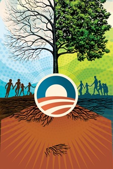
Because this print was going to be so large (23"x40" @ 300dpi raster), I had to do another phase of re-scaling to reach the final dimensions. To get it that big, I re-created all of the elements that I could in vector and brought them in from Illustrator to Photoshop. In fig.4 you can see the not-so-attractive results of this phase. This shot is from Illustrator so none of the texture or color is there yet, just the raw vector forms. Once I had those imported to Photoshop and had the image resized up, I set about placing all the large raster components again, doing the texture and color work and so on.
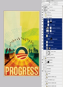
In fig.5 you can see that the textures and colors have been restored and the raster tree stand-in has been removed. At this stage the image is at full size and resolution so things are starting to move quite slow. It was also at this point that I had to switch to PSB format since it exceeded the file size limitation of the standard PSD format. With all the full size elements in place it was time to work out the tree illustration.
The Tree
I had been worrying a lot about how to approach the tree throughout the initial stages of the project. It was going to be the central element that tied the piece together and I really wanted it to stand out. I had batted around a few ideas but nothing really panned out until I settled on the idea of using individual leaves on a two dimensional plane as opposed to trying to create something with three dimensional depth as I had previously planned.
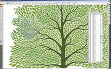
As this was going to be a very complex vector graphic I went straight to Illustrator to create the tree (fig.6a). Photoshop can handle vector but not nearly as efficiently as Illustrator so when you’re going to be doing a lot of moving things around and transformations, it’s best to stick with Illustrator. This ended up being a very painstaking process taking about 3 days to complete. I drew various versions of the leaf and then rotated and resized them to flow into the spaces created by the branches. Once that was complete I pasted the vector leaves as a shape layer in Photoshop. I broke them up into multiple shape layers and changed the colors of each slightly to give some variance and depth.
Once I had the shape layers colorized and laid out the way I wanted them I began the process of detailing and texturizing the leaves. I added various patterns of concentric circles to give some depth to the otherwise solid color of the shape layers. I created a layer mask based on the outline of the leaves over a group containing all of the shape layers so that any elements or textures that I added in this step would only show over the leaves themselves.I also added a lighter stoke outline for some definition.
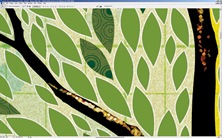
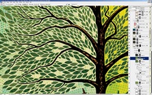
In fig.6c you can see the finished tree detail with the layer palette open. At this point I was getting pretty close to feeling like the image was complete, which was a good thing considering that Photoshop was really starting to slow down; even simple transformations were taking upwards of a minute. It’s a shame how Photoshop begins to break down on very large images even on a very powerful machine. I understand that Photoshop wasn’t exactly designed for this sort of work, but unfortunately it’s the only real option out there.
Detailing & Background
Next up I set about working with the root structure of the tree (fig.7). This got a bit tricky as the roots had to go through areas with different colored backgrounds causing problems with contrast and blending.I ended up breaking them into different shape layers and colorizing each individually. The background detail you see in fig.7 is a result of multiple layers with varying blending modes and color shades.
I did some similar treatments to the various elements that continued across the background of the tree and sky, placing various repeating patterns in different blending modes to lend some depth to the solid fields of color. Most of the layers ended up being in color burn or multiply mode. By combining different overlay modes and stacking layers you can create a lot of depth and color variation, I usually find myself going about 3 levels deep with different textures on each layer and then a base layer with a solid color to anchor it.
Typography
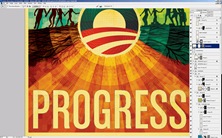
Finally I moved on to the type treatment. For the sake of continuity with the campaign’s own materials and Shepard’s earlier posters, I chose a typeface that somewhat resembled what they had been using. I ended up going with House Industry’s Chalet Comprime which is a compressed variant of their Chalet font. I converted the type to a shape layer to work out the kerning and sizing and created a mask based on the shape (fig.9). I then layered in various paper textures and shading to give the title some depth. It was right around this point that the piece ended up feeling finished, and I say "feeling" because that’s all it is, a feeling; that’s why it’s always so hard to tell when a piece is done, it’s just sort of this sense you get that nothing you could do at this point would improve things. It’s either that or you hit the deadline and in a perfect world you’d get the feeling first, but we all know that’s not always the case.
The Printing Process
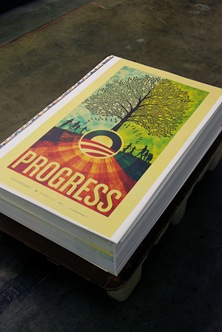
Once I turned in the finished work the campaign flew me down to Los Angeles to be on press at Continental Colorcraft as the poster was being printed. Being on site for the printing helps a lot and saves a ton of time; there are no proofs to mail and changes can be made on the fly. The place was pretty impressive, a bunch of massive warehouse spaces with enormous machines covering the floors.
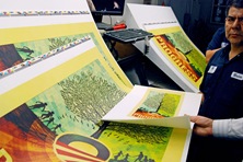
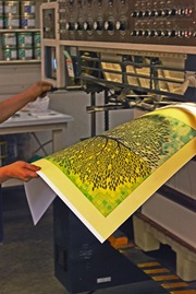
I printed up a proof on the Epson at home to take with me (it’s in the printer’s hand in fig.10). I always find this helpful as it’s really easy to forget what the print is supposed to look like once they start running off copies. It was really nice to have a version that I had already compared to the screen to look at side by side with the press output.
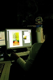
The first run wasn’t very close on the colors so they took it to their pre-press guys to do some tweaking in Photoshop (fig.11). It was pretty interesting how they were able to separate out the various layers from a flattened TIFF file. I learned a lot of color tricks watching them work through the various filters and adjustments,a few I had never actually seen or used before.
Once we got a solid version worked up they sent it off to etch another set of plates.The plates are large, thin sheets of metal with the four color separations etched into them. The pates are then mounted in the press where Cyan, Magenta, Yellow, and Black (K) are fed to each plate. So essentially the image is comprised of four colors pressed in succession on the same piece of paper. Hence the name, four color process (I know 99% of you are familiar with this but I didn’t learn it until much later in my career so thought I’d share for the few uninitiated that might be out there). At this point they fired up the machines and the prints started flying out, it was pretty impressive how fast they were able to print so many copies. At set intervals the press operator would pull samples and check them against the original proof for accuracy (fig.10, above). All told the printing process only took a few hours. At the end they had five large stacks of prints on pallets ready to ship out.
At the end of it all I got to fly home with a tube full of posters and a huge sense of relief that the project was complete and out of my hands.
All in all I had a great time working on the project. This turned out to be a rather high pressure situation so I learned a lot about myself as a designer as I made my way through the various stages. The only stage I wasn’t really prepared for was the release of the print. It’s one thing to release prints to the design community as I have been doing for a while now, but it’s entirely something else to have an audience as broad as the one commanded by the Barack Obama campaign scrutinizing your work. The response was overwhelmingly positive, something for which I am very thankful, but the politically charged nature of the piece seemed to anger some people. This led me to reflect on my motivations for doing the piece in the first place. I have never pretended to be an expert on politics and have always steered clear of espousing my political views, but when you’re facing the potential continuation of a situation like we have endured for the past eight years in this country and you’re given an opportunity to help change that, even in a small way like with this poster, I think you have to take it. Looking back now I ask myself if I would do anything differently with this piece, to be honest I think I would have approached it slightly differently. But hindsight is always 20/20 and given the parameters and constraints of this project I am pleased with the outcome.
Many Thanks to Karl Peterson for helping with the CSS on this article.
Making of Obama Print: Tomorrow

So I accidentally posted an unfinished draft version of the "Making of Obama" article this morning, complete with Lorem Ipsum stand-in text and unedited writing. The finished article will go up tonight and should be live sometime tomorrow morning.
Sorry to those of you who saw the early version, I noticed in the comments there was a bit of confusion. Apparently when you close and then re-open Windows Live Writer (which I use to publish to this blog) it forgets certain publishing flags and can make a draft live without your knowledge. Lesson learned.
So stay tuned tomorrow or sign up for the RSS feed to be alerted when the finished post is up.
Personal Work: Save The Date
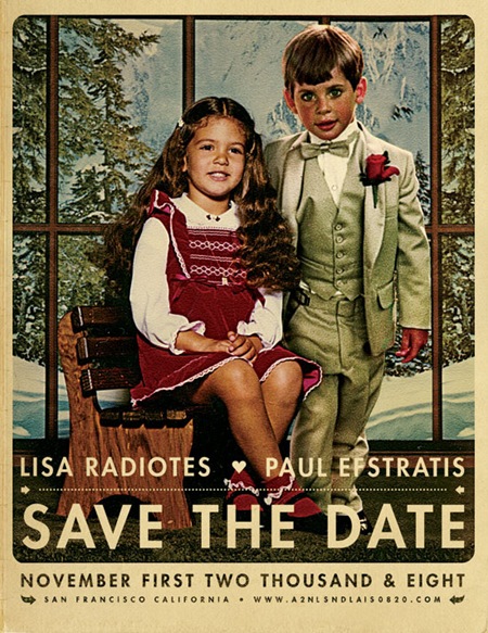
After reading Jefta’s comment in the J.Casey piece I realized I hadn’t been posting much of my own work lately so I decided to put up this wedding announcement I did for my friends Paul and Lisa. I normally wouldn’t post personal work of this nature but I was happy with the result and thought it would make a good exception. To tell you the truth, these are usually my favorite projects; there’s no money involved, no client to compromise for, and no concerns over whether it will be well received by the public. Sadly, it seems this sort of project is the exception not the rule which is unfortunate given that most of us started out in this business purely out of love and enjoyment of art and the process. The other good part of these projects is the timeline, or lack thereof. But as usual, I put this project off until the last minute so I only had a night to complete it, which ended up making it a bit more enjoyable as I knew there wouldn’t be the inevitably endless revision process to attend to after completion. As this was intended to look like a retouch or a painted piece, I was a bit more free to be heavy handed with the lighting effects. This would have been far more difficult if I was going for a photo-realistic look.
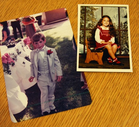
So when my friends approached me about creating this we threw around various ideas. In the end they came up with the idea of combining photos of them as kids. Unfortunately all the photos I had to choose from were very different in terms of lighting and color. I’ve never considered myself much of an expert at photo manipulation but this project made me realize just how little I really knew about the process; I definitely struggled trying to get the two photos (pictured below) to look right together. The shot of Lisa was an artificially lit, indoor studio portrait, the other an outdoor snapshot, so it was tough to get the lighting right. I decided to use Lisa as the reference point since she was well lit and then bring Paul closer to that tonal range / lighting condition. The original shot of Paul was taken at dusk as the sun was pretty low in the sky behind him so I ended up doing a lot of gradient masking of color balance and curves transition layers to compensate for the overly dynamic lighting that resulted from the conditions of the original shot. The background imagery had to be scaled up a bit, I cloned one of the windows and did some tweaking to the contents to make room for the added subject. Finally, I added some shadows to Paul’s right side to account for the new position of the lighting and Lisa’s position relative to his.
As for the art direction, I wanted this to feel a lot like an illustration or painting so I did a lot of dynamic lighting, unsharp mask, and some artistic filters to shift it in that direction. The imagery of the existing studio shot of Lisa had a distinctly European thing going on so I tried to push further in that direction to evoke a sort of vintage Swiss-era poster vibe. For that reason, and because this was just the announcement and not the wedding invitation itself, I chose the Futura typeface to give it a fresher feel (than a typical wedding invitation) while at the same time maintaining a sort of classic design sensibility. And of course I went with some loose kerning to give it that Anderson-esque vibe.
Finally I applied some paper effects (blending mode stuff etc.) to give it a real world feel. I have a bunch of vintage poster reproductions hanging around my house and always enjoyed that copy-camera style they give off. While I was overseas a couple years ago I went to a gallery that had a lot of the originals of the stuff I have at home and I got to see them in person. I realized I actually enjoyed the reproductions more, they have a nice grain and vingetting that didn’t show up in the originals (which were typically painted and so also didn’t show the yellowing of aged paper and ink.) This is the kind of aesthetic I am usually trying to achieve in most of my poster work, I want it to feel like a reproduction of an original printed piece.
All in all this was a fun project, I think we as designers should take on more work like this. Free work for friends always helps reacquaint me with the aspects of design that drew me to it in the first place; it gets me excited about the process again, an emotion that I think easily spills over into the jobs that come after it.
Tycho Live Tonight: San Francisco WWDC
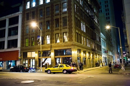
I’ll be playing a set tonight at 111 Minna Gallery in San Francisco. The event is part of the Apple WWDC conference so it’s mostly going to be people who are here for the conference, but I asked the organizers and they said it’s technically a public party so I thought I would do a last minute mention here. All the info can be found at the Upcoming Page for the event.
