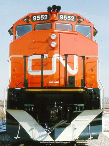

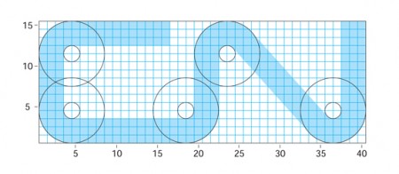
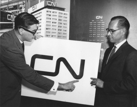
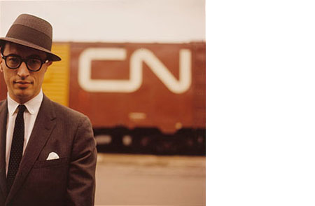
Last week I posted on the NASA logo and suggested that it might be the most iconic logo of our time. In the comments, Design+Conquer begged to differ and reminded me of an equally perfect logo. The CN logo was designed by Allan Fleming and James Valkus for the Canadian National Railway in 1960. Being an American I’ve had limited exposure to the mark, but every time I’ve come across it (usually on trains passing through when I lived in Sacramento) I’ve always been stricken by it’s minimal perfection.
Posts in Logos
CN Logo
NASA 1976 Graphics Standards Manual
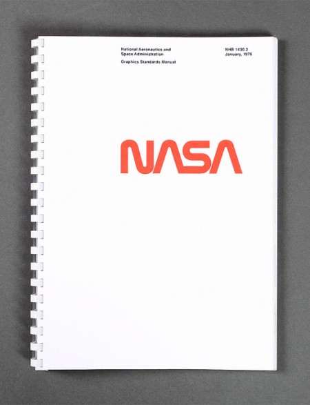
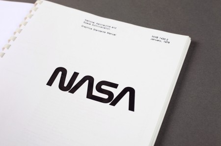
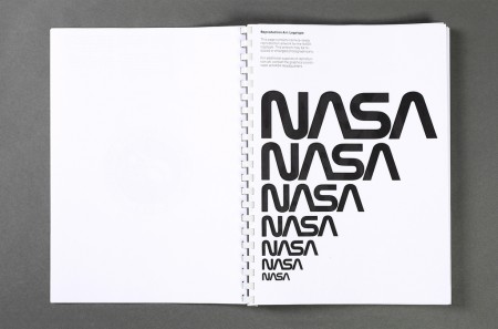
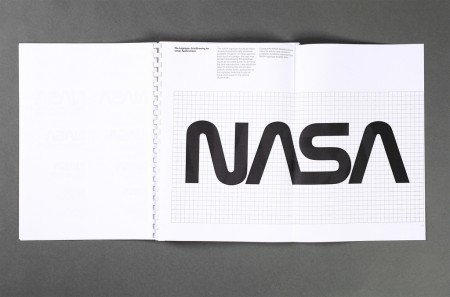
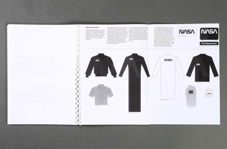
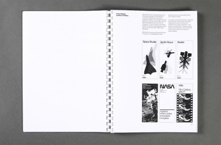
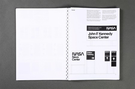
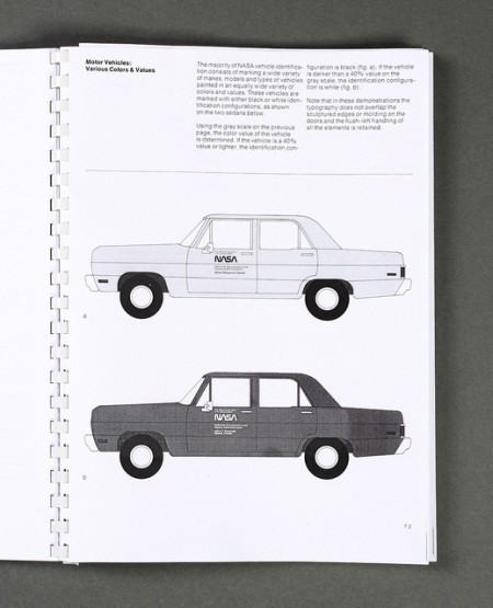
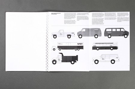
An original Graphics Standards Manual from 1976 when NASA transitioned to the “worm logo” (more info). Love the car graphics, was waiting for something on The Shuttle but then realized it was just a concept when this manual was written. Maybe it’s just an American thing, but is this not the most iconic logo ever?
Via Tim George
Firespotter Logo Design Process
While it’s fresh I thought I’d write up the process behind the Firespotter Labs logo I designed. This was an incredibly fun logo to design and probably one of the quickest, at least when contrast to some of the luxurious multiple month (!) design explorations I’ve done in the past for school or other companies. That said, it was exceptionally challenging; it’s hard to take a step back and think objectively about the company you’re a part of.
Before this, I had already designed a couple logos for some of the products we’re working on now. I had to break out of the “consumer application” design mindset I had been entrenched in for a few months. For the mothership, we needed something that conveyed that we were a lab full of crazy people brewing up cool things, while simultaneously appearing to be trustworthy gentlefolk worthy of venture support.
Susan Kare
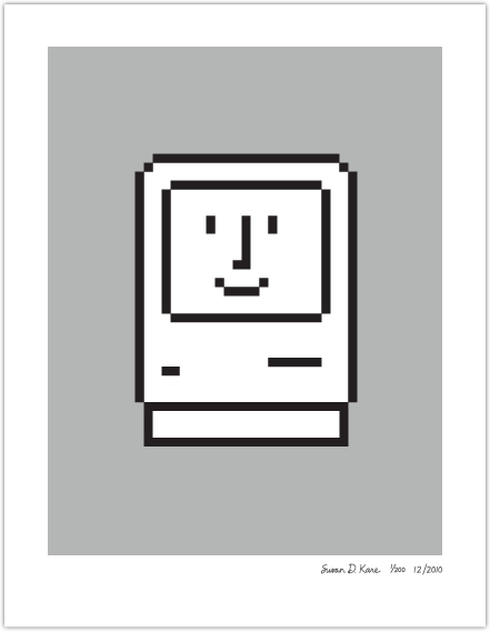
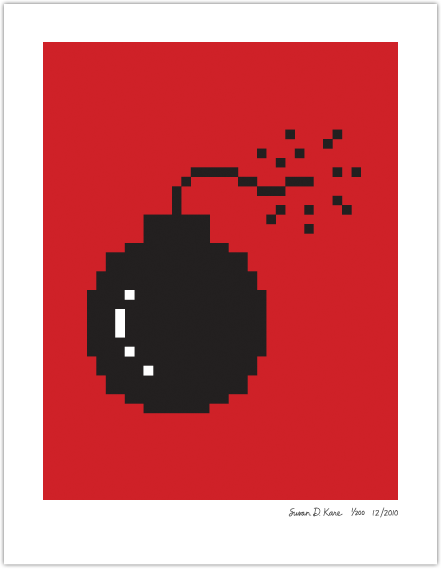
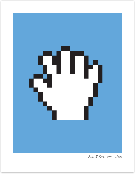
I was discussing icon design the other day with a friend and Susan Kare’s name came up. She is the brilliant designer behind these classic Mac icons as well as many other high profile user interface projects. We were specifically talking about Facebook’s icons (which I happen to love), and while I’m not sure if she created the original interface icons for the site, I know she was brought on in 2007 to handle the gifts project. Update: Aaron Sittig created many of the most well known 16 x 16px icons that you see throughout Facebook.
Shown above are some of her limited edition prints. Guaranteed to induce nostalgia in just about anyone that was present in the early 90’s (Mac OS 7.5.3 was the best!). If you’ve got any computer type folks left on your shopping lists, THIS is the gift for them.
Also, an interesting read over on Mashable, an interview with Susan Kare:
“It was a challenge to come up with a symbol for the command key. The word is a bit forbidding, as are many types of images that instantly come to mind, such as a police hat or badge. I leafed through a book of symbols, and came across a similar cloverleaf, which was identified as an image used on signs in Swedish campgrounds to mean ‘interesting feature’…Later I learned it is meant to be a castle, seen from above”.
Swissair: Behind the Logos
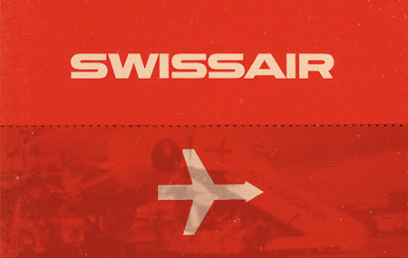
Swiss Airlines has a rich history that has been hidden in the archives for quite some time. On March 26th, 1931 when Swissair formed, I doubt anyone at the time really considered the history that they were going to be making with the company’s design. Balair and Ad Astra were the two companies that merged to form Swissair. Throughout the years they’ve changed logos many times but there was one that was most memorable (above). Quite possibly it was the best logo that the company has ever used.
Thanks to SR692 for collecting this information so that we’re able to walk through past logos used by Swissair. Some great, some not so great and a few that were very, very experimental. Hit the jump to see how the company logo changed throughout the years.
Via Wanken
Gap Redesign / Follow Up and Voting

Well it looks as though Gapgate is over as quickly as it appeared. After all the speculation, they did indeed pull a Tropicana. And what started out as a fun little experiment for us, quickly swelled far beyond our expectations. We received hundreds of submissions, so many that we had trouble keeping up. So now it’s time to sort through all of them and choose the winners. But before we do, I wanted talk a little about the contest in general and what we’ve learned during the past week.
As we mentioned in the previous post, the contest is not affiliated with Gap in any way. We are not crowd sourcing a new logo for Gap. To think that we are is to misunderstand the concept of crowd sourcing as well as our intentions. This contest was designed to give people an opportunity to put themselves in the shoes of Laird + Partners; to see what they would do if tasked with the (apparently) impossible mission of rebranding Gap. These mega-rebrands are always hit with a wave of inevitable criticism, but rarely do you see designers offering viable alternatives in addition to their critiques. It’s harder than it looks. I wanted to challenge our readers to not just criticize the new logo, but provide an alternative solution. The contest was an exercise — like a school project — and had nothing to do with Gap’s ludicrous (thankfully temporary) decision to engage in crowd sourcing.
The entries were interesting to say the least. Submissions ran the gamut from tongue-in-cheek innuendo to well executed contenders to the original logo. What filled the space between was a raft of subtle variations and incremental evolutions that all seemed to rely heavily on the original brand. But I suppose that’s what’s at the core of this whole argument: people apparently love the blue square.
So now we leave it up to you again. Please refer to the submissions on the original post, noting the number of the submission (directly below the image on the left) and place your vote here. Voting will be open until 11:59 PM Wednesday October 13th. (Update: Voting is now closed, winners posted soon)
Thanks to everyone who submitted a logo, good luck!
Gap Redesign Contest
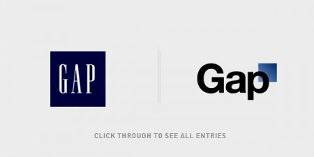
Editor’s note – In answer to some of the questions in the comments: This contest is not for Gap. We are not affiliated with Gap. Gap has nothing to do with this contest. This is for fun, not Gap. Gap will not be using any of these logos. Gap will not be forcibly entering your home and removing belongings. This is not a secret conspiracy by Gap and the Freemasons to get you to design free logos. This is not crowd surfing. I bought some socks there one time like five years ago. Also, Gap has apparently been using the new Helvetica logo for nearly a year now, everyone just decided to notice and get super pissed off when they added a gradient square this week. If you submit a logo to this contest, you retain the rights to that logo.
By now you have seen the new Gap logo. By now you have sent a “this is terrible” rant to all your designer friends. By now Gap is probably about to pull a Tropicana. (Update, they did).
OK so I get it, you don’t like the new logo. I don’t either. I want the little gradient square to fall into the gap and never come back. But I couldn’t help but think: what would I have done if Gap had come knocking and asked me for a new logo? How do you rebrand a company as ubiquitous as The Gap?
So rather than rant and rave, let’s fix this. We are a community of designers and I’m sure someone here can come up with something better. So here’s the contest:
Your Job: Design a new logo for the Gap. Assume a fairly open brief and think about where their brand is and where it’s going.
Timeframe: 1 week. Contest ends on Wednesday October 13th. Short yes, but this isn’t school, let’s work quick.
First Place: Your choice of giclee print from the ISO50 shop (size 24 x 36), a shirt of your choice (also from the shop), and a process feature article here on ISO50 (If you choose to, you can write a process piece on how you developed the winning design, which we’ll post here on the blog).
Two Runners Up: Two shirts of choice from the ISO50 shop.
Instructions: Email alex [@ symbol] iso50.com with the subject line “New Gap Logo” and attach your redesigned Gap logo. Please make sure your file is in JPEG or PNG format and clearly displays your logo. Size 450w x 250h pixels please. Center the logo, make it look nice. Limit two entries per person.
Due to the extremely high volume of submissions, entries may not be posted right away, but we’ll do our best to get them all up before the 12th!
Voting: Winners will be determined by a popular vote after the last submission date on a separate post.
Legal: All entries remain the sole property of the designer who created/submitted them.
All entries will be posted here after the jump
(more…)
More World of Logotypes
Came across this nice set from World of Logotypes on Raoul’s Blog. You may recognize these from the great book Eric Carl scanned in way back when. I’ve never seen them presented this way though, nice to be able to focus on them in individually.
Via Jetstreamprojector via Grain Edit
Qus Qus
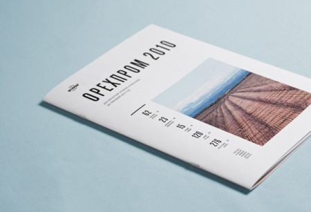
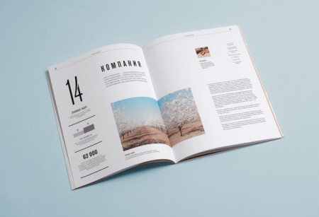
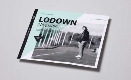
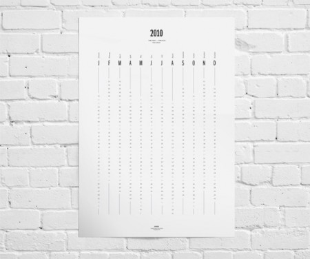
Qus Qus is the design studio of Dima Kuzmichev. This work is super clean — I feel like if I ran a corporation of any kind, I would have Dima do my annual report. Especially if we were based in Iceland and wanted to make our wind power turbines seem sexy. There is a cold perfectionism at work here. Great grid work, some beautiful type, pretty much everything you need. I was also really impressed with the logowork. The one for Artisanale was my favorite (and the name sounds awesome to boot).
Plancast Penguin // Development Process
I was hired about three months ago to design a logo and consult on the brand identity for Plancast, a local San Francisco start-up founded by Mark Hendrickson and Jay Marcyes. As you can probably guess from the name, Plancast a way to broadcast your upcoming plans to your friends; or as it’s often described, Foursquare for the future. The site is exceptionally easy and helpful, and I encourage you to check it out.
By the time I joined on Plancast was up and running, but they were without a logo or distinctive visuals. I began work in December and we agreed on the finished logo a few weeks ago. The project was easily the hardest I have ever completed — as well as the most fulfilling. I almost destroyed myself developing this logo and I am really excited to share the process with you here.