
The Museum of Flight displays an impressive collection of vintage airline logos. As I’ve just spent most of my young life traveling between DC and SF over the holiday, airline logos aren’t exactly what I want to be looking at right now — regardless, some of these are too good for me to mind. Lufthansa is still my absolute favorite (I gravitate towards anything with a stylized bird). The images are relatively high quality and they have a ton more over on their site.
Posts in Logos
Airline Logos
Rebranding Playboy
A little while ago, I wrote about my current class assignment to reinvigorate a brand that is “dead, dying or defunct”. As we are nearing the semester’s end next month, I thought it would be a good time to begin describing the process of this project. The final deliverable is a book, in which we describe the history of our chosen brand (and why it’s time for a update), outline the new identity guidelines (visual standards manuals, usage considerations etc), and show potential extensions (mock ups of storefronts, products, etc). For this process post I’ll describe my brand choice and eventual logo development.
(project permalink on my site)
When I wrote the first article, I was considering No Fear as my primary option. With such a versatile name, I figured I could take the brand in a number of different directions. However, as much fun as it would have been to revisit the dominant clothing of my middle school years (along with LA Lights), I was concerned that the project would not really extend anywhere beyond a basic brand overhaul (new logo, visuals, products, etc). I saw little opportunity for humor or much conceptual work, and I opted to move in a different direction.
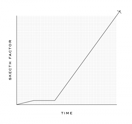
I decided to rebrand Playboy — a brand that many might say is arguably not dead, dying or defunct. Like many magazines, they actually are “dying” (financially), but for my project I focused on the decay of the overall perception of the brand. The graph below displays how I feel the brand has progressed in a more abstract fashion. Basically, these days, I would say most people would be embarrassed to say they read Playboy. A baseless assumption perhaps, but when was the last time you saw someone reading Playboy in public?
To keep up with the increasing trashiness of the American Men’s magazine, Playboy has been forced to reposition itself as “one of the boys” as it were, and is now indistinguishable from the Maxim’s of the world. Rather than hold on to the sophisticated standards of their early years, Playboy has come to embrace its unfortunately crude place in the magazine world. This evolution (rather, devolution) is tragic and the original soul of the brand has been lost. Maybe not “dead, dying or defunct”, but Playboy has certainly lost something along the way. I saw an opportunity to bring some of the original classiness and sophistication back with a drastic repositioning…
Japanese Municipal Flags

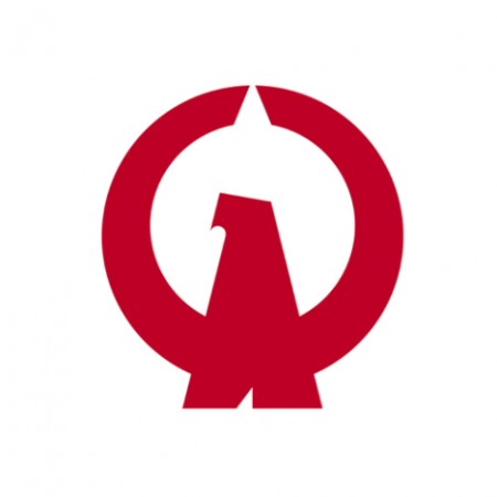



The above are some examples of the flags of the various cities, towns and villages of Japan. After looking at these, the “logo” for my town is very depressing. If I had one of these instead, flying over the place I lived, I would feel infinitely cooler and forever at ease. I am amazed at 1) how many different logos there are and 2) how many of them are absolutely incredible.
The original post on Pink Tentacle has many more on display. You can also see the full (and massive) list on Wikipedia.
Typography of the Fashion World
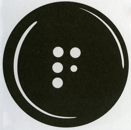
In honor of the currently unfolding (ha) Fashion Week in NYC, I thought I’d post on some of the terrific typography at work in the fashion world. When I first got into design, I used to think the typeface for the Louis Vuitton logo was the epitome of graphic design. I remember writing everything in Futura Medium for a good month (even research papers, nothing was spared). These days, I still to pick up the occasional GQ or etc just for the ads — usually can pick up a few interesting things. There are always a number of logos that catch my eye, continue reading to see some of the marks that resonate most.
The mark for The Fashion Center (above) is perfectly simple. How brilliant to utilize the button holes to form the F! This is probably one of my favorite logos of all time. What it comes down to for me is that the 5th button hole is slightly smaller than the rest — this subtle scale shift makes the whole thing. Developed at Pentagram.
Scandinavian Logos of the 60’s & 70’s

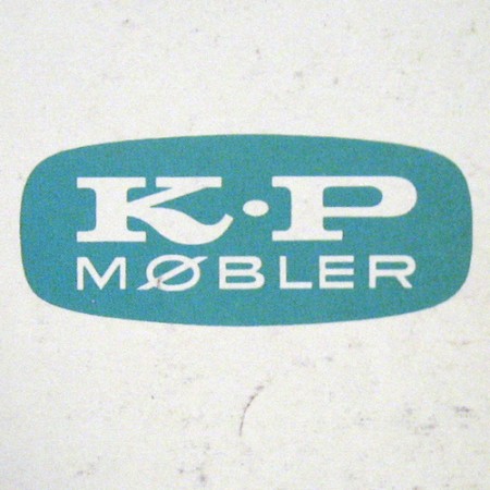
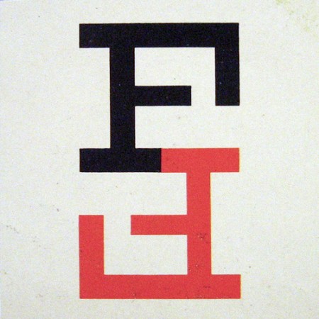
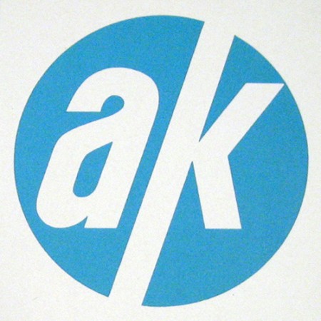
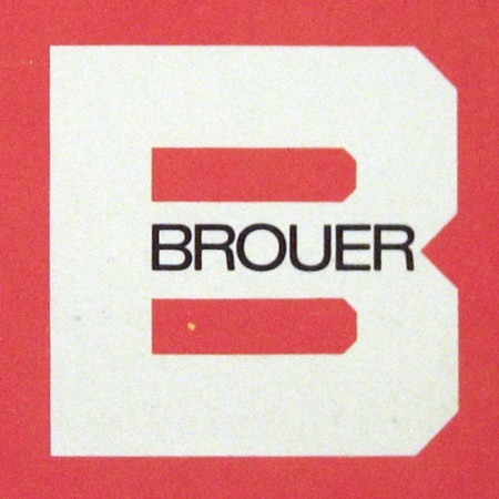
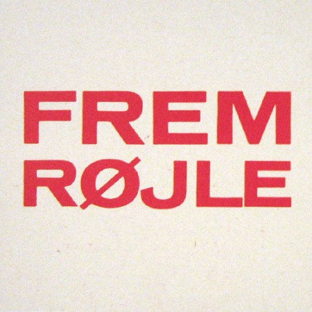
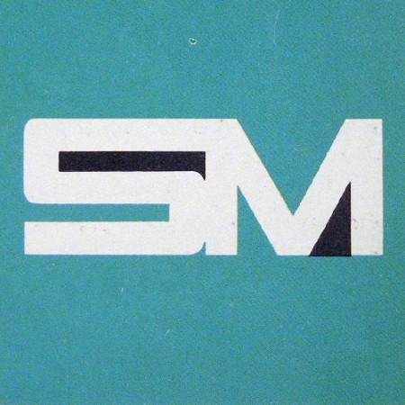
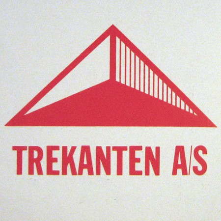
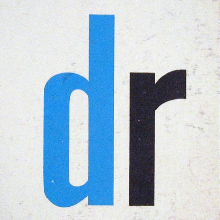
Some very nice scans of 1960’s and 1970’s Scandinavian logos from Oliver Tomas’s Flickr. As great as these logos are, it’s always amazing how much better things look when scanned from a well printed page. The texture and imperfect edges really take it to the next level.
Via Oliver Tomas
The Best T’s
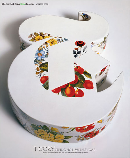
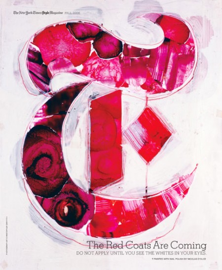
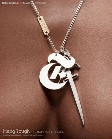
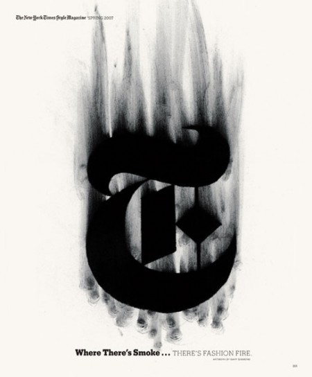
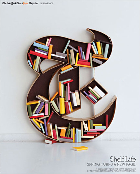
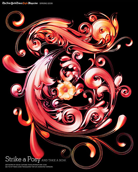
The New York Times’ T Magazine often comissions artists to create their own version of the iconic T that is the magazine’s logo. There’s a great collection of the work over at the T Magazine blog featuring some of the standouts. Interesting to see so many fresh takes on the same theme, they should make a coffee table book out of these if they haven’t already. My personal favorite is that first ceramic one; the negative space is so perfect. Unfortunately, whoever did the type layout decided that neon green in the title would somehow work with the vibe. Clearly it didn’t.
Swisscom Re-Brand Film

I can’t say I’m in love with Swisscom’s new logo by itself, but I will say that the overall rebrand feels right as a whole. The type treatment is solid and the logo — although downright ugly standing still — lends itself well to motion and reinterpretation on packaging. The rebrand was headed up by Moving Brands (apparently with help from Dalton Maag).
I’m not trying to diminish what Moving Brands has done — they know way more than I’ll ever know about brands and how people perceive them, and hell, for all I know this is the best logo ever made and it’s singlehandedly going to increase Swisscom’s annual revenue by 1600% — but seeing a room full of designers standing around an idea board like that and thinking about the hours and weeks and months and millions of dollars that go into a project like this… Well, I sometimes wonder why these big corporations don’t just surf Behance for like and hour or something, find the kid with the best logos, throw him like $50K (which will completely blow his mind and make him your slave basically) and give him like 6 months. I bet he comes up with something just about as good and you saved like $20 million or whatever the hell they pay huge agencies these days. Ok, that’s probably all a bit of a stretch, but it does cross my mind, and if I become CEO of a european telecom giant you better believe I’m at least going to look into the idea. Actually, Moving Brands should have just done the same thing and pocketed the difference, all those guys would be doing burnouts in Ferraris wearing whale skin jackets now instead of standing around a chalkboard.
All that aside, what’s amazing to me is that these companies had the presence of mind and resources to film the process. I can’t imagine what it must have been like for the poor designers over at Moving Brands having some guy with a camera always looking over their shoulder, sounds like a nightmare to me. Of course, a lot of this could have been compiled after the fact, but it’s still an interesting look inside the process of high level design shops. I’ve always wanted to do something similar for one of my posters — capture it from start to finish — but I’m convinced that the second I started the camera I would make the worst thing ever and as hard I tried I would never actually catch anything good happening. Maybe that would be more fun, the time-lapse frustrated designer movie. Video Link
More details and pictures over at Brand New
Via LogoDesignLove
Nakamichi 550
Nissan Cube vs Moodgadget Logo
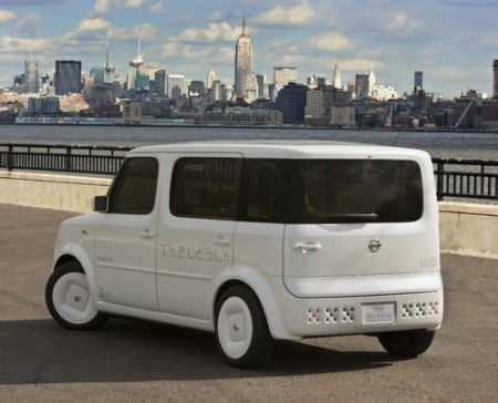
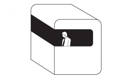
The other night i’m sitting on the computer and Mux Mool sends me a picture and starts laughing and talking about how there’s a Moodgadget car driving around. In my mind I always thought if I get enough money together one day I might buy a white Honda Element and turn it into the Moodgadget Logo. I might even put the generic man as a tint on the window but now no need because the Nissan Cube came into play. LOOK AT IT! I mean WHAAUUUT IS GOING ON!? who does that with a back window? only the Moodgadget logo.
Let me give a little background about the Moodgadget logo, a lot of people call it MOONgadget maybe because it looks like something that would land on the moon or I can’t pronounce my D’s because I might mumble sometimes but really its a dreamt up idea I had that involves my obsession with pods and early early Radiohead covers, the old Royksopp video, and those cube shaped rooms that take you up a mountain that are used mostly by tourists. The Moodgadget logo was designed by 3 friends of mine: Adrian (Creative Director of the silhouette iPod commercials), Danny (Art Director at Ghostly), and Adam (co-owner of Moodgadget) and the idea came from a dream that I had about these white pods what were controlled by these generic business men sitting inside them that floated almost assembly line style out of a glass dome flying by these row of trees and straight into the sun except for one that was in color meaning still black and white but the glass window was light blue and the guy inside had pigment to his skin. This guy wasn’t in the assembly line he was floating around exploring but not too smart of a fellow because he always questioned everything since it was all new to him and he was just overall really curious. I think that dream of the logo kind of symbolized the music industry back then for me which was a lot generic music and compilations that we’re very specific and what we do at Moodgadget is kind of break down those barriers that were up and share music that is all over the place but still catchy in a way, kind of like the music on the blog that we pick but still educates hopefully and makes you want to try listening to something new.
Let’s get back to the Nissan Cube, not my style because of how bad their commercial was for it which if I remember correctly was probably geared toward break dancers that pop n lock in their cars, people that love glowing LEDs filling their stereo screens and those people that go out to the club with a fedora hat on tipped to the side because they’re soo “street” it hurts. To be honest Nissan should of hired on a creative like Scott or some of you that send in great pieces that Scott reposts and not this Mitsubishi Eclipse regurgitation of a car commercial that probably could be sold to people like me if it was delivered to us in a way that doesn’t make me feel like a soulless 20 year old that can’t speak for himself and wants to dance to Soulja Boy or whatever ringtone Rap is popular now(the stanky leg? I dunno i’m so lame when it comes to the hot tracks on the radio) or Tiesto talentless trance music thats played in the bigger metro clubs around the world.
Either way, I’d like to see a song off this blog make it onto the next Nissan Cube commercial, maybe we’d post the commerical and the 4th generation Nissan Cube get a little help from a design firm from Sweden and we might sell a few of these cars.
Top 3 Logos / Alex
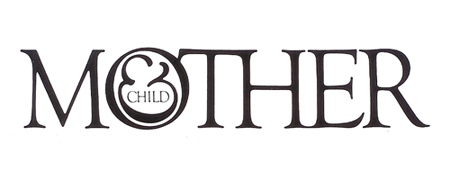
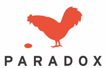
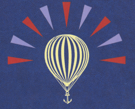
I am usually reluctant to list my favorites of anything. It’s hard to establish a consistent criteria with which to judge all items fairly, and even if you do, the list changes so frequently that it’s pointless to commit it to writing. My one exception has always been logo design, and Scott’s recent post got me thinking about it again. For as long as I’ve been interested in design I have always maintained the exact same favorite logos. They aren’t necessarily in any particular order, but the three pictured above are far and away my favorite marks of all time. I’ve never been satisfied with logos that gain their strength over time or with gradual brand association; for me, a successful mark works right away.
Mother and Child by Herb Lublin
The immediate cleverness of this one is probably what is most attractive to me. I remember staring at it for about five minutes the first time I saw it in the back of Area. I couldn’t believe how at once simple and wonderfully complicated it was. The ampersand has always been my favorite symbol, so to see it employed so unusually was also very exciting.
Paradox by Christopher Simmons
Another perfectly clever image. It needs no explanation and the “aha” moment occurs instantly. I’m still impressed how much wit was able to be squeezed into one tiny little mark. Like many great logos, it appears incredibly simple and seemingly obvious, but only after it’s come to fruition at the hand of another designer.
Modest Mouse by The Decoder Ring
What a perfect single image. This is one I can’t look at without feeling incredibly jealous for not thinking of it first. It encapsulates so many different feelings and emotions in one single mark, while still managing to be aesthetically pleasing at the same time (though I can’t stand the colors). The designer sums it up nicely: It’s an idea I came up with because it represents stasis — the balloon will never go up or down. It’s just a general feeling I have about everything: Every time we seem to cure or solve something, another problem pops up.
Of course there are many other wonderful logos out there, but this is a top 3 after all. List yours if you can think of them!
