Posts in Magazines

+81 Voyage | Magazine Report


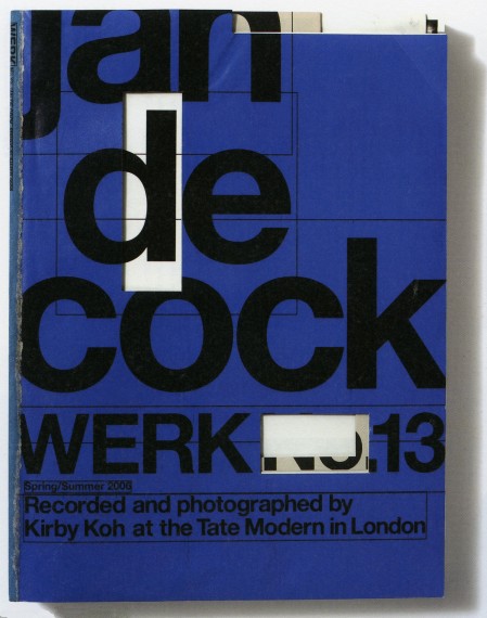
Werk

Werk


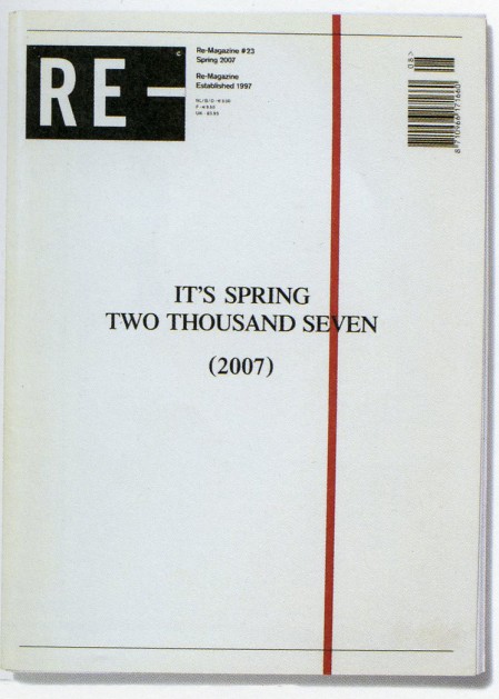
Re-Magazine

Re-Magazine


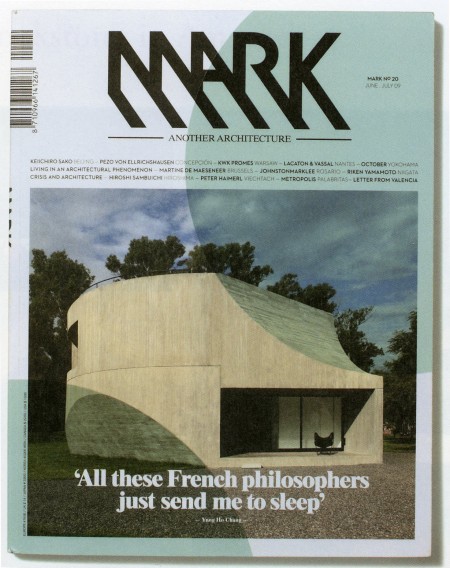
Mark

Mark


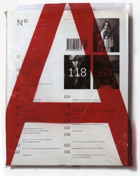
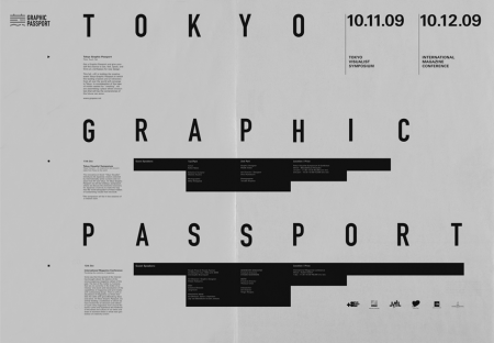
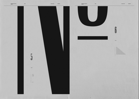
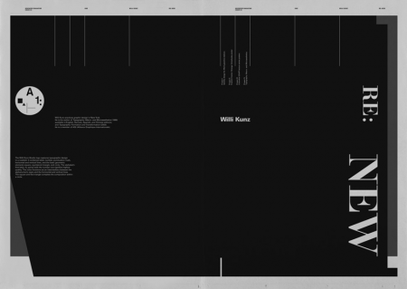
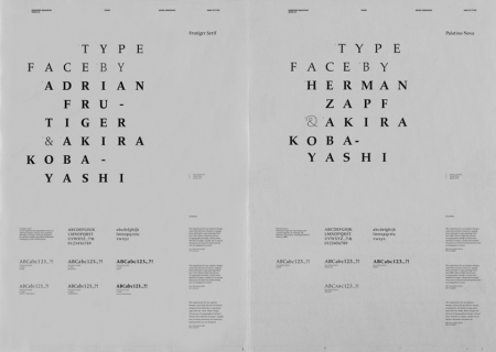
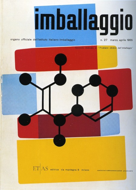
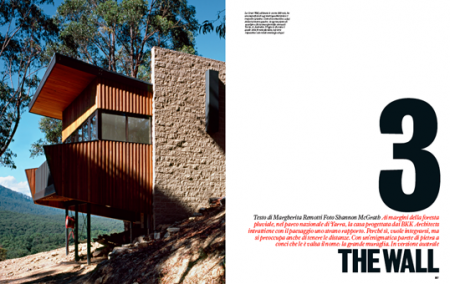
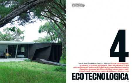
A new edition of the frustratingly infrequent +81 Voyage is out now. Billed as the ‘Magazine Creation and Bookstore Excursion’ issue, it rounds up some of the most exciting and innovative magazines out there today. From Newwork to Monocle, there are example spreads, designer interviews, and just about everything else a magazine lover would hope for. As stated in the introduction, the goal of the issue is to prove that, even in this day and age, the appeal of magazines is alive and well. As a die hard magazine consumer, you don’t have to tell me that, but if you need convincing, there is plenty of terrific and inspirational design to be found in this most recent issue. Above are a few of the magazines profiled.

Our aim with this event is not to yearn for the magazines of yesteryear but rather to look upon those magazines extant in the world today, and in doing so, understand the culture and tastes of our time, reaffirm our awareness of paper’s function, and confirm the intelligence and ingenuity of humanity as seen in magazines.

Related Reading
An Overview of Design Related Magazines
Can Design Save The Newspaper?
NYT Magazine ‘T’ Covers

Newwork Magazine

new
new2
Picture 10
Picture 11
Picture 5
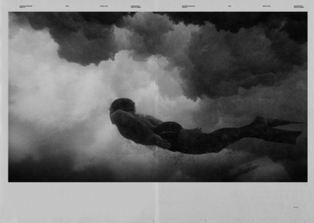
These spreads from Newwork Magazine are exceptionally awesome. At first I wasn’t sure why I was so taken by them, but I think it’s a combination of the following factors: sole use of (mostly) black and white, implementation of a strict grid, lots of little type details throughout, and a sophisticated and effective use of negative space. Newwork Magazine (ink on paper / 32″ x 23″) is put out by Studio Newwork.

The Best T’s

t2t1
t3
t4
t5
t6

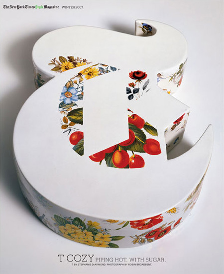
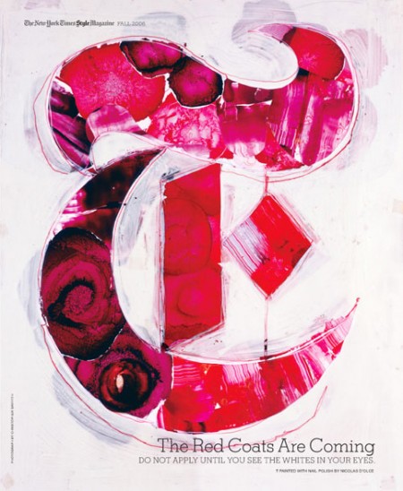
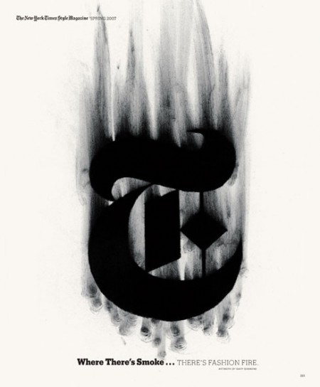
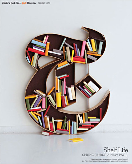
The New York Times’ T Magazine often comissions artists to create their own version of the iconic T that is the magazine’s logo. There’s a great collection of the work over at the T Magazine blog featuring some of the standouts. Interesting to see so many fresh takes on the same theme, they should make a coffee table book out of these if they haven’t already. My personal favorite is that first ceramic one; the negative space is so perfect. Unfortunately, whoever did the type layout decided that neon green in the title would somehow work with the vibe. Clearly it didn’t.

Link

Design Magazine Overview

magazine spines
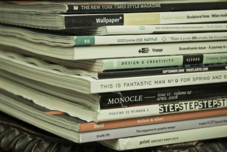
As much as I love my Google Reader, I still prefer to get my design fix in printed form. In addition to providing the necessary dose of inspiration, magazines usually include insightful commentary and design criticism. I love this sort of writing on design and it seems like the best place to find it is still in the “unplugged” land of printed media. Additionally, with each one you get an actual piece of design to hold in your hand. It’s easy to forget how cool this is if you’re used to bouncing from blog to blog. After the jump, I’ve put together an overview of a the major players in the design magazine realm. Check out the list!

(more…)

Max Huber Round Two: Idea Magazine

idea1
idea2
idea3
idea4
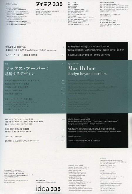
Immediately after I posted a few Max Huber posters earlier this week, I walked into Kinokuniya and saw that the latest issue of Idea was devoted to the man himself. A fantastic coincidence and even more fuel for my Max Huber inspired creative fire. The issue is huge (about 200 pages) and is filled with some pretty incredible stuff. A lot of work I had never seen before; I put a few of my favorites above (the Table of Contents as well). The issue costs quite a bit for a magazine ($50 eek!) but Idea is certainly of much greater quality than most magazines. Well worth a perusal if you find yourself in a Japanese bookstore any time soon.

Case Da Abitare

case-da-abitare1
2541510582_27b26d2cb3_o1
2541508592_6f1847cb21_o1
2541512008_87a9f260b4_o1
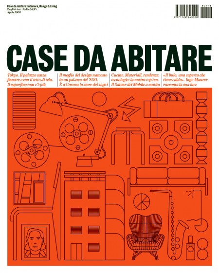
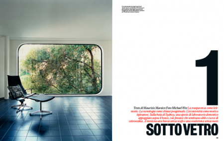
Caught these images of Case Da Abitare magazine over at Things To Look At. Very nice!

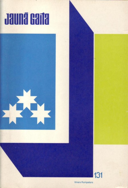
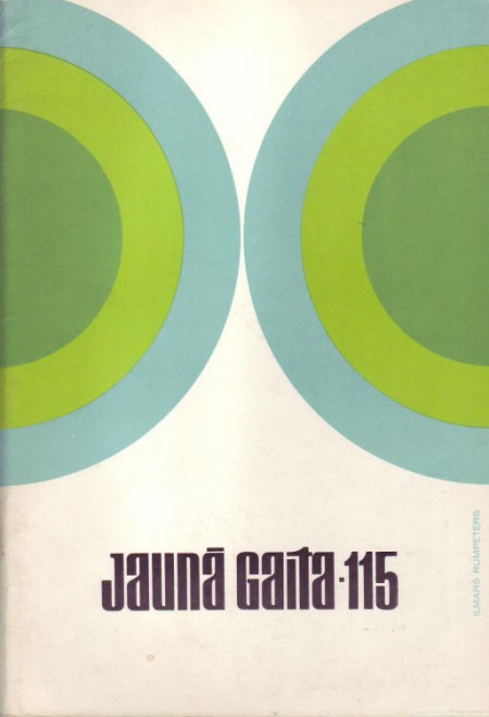
Jauna Gaita 90/115/131/133

jg133_vaaks
jg90_vaaks
2391569107_ae2d88ce79_o
2391524967_b3a624f110_o
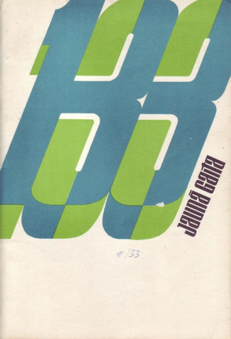
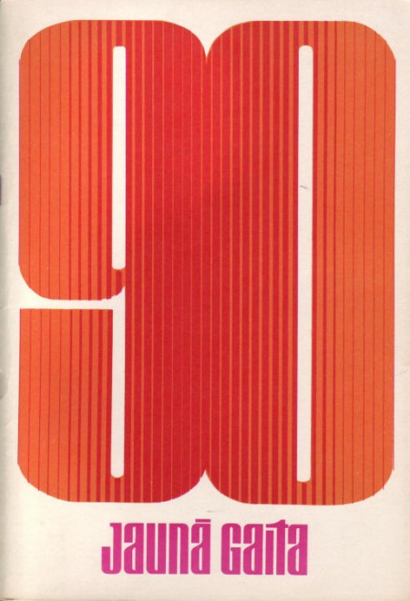
Some more great covers from Mikus Vanag’s Jauna Gaita archive. Sooooo good.

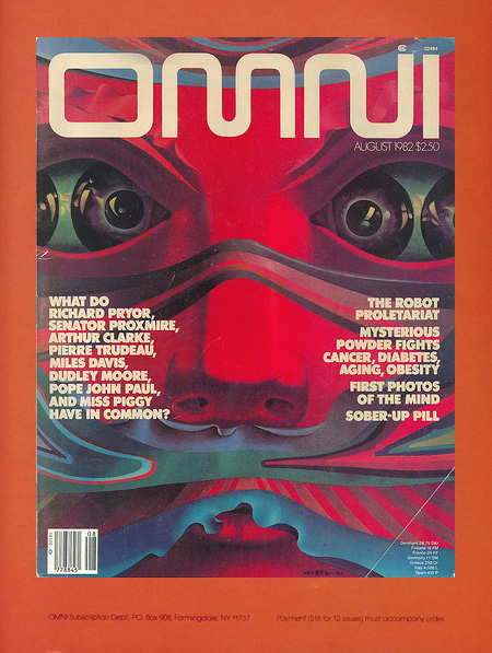
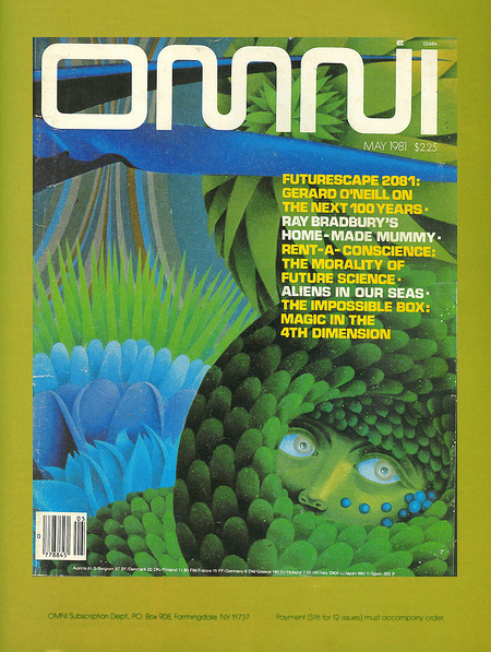
Omni Magazine Covers

omnired
omnigreen
omniblue
42105956_7283fd3022_b
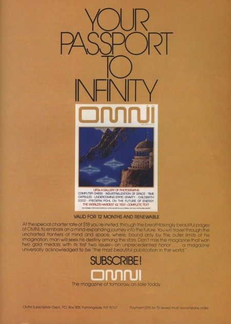
I remember seeing Omni magazine when I was a kid and wanting it. For some reason I was never able to get my hands on an issue, so I still don’t know what it’s about, something to do with sci-fi apparently. Anyways, the covers and style are excellent regardless of the content. You can find an archive of all the issues here, although the images aren’t very large.

Buchanan-Smith / New York City

picture-43
picture-83
picture-74
A few beautiful pieces by Buchanan-Smith, a New York City based design firm. I love their type sensibility, especially on the first image, and I find their image style very effective in its simplicity and subtleness. Much more work can be found on their site.

Modernism 101: 50’s Architecture

mags101
Just a few gems from the Modernism 101 collection. Modernists in the 50’s had it down and it’s images like these that remind me it wasn’t all garishness back then. Not everything had bubbles and fins and bulges; some people were hiding out in the woods quietly appreciating their straight lines and right angles. Unfortunately, most of them stayed in the midwestern United States. Out here in San Francisco, apparently they decided that the height of architecture was the victorian age so all we got is a bunch of ugly houses with 400 rooms in them and Mel’s Drive In.