Posts in Magazines

+81 Magazine

pluseightyone
pluseightyone4
pluseightyone3
pluseightyone2
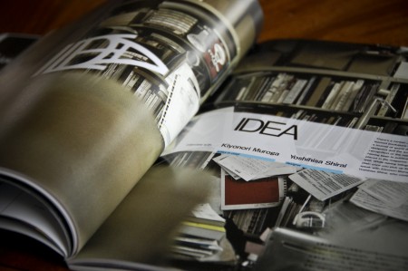
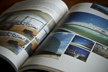
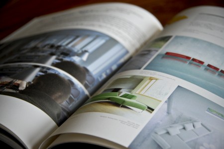
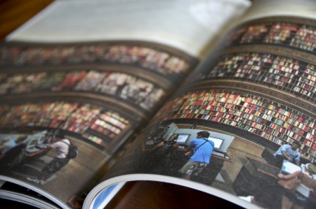
I had a chance to travel to Japan last June and I came back with many new sources of inspiration. I spent a lot of time digging through little design shops and actually had to leave some clothes behind to fit all of the great books I found. One of my favorite finds was +81, an interview driven magazine about graphic design, fashion, photography, cities, etc. They present a ton of work in each issue and it can be a great source of visual inspiration when you are looking for something stylistically very different than what you see in most American design publications. With articles presented in both Japanese and English, you see a lot of very creative layouts and unique type treatments. They experiment quite a bit, and with each issue focusing on a different theme, you never really know what to expect. Definitely worth checking out if you’re looking for a change.

You can usually find it at Japanese language bookshops here in the States (I know Kinokuniya carries it in SF), or you can check out their website for subscription information. (Currently about 40% of their readership is outside of Japan)
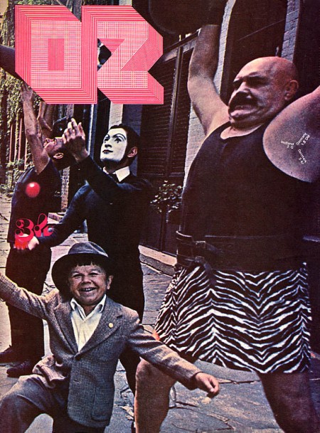

OZ And Other Scenes

oz14cov
oz07cox
oz06cov
oz21cov
oz17cov
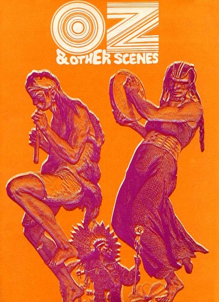
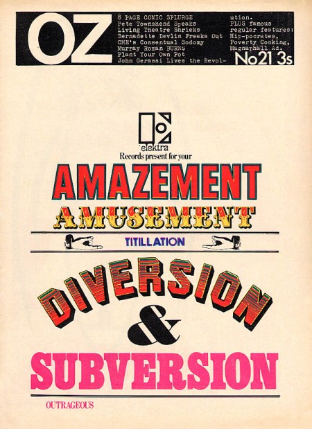
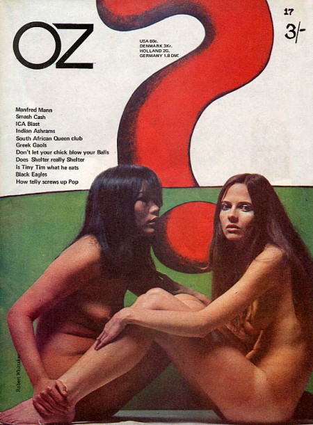
I love the 60’s because everyone was tripping balls all the time and then they would come out with crazy magazines to prove it. Case in point: OZ. These covers need no explanation, they are simply incredible. The overall idea of the magazine is definitely reminiscent of Avant Garde, but a lot of Herb Lubalin’s work seems somewhat tame and reserved compared with the over the top stuff (at least for the time) we see in OZ. My favorite cover is the one featuring The Doors “Strange Days” album photo with maybe the most awesome magazine logo ever slapped right on top of it. Also, the date and cover info are printed in the weight lifter’s armpit so that’s a bonus. It must have been nice back then when all you had to do to “freak out the establishment” was put some naked girls or a midget with circus people on your cover.

OZ started out as an Australian satirical humor magazine but then moved to the UK and began life anew as a “psychedelic hippy” magazine (I am sure the genre was overflowing at the time). Featuring art by Hapshash and the Coloured Coat and design direction by Martin Sharp, issues of OZ have become collectors items in the years since it’s demise [source].

You can browse cover scans of all the of UK issues of OZ here. On a side note, Google books features the some of the text of “Graphic Design: Reproduction & Representation Since 1800” which makes mention of OZ and Sharp.

Die Neue Gesellschaft ’74

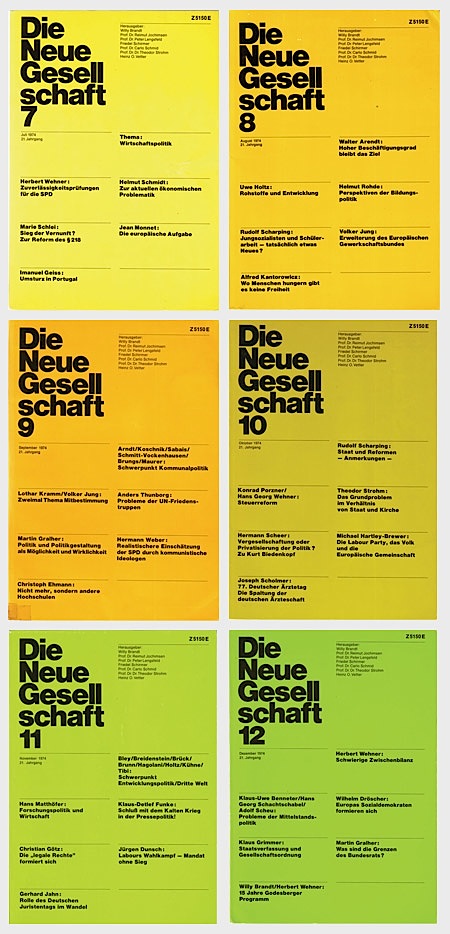
die-neue-gesell.jpg Die Neue Gesellschaft issues 7-12, 1974. This was a German political magazine art directed by Helmut Schmid. These scans were obtained by AisleOne through the curators of Schmid’s work. I love the color coding, apparently this design continued through 1981, would love to see the full spectrum of covers. There’s some more info over at AisleOne and some larger scans at their Flickr page. If I was German I think I would spend most of my weekends digging through my parent’s house for stuff like this.

The New Yorker & Photoshop 3.0

staakeelectioncover.jpg

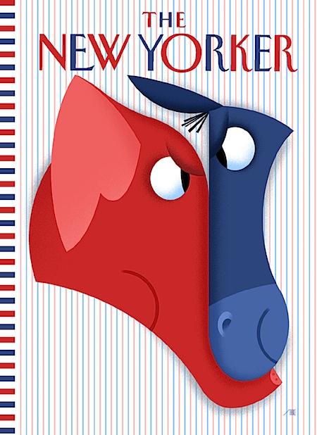
Artist Bob Stake used Photoshop 3.0 on Mac OS 7 to create this cover for The New Yorker recently. I guess you use what you know… The video above shows Bob progressing through the design, it’s a nice glimpse into another artist’s process. The whole story and more details are here. Via Gizmodo

Avalanche Magazine

avalanche_web.jpg
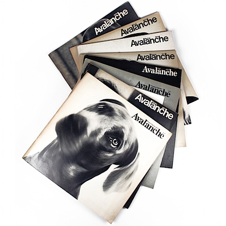
Loving these Avant-Garde-Esque covers. Via FFFFOUND

Esquire E Ink Cover

CIMG1500

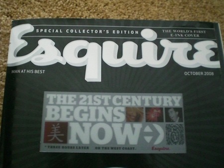
100,000 copies of Esquire’s October 75th anniversary issue will sport the "World’s First E Ink Cover". The video is pretty amazing; I’ve seen Kindles and other E Ink-equipped gadgetry before, but this is a  pretty stunning application of the technology. Whether it is relevant and/or functional as a concept remains to be seen. There are already some people raising interesting questions as to this potential trend’s impact. Whatever the case may be, that cover is pretty damned cool looking.

Via Engadget

N+M II

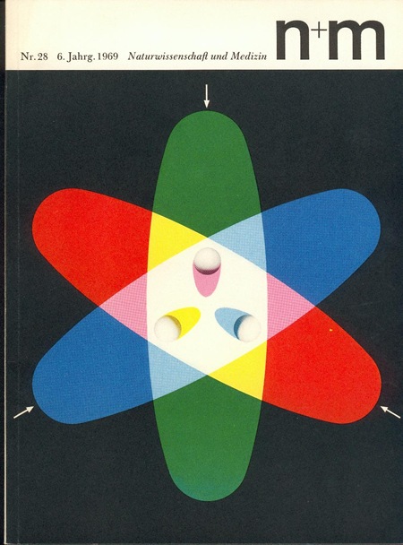
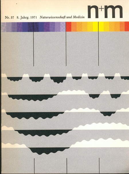
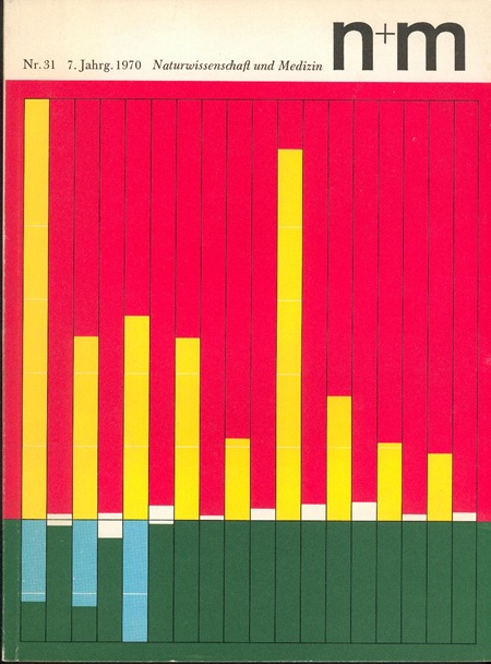
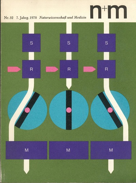
384128807_9176f16797_o 384128850_d5a578e2f3_o 384128309_3f76d943f2_o 384128669_78b2c97553_o
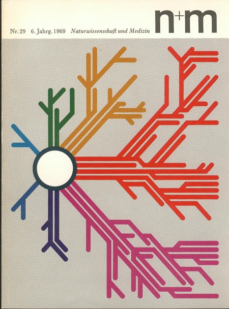
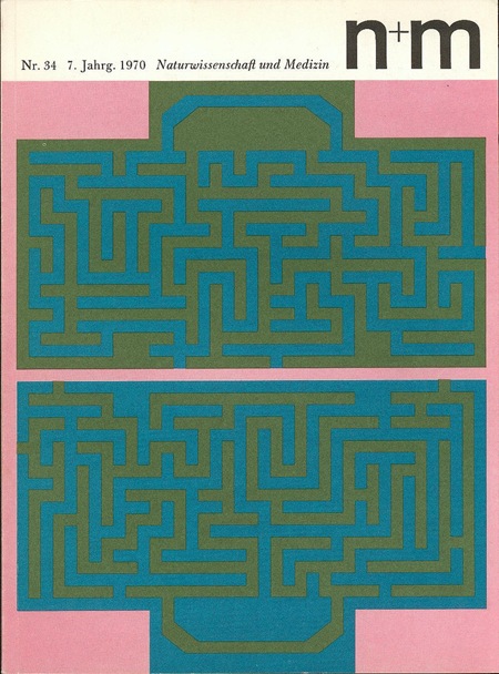
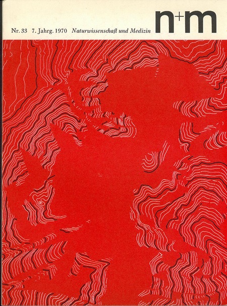
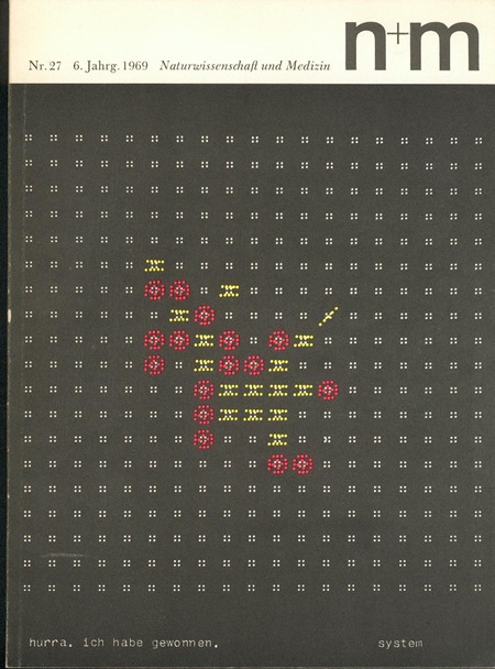
Some more brilliant covers from N+M (Naturwissenschaft und Medizin) Magazine. They were designed by Erwin Poell in the late 60’s. These are such incredible examples, not only are they beautiful, but they are no doubt conveying some extremely complex concepts through information design.  There is apparently a book covering Poell’s work (via Thingstolookat):

Title: Entwürfe für den Alltag. Typografie, Grafik-Design, Art Direction
Author: Erwin Pœll
Year: 1992
Publisher: Birkhäuser Verlag Basel
ISBN: 3-7643-2758-8

Also check out Things To Look At’s article on Poell and the N+M covers.

N+M

384128606_39bd3e712a_o384128397_75553eb877_b 384128501_9e1c6ca928_b384128914_cd3790b340_o
These incredible N+M (Naturwissenschaft und Medizin) covers are from ekusupo on Flickr. They were apparently designed by Erwin Poell but I couldn’t find any more information on him to post along with the images. At any rate, this is some classic design done to perfection. Ekusupo says of them on the Flickr page:

"I share these as one of the best examples of graphic design as a methodic communications system I am aware of. Engaging and varied, as singles or as a set work tremendously well. The inside of the magazine may be considered disappointing if you want more of the same as the cover – but actually is delightful simple. The cover does its job really well selling the contents while the contents is true unto itself."

Indeed, this set is an amazing triumph of design for many reasons. You may recognize the name and some of the images from the Graphis Diagrams book.

1971 Architectural Record Issue 2

Cover
red circle
page1
ad
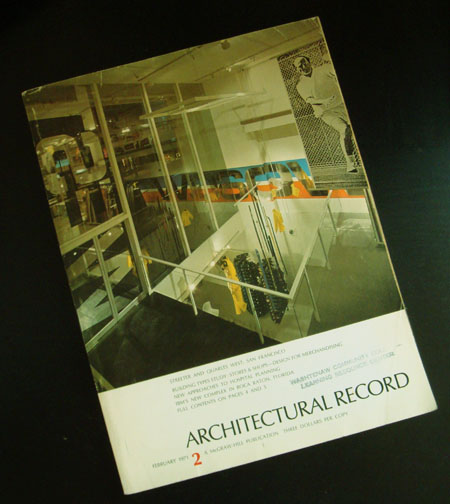
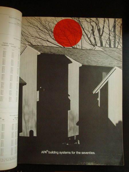
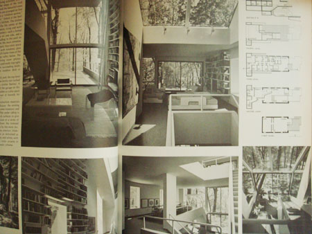
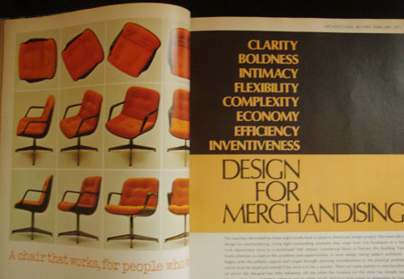
I grabbed some copies of this magazine because someone was going to throw them away. I’ve had them for awhile now and i thought i could share a few. I really love the red dot one, the dot just shows up randomly thru the magazine on black and white photographs. When i look at these older magazines i always wondered where they got all their typography, did these designers meet up and share? was there a mail-in ordering company for different types? hopefully i’m not treating the 1960’s-70’s like the stone age or anything to anyone but i always wondered about the process of graphic design was during that time to put out a well layed out higher end magazine.

Jauna Gaita on Flickr

2391630535_7f896c60ae_o
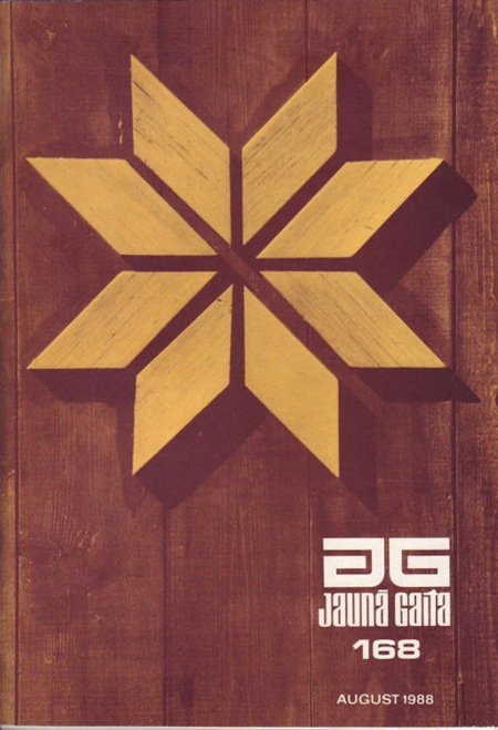
I came across a nice cache of Jauna Gaita cover scans on Mikus Vanags’ Flickr. Some of the scans are better quality than the ones on the official JG site which I posted yesterday.