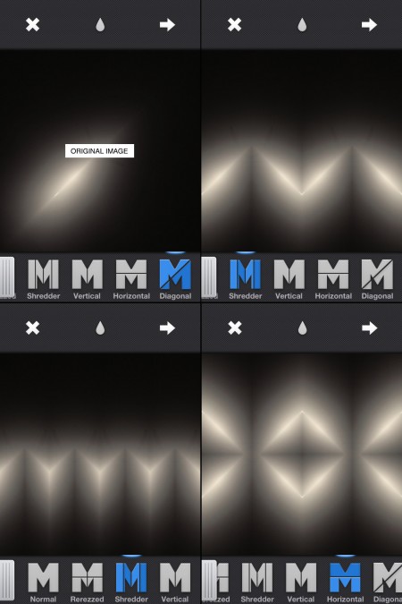
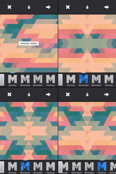
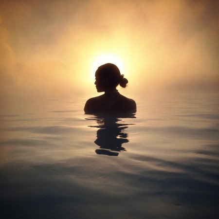
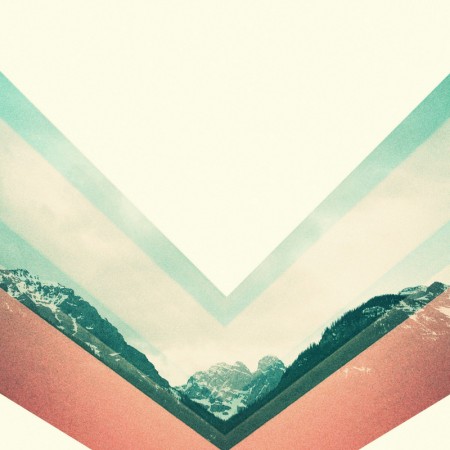
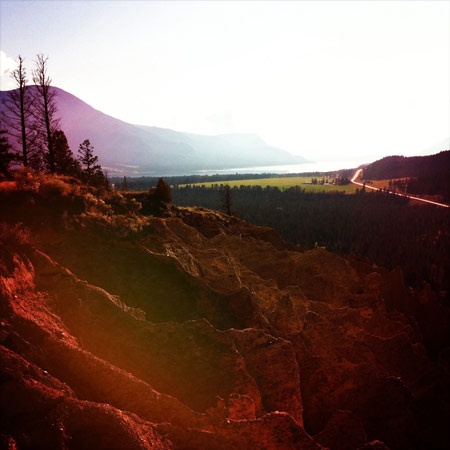
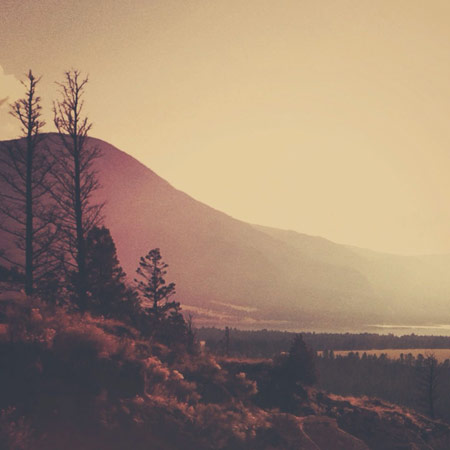
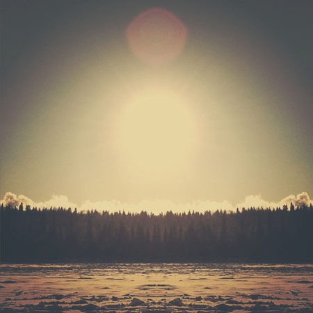
If you are interested in mirroring on the iPhone at all and you haven’t heard of Mirrorgram you are missing out. It’s just about everything you could ask for in a mirroring app. You can snap a photo in the app or load one in, but the real beauty of it is once you are mirroring an image you can move it around to get the mirror just right. Above are a couple images I ran through Mirrorgram. The first one is a photo of a hanging light in my living room. I then mirrored it on a 45 degree angle to get the slit of light and then brought it back in to Mirrorgram again. The second one is a photo I took of a type poster and then ran it through PXL to get the jagged triangle pattern and then through Picfx to get the colour and the grain. I brought it into Mirrorgram to get the different patterns you see above.
Posts in Mobile Apps
Mirrorgram
App Review: Photoforge 2
If you’re even remotely serious about editing photos on your phone, Photoforge 2 will quickly become your mainstay. Here’s why:
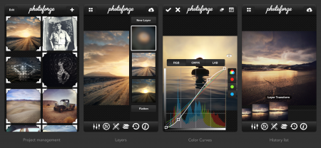
It’s the best, fully-featured photo editor for mobile.
After years of trying every photo editing app across Android and iOS, I have yet to find anything better. Like Photoshop, it gives you full control over your image with features you thought you could only get on desktop. It’s not for quick edits, so if you’re in one-stop filter kind of mood, or less familiar with terms like “adjusting curves” or “soft light,” Afterglow is probably the way to go. If you are familiar with those terms, it’s easy to spend hours fiddling away on the go just as you would in front of a bigger screen at home. Just be careful not to get car sick.
Layers, layers, layers.
If anything, layer support is what sets this app apart from the rest – you can easily overlay other photos, create 50% Gray layers to add film grain, textures & vignettes, or drag to re-arrange layers as you please. It even supports layer masking, so you can edit-out imperfections or localize adjustments similar to how you would in Photoshop.
Powerful color curves.
Yep, same color adjustments as you would expect in popular photo editing software for desktop. In fact, many of the Instagram filters (Rise, Amaro, Sierra, Willow) were initially designed with this app, using this feature.
You can always undo with the edit history list.
As project management goes, Photoforge 2 preserves every stage of your edit across multiple projects. The one downside is how much space this takes up on your phone. Since we’re dealing with multiple versions of many full-resolution photos, this app will quickly become the heaviest app you have installed. Be sure to delete the photo projects you won’t be revisiting.
Grab the app for iPhone & iPad on iTunes for $3.99: Photoforge 2 [iTunes Link]
Masking tricks in Image Blender
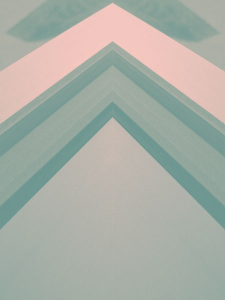
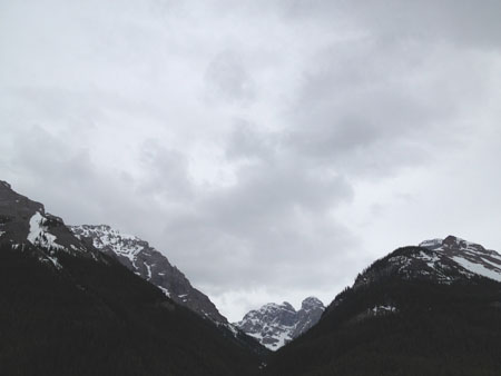
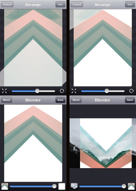
Image Blender is my go to app for blending and masking but I was getting frustrated using the brush tool to mask a straight line, then it dawned on me that I could use a solid black or white image to “knock out” the part I wanted to be transparent (or in this case to be opaque). Once I blended down the solid black or white I could bring the image back in and use the blending modes to get the transparency.
The screenshots above show this process. The original photo was the edge of a window frame. I overlaid a blank white image at four different angles. I then flipped it and blended it over the mountain photo. Tip: Swipe to the right to move and rotate the image and then from the main screen tap and hold to flatten down, switch images or copy. I did the final color adjustments in picfx, another go to app for me. If you have any other Blender tricks post them below!
Posted by: Seth Hardie
Instagram: @hallwood
Designing With Photography
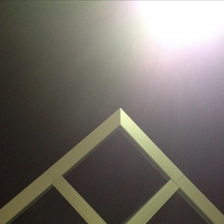
1. Initial photo (architectural feature)
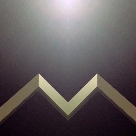
2. Cropped and mirrored
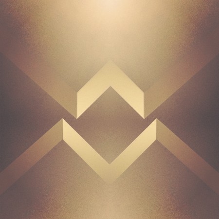
3. Cropped and mirrored and layered in Image Blender
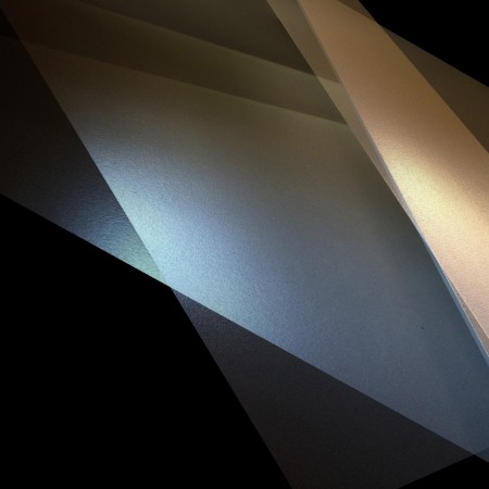
1. Initial Photo of some shadows in a corner (taken with Stilla)
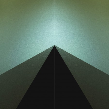
2. Cropped and mirrored
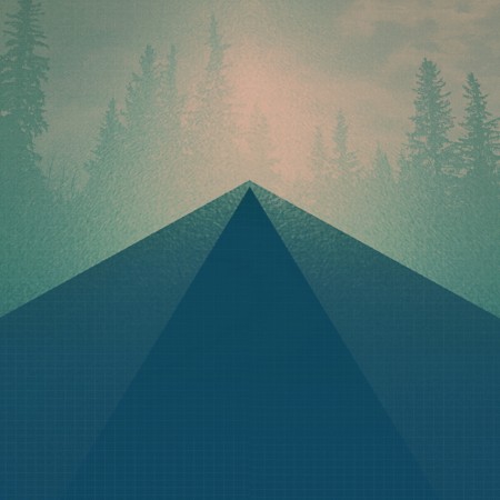
3. Final Image layered in Image Blender
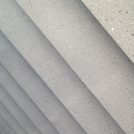
1. Initial photo of some stairs
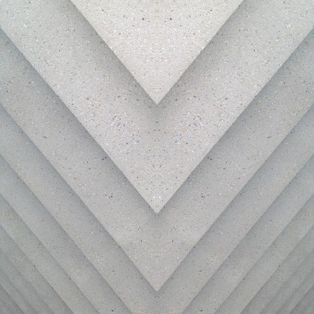
2. Mirrored (you may notice a habit here)
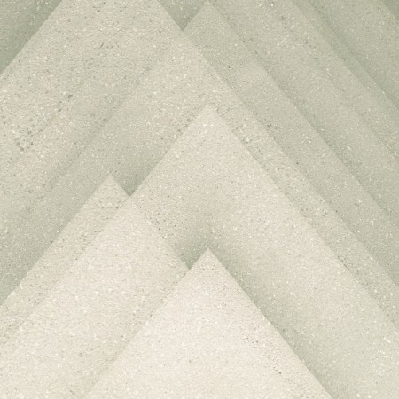
3. Final image layered in Image Blender
The first photos I started using in my designs were simple textures. (we’ve all seen the explosion of texture sites out there) but lately I’ve been using photos to get shapes that typically I would have drawn before. This has been largely driven by having a decent camera in my pocket at all times, allowing me to capture random staircases or light hitting the corner of an architectural feature just right. I find the natural light and texture in photographs have so much more depth in the final product then what I can come up with in photoshop …and its much easier to get to the end result.
Posted by: Seth Hardie
Instagram: @hallwood
Tired Of The Mouse
 One of the reasons I enjoy creating on my iPhone, is it takes me out of my usual process. The image above I created with Fuzel It’s similar to Grid Lens but lets you make your own slices that you can load up with images. The lines are the slices I made and then I added a tringle to each slice. (I added the clouds with Blender). This is all fairly simple to do in Photoshop with masks but not nearly as simple to manipulate. Being able to tap points and change their size as I’m moving them around feels much more “organic”. I find the results are less forced and there seems to be a more natural progression of the design. I recently switched from a mouse to a tablet which I find much more natural, but you really cant beat direct contact with the screen. Posted by: Seth Hardie Instagram: @hallwood
Finnish Meteorological Weather App


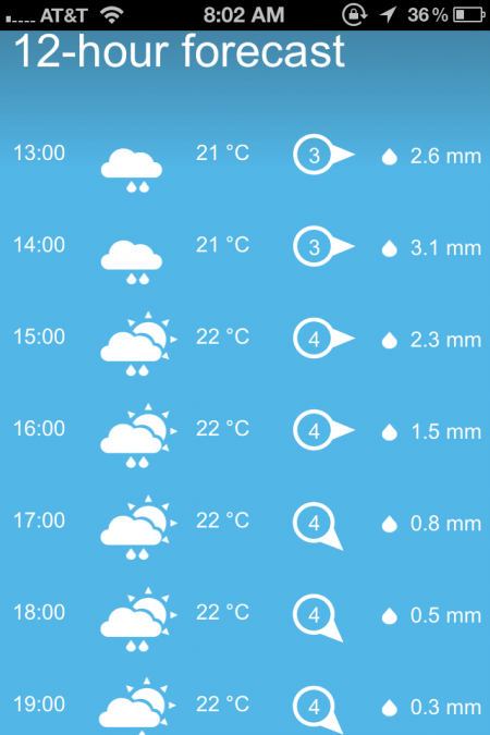
Probably one of the most visually appealing mobile app icons you can buy(it’s actually free) is the Finnish Meteorological Weather Institute’s App. It’s nothing fancy it just gets the job done of telling you the forecast but in a nicely designed way.
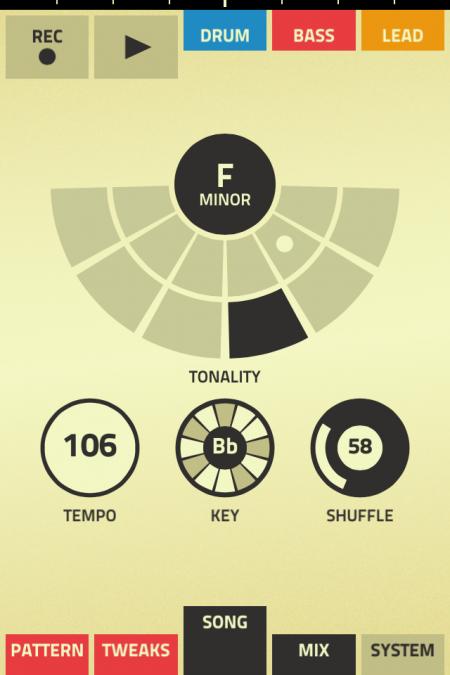
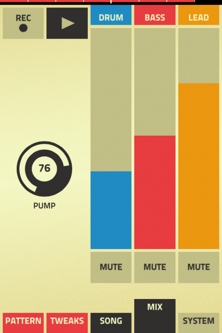
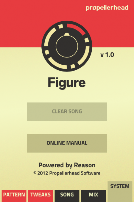
Propellerheads unveils Music Making App
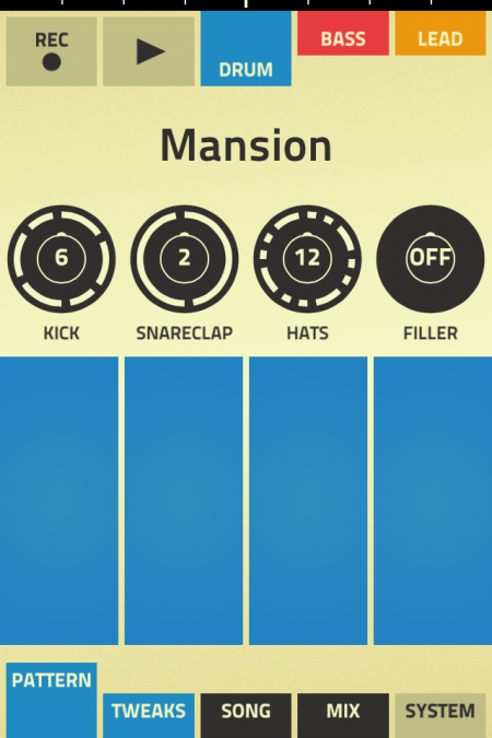
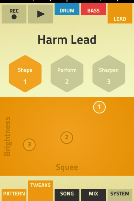
Swedish software firm Propellerhead (the makers of Reason) put together not only a simple eye appealing music making app but one that has controls that will have you making music in just a few minutes.
The great part about this music app is the sounds aren’t wacky, thin or robotic, if you’re a Reason user like myself since v2.0 then this will make you smile from ear to ear especially at the $.99 price tag.
They have a thorough overview on their site and the solid video above for new fans. Definitely haven’t been this happy about a music app since Animoog.
“I think we as an industry haven’t been that great about inviting people in who don’t have deep dreams about becoming big stars or understanding everything about music production, it’s time for that: I think everyone should be invited to be part of this. Figure is a small step towards that.” – says chief executive Ernst Nathorst Böös.
– via Guardian UK
The Violet Crown App At SXSW
With everyone heading to or already at SXSW this week and next, I thought this would be a good time to post about the location aware music apps that Bluebrain has been doing. They’ve already done one for The National Mall and Central Park ( Listen To The Light ), the new one The Violet Crown is based around Austin and SXSW. Basically it’s, as Bluebrain describes it, “a musical composition, available exclusively as a free iPhone app, that uses the phone’s built-in GPS to alter the music as the listener traverses the area – each street and intersection is tagged with various pockets of sound, turning the festival grounds into a musical ‘choose-your-own-adventure’.”
You can download the free app here through iTunes.
It’s a really cool concept and as of yet, I haven’t been able to try out the other versions from The National Mall or Central Park ( Listen To The Light ), The Violet Crown will be the first.
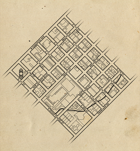
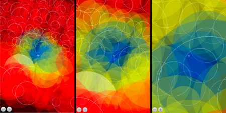
For those that can’t make it out to SXSW this year, I dug a little further to get some more of the background on The Violent Crown app and some process. Ryan Holladay of Bluebrain went over the technical info and he sent me a few screen grabs and a map from the programming end of things. He also did a breakdown of how it works, which I think is really interesting.
“What you are looking at in these shots is the app simulator running running on our desktop — this is a way that we can remotely test the music without having to be in Austin and simulate the experience of, say, walking from one block to another and hearing how the music changes. As you can see, there are many in a single area, often with so many overlapping that it’s difficult to tell visually where each of them are located. The crosshairs in the middle represent the location of the listener, the various circles indicate the size of the audio track and the colors the state the audio is in: Blue, as you probably guessed, is playing, while yellow is cued and red is disengaged.
Because, by design, the app basically has to be ready for whichever direction you move, what we have is a system that prepares the audio to be dropped in at any given point and at the correct interval by preloading audio in every direction within a certain proximity. So, for instance, if you were to begin walking from Frontage Rd towards Congress Ave, halfway up 4th Street it will have prepared the tracks waiting for you when you arrive at Red River Street. But, when you reach an intersection, the audio to your left and right is also waiting for in case you chose that direction. Once it’s realized you’ve moved on, it drops those tracks to save processing power until you turn around and re-approach.”
To see what it’s all about check out the Making Of video below, which gives you a detailed explanation of what it does and how they actually built the one for Central Park ( Listen To The Light ).
Inspiration from new tools
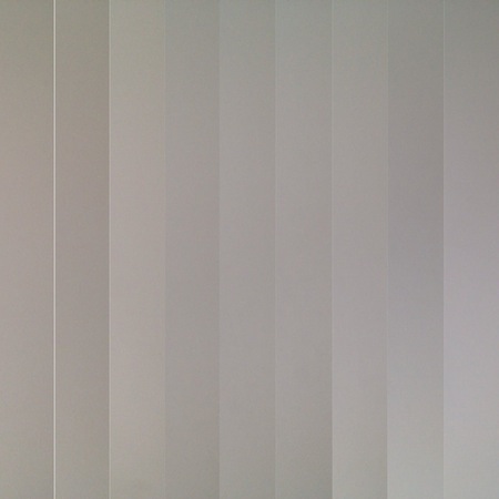
I’ve been having a good deal of fun editing on my iPhone lately and its even spilled over into some of my design work. I recently discovered a great little app called Grid Lens (well worth checking out), and created a custom grid for myself of skinny columns (Some inspiration from this painting) and took a sequence of photos of a white wall… It turned out like this (see image above).
I figured I was onto something and brought it into Image Blender (another invaluable app) and started layering it. First horizontally and then diagonally. I ended up with this:
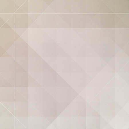
This got me pretty excited, especially because it started with a photo of a white wall… I then layered it over another photo that I mirrored for more symmetry and ended up with this:
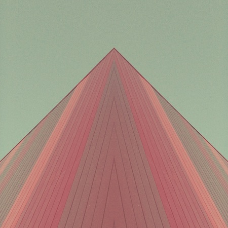
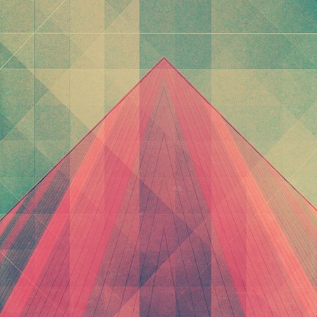
I find accidental creativity to be some of the most exciting, especially when it comes together quickly, when you almost cant keep up with it.
A few more examples of the same technique:
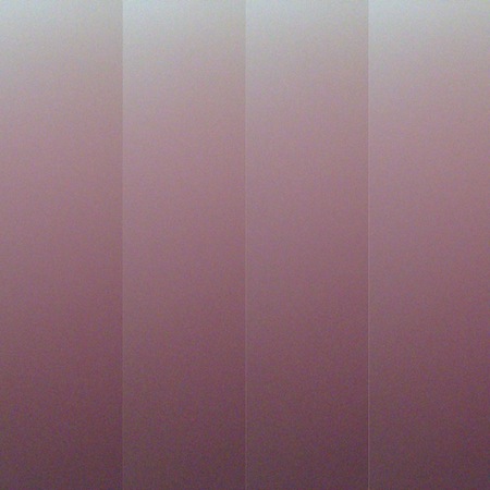
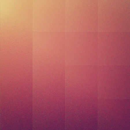
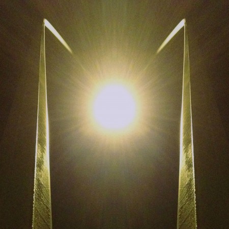
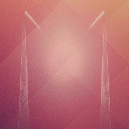
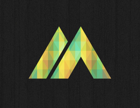
I am working on a logo right now and I figured this is great application to try out this same technique. I did it all in illustrator but the inspiration came from a $2 app.
Tools that fit in my pocket fit much better into my life.
All images by Seth Hardie
Find me on Instagram here: @hallwood
The Importance Of A Good Crop
I’ve been taking pictures with my iPhone for about a year and half now and I’m continually surprised at the things I’m learning and new techniques I’m discovering.
I barely used to crop at all, especially when editing my DSLR photos. I was always (overly) concerned with resolution and making sure I didn’t lose any.
Enter lower resolution iPhone with a fixed focal length…
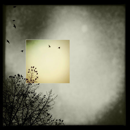
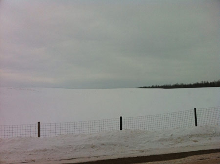
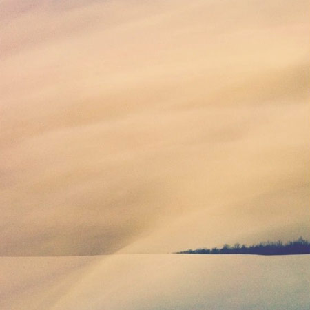
As I always have my iPhone on me this is how I take most of my photos these days. I often find my self on the other side of a river, across a huge field or just a little too far away from a mountain. This has literally forced me to crop in closer to get the photo I want. Because apps like Instagram publish quite a small image I don’t care as much about resolution anymore (although this can be frustrating later).
Having this “freedom” of no longer caring so much about resolution has encouraged me to crop more and often I find myself revisiting photos that I had written off, only to discover post crop a new favourite photo. Where I was concerned about resolution before I’m now concerned about the final composition. Now I just need a 50mp camera thats fits in my pocket!


All images taken and edited on the iPhone and posted on Instagram by Seth Hardie.
Find me on Instagram here: @hallwood

