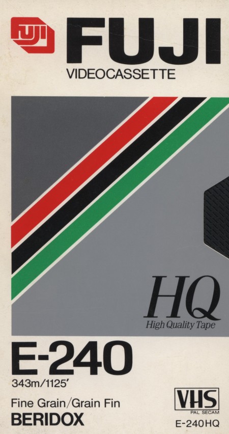
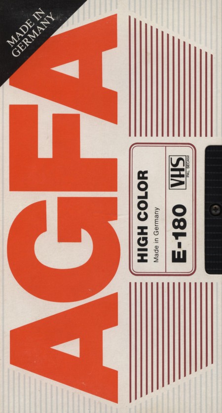
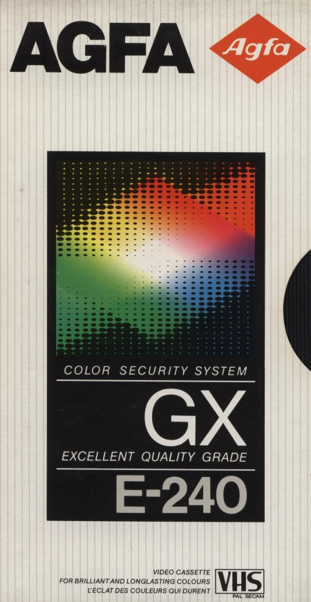
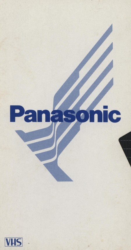
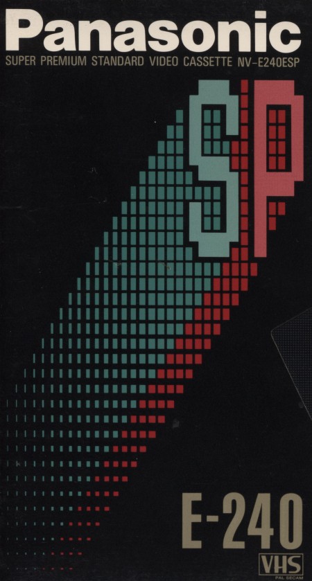
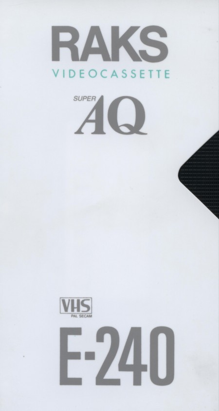
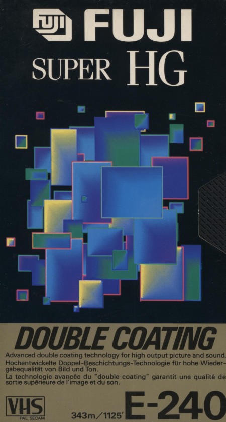
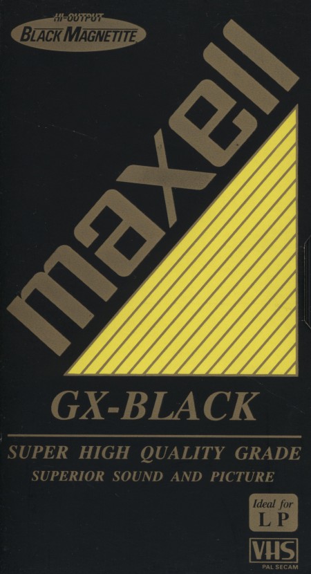
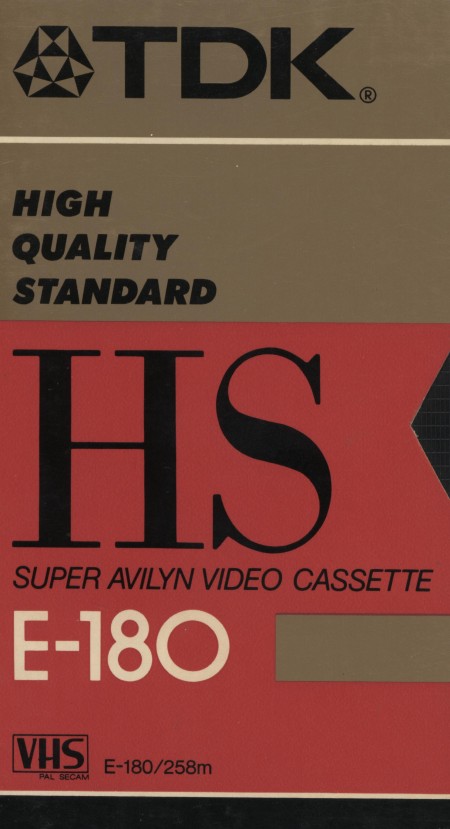
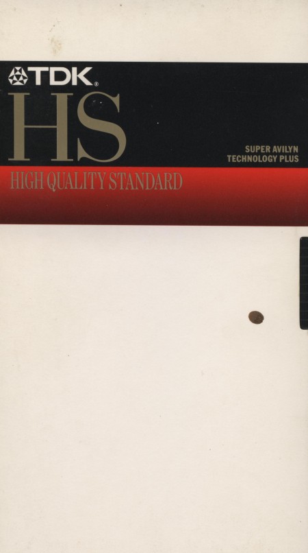
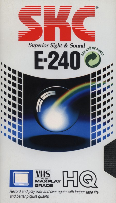
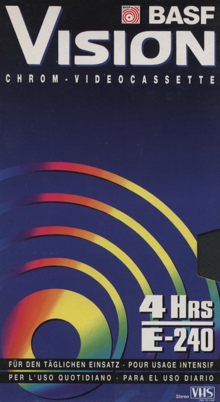
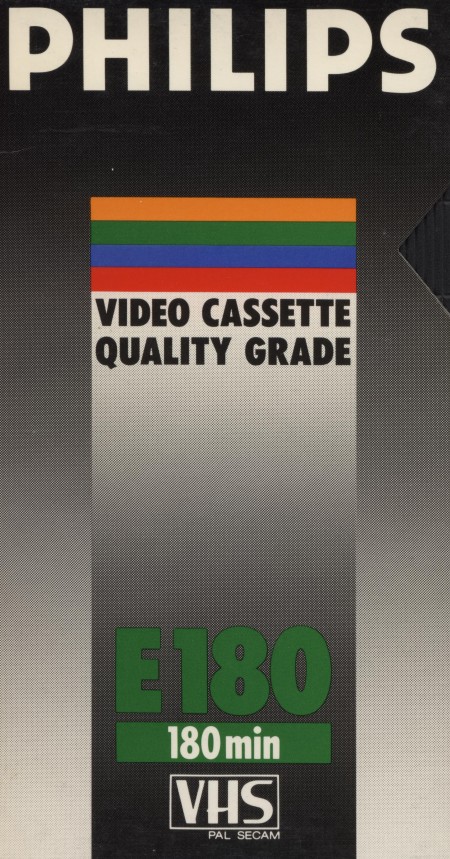
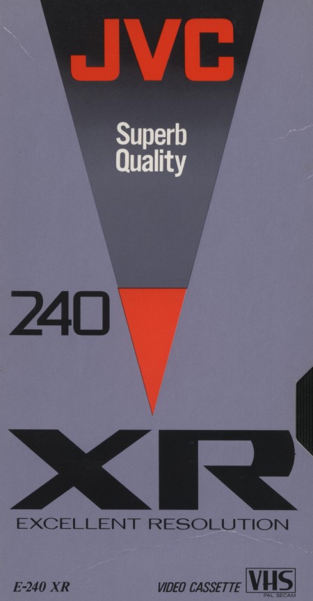
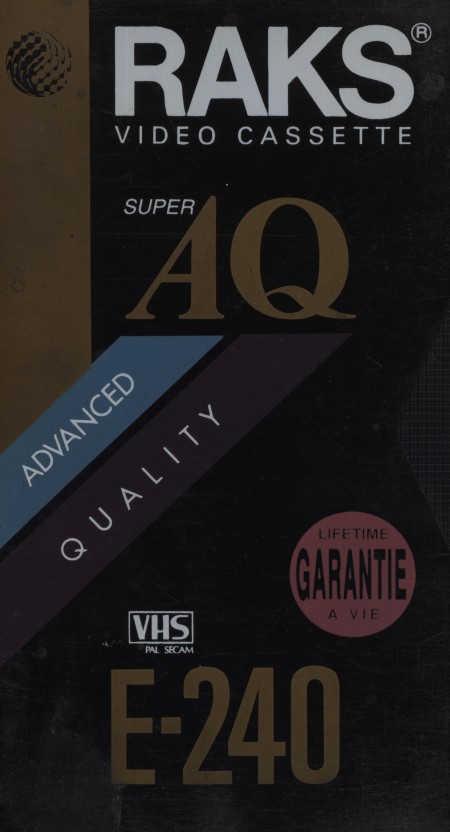
Sadly, VHS box design never reached the heights achieved by audio cassettes, but looking back they weren’t as bad as I remembered. This set comes courtesy of Hauk Sven
Via Flyer Goodness


Sadly, VHS box design never reached the heights achieved by audio cassettes, but looking back they weren’t as bad as I remembered. This set comes courtesy of Hauk Sven
Via Flyer Goodness
I’ve just returned returned from a trip to both Munich and London, where I spent time with colleagues in both locations. Cosmic timing really, considering the London 2012 Olympics are on the horizon, and I’ve had Otl Aicher on the mind recently.
Much has been said in recent years about the shortcomings of the London 2012 graphic identity, but I hadn’t really been paying close attention to all the outrage, and had all but forgotten the design work – so I wasn’t prepared for the onslaught of Olympic schwag that greeted me at the official London 2012 shop at the St. Pancras Station in London. It’s borderline seizure inducing. Having just stepped off the train from Munich, where I spent time in Olympiapark and was exposed to Aichers work throughout the city, this London 2012 noise was especially jarring. And that mascot! Sigh. I took quite a few pictures, and had originally thought I’d post about Waldi vs Wenlock, but I decided I wouldn’t subject you to any of that madness. After all, this blog is here to celebrate beautiful things.
Scott has extensively covered Aicher’s work for Munich ’72 here before (in fact it’s where I was first exposed to it), but I thought the timing was right for us to be reminded just how amazing a coherent Olympic graphic identity and subsequent merchandising campaign can be.
Creative Review recently posted the above scans of the official Munich ’72 merchandise catalogue, and there are a few images of what look to be the official gift shops as well. While Waldi was the only souvenir that was actually designed by Aichlers studio directly, I find it really impressive how cohesive the entire output of the “Olympic Souvenir” department was. This is most likely due to the fact that Aicher dictated a very strict set of rules as to how the logotype and symbols could be used.
It’s easy to pick apart London 2012 when stacked up against the extremely high bar set by Aicher’s work for Munich, but let’s be real here, remember Izzy from Atlanta? NOTHING is as bad as that. What. Is. That. Thing.
I’m not sure if they entered the competition, but if they did I’d be real curious to see what Bibliotheque came up with for the London 2012 graphic identity. After all, they know a thing or two about Aicher’s legacy, having put together an exhibition of his Munich ’72 work over at the Vitsoe shop in 2007, comprised entirely of posters and print from their their own collection. This unofficial Olympic torch poster they did is pretty amazing as well.
Bonus link: While googling around, I found this site that offers up the official Olympic report books as PDFs. The Munich 72′ books span 3 Volumes, upwards of 1200 pages. For the true Munich ’72 geeks.
Posted by: Rob Fissmer
As a kid, a lot of my time was spent either drawing or rummaging through my parents vast music collection. The latter becoming more of bed time ritual, as every night I would listen to an album(s) until I fell asleep, literally, until I fell asleep, which meant that the next morning my Dad gave me his usual: “Jonathan, you’re going to go deaf if you continue to fall asleep with those headphones on…” speech. This ritual turned to obsession when in 4th grade I received my first Sony Walkman. Night to night I would pick out a new tape to listen to. At first, I started listening to albums that I had heard my parents play on one of many weekend camping trips or long drives to our lake house, but when I started running out of familiar names, I would choose solely on a what the album’s cover looked like (unbeknownst to me at the time, this would be one of the main reasons I would become a Graphic Designer). As I got older and became more familiar with certain artists, photographers and designers, I came to realize that 90% of the album covers I had fallen in love with as a kid, were designed by a group by the name of Hipgnosis.
Hipgnosis was a British design group responsible for creating some of the most iconic and recognizable album covers of all times. Most notably for bands and artists such as Pink Floyd, T-Rex, Led Zeppelin, AC/DC, Scorpions, Yes, The Alan Parsons Project, Genesis, Peter Gabriel, ELO, just to name a few. The group consisted primarily of Storm Thorgerson and Aubrey Powell, and later, Peter Christopherson. The group would dissolve in 1983, though Thorgerson still works on album designs, and Powell works in video.
The groups approach to album design was strongly photography-oriented, and they pioneered the use of many innovative visual and packaging techniques. In particular, Thorgerson & Powell’s surreal, elaborately manipulated photos (utilizing darkroom tricks, multiple exposures, airbrush retouching, and mechanical cut-and-paste techniques) were a film-based forerunner of what, much later, can be called “Photoshopping”. Hipgnosis used primarily Hasselblad medium format cameras for their work, the square film format being especially suited to album cover imagery.
Another trademark was that many of their cover photos told “stories” directly related to the album’s lyrics, often based on puns or double meanings of words in the album title. Since both Powell and Thorgerson were film students, they often used models as “actors” and staged the photos in a highly theatrical manner. Many of Hipgnosis’ covers also featured distinctively “high tech” pen and ink logos and illustrations (often by graphic designer George Hardie), stickers, fancy inner sleeves, and other packaging bonuses. One of the unique extras created by Hipgnosis was the specially printed inner sleeve for Led Zeppelin’s “In Through the Out Door LP”, a “black and white” affair that magically turned to color when dampened with water (tying in with the main cover’s photographic theme).
The groups contribution to album cover designs and packaging can best be described as more of a legacy than anything. A legacy that definitely shaped a generation and set the bar for future album design for years to come.
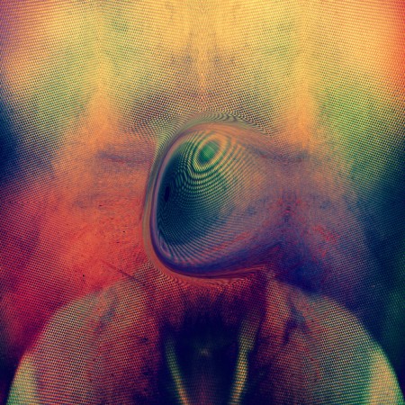
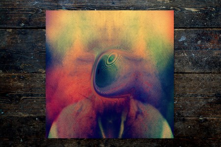

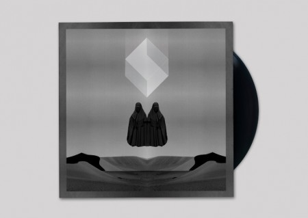

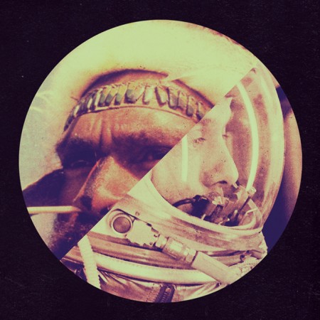
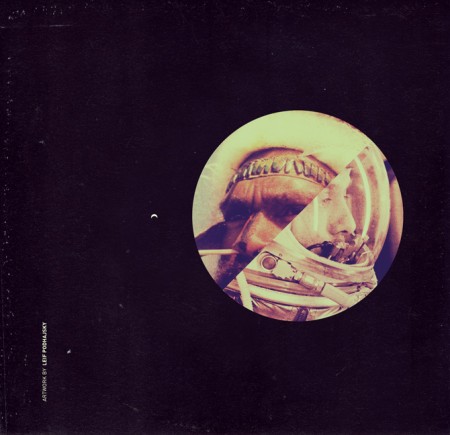
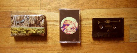

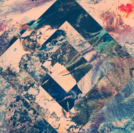


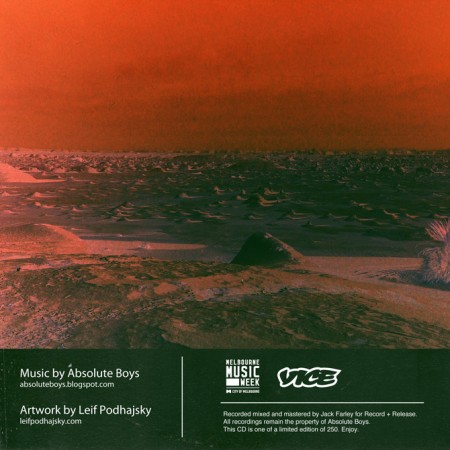
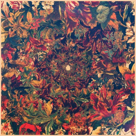
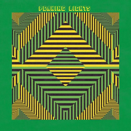

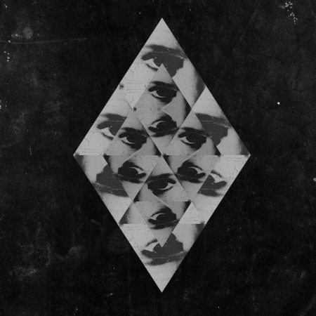
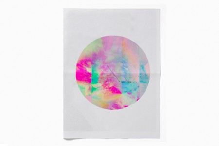

The amazing work of Australian artist and creative director Leif Podhajsky has been posted about here on the blog before, but I thought I would feature him again, this time as the subject of this week’s Weekend Inspiration. I have found myself revisiting his portfolio frequently over the past few weeks, In particular for his amazing album covers, as I’m working on a few myself.
He also launched the Melt Blog and has been experimenting with video and visuals.
Posted by B3PO
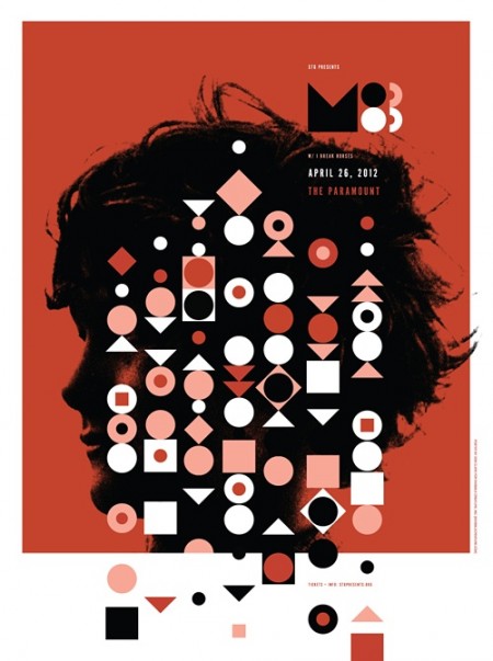
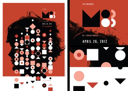
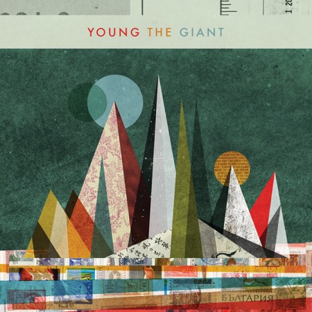
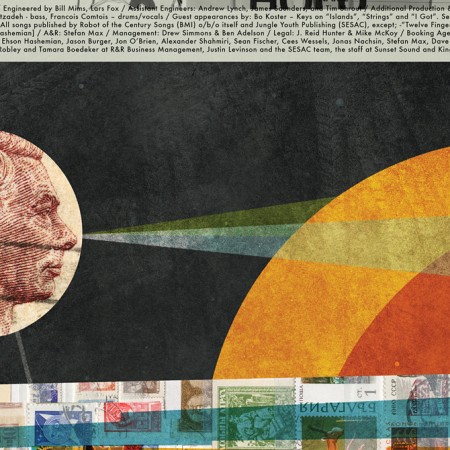
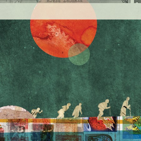

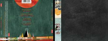
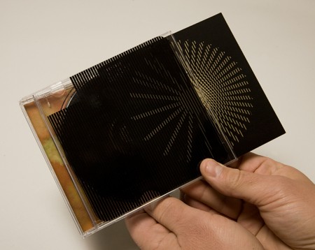
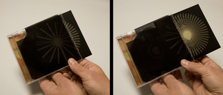
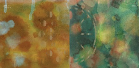
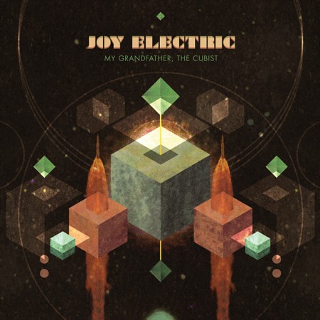

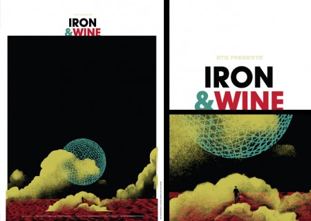
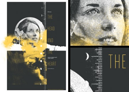
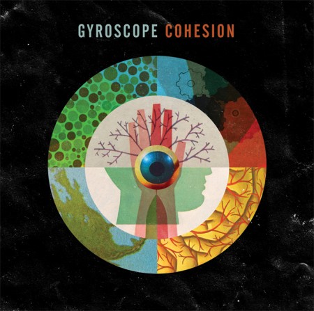
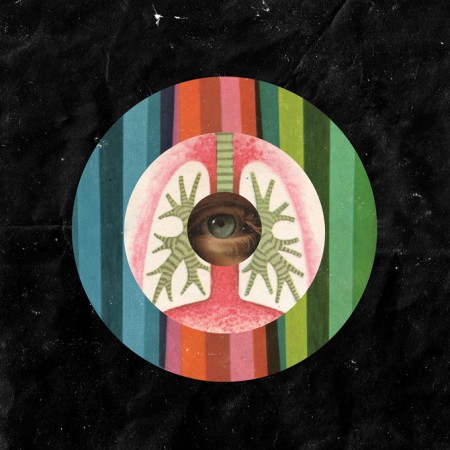
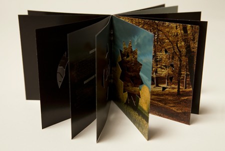
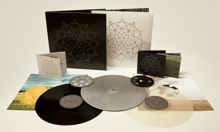

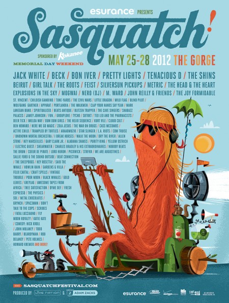
Invisible Creature is a Seattle based design studio comprised by brothers Don and Ryan Clark. From music packaging and band posters, to logos and identity, these guys do it all and they do it well, to the point of even being nominated for 4 Grammy awards for their music packaging.
Really enjoy their great use of textures and clean vectors.
They are also behind the Sasquatch Music Festival identity, which Tycho will be playing at the end of this month, along acts such as Beck, Apparat, Purity Ring, Gardens & Villa, Com Truise, Star Slinger, Active Child, Lord Huron, to name a few.
Posted by B3PO
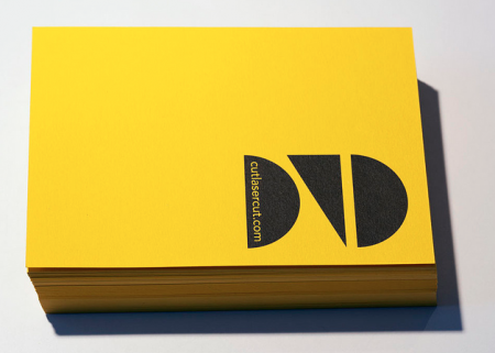



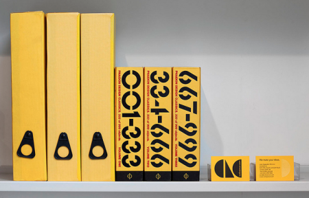
Many of us artists/designers/musicians love dreaming about our ideas becoming a physical piece that you can hold, touch, gift or make available for others to have. I really appreciate the printers, warehouses and studios that have to deal with our minds and files. So here’s to CutLaserCut, a well branded youthful laser cutting company that I dream of using someday soon, check out their Flickr and keep these physical type of companies close, I hope to see more creative uses of what they offer in the future and thats up to us.
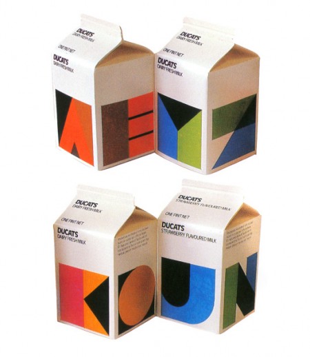
Tears of joy would stream from my eyes if this were under my tree Christmas morning. It is now that I can fully appreciate the simple solutions of such design—less is more. It just makes me sad to know that the chance of this ever happening again on mainstream packaging is slim to never.
Via Wanken / Re:collection
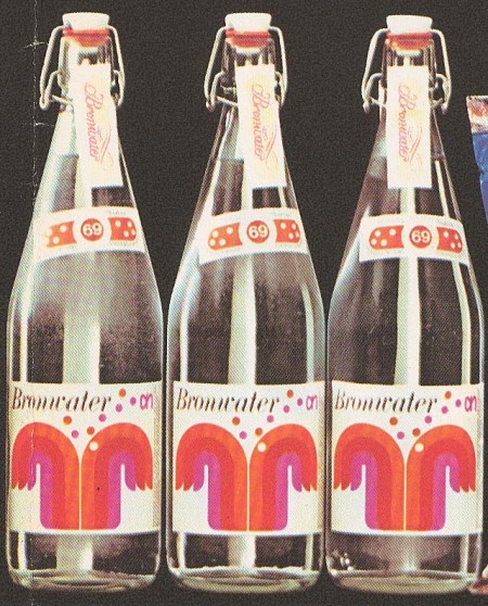
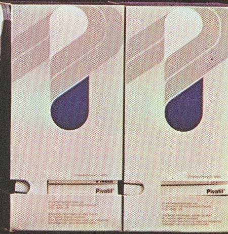
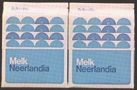
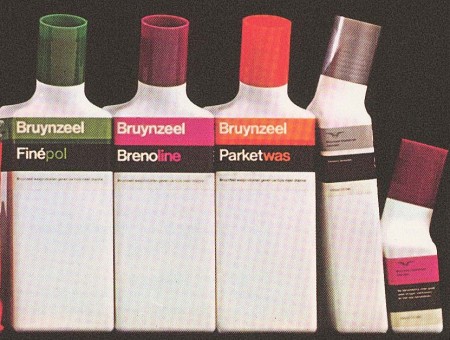
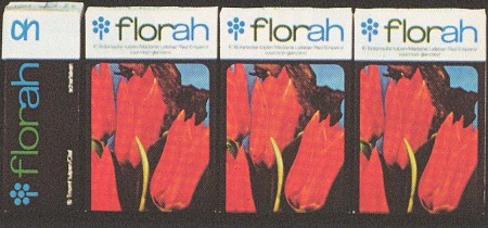
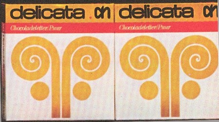
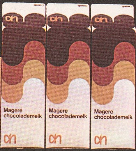
Some great examples of packaging design by Dutch artist Louis Swart. Swart got his start as early as age thirteen and was quoted at that time as saying ‘I am striving not to become the grand old man of the profession, but to close my design doors when I reach forty-five’. So not only was he a designer at 13, he was getting interviews, pretty incredible.
I recognize those Albert Hein logos in there. As I recall, the current in-house brand has not carried on this tradition.
More on Swart and his work over at the Graphic Design Museum via Grain Edit
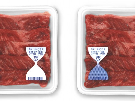
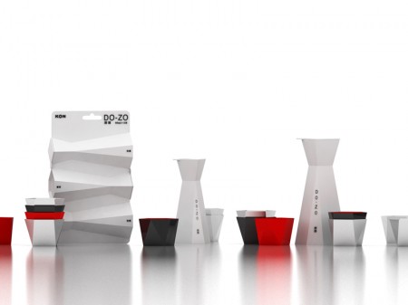
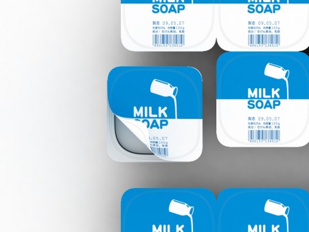
To-Genkyo is a Kyoto based studio specializing in product design. Their stated goal is to “make a small utopia of daily life” which I’d say sounds like a good plan. Among their innovative product designs is an hourglass shaped label which reacts to ammonia released by aging food giving a clear visual indication of it’s freshness. Great idea, I hope this actually makes it from concept to the shelves. Sorry, no clue what “milk soap” is.
To-Genkyo via Swiss Miss
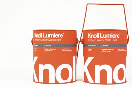
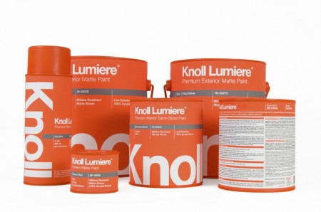
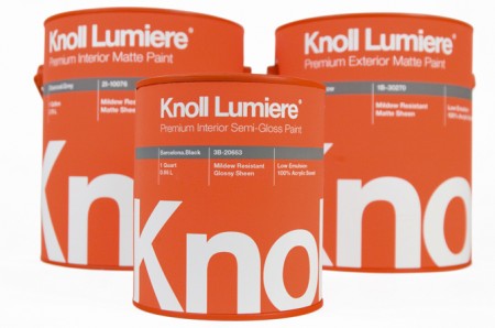
Knoll paint! Sorry, it’s not real. These mock ups were made by Kristin Agnarsdottir for a package design class. Really amazing stuff, and I was just complaining about how bad packaging is these days.
More over at Kristin Agnarsdottir’s site (cool logo too!)