Posts in Packaging

Graphis Packaging 3


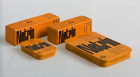
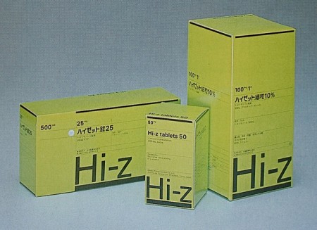
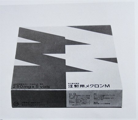
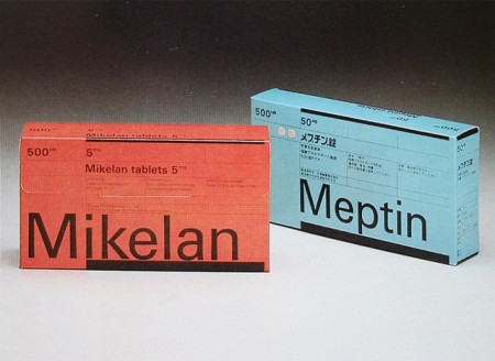
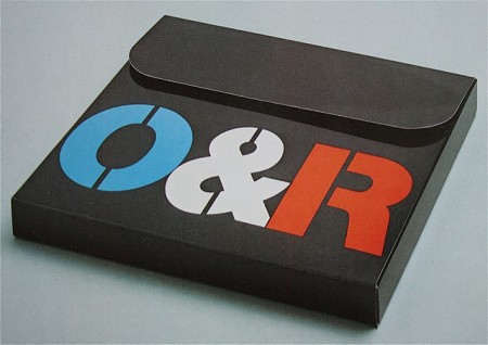
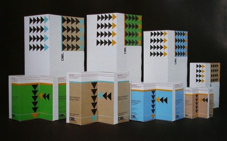
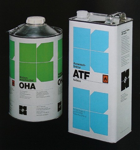
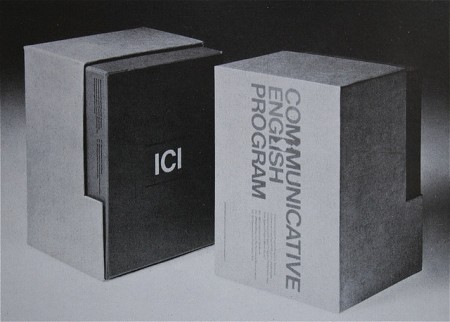
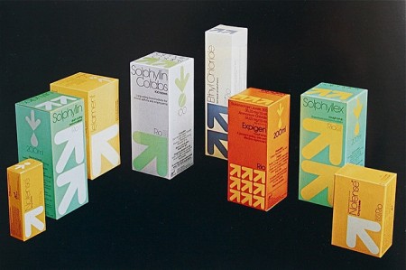
Some excellent examples from Graphis Packaging 3. I can say without any doubt in my mind, that packaging design has declined significantly over the past 20 years. Take a look at the more recent Graphis Packaging 9. Nothing in there even remotely piques my interest. I would love to hear a reasonable explanation of this phenomenon. Is it that marketing departments have slowly wrested control from true designers? Or is it just that I personally appreciate the style of a specific era to the current one? Or maybe I’m just so used to the style of things today that I am intrigued by the rarefied forms of the past. I’d like to think I’m being objective about the whole thing and that the above examples really are superior, but perhaps I’m not.

Anyone in the know care to shed some light on this? Have studies been done? I need answers!! I’ll tell you one thing, you could fill those boxes with whatever you wanted; if I saw them on the shelf I would buy them. Check out some more examples here.

Images via Crabstick
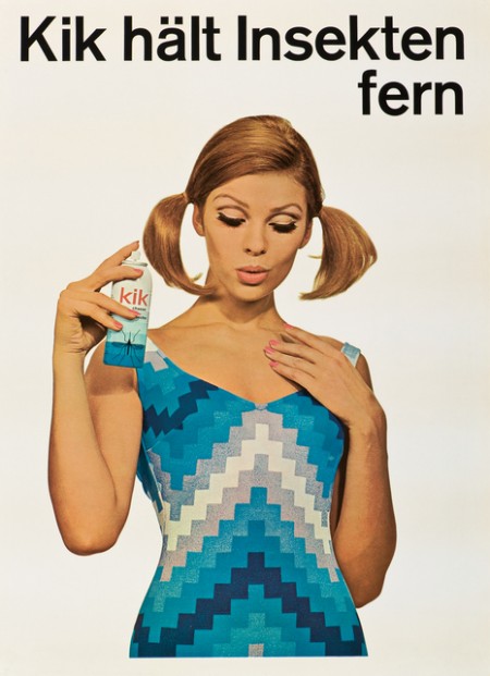
Geigy Graphic Design


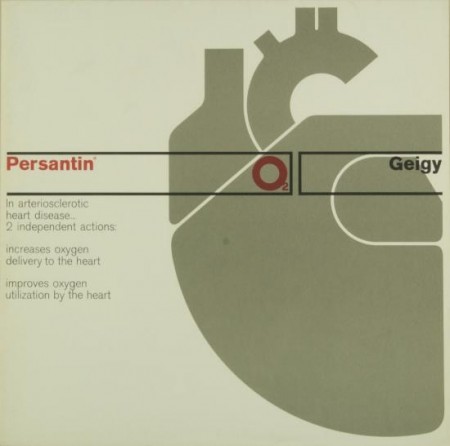
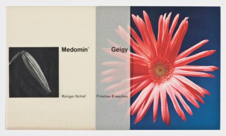
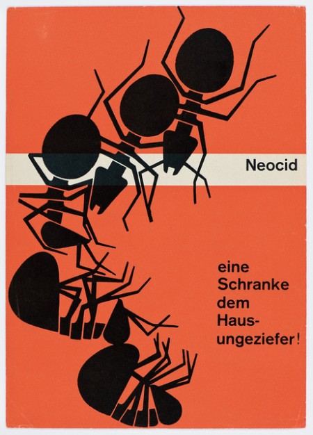
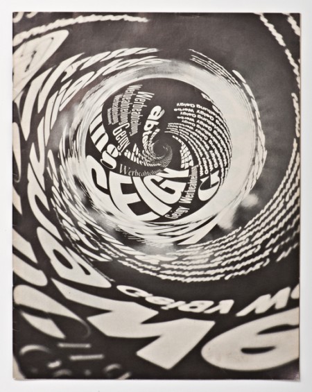
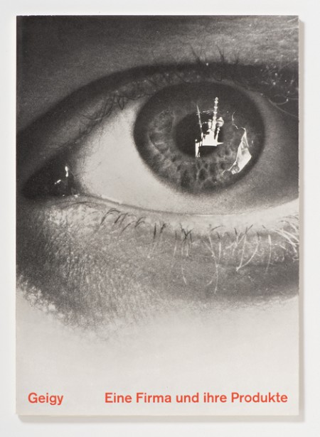
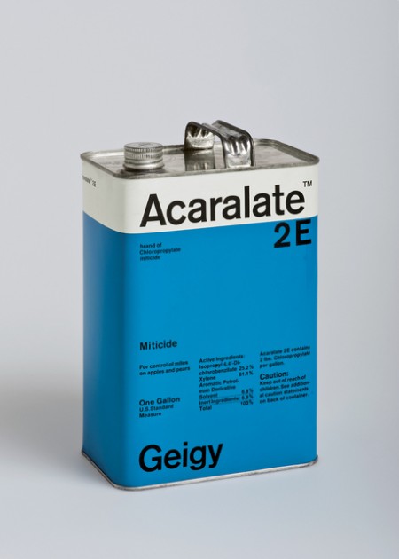
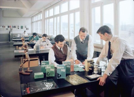
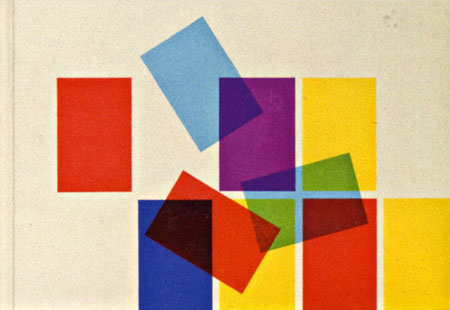
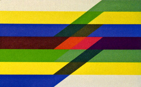
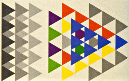
Dwell has an excellent piece on Swiss design shop Geigy. The in house agency has such a rich portfolio of beautiful work, most for the medical industry. I particularly enjoy the packaging work.

Grain Edit also has some more info and pics from a book about Geigy design here

Source Dwell

Extinct Ammo


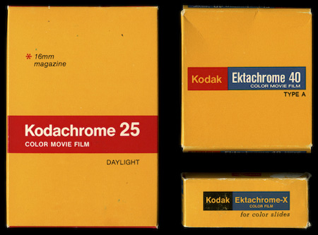
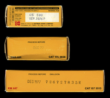
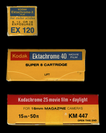
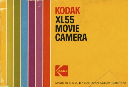
The always excellent Watsonian — who also brought you the Super 8 packaging — have posted these beautiful examples of vintage Kodak film packaging. Every time I see something like this the first thing that pops into my head is “Why doesn’t more commercial packaging look like this anymore?”. I then tell myself “If more commercial packaging looked like this you wouldn’t find it as interesting.” I think that point could be argued but you can’t argue that strictly from a design standpoint, these are just plain better than this crap.

I guess the next question though is whether some kid in 30 years will think the more recent example is better, but I seriously doubt it. I really feel like more attention was paid to the quality of design before the age of computers, I guess the practitioners were just more skilled given the level of training required. Now it’s “have Photoshop will travel”, which obviously cuts both ways. What do you think?

Via The Watsonian (who is apparently a cat)

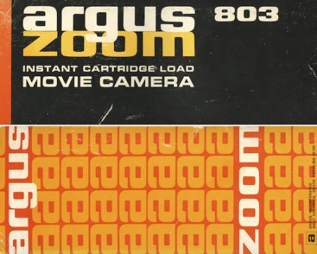
Super 8 Packaging


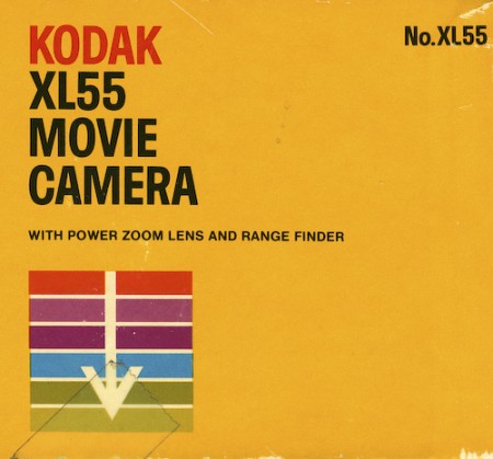
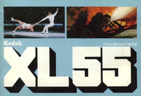
The Watsonian posted some very nice Super 8 packaging. That XL55 type is amazing.

Link

TCHO Chocolate

tcho17_540x367
tcho14_540x360
ed04
tcho_1-1

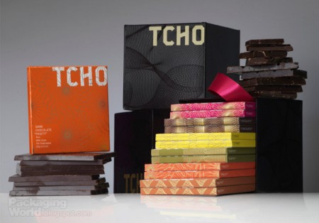
I’ve noticed these high end chocolate companies springing up left and right over the past few years. The paper-made thing seems to be the prevailing aesthetic of retail chocolate branding; employing one-color screened ink on kraft paper along with things like wax seals and cardboard hang-tags to give off that organic, handmade vibe I guess. It’s usually done to good effect but it’s nice to see a fresh take every once in a while.

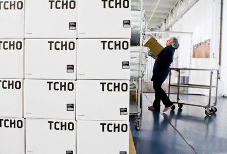
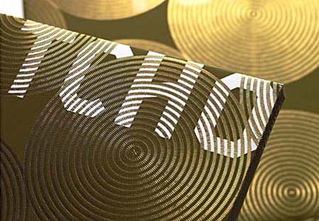
When I first saw San Francisco-based Tcho Chocolate I was struck by the name (no, I didn’t trade my studio for a chocolate factory down by the pier) and then by the design. I regrettably couldn’t find many decent pictures of the actual packaging, but suffice it to say you need to hold it in your hand to really appreciate the finer points. The letterpress and gold leaf inlay are a very nice touch that I don’t think is really captured properly in the above shots.

The video above goes over the concepts that informed the TCHO branding. I particularly like the central idea of chocolate as currency; design firm Edenspiekerman’s implementation of that concept is well executed. The result is a striking design which vaguely conjures the notion of European currency whithout making you forget you’re supposed to eat it. I don’t really enjoy chocolate on it’s own but they still had me wanting some just from the packaging.

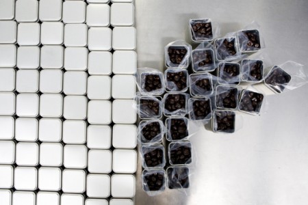
First two images from CNET’s tour of the Tcho factory at Pier 17.

» Tcho Chocolate – San Francisco, CA

Swiss Graphic Design: Geigy

geigycut2
geigycut3
geigycut1
geigycut4
geigycut5
Swiss pharma company Geigy (now Novartis) cranked out tons of drugs and tons of great designs to sell them during their time. The images above are from the book “Corporate Diversity : Swiss Graphic Design and Advertising by Geigy 1940 – 1970” (amazon) which chronicles their best work during that period. There are more images and info over at Things To Look At and Grain Edit.

Images via Things To Look At