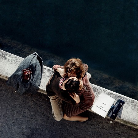
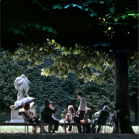
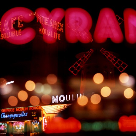
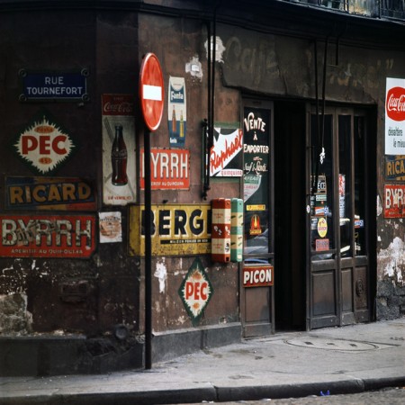
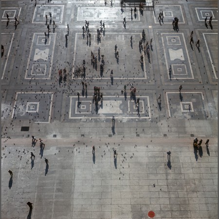
Born in Switzerland, Hans Mauli was a graphic designer who worked with Herb Lubalin and designed the typeface for the World Trade Center signage. From 1971 to 1991 he worked as an advertising photographer in Paris, after which he moved to the United States and began to focus on fine art photography. When he began his photographic career he did not have access to a darkroom, so most of his early work was not printed until much later. See more of them here.
Posts in Photography
Hans Mauli
Gavin Hammond
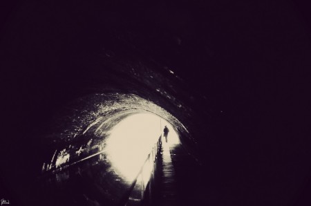
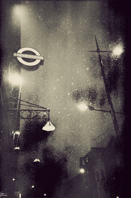
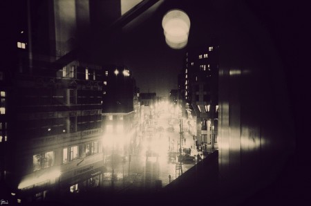
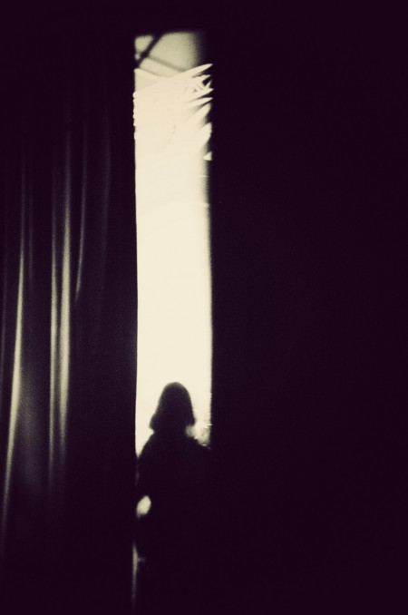
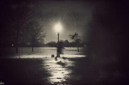
Gavin Hammond is a writer, musician, cartoonist, and filmmaker as well as the producer and songwriter for the British electro pop group Sweet Tooth. He also happens to shoot dark, beautiful, dreamlike photos while wandering the streets of London with his Lomo. See more of his work on his Tumblr and Flickr.
via My Modern Met
Linda McCartney
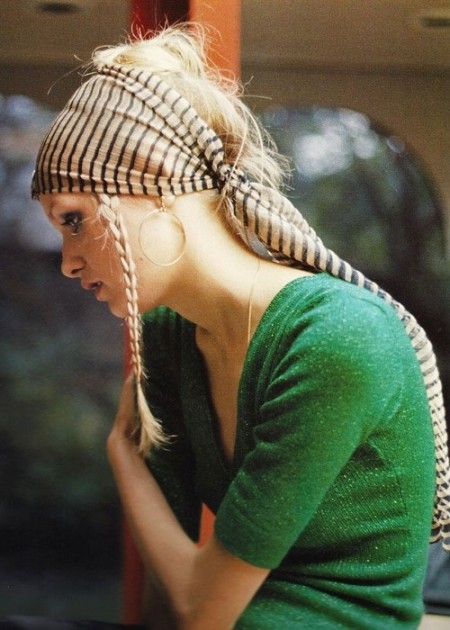
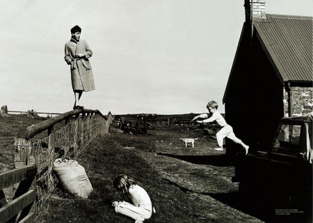
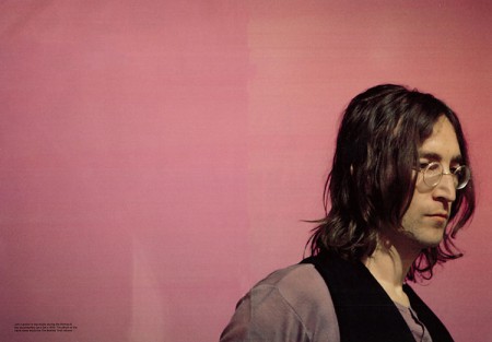
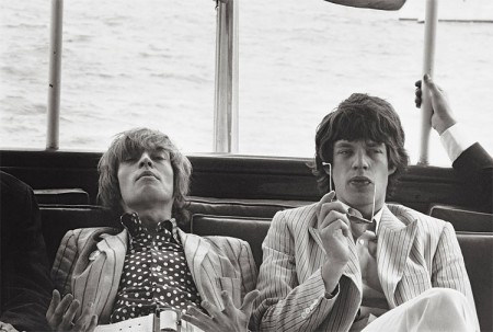
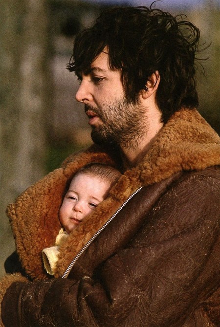
Linda McCartney married Paul in 1969 and was a professional photographer who shot intimate portraits of some of the most influential artists of the 60s.
Linda was house photographer at the Fillmore East concert hall and shot numerous musicians including the Stones, Doors, Frank Zappa, Kinks, the Who, the Beach Boys, the Byrds, the Beatles etc.
A collection of her photographs titled Linda McCartney’s Sixties: A Portrait of an Era was published in 1993. Sadly, Linda was diagnosed with breast cancer two years later and passed away at the McCartney Ranch in 1998.
via Design You Trust
Edward Burtynsky
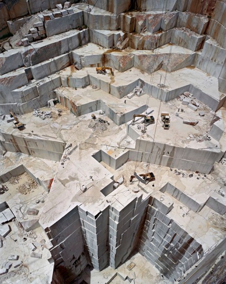
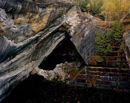



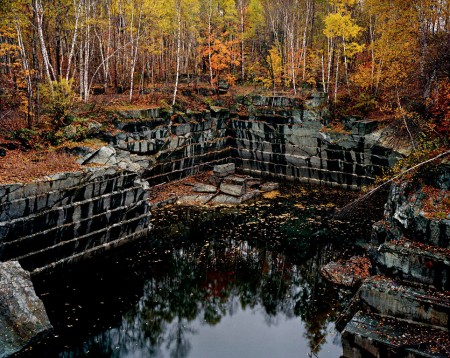
Shot at mining quarries and ship breaking yards around the world, these photographs by Edward Burtynsky seem both familiar and otherworldly.
Nature transformed through industry is a predominant theme in my work. I set course to intersect with a contemporary view of the great ages of man; from stone, to minerals, oil, transportation, silicon, and so on. To make these ideas visible I search for subjects that are rich in detail and scale yet open in their meaning.
They almost feel like set photos from the most amazing science fiction/fantasy motion picture from the 70s to me. See the rest here.
via Snowce
1940s Kodachromes
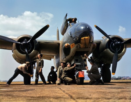
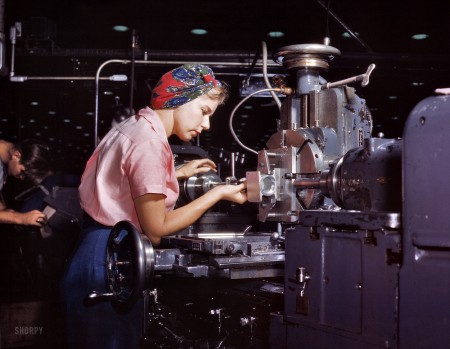

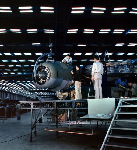
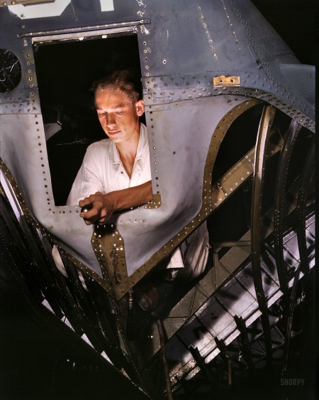
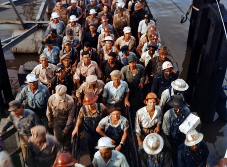
Beautiful, lush Kodachrome photos from the 40s. Kodachrome was the legendary color film popular among photographers like Steve McCurry, who shot the final roll after it was discontinued in 2009. See the rest of the set here.
via Shorpy
Discovery: A Visual Eulogy
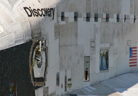

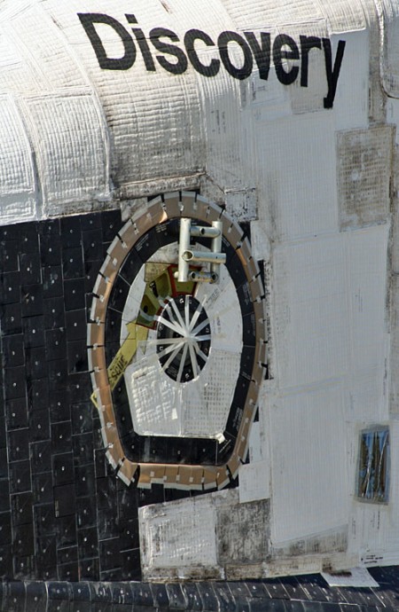
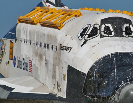

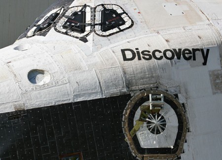
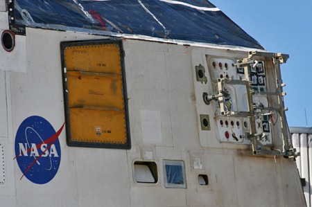
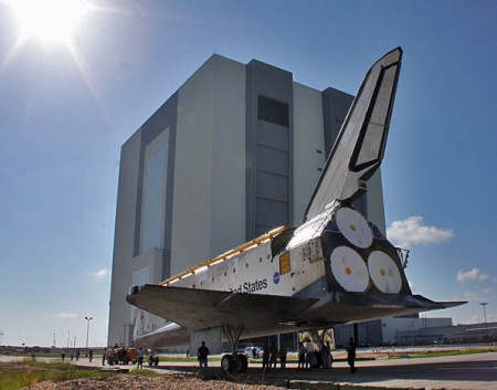

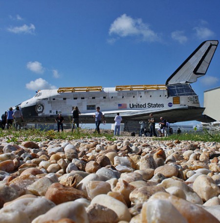

I’ve seen a lot of beautiful, moving images of the Shuttle lately but none have felt so intimate as these by Justin Ray for Spaceflight Now. Something about these photos of the now decommissioned spacecraft, engines removed, mission complete, bring the idea of it to life like none I’ve seen thus far. It’s the textures and details that highlight what an incredible machine this was and what a profound achievement for humankind it represents.
And look at that lettering! I’ve never seen it so close; it has such a handmade feel to it at this scale. The logos and typography of the Shuttle program always intrigued me, they seemed to represent the idea of the United States as a brand, an ideal to be consumed by the rest of the world. Then when Canadarm was installed on STS-2 it became apparent that even other — less crazy — countries felt the desire to push themselves as a brand in space. Of course, pushing your national space-brand became a bit more accessible with the ISS, but the US and Canada used Helvetica and were way ahead of the curve so I’d say they won whatever prize you get for most recognizable space-brand.
I wonder what we all gained growing up in a world where the Shuttle existed. I know it was a big part of my consciousness as a kid and probably had something to do with how I felt about my national identity. For me it symbolized the combined efforts of some of our greatest minds collectively reaching for a better understanding of the world we live in. For some — and perhaps rightly so — it probably represented a colossal waste of resources in the face of more earthly problems. Maybe it was both, but I I’ll personally miss it as a symbol of what we as humans can achieve when we work together.
William Eggleston
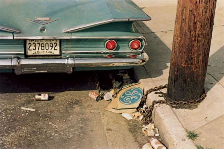



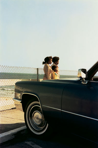
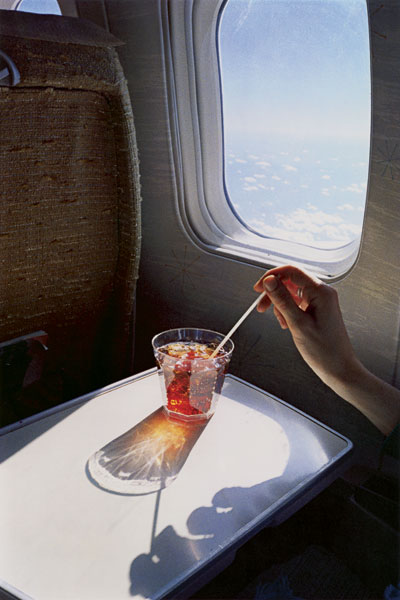
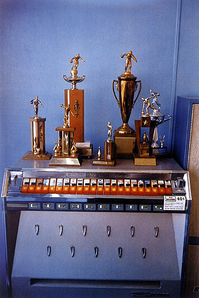
Just came across William Eggelston’s photography work tonight (I know, very late to this party). I’m completely blown away. A lot of these almost feel like realist oil paintings.
Does anyone do work like this anymore? I’ve never really seen tone and definition like this in anyone’s work. I have to imagine most kids starting out in photography these days are purely digital; sad to think we’ll be seeing less and less film output as the years go on.
More work at William Eggleston Portfolios. Also check out his bio (pdf) for more info on cameras / film used.
Hengki Koentjoro
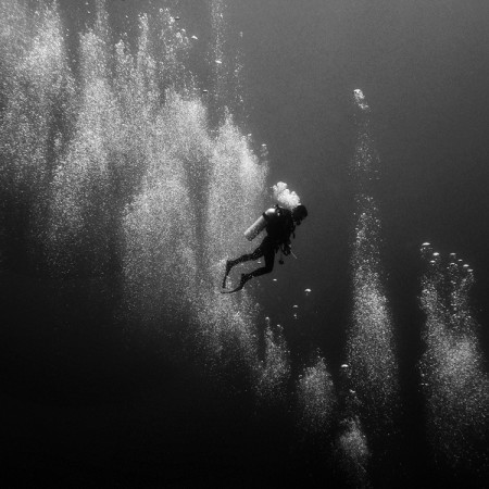
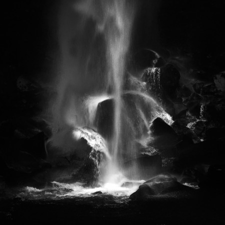
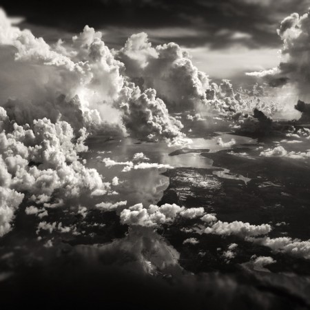
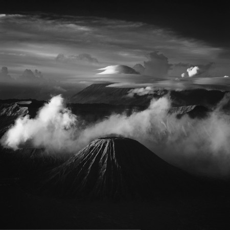
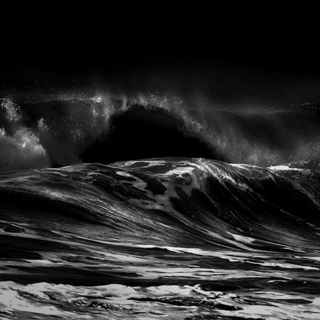
Hengki Koentjoro is a photographer from Indonesia, where most of these shots were taken. You can see more of his jaw-dropping work on his flickr. Any idea what kind of camera was used for these?
via Snowce
Aaron Ruell Photography
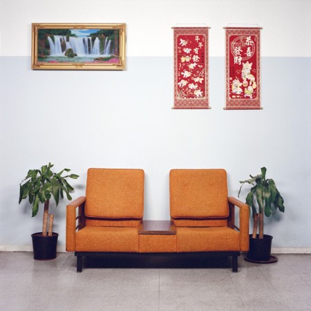
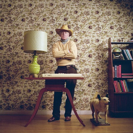
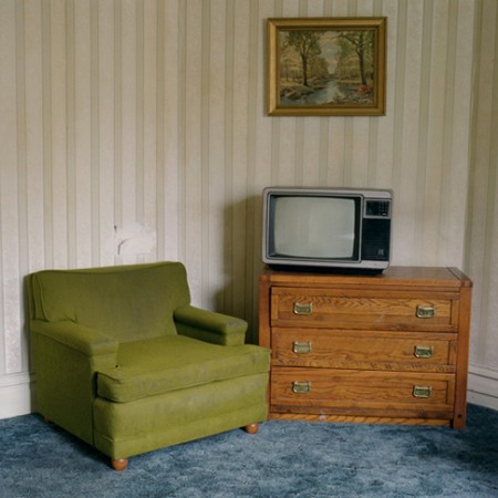
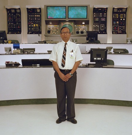

I’m a fan of Aaron Ruell’s vision, he fakes retro in a very plastic & clean way. Some of his best work with Napoleon Dynamite I think we’ve overlooked since we’ve seen it soo many times in ads but after looking at them closely again i’m amazed at how well the color schemes are put together.
Oliver Morris
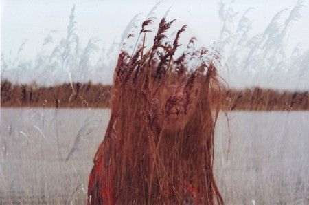

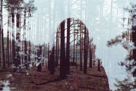
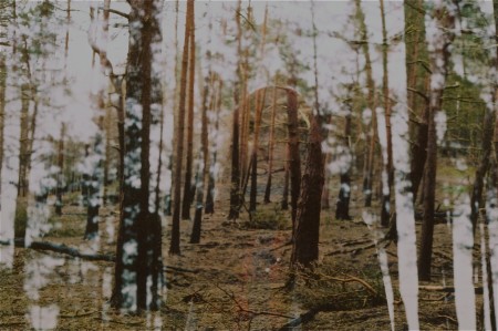
Beautiful, haunting double exposures by Oliver Morris. Even the title of his Flickr stream, “Lullabies to Paralyze” conjures a similar feeling of uneasiness in me.