Posts in Photography

Canon Rebel T1i Video

My brother Kirk got the new Canon Rebel T1i over the weekend and it looks like it’s working out quite well for him. He used Sigma 70-300 lens in macro for his first video tests (above, wait for the ant!) and as you can see, the detail is incredible (albeit slimy). I’d like to see some more tests in different lighting situations and with different subject matter, but so far the performance looks great. Although, after seeing what Will Calcutt did with the 5D MKII in Detroit I am not sure I could settle for the T1i, but it seems like a close second for the budget-conscious. At any rate, I am pretty close to jumping ship from Nikon. Video Link

Update: Kirk added a short clip of Forrest skimboarding in Sacramento:

iTunes Artists Page photos

Grizzly Bear
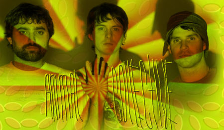
Animal Collective
Deerhunter
matthew dear
ITunes has a decent layout, I mean you can’t do much especially if you end up updating it weekly and the artwork can range from pretty good small album art icons to just awful ones. One way of making the pages on iTunes more appealing is these custom artist pages that iTunes staff picks out, the photos seem to be exclusive which is always a nice addition.

Dan McPharlin

2254545468_7bc6d6e94e_o
2680773423_b4a532640f_o
2471940929_be42e8c524_o
3473955449_f5389e4f58_o
2987819196_55dec0f030_o
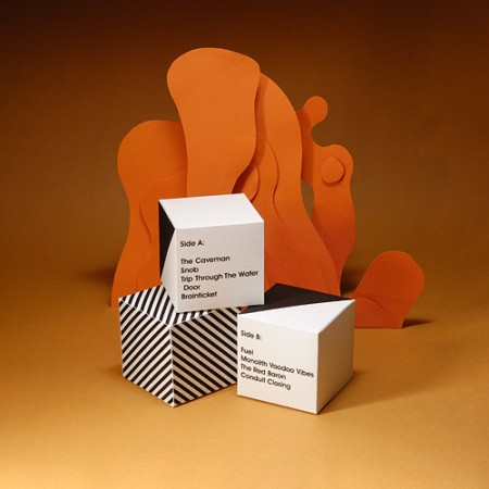
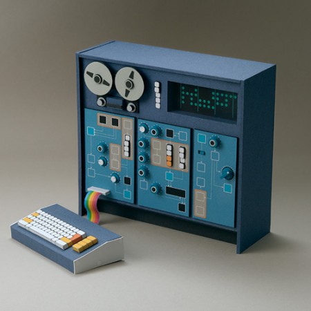
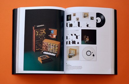
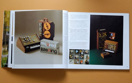
I’ve been following Dan McPharlin’s work for a few years now, ever since his miniature synthesizer models started showing up on Matrixsynth. I fell in love with his perfectly crafted, perfectly photographed (seriously, the photography is almost cooler than the work itself) paper music machines. But after being introduced to his graphic/illustration work he quickly became one of my favorite artists. His illustrations are very reminiscent of another favorite of mine, Roger Dean, and are evocative of that prog-rock driven 70’s sci-fi art scene that, when done right, is just downright incredible.

So it’s been great to see Dan’s work start popping up all over the place, like here, here (Prefuse 73 cover), and here (Jakub, you really should have know better!). Beyond the visual beauty of his work, it’s just great to see someone being creative with such a novel medium. He brings the mind and eye of a designer to a world previously reserved for 60-somethings hiding out in their basements building model railroads. To see him wrap all this up and successfully translate that future-past-that-never-was aesthetic into commercial projects is a good thing indeed.

You can check out more of Dan’s work at his flickr.

On a side note, he’s posted some shots of his home/work-space here. Are you kidding? Amazing. My house looks like it was built of scraps from a 19th-century Troller Boat that ran aground in front of a hippie commune. Seriously, parts of a boat were used in the construction of this house, I am sure of it. Anyways, I am disorganized at best, slovenly at worst and I don’t think I have the skill set to keep such a meticulously minimalist situation like that up for any length of time. If I win the lottery I will get one of those modernist prefabs and put it in front of this house. I’ll then carefully place completely unusable angular furniture and German-designed objects all around it. Finally I will place a single synthesizer with wooden endbells and an analog sequencer on a white table with a molded plywood chair in front of it. When people come over I will tell them that’s where I get all my work done and then I will sit them down at a walnut coffee table with various important looking design books stacked neatly on top of it and expound on typography theory and then chastise them for not understanding the difference between kerning and leading. After they leave I will go back to my real house and eat a sandwich in my basement and watch Adult Swim and then not clean up the plate for a week or so.

Vuela Shirt Now Available

iso50-vuela-side
Spring is finally creeping into town (although very slowly here in San Francisco) and I’ve been way into the AA tri-blend tees this year. So I printed up a modified version of the Vuela Print on Heather Grey tees for your sunny weather enjoyment. As always, you can get yours over at the ISO50 Shop. I’m also clearing out a lot of the older designs to get ready for summer so you’ll find lots of shirts marked down 20-30%. All marked down shirts are the final pressing of that particular design/colorway.

On a related note I’ve been spending a lot more time trying to learn the ins and outs of product photography. I’ve been shooting the products for years but I’ve never spent enough time worrying about the color accuracy of the output. After all this time working with cameras you’d think it would come easy, but I was surprised to find how difficult it was to get good shots when the goal is creating a color accurate representation of an inanimate object. With my creative photography I’m always trying my best to make things appear inaccurate and I guess old habits die hard. For the shots above I used a tungsten photo bulb/can light along with a Quad CF lamp from Calumet. I had been using 3 lights but it turned out that hitting the subject from the right side and front with lights and letting some natural light in from the left (there was a window there) made for better dynamics so I’ve been sticking with the 2 light setup.

The last couple product shoots were the first times I’ve used a Gretag card to calibrate the camera color temperature under the lights. That and shooting in NEF RAW really went a long way to getting a solid foundation, but there was still a lot of work done in post. Having the calibrated monitor definitely helped at that point, but the real key I found was changing my own perception of the image and training myself to see it in a different way than I’m used to. I always catch myself slipping and trying to make the shots look interesting or enhanced and then have to step back and realize that this needs to be a literal representation of the real object. At any rate, I’ve got a ways to go (can’t even imagine how they get all those high end fashion shots) but it’s been surprisingly interesting learning the subtitles and nuance of a new kind of photography. It certainly is it’s own art form. I’m sure a lot of you have some product photography chops, feel free to share any of your tricks of the trade in the comments.

Also, I know I’ve been promising it for a long time, and I assure you, a very detailed post about color calibration is on the way. The project has sort of taken on a life of it’s own and I’ve brought Alex on board to help with research and production. We’re going to be shooting an interview with a color expert in the next couple weeks and we should wrap the post soon after that so stay tuned!

Catherine Wagner / Art & Science

img0602
img0592
img061
img063
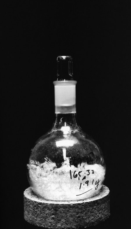
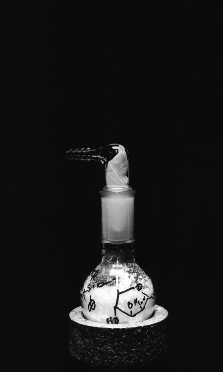
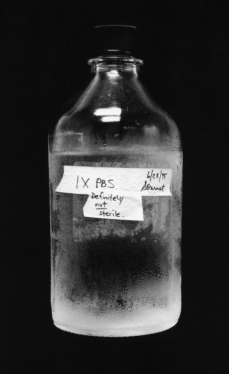
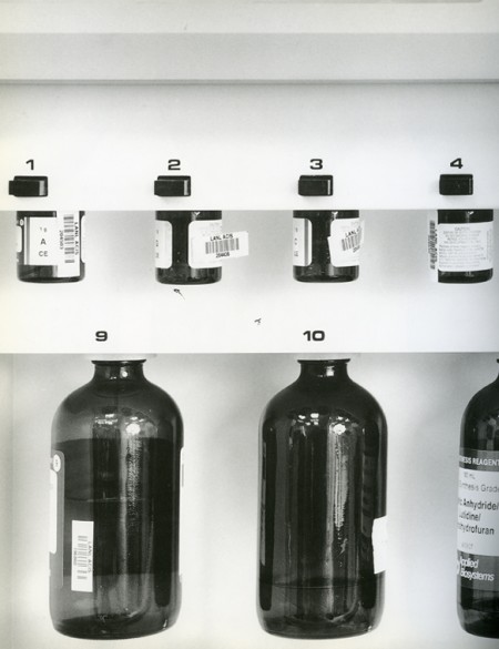
Photographs by Catherine Wagner from her book Art & Science. They are all part of the same project for which she travelled to major laboratories around the US and captured many different elements of the scientific experience; everything from beakers (my favorite) to bone marrow smears. As the intro states: “The resulting images offer the opportunity to encounter science in an innovative and unusual manner, as they bridge the distances between art, science and everyday life.”

NYC April 09

2506932923_e3db97139f_o
2506933193_cd62d3a336_o

I’ll be heading back to my other favorite city today for the F5 fest. I’m staying a few extra days as I haven’t had the chance to really enjoy myself the last few times I’ve been in NYC. Jakub scored some tickets to the Brainfeeder/Flying Lotus show @ Love so we’ll definitely be making it out to that. I’m brining the Nikon and the new little Canon (which, by the way, I’ve been loving) for some undercover HD video action; I’ll post up the results as they roll in.

2506932691_0c68980e95_o
Amazing photos via Chozno01

Why Film Can Never Die

2288181293_916c68a058_b1
2288185435_1c03ce41db_b1
I love digital technology. I love the convenience, the economy, the permanence, and the instantness (yes, that’s actually a word….who knew). So I’m constantly trying to trick myself into believing that I don’t need film photography because digital can replace it. Then I see pictures like the ones above and remember that it’s never going to happen. There’s something going on here that I’ve yet to see captured in a digital image. Sure, I’ve seen incredibly beautiful digital photographs, and they stand on their own. But that’s all they do. They don’t stand over film and they don’t replace it. Film can never die or we will lose our ability to capture the beauty that hides behind the subtlety and nuance that digital seems to miss. There’s a tone, a separation and depth here that I think can only be produced by an analog chemical reaction. The grain is so beautiful it just begs to be blown up to wall-size.

The pictures are of the band Panic Ensemble and were taken with a Canon AE-1 Program by dirkhaim. AE1-P’s can be had for next to nothing (with glass!) on eBay.

Carlo Van de Roer

orb41
orb21
orb61
picture-15
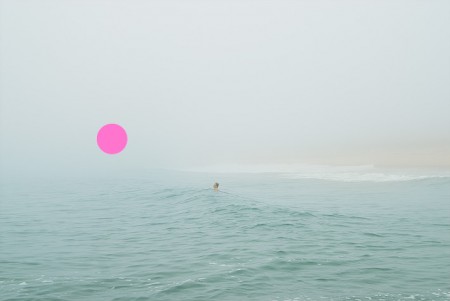
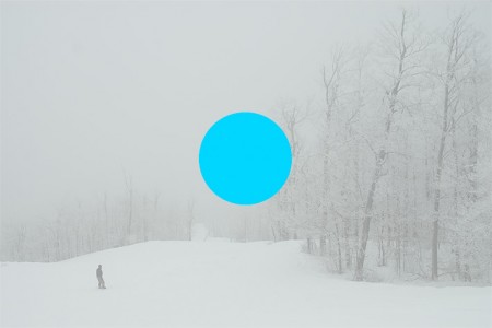
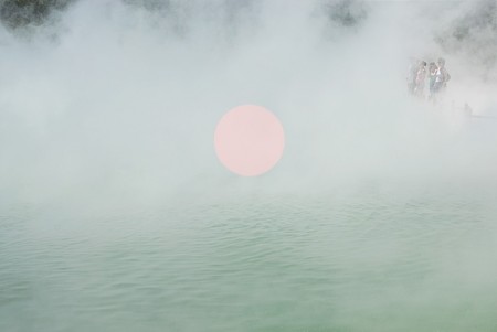
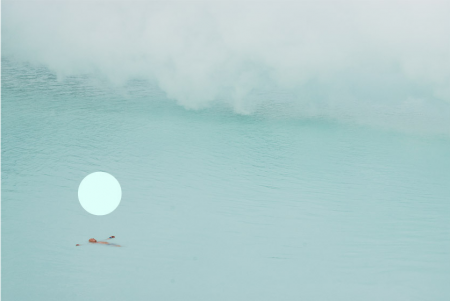
These shots by Carlo Van de Roer look like pure and unfiltered tranquility. I’ve never been to Iceland before, but this series captures what I imagine it would be like. It looks freezing and potentially dangerous, but still somehow soothing and comfortable. Probably the most immediately noticeable aspect of these images is the inclusion of the colorful floating orbs. Personally I love them, and I think they are the reason his work has picked up so much recognition. They are a unique touch that brings a little bit of extra magic to his already stunning photography. I’ve read he screen prints the orbs onto the photographs, but I can’t find any information regarding the concept behind the orbs. Perhaps it’s just an aesthetic choice, but I would imagine (and prefer) that there is some deeper conceptual reason for their placement.

via picdit

Diana+ Instant Back

4
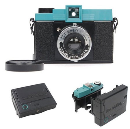
I miss Polaroid! I’ve been stockpiling some old film, but I’m always afraid to use it and run out for good. It looks like the Instant Back attachment for the Diana+ Lomo camera might serve as an able replacement. The Instant Back attaches to the Diana+ and provides you with instant (90sec) print outs, just like Polaroid. It looks like it will do until the Impossible Project begins manufacturing their new film for the old cameras.

Of course, after Scott’s post below, a purchase of any other type of camera besides the 5D seems pointless. I have to start saving now!

via Core77

Deleteyourself vs. Canon 5D MKII

picture-82
picture-21
picture-73
picture-61
picture-51
picture-93
picture-10
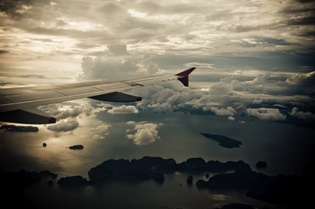
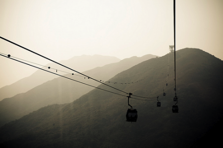
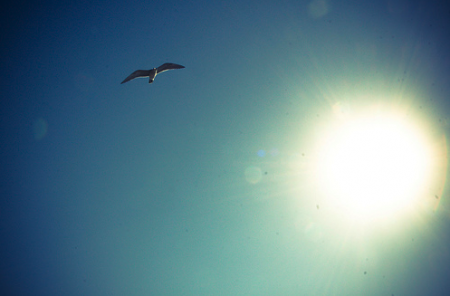
So I stumbled onto the deleteyourself blog the other day (same guy who runs Photololz) and in turn found his Flickr. There were some nice shots up there but what really struck me in particular was the vivid clarity and tone of the photos. So I took a look at the EXIF data and sure enough, they were all shot with a Canon 5D MKII. As you may well know, I have been trying to decide whether to stick with Nikon for my next camera or make the leap to Canon. I think that decision is becoming much clearer now; after seeing what Tim Navis did with the EOS 30D and now this, Canon is way out in front for me. Of course, he’s also using the $1500 Canon EF 16-35mm, but I suppose a camera like the 5D deserves only the best. At any rate, these shots drive home how good the 5D is at transforming otherwise mundane scenes into exquisitely detailed compositions of incredible depth and tonal range.

On a side note, that second pic looks like it was taken right around the same place I took this one, flying into Phuket Airport. I effected the hell out of mine, so it’s hard to compare the two, but I assure you that even in it’s raw form, mine was never anywhere near this detailed and dynamic. I’m not sure how much post processing he is doing with these, I’d love to know how much Photoshop had to do with the end results. Whatever the case may be, Photoshop can’t just synthesize out of thin air the kind of clarity and depth found in these shots; I would bet there’s just some simple color balancing going on. I’m also really liking the vignetting in a lot of these, can anyone out there with a similar rig testify as to whether that is a natural artifact of that particular lens or something he did in post?