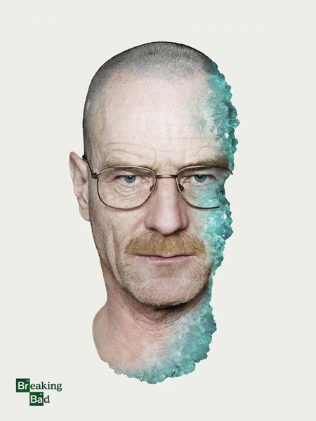
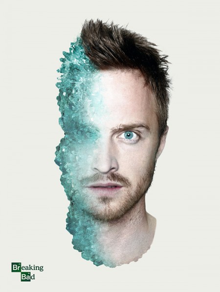
For the final episode of AMC’s Breaking Bad show, I (Shelby) created these two posters of Walter White (Bryan Cranston) and Jesse Pinkman (Aaron Paul). If you’ve seen the show you’d immediately recognize the blue as a representation of Walter’s high-purity methamphetamine. Without spoiling the show, you’ll notice there is more blue crystal on Pinkman’s face than there is on Walt’s. In that lies the concept of these posters. The posters were created for fun using only a few images.
Posts in Photoshop
Breaking Bad Poster Series
Sebastião Salgado
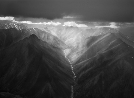
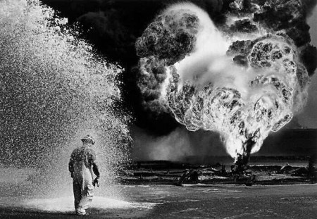
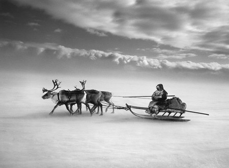
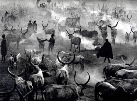
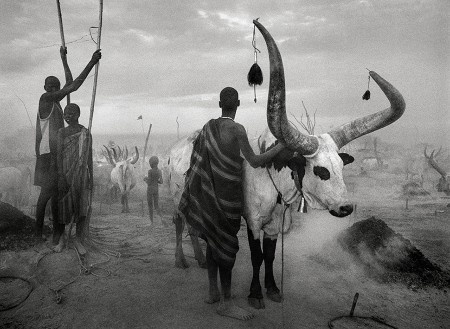
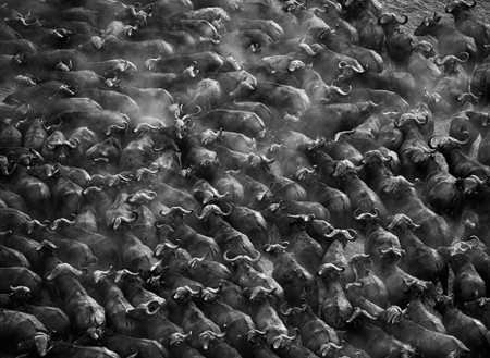
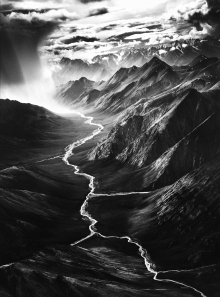
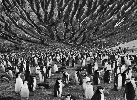
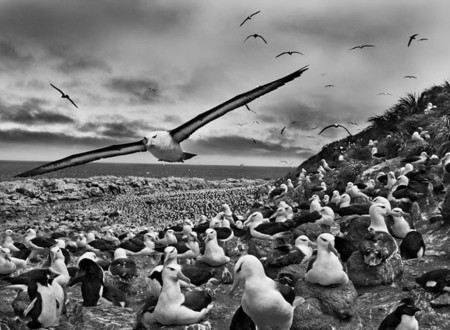
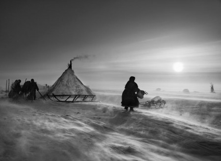
Perhaps I’m a little late on the Sebastião Salgado bandwagon but I’m really glad I jumped on. Sebastião Salgado is a veteran documentary / photojournalism photographer from Brazil. I believe most of the shots above were shot with a Leica M7 with mostly Kodak’s T-Max 400 film. I’ve also read that Mr. Salgado has switched to digital format in recent years. Either way, his photographs floored me. I was at Samy’s Camera here in Los Angeles and they had his book Genesis on display. I could have sat and viewed that book for days. Each image had me staring at it for a good length of time. Salgado’s work is the kind of work that makes me want to quit photography entirely because it’s just too good.
I could go on and on about his work but go ahead and do your own research on Sebastião Salgado.
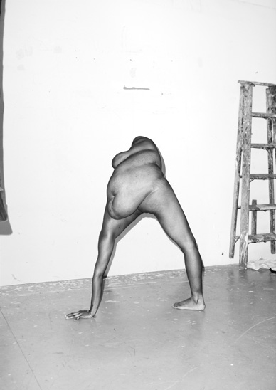
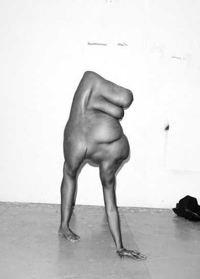
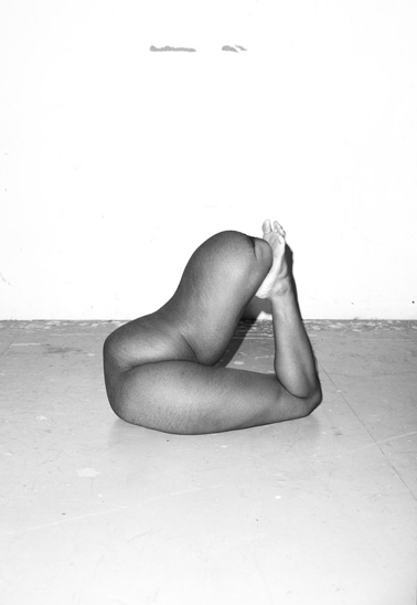
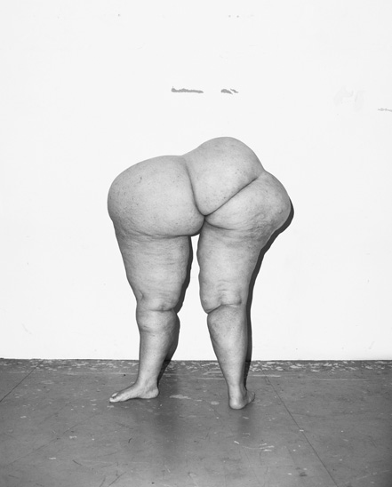
ASGER CARLSEN: HESTER
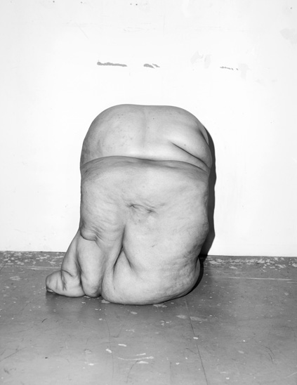
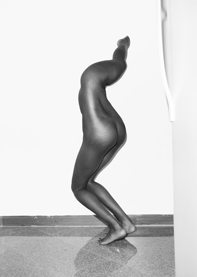
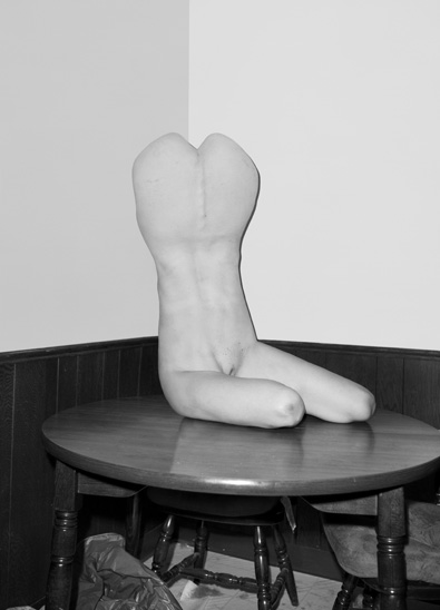
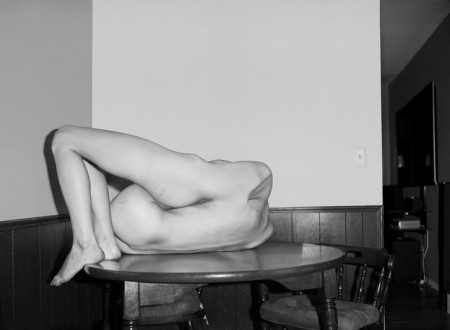
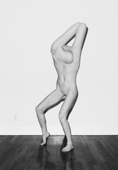
The fantastical black-and-white nudes of Asger Carlsen‘s Hester series are nothing if not provocative. The NY-based artist works in limbs and lumps, torsos and bulges, constructing figures that are human and yet not quite, and “shooting” them in gritty greytones. The resulting images are alternately grotesque, graceful, and thought-provoking. If you can suppress your gag reflex long enough, Carlsen’s deformed forms possess a strange beauty, and an unblinking skepticism about photography’s capacity for realism.
Posted by: Todd Goldstein | Twitter: @armsongs
Twitter GUI Photoshop PSD Template
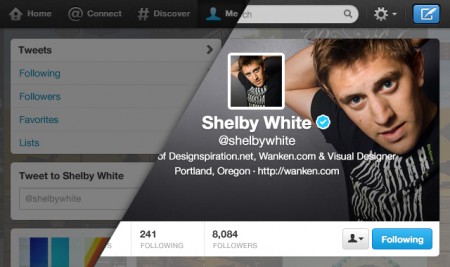
Twitter just rolled out a new profile design that allows you to add your own header banner. Pretty cool, but it’s hard to tell what looks best without fidgeting with it, then waiting. To make it easier on you, I’ve updated my Twitter PSD Photoshop template to the new design.
The profile images in the template utilize smart objects to make it easier to update all of the images in the template at once. The name/username’s in the tweets also utilize smart objects. Double-click to edit, then edit the contents and it will update all of the smart objects synced with it.
This template was built closely to Twitter’s current layout as of September 20th, 2012. Download the template below. Please share the PSD if you find it useful. If you have any questions or suggestions leave a comment.
Enjoy!
For updates to the PSD you should follow @ShelbyWhite.
Twitter UI Background Template PSD
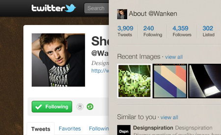
Giving back to the community isn’t always as easy as finding and sharing great design. Sometimes it requires spending time doing tedious details of a Photoshop document… and that is exactly what I’ve done for you.
Here for your use is a Twitter UI Photoshop template perfect for mocking up your page before updating it live. The template is spot on with Twitter’s current layout. In the Psd, each of element set is grouped into its respective area based on the page. Each layer is also labeled and color coded. Twitter mockups should be a whole heck of a lot easier now, enjoy!
Twitter UI Photoshop Psd (4.9 MB) | Version 1.2 — Share this
For updates to the PSD you should follow @ShelbyWhite.
Jamie Beck: Cinemagraphs
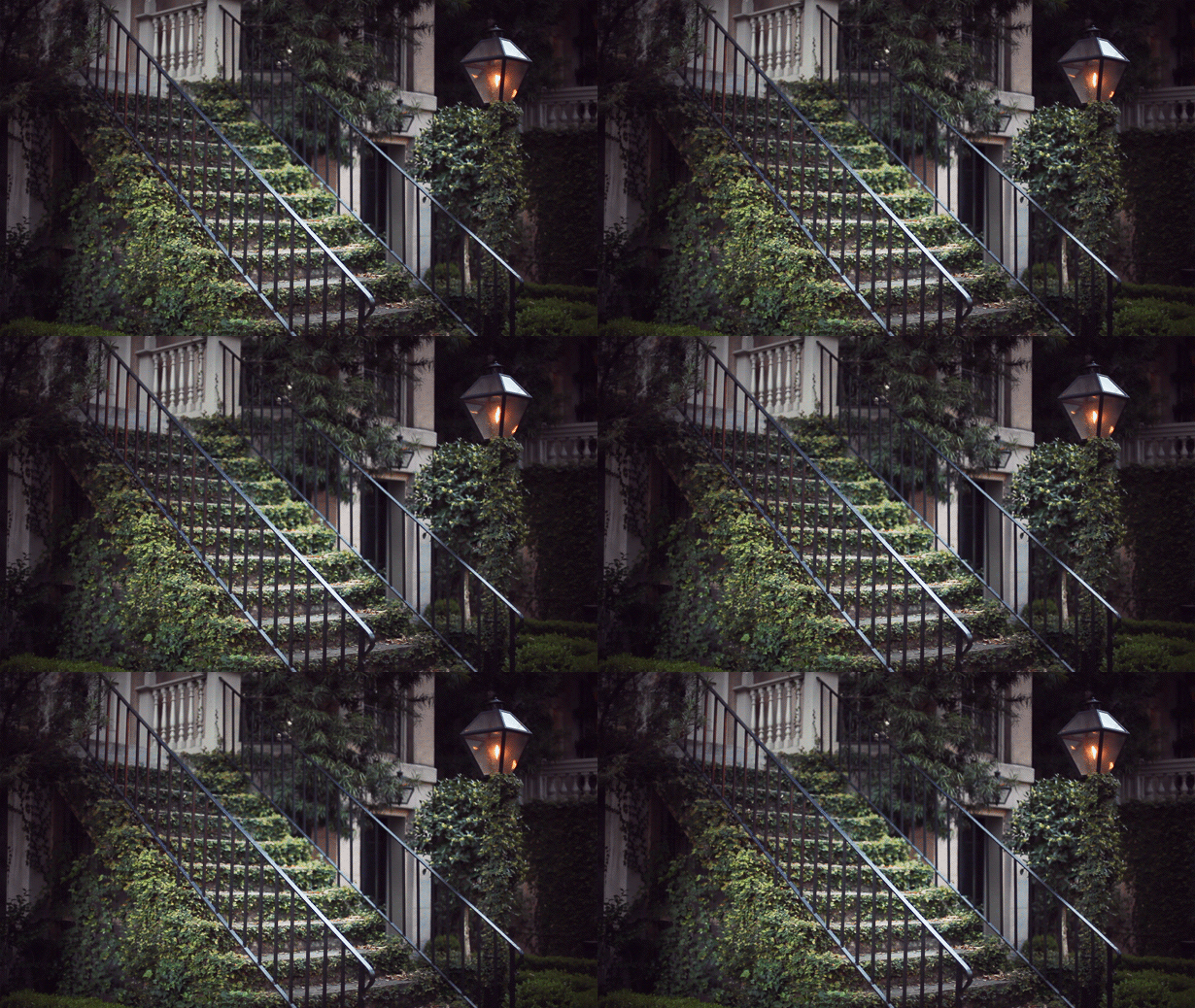
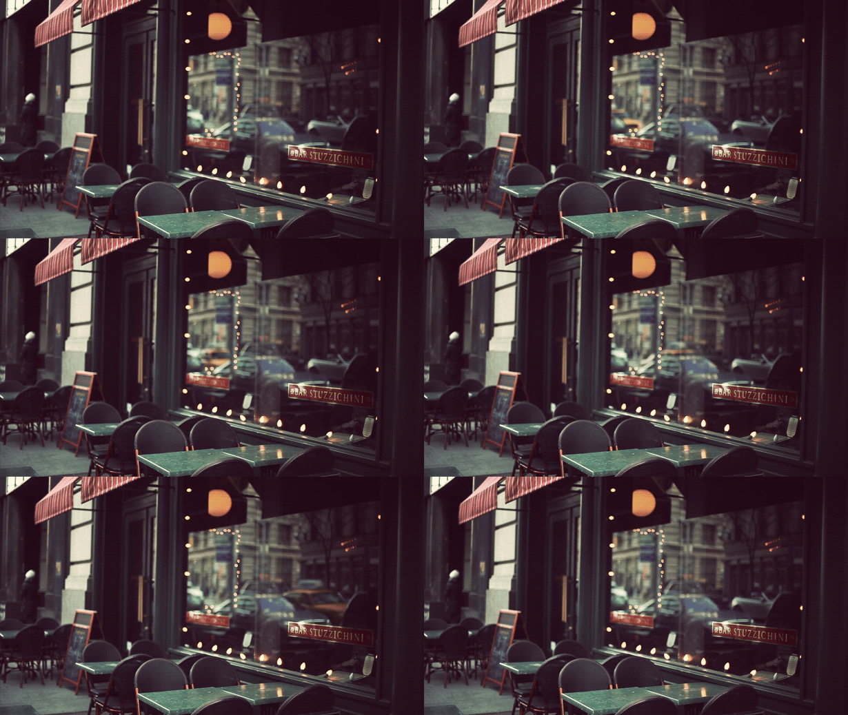
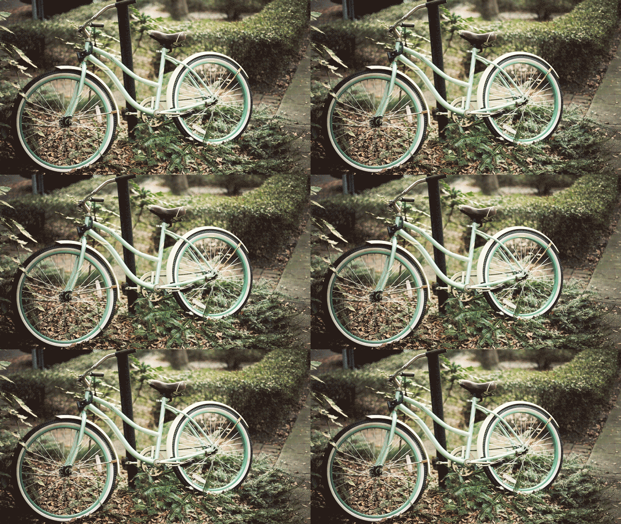
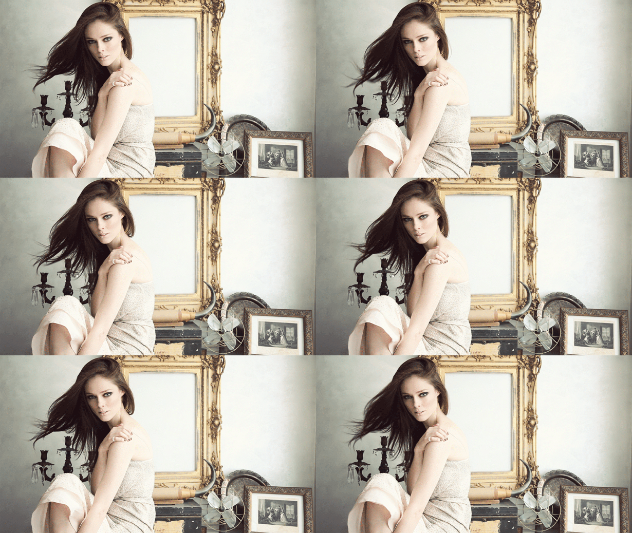
This is my favorite thing on the internet right now. These terrific animated GIFs were created by Jamie Beck, a NYC based photographer. The allure is simple: rather than overtly drawing your attention to obvious movement, these animations are very subtle and controlled.
*Tasteful* I think is right word to describe them. It’s what sets them apart from all the other nonsense GIF animations. The subtlety creates a kind of serenity almost — sort of a halfway point between film and real life. Definitely makes you do a double take the first time you see it.
Prediction: I know animated GIFs are as old as time, but I think soon this subtle spin on the technique will be absolutely everywhere. Enjoy it now.
Thomas Scholes
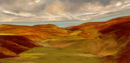
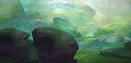
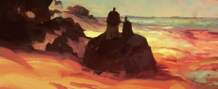
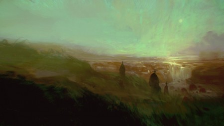
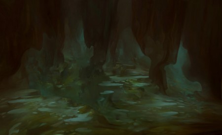
Thomas Scholes is a digital artist out of Seattle who uses Photoshop to create painterly landscapes sort of in the vein of Roger Dean and more recently, Dan McPharlin. I love his color use and the texture; it’s really incredible that this is all being done within software.
Thomas also does a lot of process videos showing how he works with various imagery and textures to get these effects. I particularly enjoyed this one which shows him modeling a landscape from a photo of a woman (see video below). I love the idea of incorporating unrelated imagery into a composition as texture or distressing — or, in this case, as a framework.
httpvh://www.youtube.com/watch?v=3f9D9Fvh2pM
You can check out more of Thomas’ work and videos at his blog
Content-Aware Fill Sneak Peek
httpvh://www.youtube.com/watch?v=NH0aEp1oDOI
Update: The Real Uqbar has a post discussing GIMP resynthesis and how it makes this particular feature completely possible. Via Kevchenko
This is absolutely insane. In the video, Photoshop product manager Bryan O’neil Hughes walks us through a new feature they’re working on: “Content-Aware Fill Sneak Peek”. I can’t tell you how much time this would have saved me. To be honest I thought this might be an early April Fools joke (a’la Google’s hoaxes) but this appears to be legit.
Bryan doesn’t say when/if this new feature will show up in the product, but judging from it’s performance in the video I wouldn’t be surprised if it shows up in CS5 at some point (coming April 12th, 2010). Let’s just hope it works as well in the real world as it does in the lab because that’s downright incredible.
Old School BMX
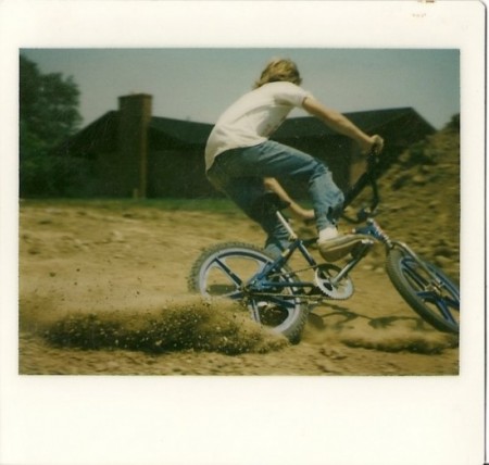
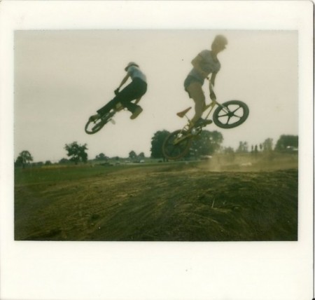
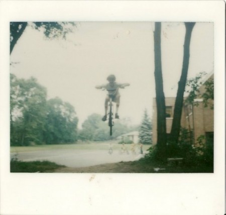
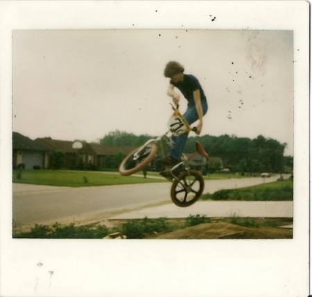
I wish I could say these were from when I was younger, but the closest I ever got to BMX was digging jumps and watching my friends careen off of them (I went off once with a road bike, crashed, and stayed grounded after that).
Anyway the above shots were taken by Cameron Muilenburg from Hidden Clothing. It looks like he and his friends were pretty good — not only at riding but also at capturing the experience with basic equipment (I assume Polaroid). I love the color and composition. The first one feels like a still from a film, paused at just the right moment to capture the most movement.
Sure look like some fearless little kids. Check out the rest of the pics here.
Genuine Fractals
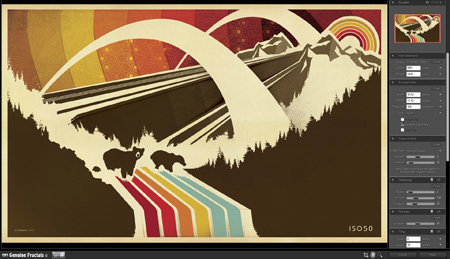
I’d heard of Genuine Fractals — onOne Software’s scaling plugin — from Tim at Blue Moon Printing but I had yet to try it out for myself. It’s basically a plugin for Photoshop which uses a proprietary algorithm (as opposed to Photshop’s built in resizing modes) to enlarge images. I was pretty skeptical but finally decided to try it out tonight when faced with some daunting upscaling projects.
I’m in the process of working through some older posters and sizing them up to the larger formats. For a long time I created all of my prints at 12×18″ (or thereabouts, depending on the format) as my computer just couldn’t handle anything bigger. For many I’ve been able to go back and recreate them, but some elements in the posters are scanned from smaller sources and just couldn’t be scaled up (e.g. the sky background in the above example. It’s made from a photo of a textile which is of a finite size and I don’t have access to anymore). So I figured now would be a good time to give Genuine Fractals a try. To my amazement it handled everything I threw at it beautifully. The interface and workflow are dead simple: you just initiate the Genuine Fractals dialog from the File > Automate menu, resize, click apply, and you’re done. It’s even fast, about the same speed as Photoshop’s resize command. There’s not much more to say as the results really speak for themselves. Simply put: Genuine Fractals can scale your images up to 1000% larger without any noticeable degradation. That’s what it says on their site and from my experience I’d say that’s absolutely true.
Genuine Fractals excels at photographic imagery, but that’s to be expected. With complex raster images it’s easy for imperfections to hide amongst all the shapes and colors. I thought the true test would be it’s ability to scale up flattened vector images. That is, vector shape and text layers flattened into raster images. I am doing this just to better illustrate how clean the scaling is but Genuine Fractals can actually handle multi-layered images (text, raster, and vector shape layers), scaling each layer individually and maintaining the original layer type. Meaning, if you feed it a document with a raster layer, a text layer, and a vector layer, it will use it’s algorithm to scale the raster data but will also scale the text and vector layers without rasterizing them. All the layers will be maintained as they were in the original document, they will just be scaled up. For my purposes, this is what makes Genuine Fractals truly powerful.
Here are some of my results. I know, none of this is very scientific but it’s a small glimpse of how well this program works. See the subtext under each image for a description.
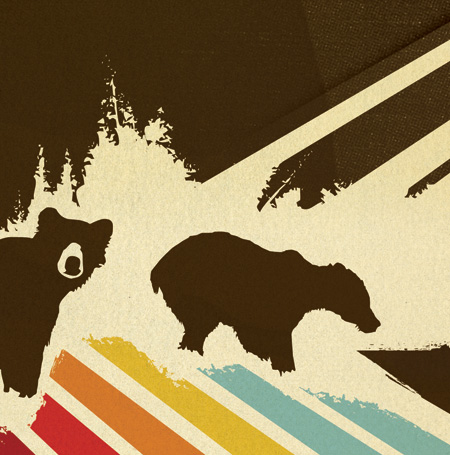
Original Image
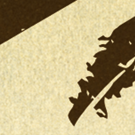
Photoshop Resized
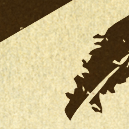
Genuine Fractals Resized
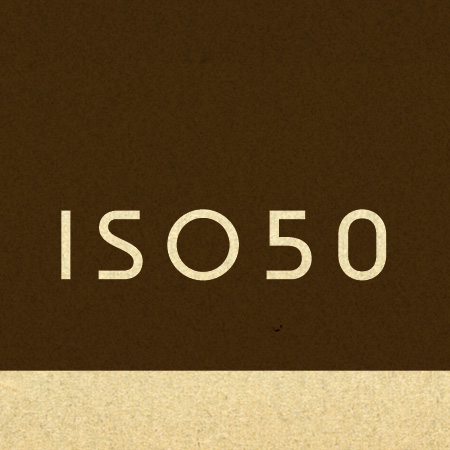
Original Text
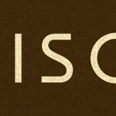
Photoshop Resized
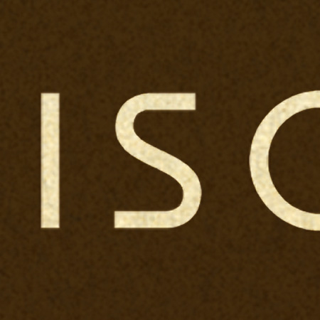
Genuine Fractals Resized
As you can see, the lines are still crisp and defined with the Genuine Fractals enlargements. It’s not exactly perfect when compared to the original, but it’s a greatly improved alternative to Photoshop’s native scaling algorithms. My only question now is: At $700, why doesn’t Photoshop have this kind of power built in? New features like content aware scaling are nice and all, but I’d much rather they spent their R&D money on core functionality like this.
You can download a demo of Genuine Fractals from their site to try it out yourself. At $150, the software is a little too pricey for casual use, I’d say this is more for print shops and professional photographers looking to scale up their work for large format printing.
