Clever, via gdurrell
Posts in Posters
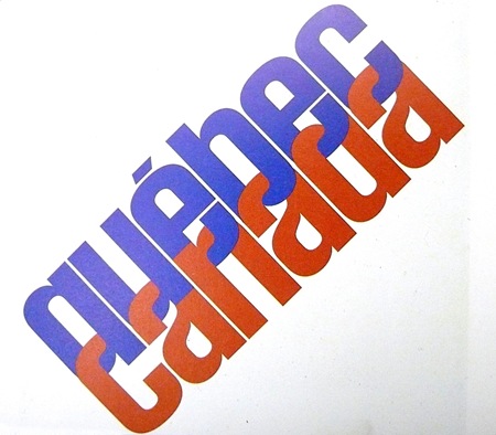
Quebec / Canada
Olympische Spiele Munchen 1972
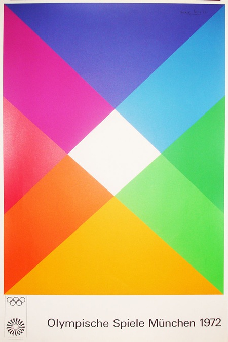
This Otl Aicher-designed Olympic poster is from Blanka. I see them linked on FFFFOUND all the time but I really don’t know what they’re all about. At first I thought they were an agency but now I think they’re just some sort of design shop with all sorts of cool stuff that is never in stock. At any rate, it’s fun to look at the pictures; they have an extensive archive of vintage poster prints.
The Bank Job
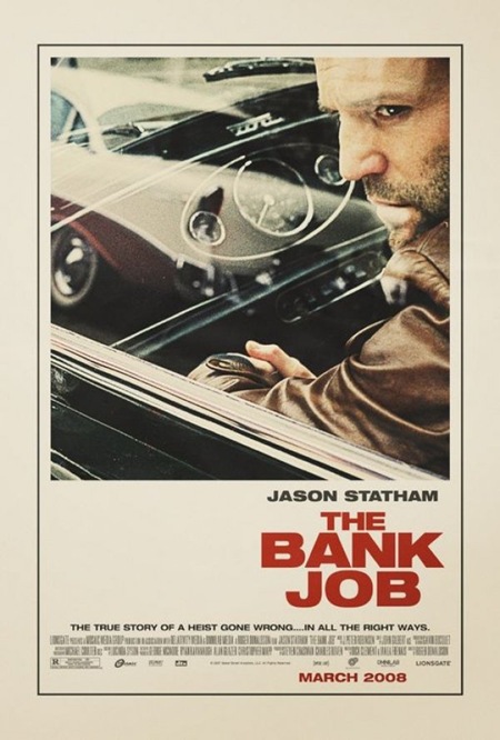
I saw this poster plastered all over a construction site by my house a while back and was really struck by how well executed it was for a modern movie poster. I had been meaning to post it but had totally forgotten until Joris commented on it in the 100 Greatest Movie Posters post. You really don’t see design of this caliber and style in the movie industry anymore. I am assuming this was an early version of the poster. I read somewhere that the big studios will commission an early, more subdued / subversive version of movie posters far in advance of the release and then they come with the tried and true (and boring as hell) final version replete with giant heads and random quasi-illustrative open space backdrops. It’s so formulaic, but I suppose they’ve done their homework and that’s what moves the masses. Sad. Thanks Joris for the reminder on this one!
Extra Credit: This seems to be a similar still to the one used for the poster, give you an idea of the sort of photo manipulation that went into the poster version, very nice. Also, here’s another, infinitely worse, version of the poster.
100 Greatest Movie Posters
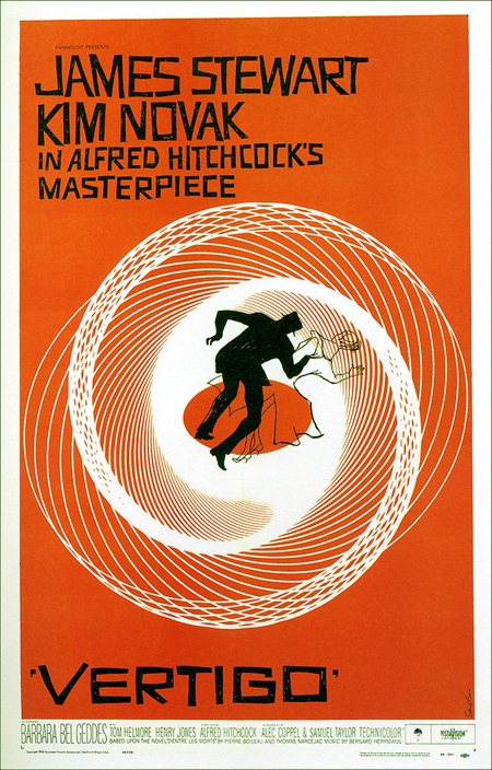
Over at Tccandler there’s a post on "The 100 Greatest Movie Posters". It’s a nice collection and while most are not aesthetically quite my style, they are all successful in one way or another. I’ve included one of the few I would actually hang on my wall above, Saul Bass’ poster for Alfred Hitchcock’s Vertigo. Link
J.Casey In Black

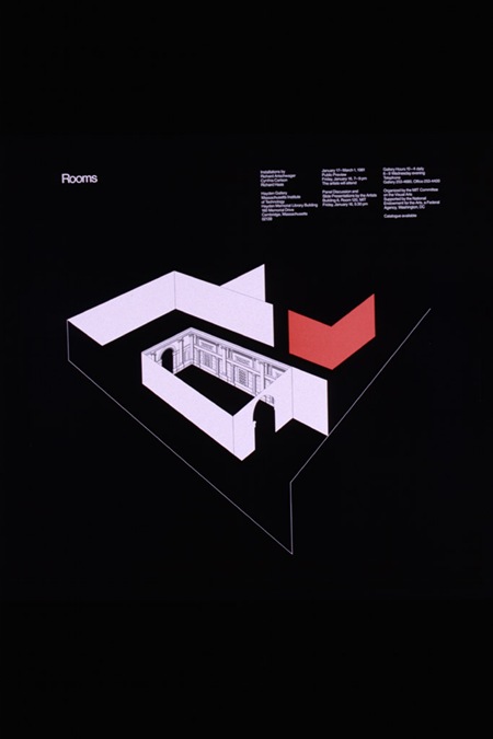
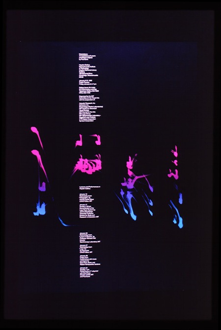
The darker side of Jacqueline Caset. Via RIT
Buro Destruct






Buro Destruct was one of the design bureau’s i found after finding Scott’s ISO50’s work that i really enjoyed. I was mostly drawn to the bearded guy icon and their poster’s they did for artists on Warp Records 5-10 years ago. I love their well thought out press photo though and books they’ve put out over the years.
Destroyer’s Rubies
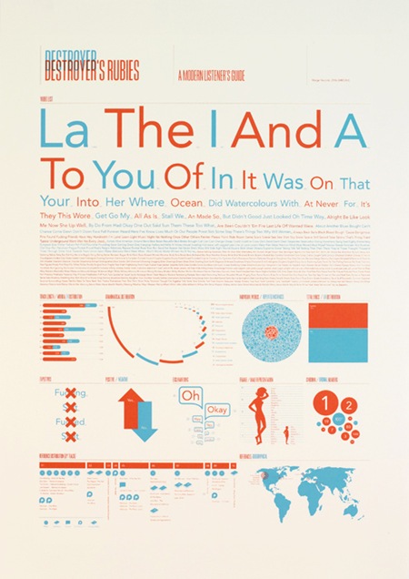
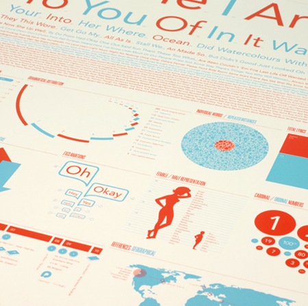
Jez Burrows’ expression of ‘Destroyer’s Rubies’ by Destroyer. They’re sold out but you can at least read a bit more about the idea behind them at Jez’s site. Great typography and color. Via FFFFOUND
ISO50 Obama Print Out Now
 Update: This print is sold out.
As some of you already noticed, the Barack Obama site announced the arrival of the print today. You can purchase the print now for $70, all proceeds go to the Barack Obama Campaign.
After all is said and done, I am very happy with the finished product. Unfortunately the colors on the JPEG above don’t come through as well as they did in print and there’s a lot of fine detail that’s lost at this size, so you’ll have to stretch a little bit to imagine what the real thing looks like. I just got into Detroit, will be playing a set at DEMF tomorrow, so I won’t have time to put together a good case study on the process of creating this print until I return on Sunday. But I wanted to post this up in the meantime after holding it back for so long.
Spirograf Posters
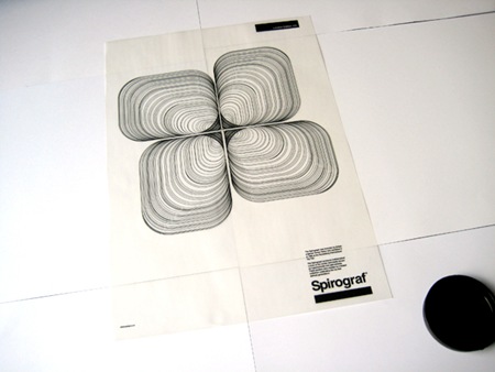
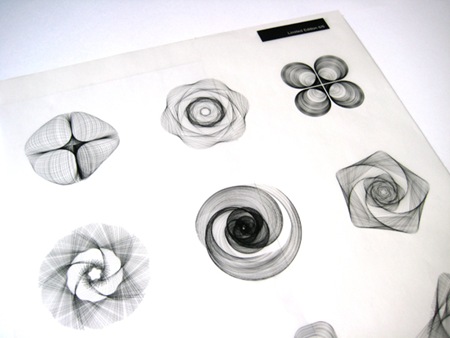
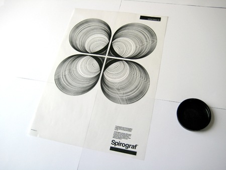
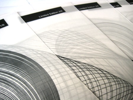
These Spirograf posters by Greig Anderson (Effektive) are absolutely wonderful. I love when people use techniques or styles that have laid dormant or were just overlooked as passé to create new and exciting design. Also check out the rest of Greig’s work, it’s all very good.
Via ffffound.
Shannon Palmer: Colour Revolt
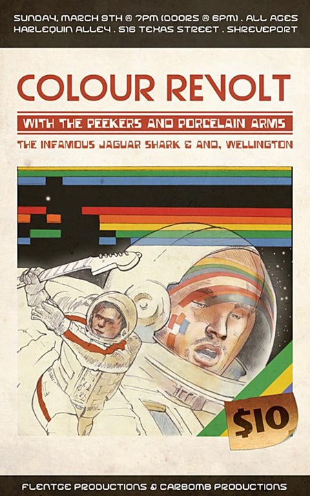
Cool Atari-esque concert poster by Shannon Palmer for Colour Revolt. Via Dusty Brown.