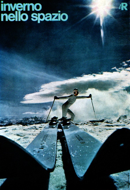
Great poster from Pink Ponk’s Flickr via FFFFOUND. Sadly I myself won’t be doing much skiing this season though.
Posts in Posters
Inverno
ISO50 Stockholm Workshop
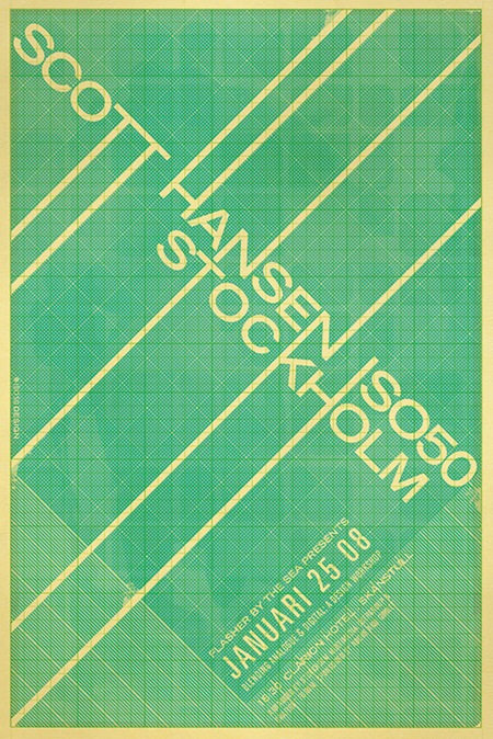
UPDATE: Registration for this event is now open here.
I’ll be hosting a free (thanks to our gracious sponsors) workshop / talk in Stockholm during January. The workshop will focus on a lot of the concepts I covered in the the Barcelona and New York series along with some new ideas and a good dose of design theory. I usually do a lot of hands on work within Photoshop so you’re encouraged to bring a laptop if you want to follow along. There will be a full question and answer period at the end so come prepared if there are any specific concepts you’d like to discuss.
It should be a fun night, the event itself will last about 2 hours and afterwards we’ll move over to the hotel bar for some drinks and mingling. I’ll be bringing some prints from The Shop, but due to the distance I will be traveling for this one, bringing shirts won’t really be practical. Due to other limitations there will not be a live Tycho set, but I will be playing some new music and any questions you have about music are welcomed. Hope to see you all out!
Flasher By The Sea Presents:
Scott Hansen / ISO50
Blending Analogue & Digital: A Design Workshop
January 25, 2008 – 18:30
Stockholm, SWE
Cost: Free (thanks to our sponsors)
RSVP / Tickets: Info is here
Arranged by Stockholm Multimedia Usergroup and Grafiskt Forum
Sponsored by Adobe and Gimlet
Clarion Hotel, Skanstull
Ringvägen 98, BOX 20025 Stockholm
Telefon: +46 (0)8 462 10 00
Arrive at the lobby and there will be signs pointing to the event.
Olivetti Elettrosumma 22
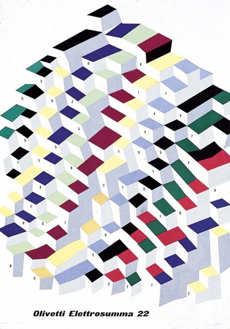
Poster by G. Pintori for the Olivetti Elettrosumma 22 calculator – 1956
Via Olivetti Group
The New Age of Censorship
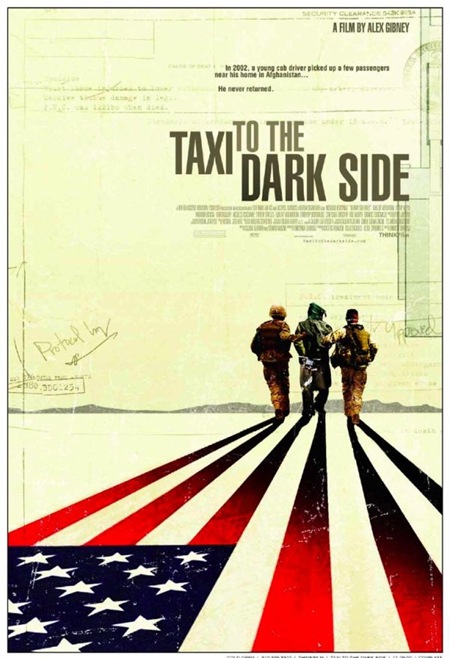
This was posted over at Monoscope:
"The Motion Picture Association of America (MPAA) has rejected Taxi On the Dark Side’s poster as being “not suitable for all audiences.” …
What’s offensive about this image? The detainee in the hood. Well, actually just the hood. An MPAA spokesman said: “We treat all films the same. Ads will be seen by all audiences, including children. If the advertising is not suitable for all audiences it will not be approved by the advertising administration.”
Welcome to the new age of censorship kids, it makes McCarthyism seem almost quaint."
Sickening to say the least. This is a well executed, poignant design and I don’t see how depicting a real world situation in this manner would be offensive to kids. More like "educational", but of course the MPAA isn’t exactly concerned with educating the youth, perhaps dumbing them down to the point of complete complacency, but certainly not educating.
The New Propaganda
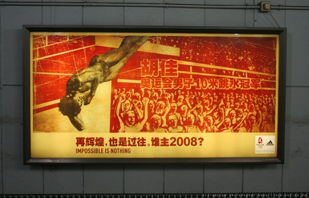
Very nice contemporary propaganda-esque Adidas billboard for the Beijing Games. Not sure who did this campaign, anyone got some info?
Photo via Ack-Online
LOST + FOUND
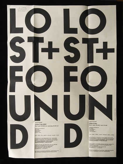
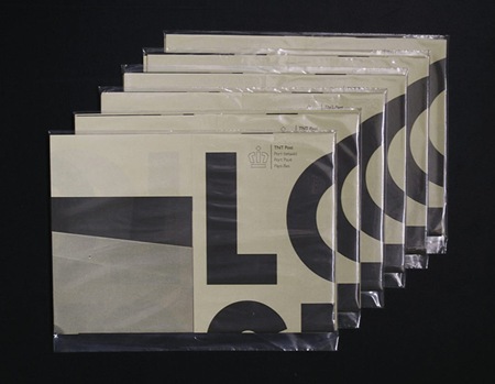
Another great example of some well used typography. I found this online a while back and forgot to to write down the source. If anyone knows where it’s from or anything about it please post in the comments. Also, name that font.
UPDATE via Sam Mallett in the comments:
"the piece was designed by Timo Hofmeijer / New Folder from Amsterdam and it was a collaboration with Ian Brown"
Disco Rout Poster
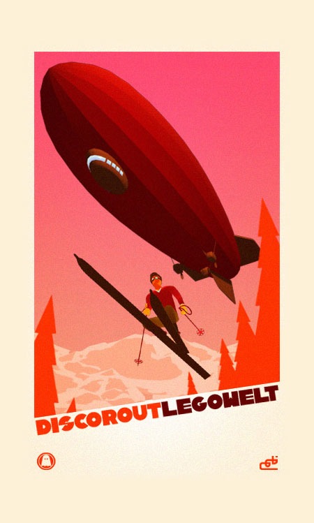
Nice promo poster for the Legowelt Disco Rout video.
Busag Principle
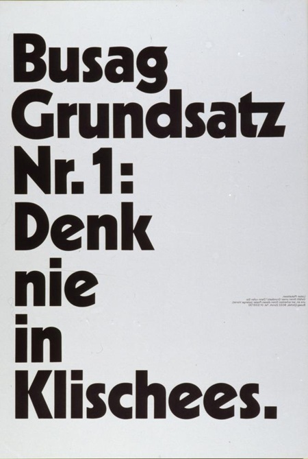
"Busag Clichés" [1973]
By: Diggelmann & Mennel Werbeagentur (Zürich)
Black and white at their finest from The Poster Library via Joyrex. I really like how this piece emphasizes extremes; dark / light, massive headline / miniscule copy. As a poster designer you dream of being able to keep the detail copy this small. Unfortunately, clients don’t always appreciate the finer points of minimalism.
Name that typeface in the Comments >
Update: Title translation via Jessie Rumble: "Never think in Clichés"
Solaris
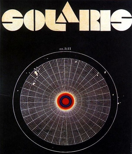
Movie poster for Soviet-Era Sci-Fi film based on the novel Solaris by Polish author Stanisław Lem. Solaris on Wikipedia
Das Neue Schulhaus

I’m pretty sure it doesn’t get any better than this. By Swiss Designer Carlo Vivarelli who also did the "Flums" Poster.
"997. 1953 poster, advertisement for The New School House, C.L. Vivarelli, Zurich Art Business Museum, marked Vivarelli, printed by Bollmann, dated 1953, linen backed, 36"x 50", 500-700"
Via the Treadway/Toomey Gallery
Seeing great design like this, by designers who are no longer with us, always makes me wonder what our generation’s legacy will be. in 60 years I wonder what artifacts young designers will look back on in awe. The pessimist in me wonders if we are doing anything quite as groundbreaking and forward thinking as this in the print medium. Print seems to have been relegated to a sort of suspended animation while mediums like video and interactive jump leaps and bounds every year. I don’t know if this is a function of the age of the print medium, i.e. everything new and innovative has been done, of if there just aren’t enough people pursuing print design as an art form anymore. Or perhaps I’m just stuck in the past and for some reason only design like this affects me in any meaningful way. Either way, there is no denying the greatness of this image.
Can any of you design scholars out there name the style or period that informed this design? I want to say Bauhaus, but I am sure someone can explain why that is wrong.
UPDATE: Via Eric in the comments:
"This design is definitely a product of the international typographic style developed in Basel switzerland, during the 1950s…This style is is clearly influenced by the bauhaus, but they took it to the next level. beautiful example."
Carsten also wrote a great comment explaining the "Reformed-School" in Germany and how it relates to this poster.