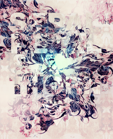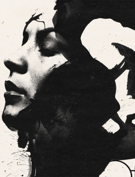
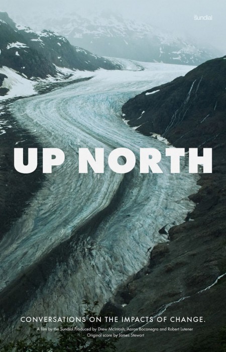
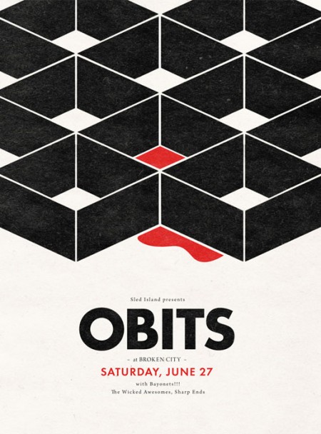
A few killer works by Justin Allen LaFontaine. I had the Up North one on my blog a while back, but forgot how cool it was until today when I was perusing the electronic basement as it were. I wonder where that photo was taken.. Would love to see some recent work by Justin!
Posts in Posters
Justin Allen LaFontaine
The Lovestep poster boys: Sepalcure
With Dubstep branching out to see how far the genre can be pushed a ton of new ideas start to surface and a fusion of appealing sounds start melting together. One group i’m really excited about is Sepalcure which is a collaboration of Brooklyn’s Praveen and Machinedrum. the duo is doing a fine job of taking hints of soulful house and dubstep to create what they call Lovestep. One thing that Sepalcure has that other dubsteppers don’t usually have and ISO50 fans might also really enjoy is fine art direction by the multi talented designer Sougwen Chung. As you can see above and below her posters and videos of her work are a perfect fit for this heartfelt music.
Sepalcure’s debut performance alongside Untold, TRG, Pole, 2562 & more is February 13th at Unsound Festival NYC.
Below is a “Lovestep” mix done by Percussion Lab Founder/Sepalcure’s very own Praveen.
TRACKLIST
Pangaea – Memories
Burial – You Hurt Me
TRG – Broken Heart (Martyn Remix)
Untold – Dante
DFRNT – Tripped (Synkro Mix)
Synkro – Inhale
Sines – Memories Are Here
DFRNT – Tripped (Ital Tek Remix)
FaltyDL – Party
Joy Orbison – J. Doe
Sepalcure – Deep City Insects
Floating Points – K&G Beat
DOWNLOAD HERE
Sepalcure – Feeling That I Know So Well from sougwen on Vimeo.
Sepalcure – Every Day of my Life from sougwen on Vimeo.
North Korean Propaganda Posters
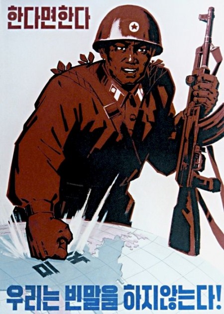

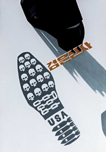
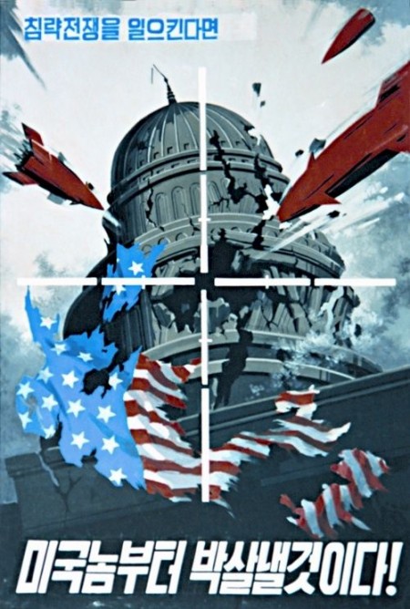
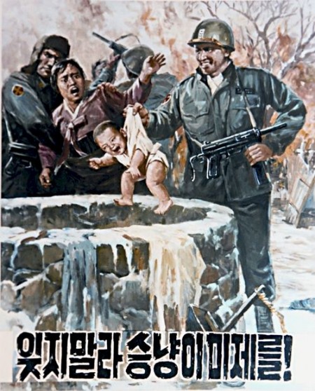
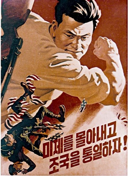

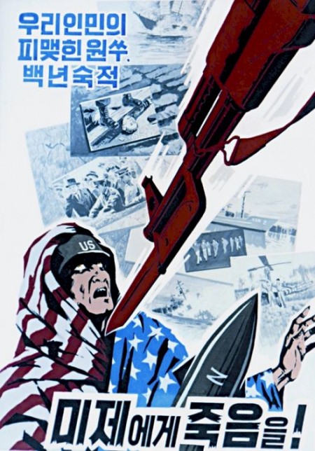
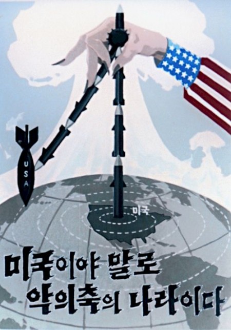

This set of North Korean propaganda posters was originally posted on Reddit today but the images were soon removed. I’ve mirrored them here and you can also find alternate mirrors along with translations at the original Reddit article. Pretty incredible these images made it to the outside world and the goat one seems so friendly. Here are the translations in case the original goes down:
· “When provoking a war of aggression, we will hit back, beginning with the US!”
· “Though the dog barks, the procession moves on!”
· “Death to US imperialists, our sworn enemy!”
· “Prevention and more prevention. Let’s fully establish a veterinary system for the prevention of epidemics!”
· “Let’s drive the US imperialists out and reunite the fatherland!”
· “Let’s extensively raise goats in all families!”
· “The US is truly an Axis of Evil.”
· “When we say we will, we will. We do not talk idly!”
· “Wicked Man.”
· “Do not forget the US imperialist wolves!”
Quadradao
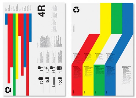
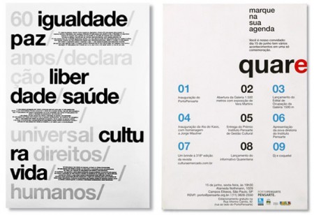
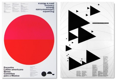
I’m definitely getting way into this style right now; what can I say, people are doing some amazing things with type and shapes. These posters are by Quadradao out of Brazil. There is something familiar about the look of course, but I think it’s still fresh in its own way. What I find interesting about it is how much harder it is to design effectively in this style than it looks like. Sure it’s just type and shapes, but try and work something equally refined and see if you don’t go completely nuts.
Couldn’t find too much information on the studio, but from what I can deduce they’re chilling down in Brazil pumping out crazy good posters like these. If I had to guess I would have said these were straight out of the Netherlands.
Hey Ho
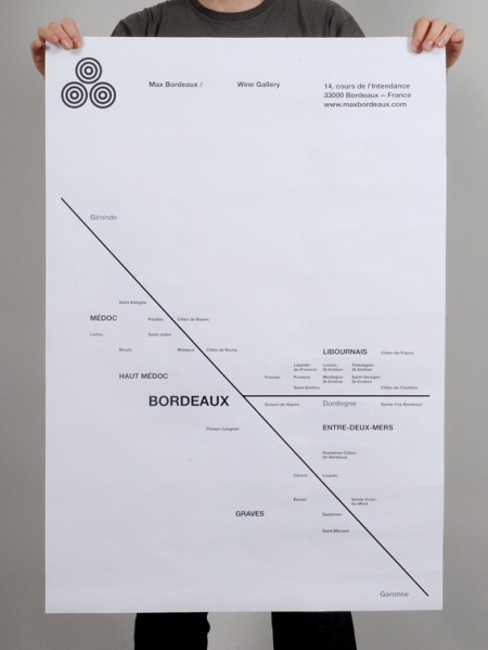
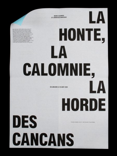

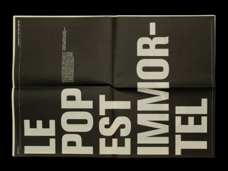
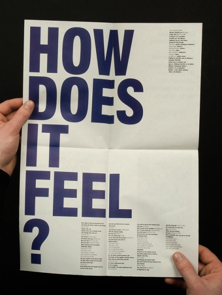
Gorgeous typographic works by French studio Hey Ho. I’m a big fan of this super regimented typographic chaos; a contradiction of terms I know, but looking at the pieces I think you know what I mean. Careful inspection usually reveals a tight grid and all of the placement feels *right*. I try to imagine adding or taking away elements and always find that Hey Ho has balanced things perfectly. Their work kind of reminds me of Experimental Jetset in an alternate typographic universe.
Movie Posters of the Decade
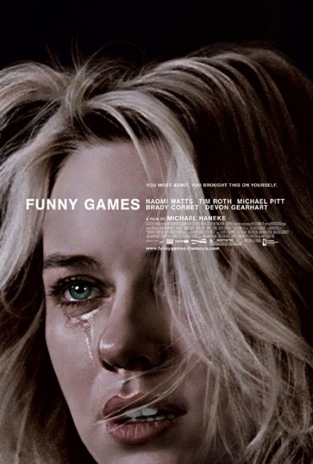
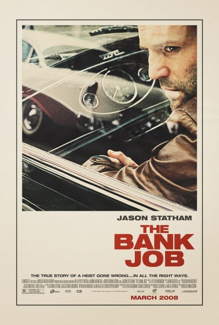
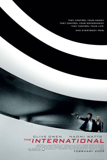
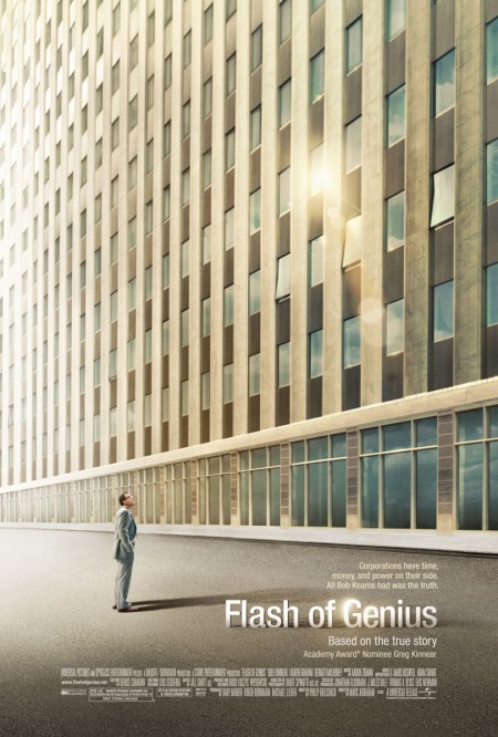
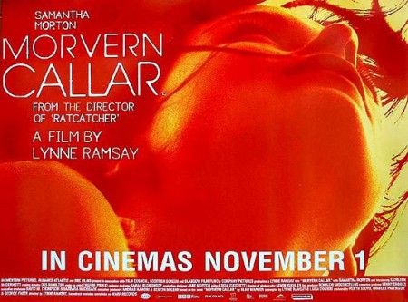
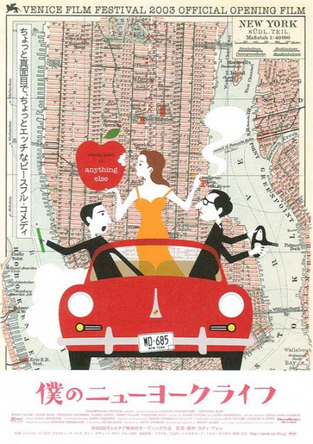
The Auteurs has a post on their picks for the top movie posters of the decade. Considering that the vast majority of modern movie posters fall short of the standards set in heyday of film, this must have been a difficult list to assemble and a boring task to complete. Nevertheless, they have managed to dig up a few gems. Good to see The Bank Job in there — always a favorite — but I was pleasantly surprised by Funny Games, hadn’t seen that one.
Can you think of any obvious omissions from this list? Let us know in the comments
For some background, more good movie posters from years past can be found in these older posts: 50 Beautiful Movie Posters, 100 Greatest Movie Posters, and, of course, SOLARIS!.
Via The Auteurs
Pan Am’s “Helvetica Dream”
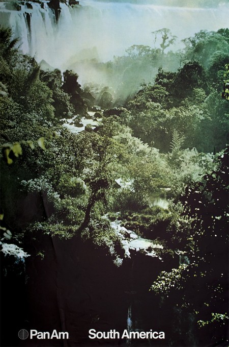
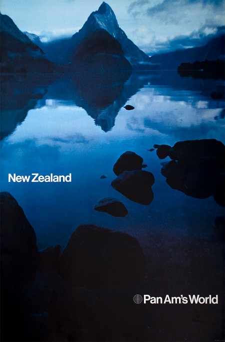
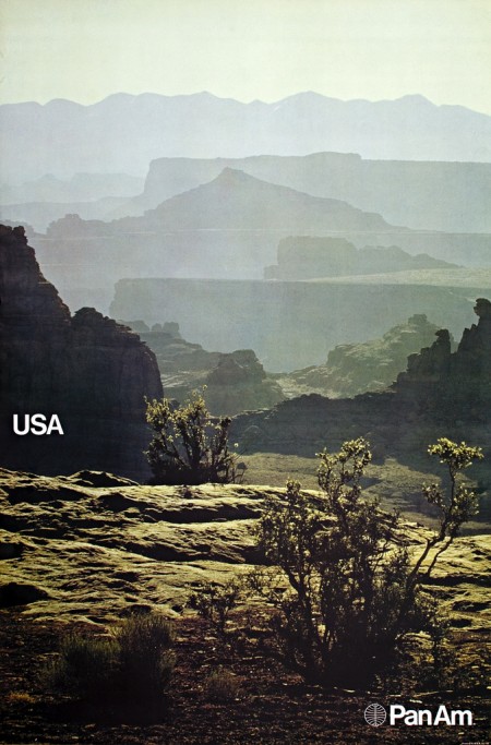
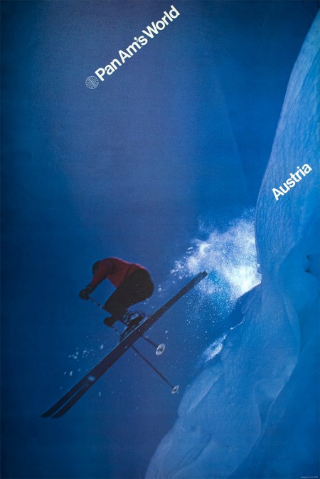
Determined to find out the history behind these beautiful posters, Frederico Duarte did some extensive research and learned how “Pan Am’s short-lived Helvetica dream” came to be. He chronicles this process over on the Eye Blog and in an article for Eye Magazine. These posters are incredible and their story is well worth the endless emails and phone calls he had to make to determine their origin.
Pan Am is no longer. But the story of its redesign, as told by the people behind it, proves personal connections, proximity and chance are all makers of (design) history. How many other great design stories are left untold?
Fredrico’s post reads like a design mystery and I lamented how little of this research I do, or even curiosity I possess when I come across work that interests me. For example: I wake up, see something amazing on FFFFOUND, then I bookmark it. End of story. If it’s especially awesome maybe I blog about it, but I rarely dive deep into whatever visual universe I’ve uncovered. I usually just absorb it quickly, then move on with a slightly augmented sense of visual understanding. This is why I both love and hate sites like Dropular or FFFFOUND. While they allow me to quickly consume lots of high quality design, they remove context and discourage the exploration that would otherwise go along with finding out about a new artist. (Of course there are many benefits to sites like these, but the removal of the ‘story’ that goes along with the work is one of the primary downsides.)
As Fredrico mentions in his article, the research was done for an SVA class where the rule is “No Google”. I thought this was interesting because I tend to use Google and “research” interchangeably, especially when thinking about design. To be stripped of my only research tool! Of course this makes sense these days, as most of us young designers primarily exist on the web anyway (which is a scary thought if you think about it…if the hardrives go, so do I). What the story hammered home for me was the importance and overwhelming benefits of a design education. What allowed Fredrico to take this much time plunging into the depths of design history (and what allowed me to spend so much time with Playboy) was the freedom and time provided by the design education environment. While you could always try and inspire yourself to do this on your own, it’s hard to beat limitless boundaries coupled with external motivation.
Albert Exergian: Minimalized TV
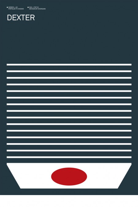
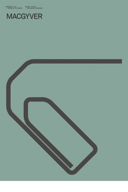
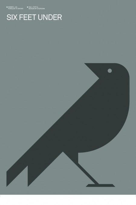
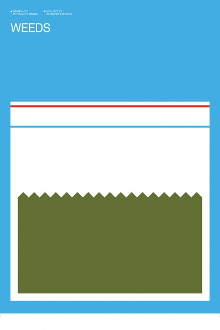
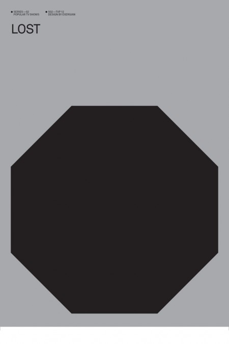
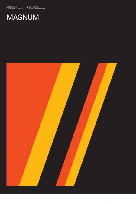
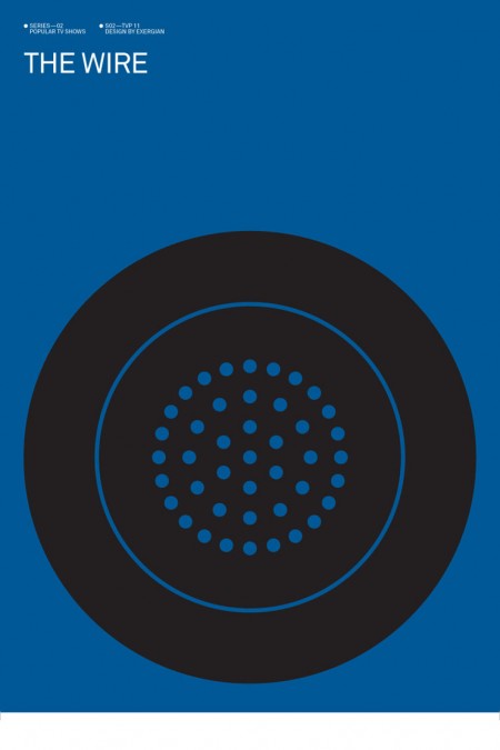
Update: Thanks Wilamagamid for pointing me over to Blanka, where you can purchase these prints.
Albert Exergian created this series of posters depicting popular television shows boiled down into their most simplified forms. He describes them as “A HUMOROUS VIEW ON TV CULTURE” but they don’t strike me as being particularly humorous. Intriguing is a better word, Exergian’s sense of efficiency is uncanny. This would make a great set of screen prints, if only he were selling them. I guess he might have some legal issues though. Although, he’s only really putting words on a page; does writing “Dexter” (my favorite poster by the way) constitute copyright infringement? I hope not. Anyways, if anyone knows where to get prints of these, please let me know.
More posters at Albert Exergian’s portfolio (scroll down)
Update: Found better images over at Blanka, but the following gripe still stands! Major tangent here: Sorry for the white lines around the edges, I got these directly from Exergian’s site and that’s how they came. This brings up a HUGE gripe I have with Photoshop: If you don’t flatten a file before you resize it, the edges tend to show through to the transparent background so when you save as JPEG, it ends up with these annoying white lines. I have no idea why this is so, but it is. I guess it’s time for another “Dear Adobe” post.
Notcot ISO50 Giveaway + Process Article
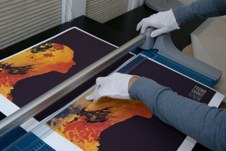
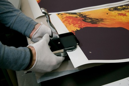
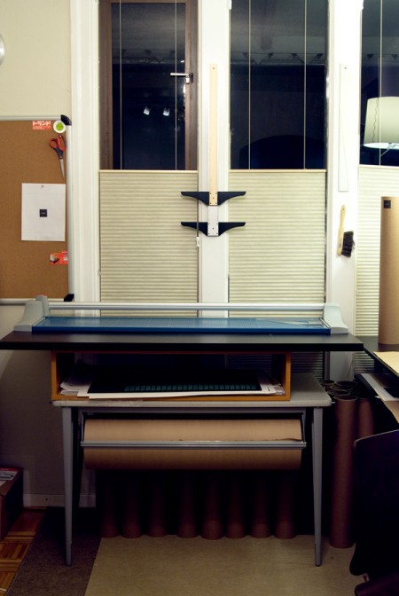
NOTCOT is having an ISO50 giveaway including a couple Studio Giclee Prints, the new Syv shirt, and the Tycho Coastal Brake 12″. I also wrote a short piece on how we print the posters here at the studio and posted up some pictures of the process.
→ Read on and enter to win here. Good luck!
Analog Visions
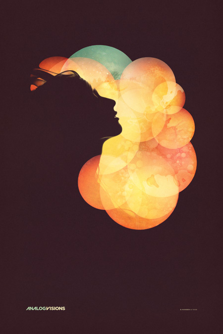
As promised, here’s the final poster for the Analog Visions show on Friday in Toronto. In case you missed it, I’ll be doing a solo show at Function 13 Gallery this Friday, November 20th. I’ve been working out concepts for how to hang the posters throughout the past week, I’ve decided against frames and want to go with something a little more raw feeling for this one. The work that I’ll be showing are all printed on Hahnemühle German Etching paper which has this incredible texture. I don’t want anything to get between the viewer and the piece. I have been working with Bulldog clips and nails, spray painting the clips matte white and using longer nails to let the piece stand off the wall a little. I think it’s going to look nice, but I’m still open to any suggestions, if you have any ideas for alternative poster hanging methods, let me know in the comments.
As for the poster design itself, I spent way longer than expected on this one. It was meant to be a quick promo poster for the gallery but the deeper I got into it the more I realized I had to finish it off properly. Once you hit on a concept you kind of have to decide whether to go all the way with it or save it for when there’s time to do it right. It was a stretch, but I was able to get it done in time (deadline was this morning) so it’s pretty nice to finally see it in it’s completed form. As you can see, this is another take on the Nocturne poster, featuring the same model. Seeing as how these events are the same night I wanted them to be related, but not exactly the same. I wanted the Nocturne design to be a little more divergent from my earlier work while this one was meant to sort of bridge the gap between new and old given the nature of the gallery show. You can see a larger version of the image over at the studio site.
The version above is probably the fifth or sixth, not counting the various in between states. The final file ended up around 4GB, 24×36″ at 300dpi but I did most of the heavy lifting with low resolution smart object stand-ins so it wasn’t too slow. In case anyone was wondering, this is the project I was referring to in the Photoshop Question / Problem post. All of the circles were smart objects based on the same photograph. As stated above, I worked with a model I shot here in the studio for the silhouettes, but I worked with another photographer for some elements of the background. I used some shots from Jacob Sargeant’s beautiful Experimental Set on Flickr for the detailing and color shifts. Thanks to Disign Police for turning me on to Jacob’s work.
Time for a day off and some much needed rest, hope to see you out in Toronto.
» Scott Hansen / ISO50 Solo Show @ Function 13 Gallery
» Tycho Live – ISO50 Gallery Afterparty @ Nocturne
