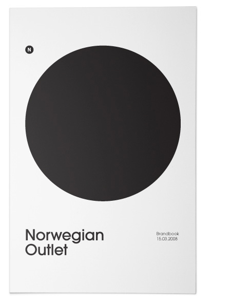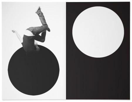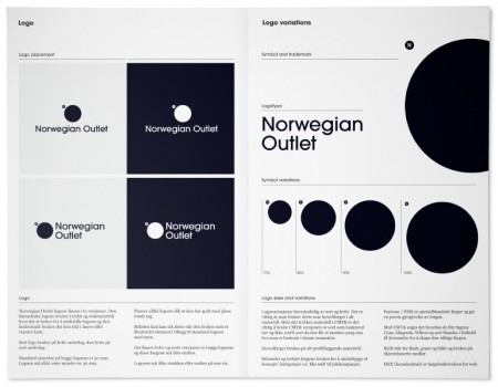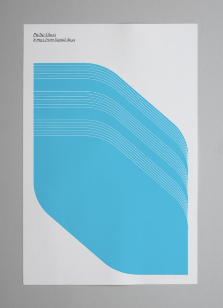
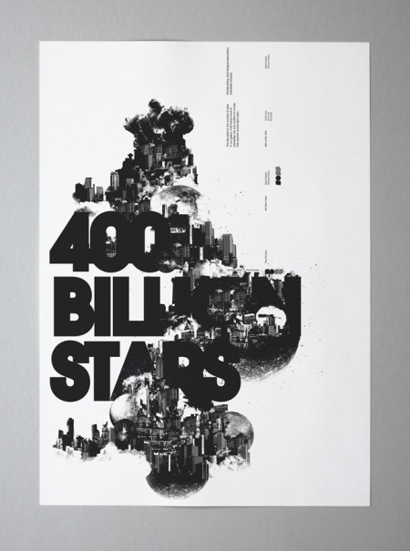
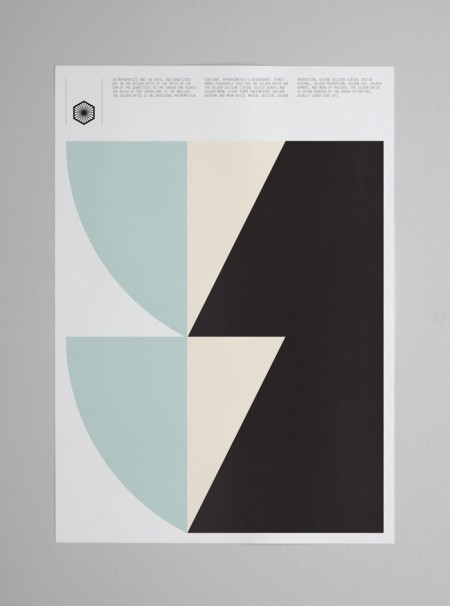
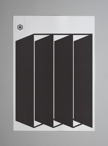
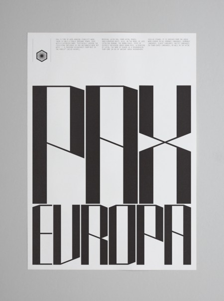
The work of Tom Balchin stopped me in my Google Reader tracks this evening. His Pax Europa project was my initial favorite, for the bold simplicity and terrific layouts, but there is a ton of terrific work in his portfolio. I came across the phrase “talent turbine” in the NYT Magazine the other day and have been itching for an opportunity to use it, so here goes; Tom Balchin is a talent turbine.
Posts in Posters
Tom Balchin
Snansen: Norwegian Outlet
Tycho Live In Toronto / New Poster
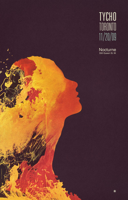
I just wrapped up the poster for the upcoming Tycho show in Toronto (shown above) which can also be purchased at the ISO50 Studio shop. I’m doing a solo art exhibition at Function 13 Gallery and then a live Tycho performance afterward at Nocturne on Friday, November 20th, 2009. I’ll be posting the gallery show poster tomorrow with all the info, for now you can find all the details for the Tycho (music) show here and details for the Function 13 Gallery Show here.
This poster is sort of an alternate take on the gallery show poster (which will be released tomorrow), they are both based on the same subject but have very different aesthetics. This is the first time I’ve worked directly with a live model for a project — I shot her against a light bouncer with a flood light coming from the back to get the silhouette. Although rather time consuming, it was a pretty fun process and I learned a lot. You may notice that this piece in similar to the Coastal Brake cover in it’s use of negative space. I’ve employed this concept in various ways throughout my career (the Past is Prologue cover [2004-2005], for example) but have only recently found the time to truly explore it to the extent that I have with these recent pieces as compositions in this style are the most time intensive of all my work. When creating these, I treat the process more like painting than graphic design and so things can become much more complex. This particular piece is not quite as complex as some of the others, it’s a composite of about 20 image layers overlayed using various blending modes and masked by the silhouette image, the negative space was then filled with photographed paper which was colored using color balance. It will be on display at the Function 13 ISO50 Gallery show on the 20th.
Tycho Show Details
ISO50 Toronto Art Show After Party
TYCHO (Live Audio / Visual Performance)
With Guest DJ’s
Aarnio (Ghostly/Moodgadget, New York)
Noah Pred (Thoughtless Music, Toronto)
Nocturne
550 Queen Street West Toronto
ON MSV 285
$10 Advance / $15 Door
Doors: 9PM
Simon Page
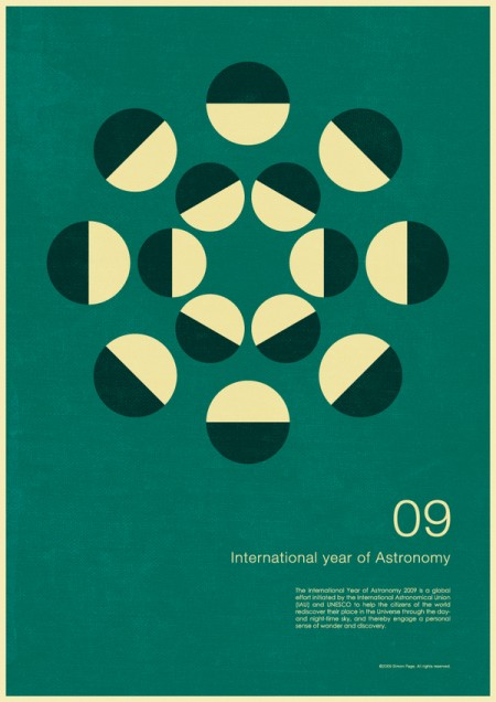
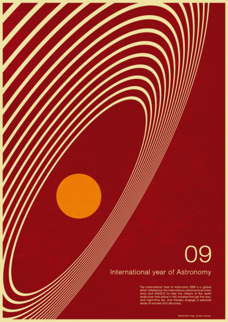
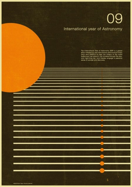
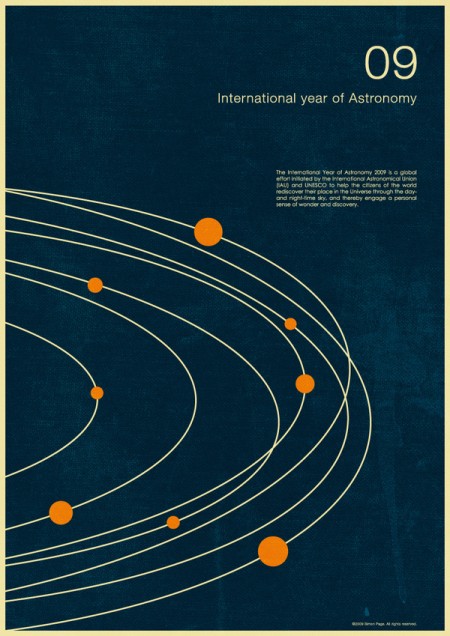
This series by Simon Page is great. I’m always a fan of this retro minimalist look. I think he does a great job making it feel aged without going overboard. The color and texture is spot on and the vintage feel is skillfully conjured. Sounded like what started as a personal project turned into a successful client job after they saw the work. Got to love when that happens!
1970’s Russian Posters
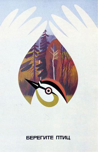
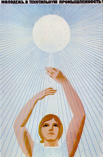
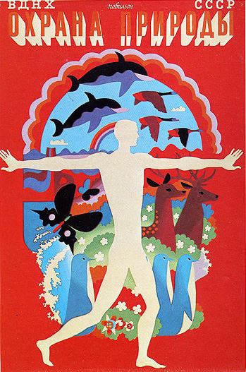
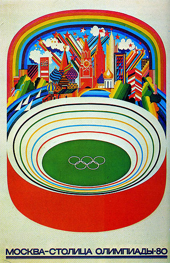
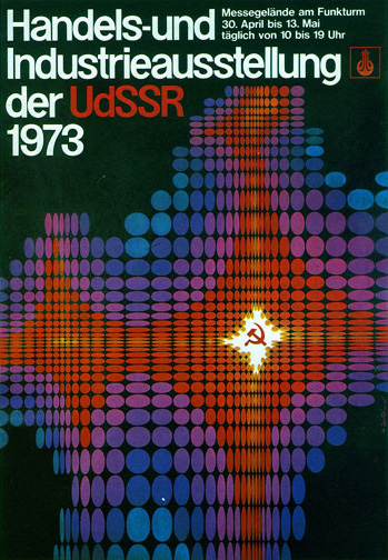
Dave over at Grain Edit scored a book full of amazing 1970’s-era Russian posters. Incredible stuff, I really wish someone with access to these would reprint them. That first one with the bird has got to be my favorite.
Yasuhiro Sawada
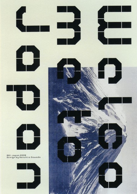
Maybe it was my last post, or Scott’s recent travel adventures, but something has reinvigorated my desire to go back to Japan. I guess I’ve always wanted to go back, the feeling is just very acute right now. As Jon and Kjell mentioned in the Non-Format interview, Tokyo is a rather hard city to beat. Personally I can’t imagine a more inspiring place.
Anyway the poster above is by Yasuhiro Sawada and I’m sorry to say, I don’t know too much more about it. I’ve always loved it for the simple shapes and unusual layout. It also took me repeated viewings to see that there was a message in the shapes — felt pretty oblivious after that. The image comes from GD in Japan, where you can find many other excellent works like this.
Mark Brooks For Santamonica
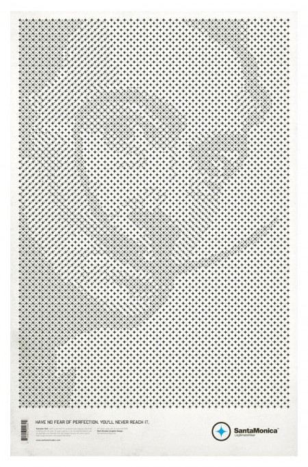
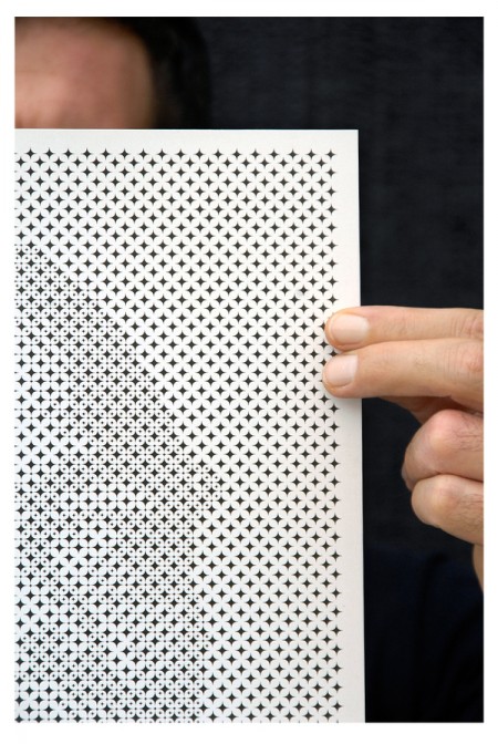
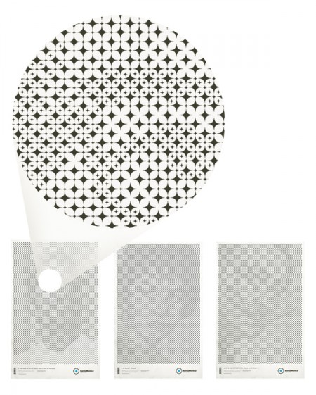
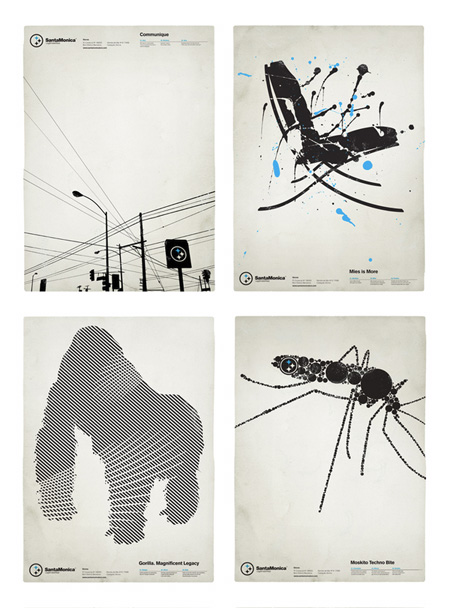
I first noticed of Mark Brooks’s work when he designed a series of very distinct black and white posters for Barcelona based Santamonica Apparel. Tonight I noticed that he’s back with a stylistically similar, but conceptually unique new series for the same company. While the originals were great in their own right, this new series — based on a grid of stars made from the Santamonica logo — takes things to another level. Very clever stuff.
Be sure to check out the rest of his work at Behance or his personal portfolio.
Klas Ernflo and My Favorite Letters
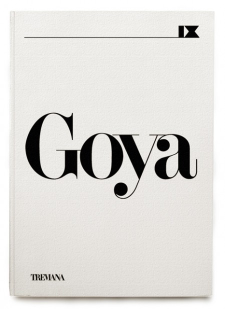
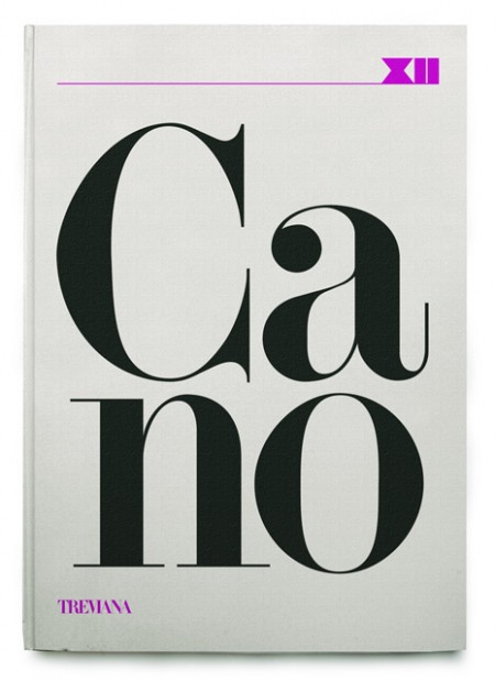
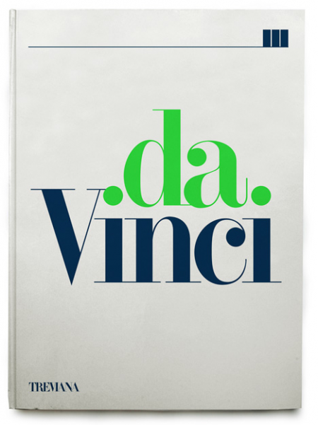
A few rejected book covers by Klas Ernflo. Beautiful typography at work here — I especially can’t get over how amazing the uppercase G is in the top image (looks like Didot, but I’m not positive). Surprising (and not at the same time) that these were rejected by the publisher. I would have bought them on the spot, regardless of their contents!
Recently I’ve been trying to determine my favorite occurrence of each letter of the alphabet. I’ve picked a few, like the “G” seen above, but most letters remain up in the air. The eventual goal will be to have a list of 52 shapes; representing my absolute favorite renderings of each letterform, upper and lowercase. After that I guess I’ll move onto symbols and numbers (I already know my favorite “7” — Clarendon). A few other examples might be the “W” from the Westinghouse logo, the lowercase Avant Garde “a”, and maybe the “H” from Scott’s recent post.
Would love to hear everyone else’s favorites! It’s hard I know, to narrow it down outside of the context of application, but I’m sure there are some standout letters for each of you. Let us know!
Tycho Live 9/24 – Seattle
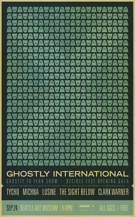
I’ll be heading up to Seattle later this month to Play the Ghostly 10 year show at Decibel Fest. Last year was great so really looking forward to this one.
You can see the flyer for the show above. I went with a slightly modified version of the Chicago poster / Ten Year Print to change it up a little. With this one I was going for more of a flyer/handbill feel as opposed to a poster.
Here are all the details, hope to see you out there…
Location:
Seattle Art Museum
1300 First Avenue
Seattle, WA United States
Performing:
Lusine
Tycho
Michna
The Sight Below
September 24, 2009
6-9 PM All Ages
$10 Buy Tickets
Ghostly celebrates 10 years at this years Decibel Festival.
The 2009 edition of Seattle’s Decibel Festival takes place September 24th through the 27th, and Ghostly is kicking it off at the SAM for the opening gala on Thursday the 24th.
826LA Time Travel Posters v.2
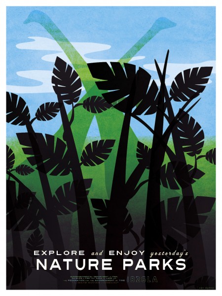
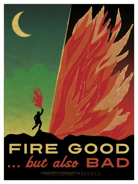
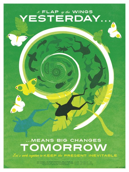
826LA has released a second round of Time Travel posters, on sale at their Echo Park Time Travel Mart. You can view the first series on this page as well, just scroll down a touch. Both were created by Los Angelas based illustrator/designer Amy Martin. As Amy notes on her blog, the sans-serifs at work are Turnpike and Featured Item. The script face is Vitrina.
I love both editions — can’t really decide which set I like better. I think they each have their strong points; for me, the illustrations of the first series and the typography of the second are the standout features. If there were some way to make a super amazing hybrid of the two I’d be all for it. At the end of the day, they are both great — terrific concept and strong execution.
