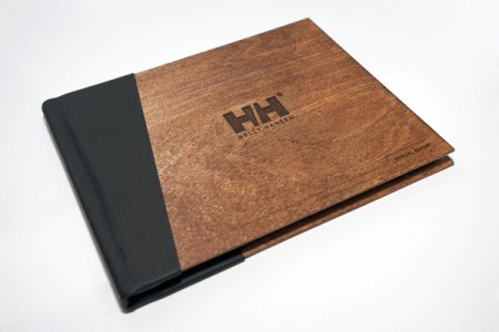
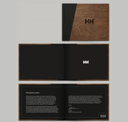
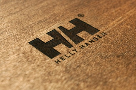
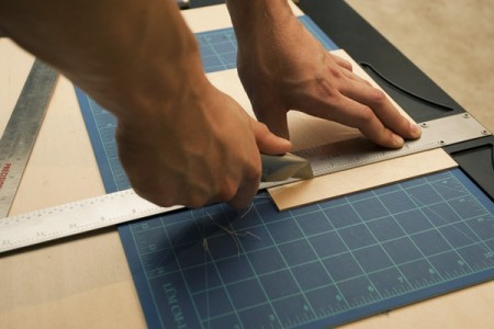
Awesome class project with process by Shelby White. I’m always a sucker for engraved wood. More pics and making of here.
Posts in Print
Helly Hansen Annual Report
Newwork Magazine
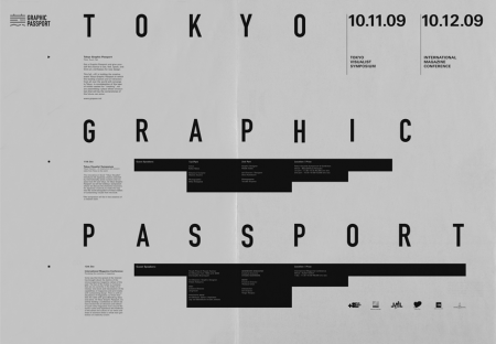
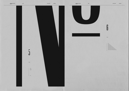
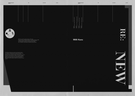
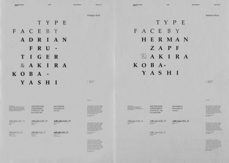
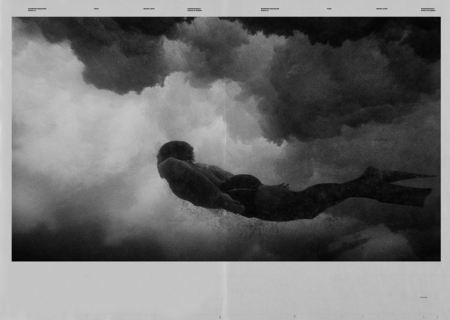
These spreads from Newwork Magazine are exceptionally awesome. At first I wasn’t sure why I was so taken by them, but I think it’s a combination of the following factors: sole use of (mostly) black and white, implementation of a strict grid, lots of little type details throughout, and a sophisticated and effective use of negative space. Newwork Magazine (ink on paper / 32″ x 23″) is put out by Studio Newwork.
Decca Records
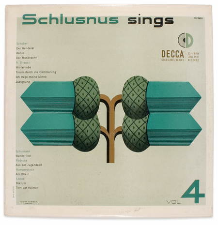
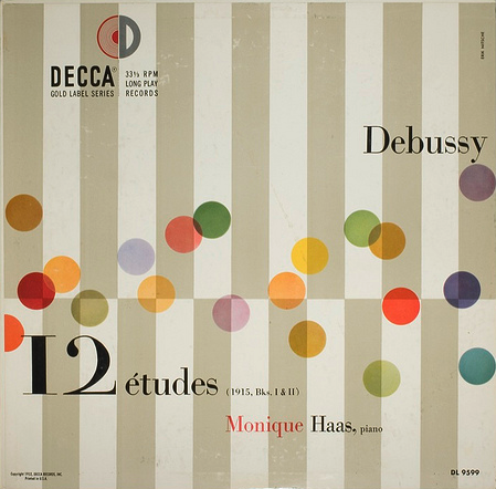
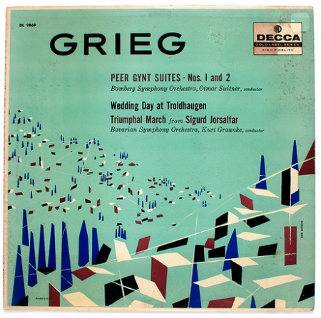
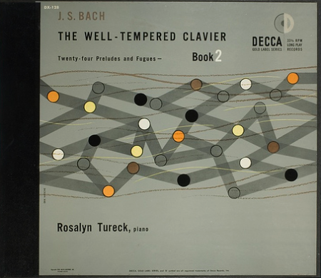
A few Decca record covers done by ISO50 favorite, Erik Nitsche. I was browsing Flickr for some or Nitsche’s work and I came across the massive assortment of images here, compiled by BustBright. I am in love with the type on these, especially the “Schlusnus sings” typeface. I’m not sure what it is but it amazing. And I always love Didot — if you browse the rest of the archive, you’ll see a lot of that.
Mark Brooks For Santamonica
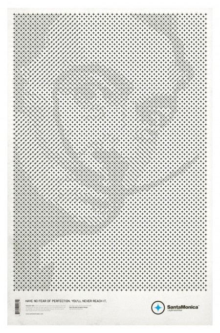
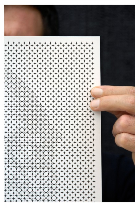
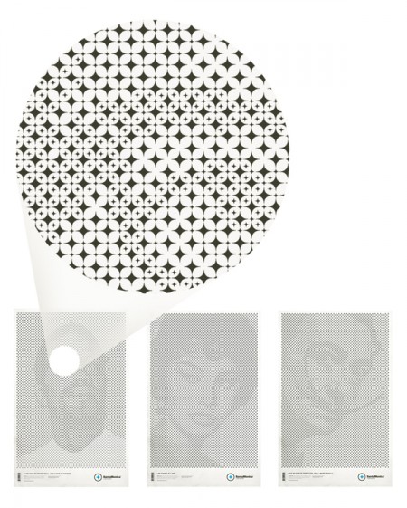
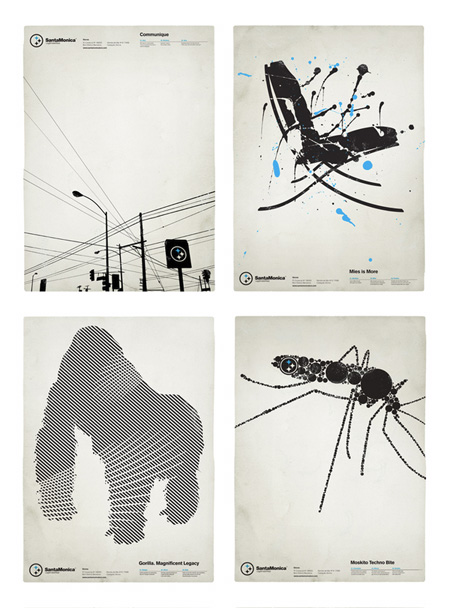
I first noticed of Mark Brooks’s work when he designed a series of very distinct black and white posters for Barcelona based Santamonica Apparel. Tonight I noticed that he’s back with a stylistically similar, but conceptually unique new series for the same company. While the originals were great in their own right, this new series — based on a grid of stars made from the Santamonica logo — takes things to another level. Very clever stuff.
Be sure to check out the rest of his work at Behance or his personal portfolio.
Hans Gremmen
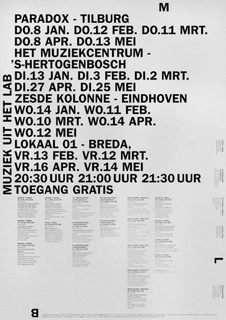
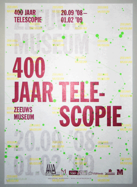
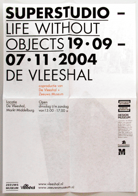
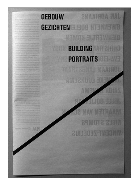
Assorted posters by Dutch designer Hans Gremmen. I love posters — like the first one — that are just PACKED with all sorts of information and data. Really gives the designer a chance to show off their typographic skills and hierarchic sensibilities. I especially enjoy the tendency for the asymmetrically balanced composition; really makes for that much more of an interesting poster.
Also worth noting is Gremmen’s portfolio site which randomly generates a selection of eight of his works. An interesting approach to be sure; I like the concept of an ever-changing front page, though it was a little tough to find the specific work I was looking for.
Louis Reith
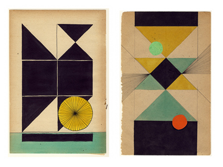
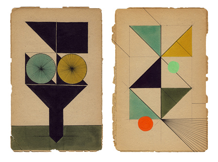
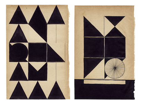
Assorted works by Dutch graphic designer Louis Reith. I really love the texture and the color of the paper he’s working on. I’ve spent hours in Photoshop trying to replicate that same off-white mix; can’t beat the real thing. Even more exciting is the color at work in the shapes — each hue is dialed in exactly where it should be. Some of the forms in the bottom image remind of the typographic stylings of Non-Format.
More info about Louis, including upcoming gallery showings, can be found on his Myspace.
Katja Gretzinger
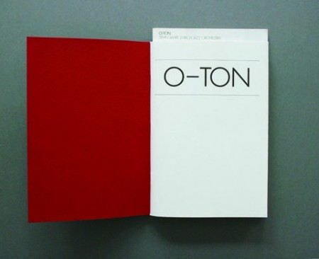
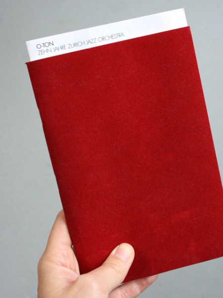
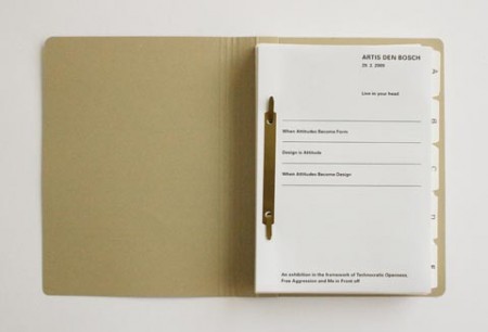
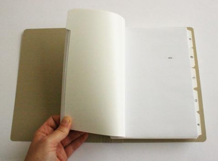
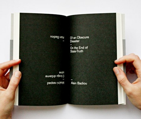
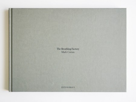
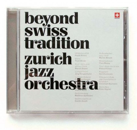
Absolutely loving this brilliant work from Berlin/Zurich-based Katja Gretzinger. This is the kind of work that really expresses the core ideals of design to me; it’s efficient, functional, and pleasing to the eye.
You can have a look through the rest of Katja’s excellent portfolio here.
The Best T’s
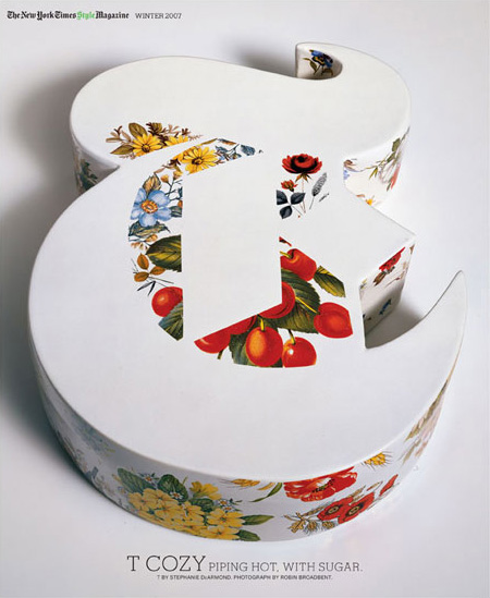
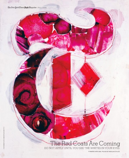
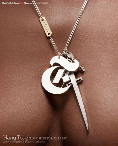
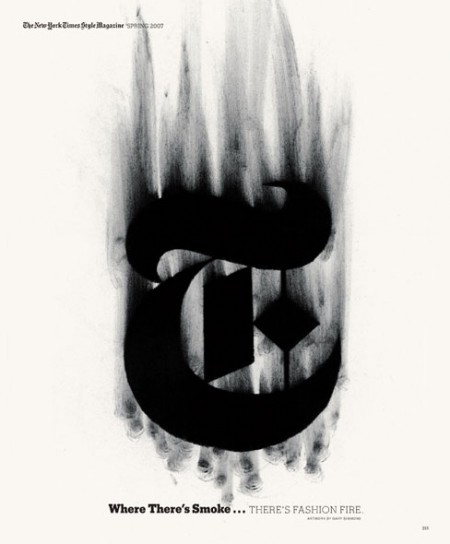
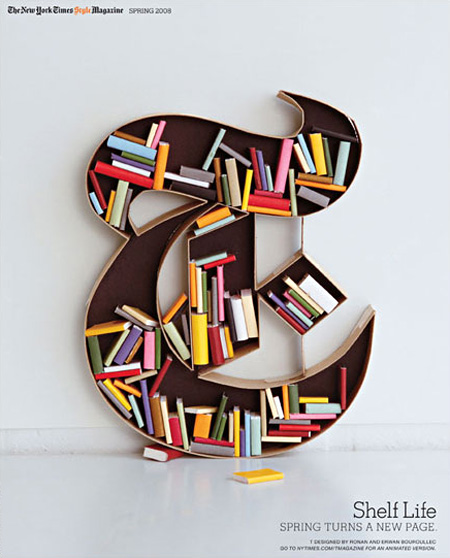
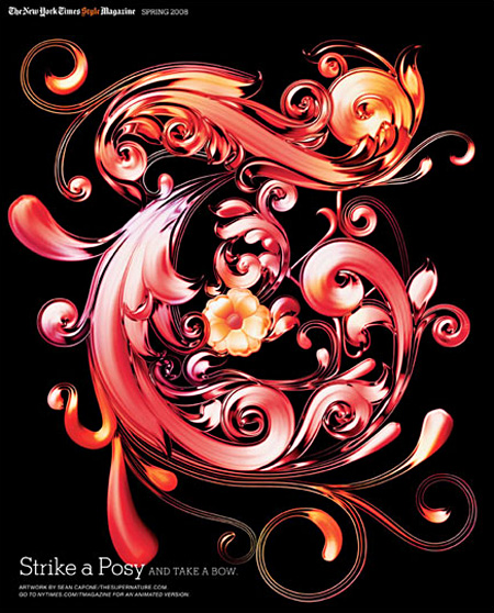
The New York Times’ T Magazine often comissions artists to create their own version of the iconic T that is the magazine’s logo. There’s a great collection of the work over at the T Magazine blog featuring some of the standouts. Interesting to see so many fresh takes on the same theme, they should make a coffee table book out of these if they haven’t already. My personal favorite is that first ceramic one; the negative space is so perfect. Unfortunately, whoever did the type layout decided that neon green in the title would somehow work with the vibe. Clearly it didn’t.
Chad Hagen
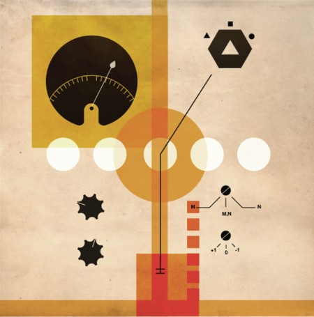
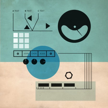
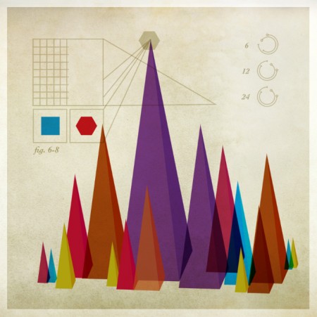
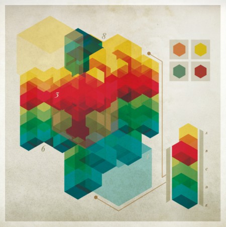

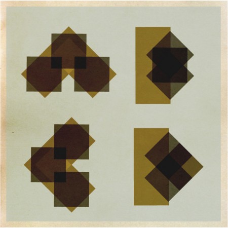
I found a number of cool sites as I explored the Cargo network this last weekend. One such site was the portfolio of Chad Hagen. I love how each of his projects unfolds as a series; within every section there are a number of interesting images tied together by similar visual stylings. I enjoyed clicking through the slideshows and determining my favorites of each, some of which are above.
His beautifully designed illustrations look like they could be out of an instruction manual for some amazing (albeit nonexistent) product or device. As his title “Nonsense Infographics” indicates, there is actually no “information” being conveyed per se — but when the graphics look this good, I don’t really care.
Munich 72 Ephemera
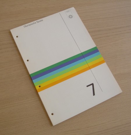
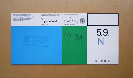
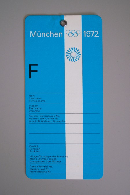
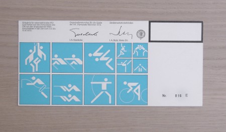
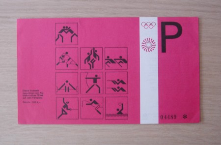
Alphanumeric has a great set of Otl Aicher work including these artifacts from the 1972 Munich Olympics. As much as I love the posters from Munich, there’s something about the official stuff (tickets, badges, etc.) that might be even more fun to look at. I love how they combine form with function and you can never go wrong with serial numbers. It’s amazing to think that people defiled that beautiful luggage tag with their names and addresses. I guess that’s what makes these all the more interesting, the fact that most were destroyed by being used for their intended purpose.