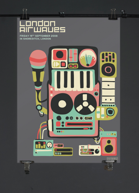
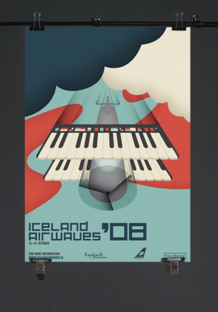
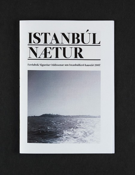
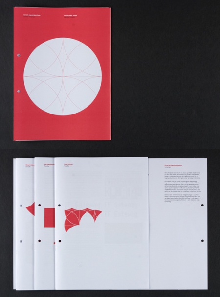
Icelandic artist Siggi Odds is amazing. I think it’s great that he takes time to describe a little background for his projects — each description is perfectly concise and provides just enough context for a better understanding of his artistic choices. Not to mention the work is terrific. I would love to see what he’s been working on recently — if his older work is any indication, he is probably doing some pretty incredible design. Keep an eye out for updates on his site. Hopefully see something new soon!
Posts in Print
Siggi Odds
Max Huber Round Two: Idea Magazine
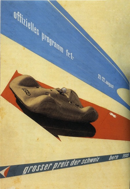
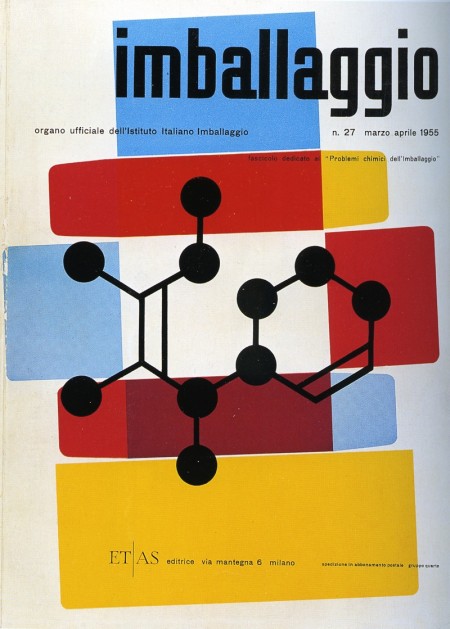
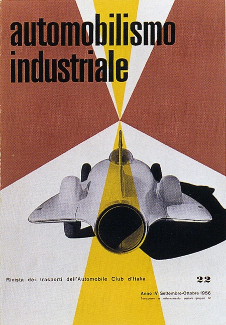
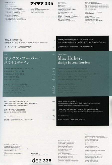
Immediately after I posted a few Max Huber posters earlier this week, I walked into Kinokuniya and saw that the latest issue of Idea was devoted to the man himself. A fantastic coincidence and even more fuel for my Max Huber inspired creative fire. The issue is huge (about 200 pages) and is filled with some pretty incredible stuff. A lot of work I had never seen before; I put a few of my favorites above (the Table of Contents as well). The issue costs quite a bit for a magazine ($50 eek!) but Idea is certainly of much greater quality than most magazines. Well worth a perusal if you find yourself in a Japanese bookstore any time soon.
Max Huber
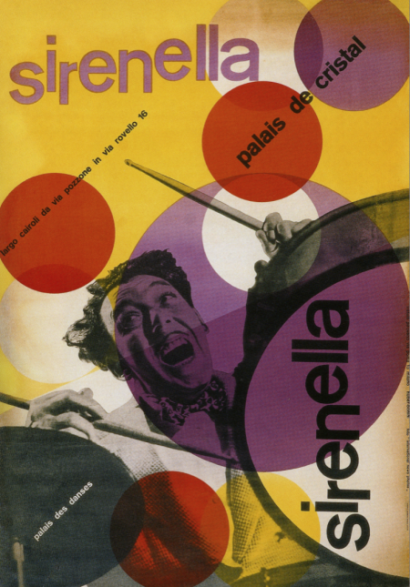
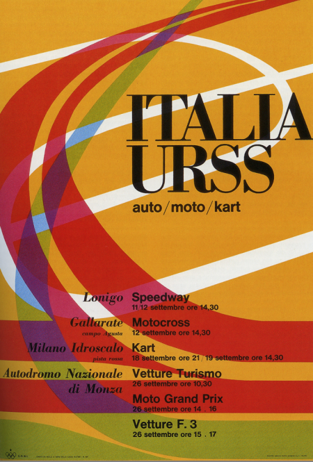
I’ve got a few projects coming up so I’ve been browsing through some of my old design books for inspiration. These two posters by Max Huber kick-started my mind into creative gear. I really like the color palette at work in both; really unusual and effective. The second one is all about the type for me. Didot Bold in all caps always does a good job. I was recently in Switzerland and am really bummed I missed out on the Max Huber Museum. Next time I guess.
Leandro Castelao
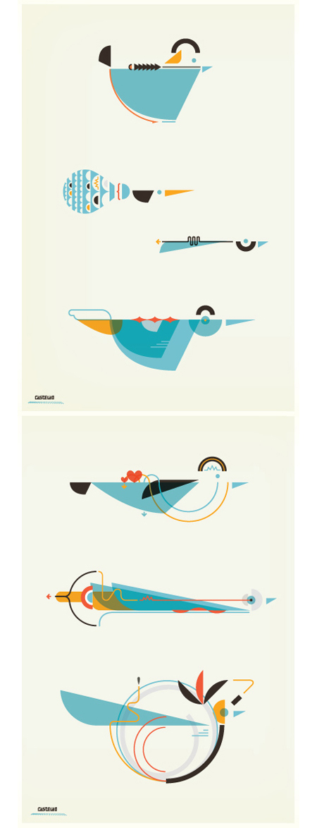
A few pieces by Argentinean illustrator Leandro Castelao. Terrific attention to detail and great color at work here. I feel like I’m looking at a retro instruction manual for some super bad ass birdhouse. Illustrations like this remind me of the work of Feric. Castelao’s are a little less intricate, but the playful/scientific aesthetic is reminiscent of some of the Fevolution renderings. Some impressive work from both artists.
Paper Embosser
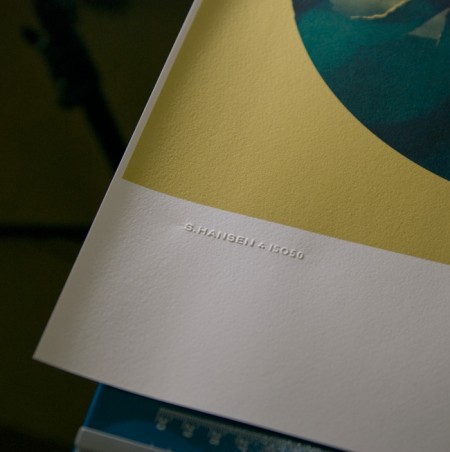
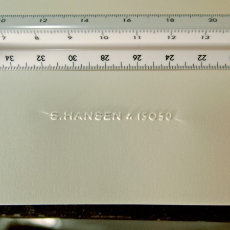
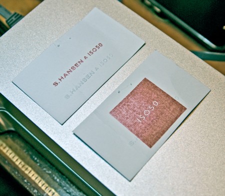
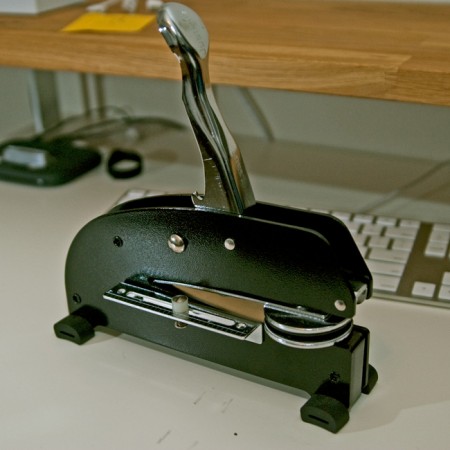
I’ve always loved official stamps and seals; as a kid I used my dad’s Civil Engineer’s certification stamp to make official looking paperwork and IDs for fun. I was looking for a way to add something like that to the upcoming Giclee line I’ve been working on but I rulled out rubber stamps as I wanted something a bit more subtle. So I recently started looking in to getting a paper embosser made with my signature logo. I was pretty surprised by how easy it was and how great the results are. The pictures don’t really do it justice, but you get the idea. The stamp can be embossed or debossed and it really adds a nice crafted touch to a project. It’s so fun I’ve started just embossing everything around the house; just cool to see the thing work.
The main cost is the press which runs about $200 (seems steep for what looks like a glorified stapler). The dies themselves — the circular part that hold the custom design — are included in this initial cost and are interchangeable. The only issue I’ve run into is with creasing at the edges. Depending on how you stamp it there will be moderate (first photo) to severe (second photo) creasing toward the edges. I am working with the vendor to fix this and depending on the technique I am able to minimize the effect. This may just be an artifact of this particular stamp as most are circular seal designs that fill the entire die, but I’m waiting until I can get it to be almost invisible. To be fair though, the flash is really exaggerating the effect in both shots, the creases really aren’t that noticeable in normal light.
Another fun — and far cheaper — alternative is rubber stamps (see third pic). I had a couple made by the same people and it’s been fun blasting those all over everything. But I was thinking the embosser in particular would be a really good buy for design students wanting to add a little extra something to their projects and also to mark their text books. It really has that old school real-world graphic design feel.
The unit pictured above is a heavy duty desk press from Made to Order Stamp and Seal out of New Mexico. We tried some local vendors initially, but the customer service of Made to Order was much better. They really work with you to determine the best option for your needs, and can turn around a custom job within a week. Highly recommended.
Film the Blanks
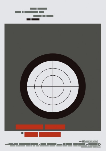
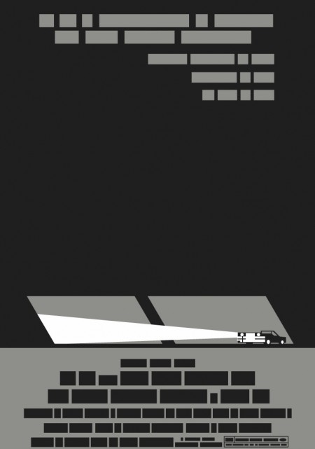
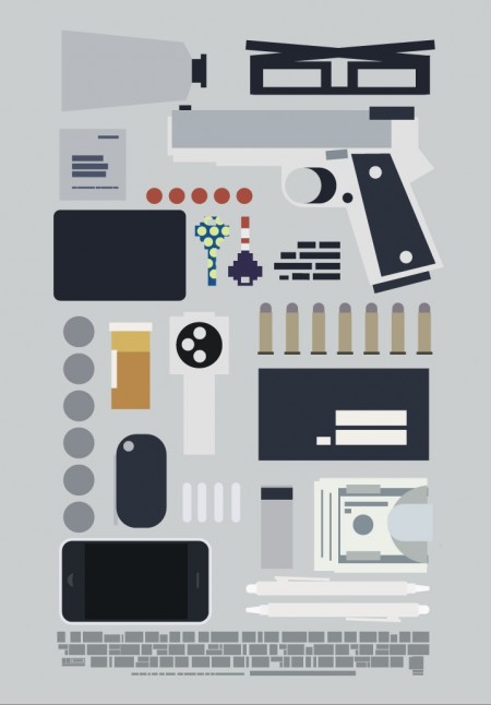
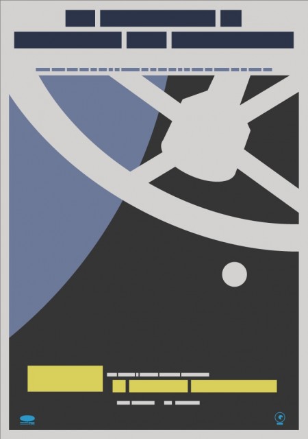
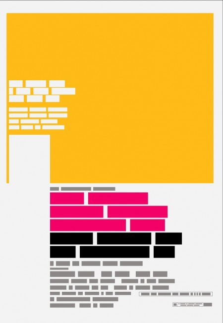
Film the Blanks is an ongoing design experiment that takes existing film posters and abstracts them down to their core elements. The project has garnered much press over the last few months, and I figured I’d post up some of my favorite pieces. I like the work because of the visuals, but there is also a strong participatory component that sets it apart. Each time a “blank” is uploaded to the site, users are invited to guess which film the abstraction represents. In some cases the solution is obvious, but it’s often remarkably difficult to discern which poster is hiding behind the blocks. Eventually clues are released and points are awarded to the successful guessers. It’s an exciting format for a design project; one that takes a strong concept, built around a fairly standard medium (poster), and twists it into something unique and engaging.
You can find all the posters in the Flickr set. You can also buy a few over at the Buy the Blanks store.
Ring Geigy for Service
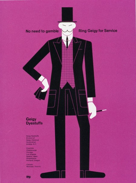
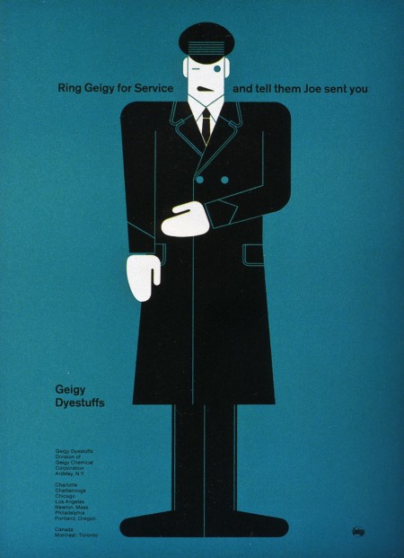
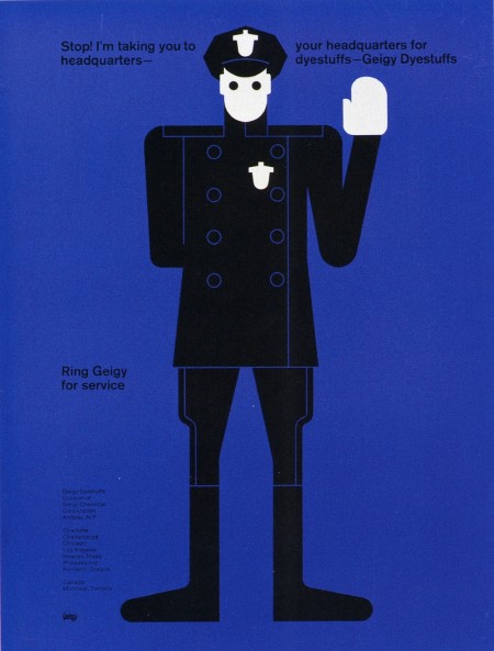
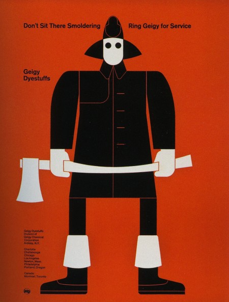
These advertisements are part of a Geigy campaign from 1965. They are all letterpress illustrations by Fred Troller. Each version pairs a striking figure with a related slogan and encourages you to “Ring Geigy for service.” I probably would have called these guys up even if I had no idea what “service” they could provide.
I like Winkreative’s identity for Porter Airlines for similar reasons. I wouldn’t stack one against the other by any means, but the use flat colors, stark figures, and limited perspective at least puts them in the same inspiration folder for me. (And the panda is awesome)
Ill Studio
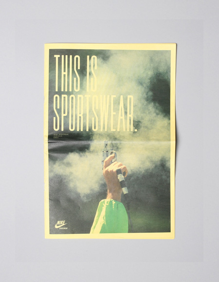
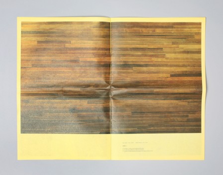
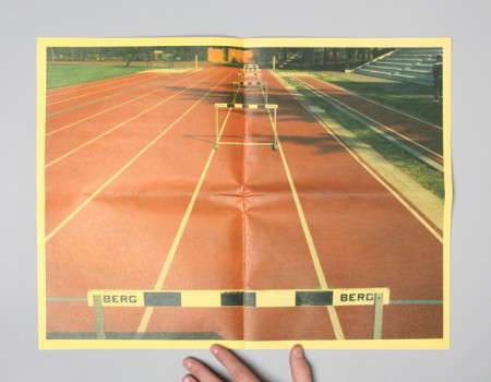
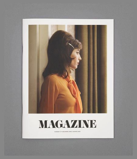
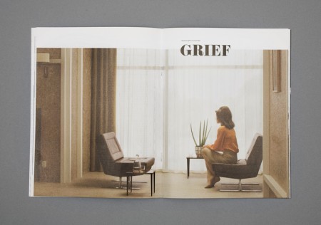
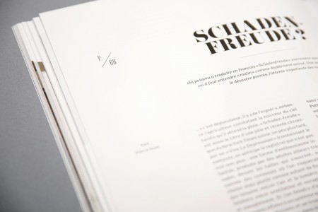
Awe inspiring work by French design collective Ill Studio. I really can’t get over the colors and texture in the Nike ad, absolutely incredible. From their About page:
The ill-studio is a French group of collaborators devoted to fine arts. Our goal is to bring ten individuals together, working in various artistic areas such as graphic design, photography, typography, illustration, video, motion design, etc.
The ill-studio is Léonard Vernhet, Thomas Subreville, Nicolas Malinowsky, Thierry Audurand, Sébastien Michelini, Pierre Dixsaut, Harold Urcun, Artus de Lavilléon, David Luraschi and Fred Mortagne.
Oil Company Ephemera
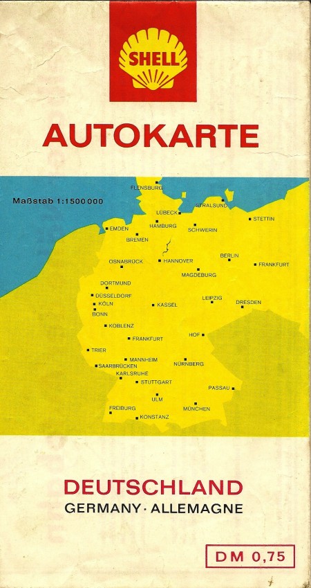
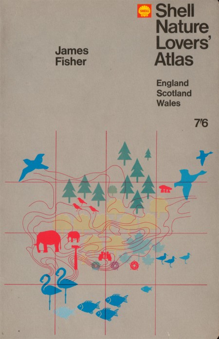
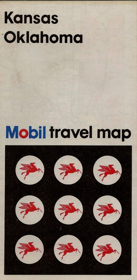
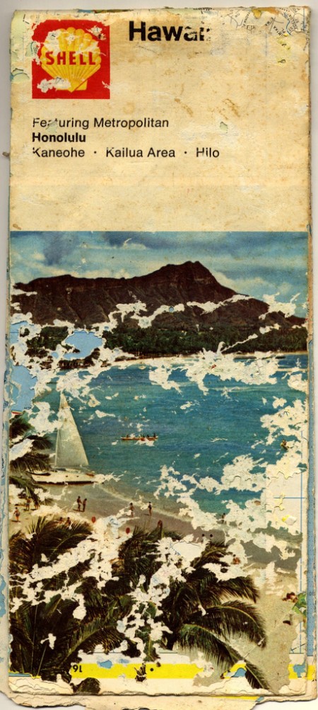
Just a small collection of oil company maps I’ve found around the web; I wasn’t aware of this fascinating sub-genre of design. This is the sort of throw-away stuff that for some reason is the coolest thing to find in the garage drawer it’s been sitting in for 30 years. I think that Hawaii one is actually just a Casino Versus Japan 12″ cover. That German one is ridiculous; leave it to them to design a map that they give out free at the gas station that betters the collective output of United State graphic designers for the entire calendar year in which it was produced. Way to go guys.
Sources:
Shell Nature Lovers’ Atlas
Shell Deutschland Map
Mobil Travel Map
Shell Hawaii Map
Robert Longo
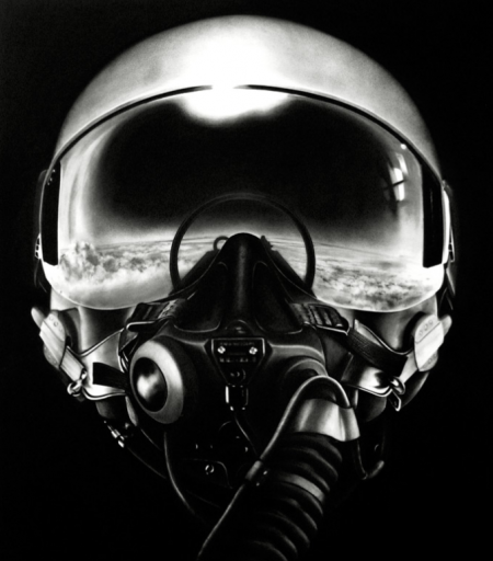
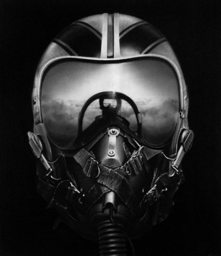
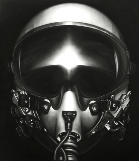
These images are by New York City based artist Robert Longo. Props to but does it float for spotting these, truly a great find. I have always been fascinated with anything and everything to do with aviation, so these are of obvious appeal. The coolest thing is the process behind them; though they look like photographs at first, they are actually graphite and charcoal drawings, based off projected photographs. The background disappears and all that is left is the strikingly detailed subject. These pilot renderings are my favorite, but much of his other work is up on his site for your enjoyment.