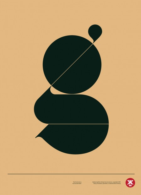
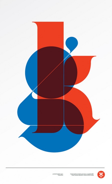
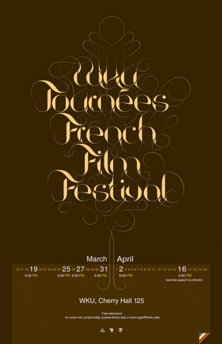
I had seen Aron Jancso’s “g” poster on Buamai earlier but just recently saw more of his work. Very impressive mastery of typography. Check out his Flickr for more.
Posts in Print
Aron Jancso
Paul Tebbott
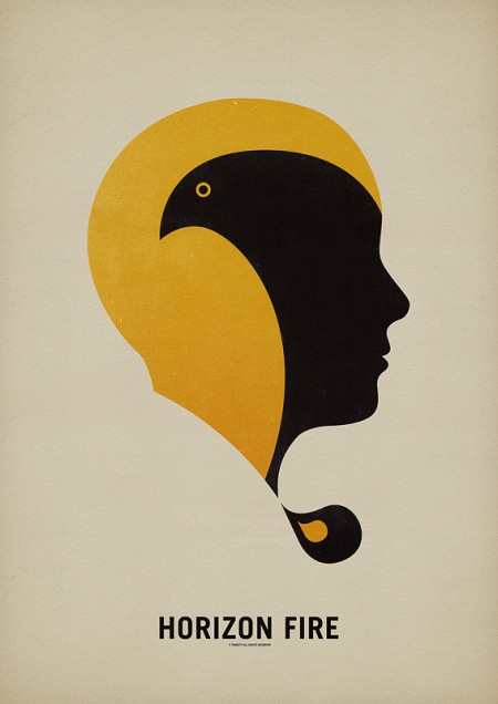
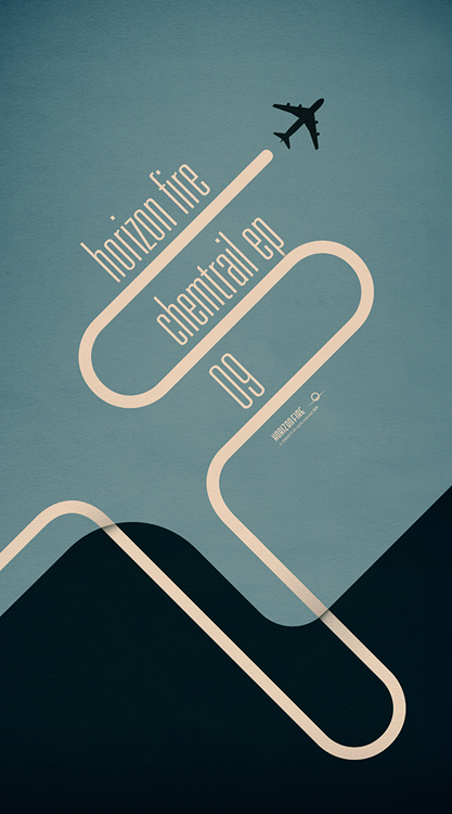
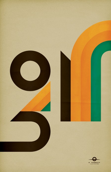
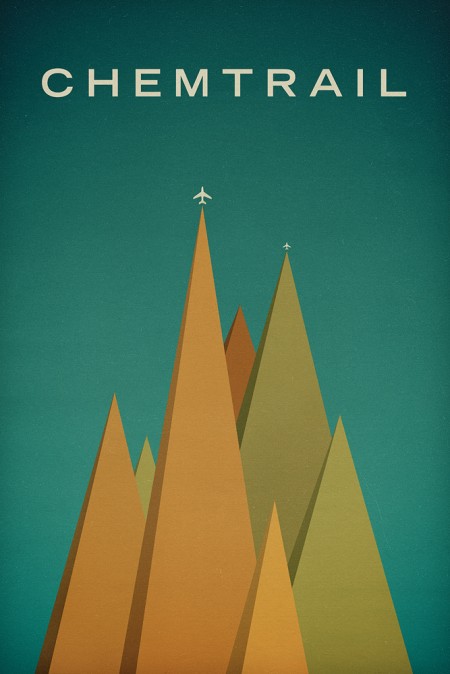
It’s always great to learn about new artists and Paul Tebbott is no exception. Alex sent me Paul’s site today and I was really moved by his color choices and restrained use of texture and distressing. Paul seems to be just getting started — as evidenced by his relatively small body of work — which is all the more reason to believe we’ll be seeing lots of great things from him in the future. If that’s not enough for you, Paul also has a music project that Boards of Canada fans will surely find enjoyable.
New York Times Magazine Redesign
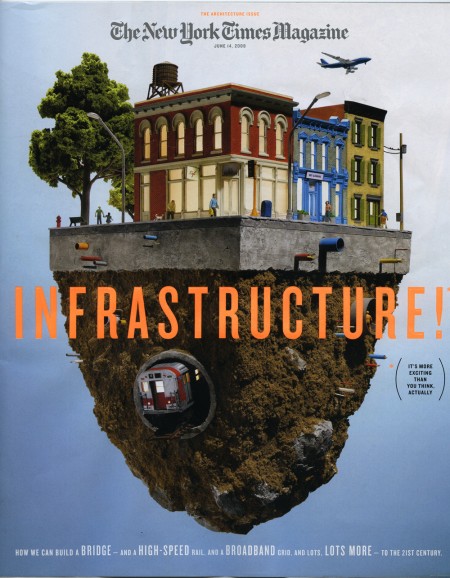
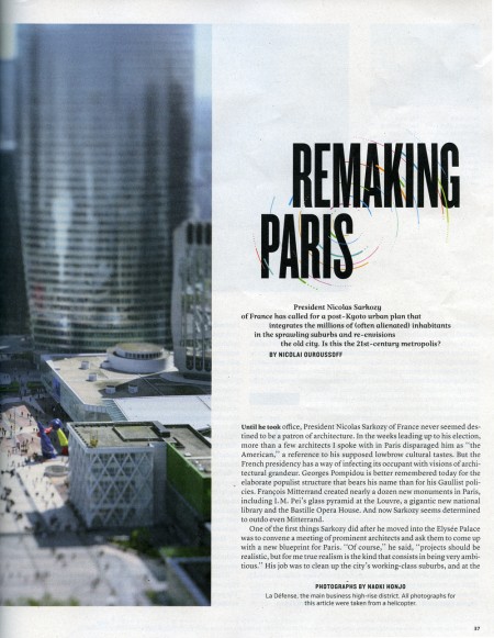
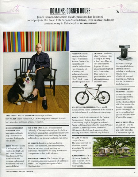
The New York Times Magazine is the reason I wake up early on Sunday morning. Excellent photography, fascinating articles, and sophisticated design fill its pages week to week. It was recommended to me when I started graduate school and I haven’t missed an issue since.
This week the Times rolled out a new, svelte version of the Magazine. Like everyone, they are cutting costs where they can, and it was determined that reducing the size of the magazine by 9% would save them millions in paper costs. To accommodate the smaller page real estate and squeeze in more words, they enlisted Lyon Text, a more condensed typeface than they were using before. It’s a very subtle switch, and as they say, “Perhaps if we hadn’t mentioned it, you would hardly know the difference.” Where the change is most obvious is with the two new display faces: Knockout (H&FJ) and Nyte (Dino dos Santos). Both work really well in the new layout; definitely my favorite part of the redesign. They have also reworked the table of contents, changed the section order a touch, and sprinkled a multitude of new design elements throughout.
I think Arem Duplessis and his team have done an incredible job. I loved the Magazine before, and was initially concerned they might mess with a winning formula, but I think they succeeded in turning budget induced page shrinkage into a successful and well-executed redesign. Intact is the nuanced and ultra refined look and feel that first caught my eye. The smaller size is actually more manageable (a la Rolling Stone), and afforded them the opportunity to make the exciting upgrades. I don’t think anyone will miss the extra millimeters.
note: There were two covers that came out with the redesign. The one above, with a model by Thomas Doyle, was my favorite, but be sure to check out IC4Design’s version on the NYT website if you’re interested.
Jung + Wenig
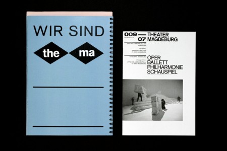
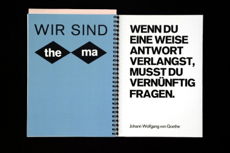
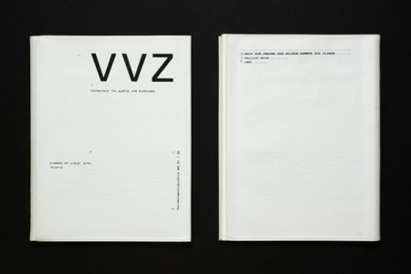
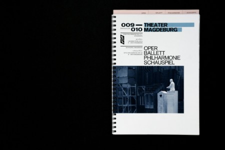
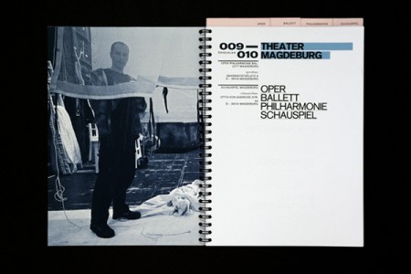
Some wonderful things going on over at Jung + Wenig. Always a fan of this brand of restraint. Via The Strange Attractor
Jessica Helfand / Letter to Students
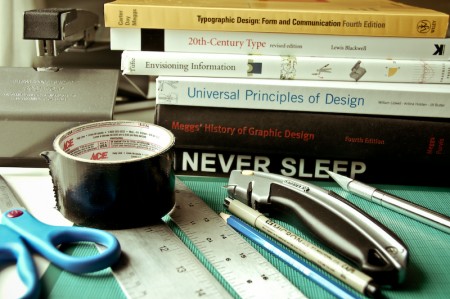
Jessica Helfand wrote an open letter to design sudents everywhere this morning. It is an insightful piece, and I think everyone could benefit from giving this a read really, student or no student.
If you’re graduating in the middle of a recession, it’s likely that an arc of despair trumps the impending thrill of your newly-liberated station in life. Conversely, though, I can’t imagine a better time to get out of school. Nobody’s hiring, but why let that stop you? While the mechanics of, say, having a roof over your head suggest that a little modest income might be a good thing, the actual economics of making work no longer depend on an actual employer. The portfolio no longer means a big black suitcase schlepped around from studio to studio. Get your work online, put your videos on YouTube, and get busy.
I am about 1-2 years out from graduating myself and I already feel the jitters of the “what next…” syndrome. The world of design is changing so fast, every day, and it can be quite an intimidating place to look out upon from within the graduate school bubble. Sometimes I feel like being a student is like being a star college basketball player; floating along no problem in this league—making threes, hitting jumpers, dominating the *paint*—only to be in for a big surprise when you graduate to the Pros and get dunked on by guys double your height and ability that got recruited straight out of high school.
The cries of “nobody’s hiring!” that sound throughout the design world can be periodically distressing, but also inspiring in a backward kind of way. As Ms.Helfand alludes to above, the traditional model of graduate/interview/work for studio is not what is necessary anymore (and thankfully!). New opportunities exist, and as long as you have that hyper-awareness and ready ability to adapt, you can take advantage of them just like before. At least that’s the way it seems from inside the bubble.
It does seem like a scary time to graduate now (and probably will again in a couple years), but the optimist in me agrees with her letter and isn’t concerned. Everything is going crazy and I’ll just try to stay crazy right along with it. Read the full letter on Design Observer.
New Work From Andy Gilmore

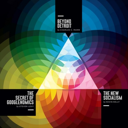

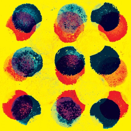
I posted on Andy Gilmore last year and I stumbled across his site again today. Looks as though Andy’s been busy, there’s a lot of great new work up at his site. This stuff would be great large format.
El Al Playing Cards
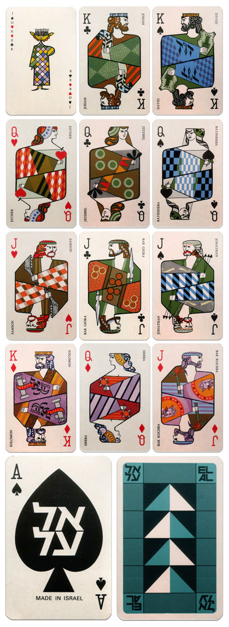
Ministry of Type has a great post on these beautiful El Al Playing Cards. The cards — illustrated by Jean David — came in this cardboard sleeve. The MOT article is quite in depth and includes all sorts of extra credit info: Link
These are definitely the best looking playing cards I’ve ever seen, someone needs to reproduce these and offer them for sale. I keep seeing all these nice examples of design and thinking how sad it is that most of us will never actually get to see any of them in person. Apparently MOT scored his own deck the old fashioned way, via eBay, but that’s so 2002. Somebody needs to form a non-profit pirate design company that’s sole purpose is to reproduce and freely distribute design artifacts. I’ll take a few copies of all of these.
Loworks Japan
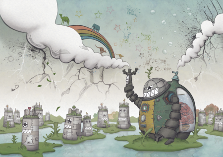
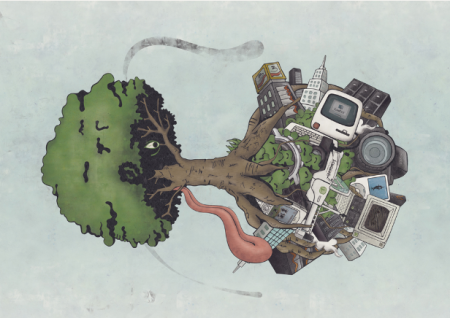
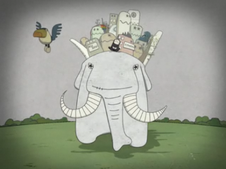

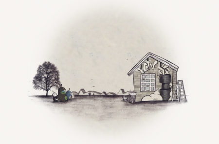
Loworks is a design company based in Japan. I’ve been on a wacky illustration kick recently, and it’s always fun to see what Loworks is up to. Their old site is one of my all time favorite website designs. It may not be the best design from an accessibility standpoint, but you can’t beat the creativity and absolute craziness at work. I wish it was still active, always made me happy. Computer Arts did a small feature on Loworks if you are interested.
Film Festival Project Completion
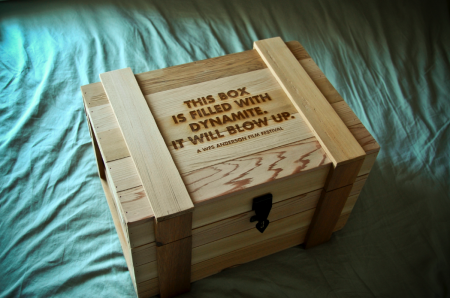
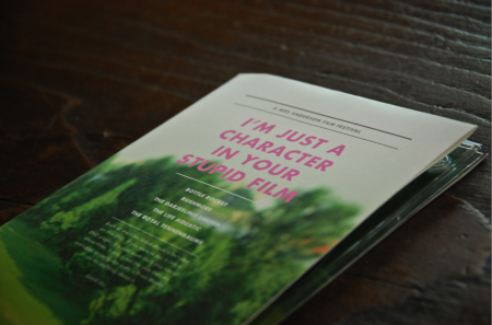

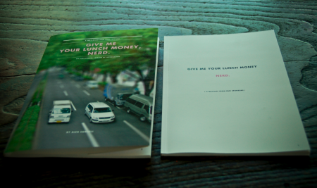
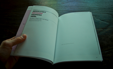
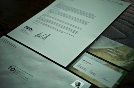
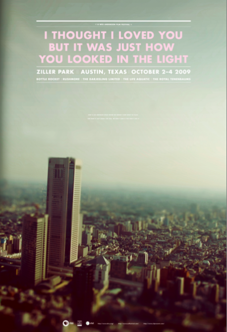
It’s done! The semester came to a close last week and my hypothetical Wes Anderson Film Festival went off without a hitch. On the final day, the project consisted of a presentation box, DVD set, poster (30″ x 44″), fold out schedule, identity system, catalog book (63 pages), website, soundtrack packaging, tickets, billboards and outdoor signage, iPod/iPhone skins, a trailer, and a few other assorted doodads. It was crazy to see it all in one place. I was very happy with the way it all turned out and am relieved to have made it through successfully. This semester was a particularly intense one (as we were also presenting our thesis proposals), and it’s exciting to have made it halfway through the graduate program. Next up will be thesis development over the summer.
This semester’s project really helped us develop our conceptual and technical skills, as we were challenged to create a integrated brand system across a variety of mediums. Everyone had to work with a number of vendors (easily my least favorite part) and be able to coordinate a massive design effort on a strict schedule. My process was not without its speed bumps; color calibration issues at the printer, boxes delayed by weather for weeks, and unfortunate stylistic meanderings early on, all contributed to periodic frustration along the way. Thankfully, once I knew how I wanted everything to look, the implementation of the brand became systematic. The last couple weeks were just a matter of hammering things out.
Above I’ve included some of the pieces that I have not written about previously. First is the presentation box which housed all of the other materials for the festival. It was constructed by Wood Box Supply and is branded with an irreverent slogan. I liked this, but still wish I would have thought of something a little funnier. Next is the DVD set which came in a similar wooden box. These were created out of paper folds and a plastic DVD tray. You’ll also see the catalog, which was one of my favorite things to design, as it allowed for the most copy to be written. As usual, no one will probably ever read most of what is contained within, but it was still fun to put together. Next you’ll see the identity system for sending things to and fro, and which classified my rank as ‘marginally important person.” The rest of the project, in its entirety, can be seen here.
The last image is one of the final versions of the poster (there were many color variations). This was one of the first things I designed for the project. After I completed the rest of the system, I really didn’t feel like the poster fit as well with the other elements. The photograph, especially the dominant color palette, didn’t mesh very well with the warmer tones at work elsewhere. I was aware of this as I worked through the rest of the system, but had unfortunately already printed the poster very early on. It can be a real nightmare printing at the end of the semester (due to the student rush at the vendor), and I always try to finish early and get the printing out of the way if possible. In this case, I would have liked to switch out the photo for something more consistent with the rest of the project. I really had a hard time seeing my picture of a Tokyo skyline (tilt shifted as it may be) conjuring Wes Anderson.
Given that the photograph didn’t really feel like the festival, I tried to at least bring it a little more on brand with the language used. The original title of the poster was “I love you too but I’m going to mace you in the face”, a line from The Darjeeling Limited, but this was determined to be “too violent” and I changed it to a Fall Out Boy lyric that possessed the same dry wit. This title fit with the rest of the identity marks and I was happy with the tone it set. The last issue was finding an appropriate text lock up to fit in the sky section. Eventually I settled on one that didn’t fill out the whole space. In the empty area below I wrote “Here is an awkward space where we weren’t sure what to place. For now it just looks like this, we don’t care if you don’t like it.” That made me laugh and I figured it was as “Wes Anderson” a solution as I could muster. It was that or leave it blank, but on a 30″ x 44″ poster, there needed to be something there. I like the poster as a stand alone piece, but as part of the system, I feel like it is the weakest link.
So that’s it, all done! As I’ve mentioned, the project is for a hypothetical Wes Anderson Film Festival and there is no actual event. I got more than a few confused emails after the trailer was posted. So just to be clear, this doesn’t actually exist. If Mr. Anderson is reading this, and would like to actually hold the festival, that would be fantastic for all involved.
Designunit
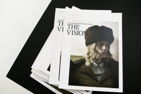
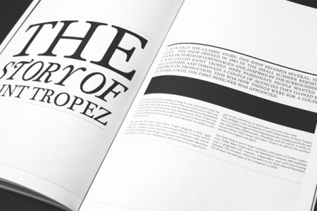
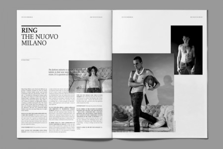
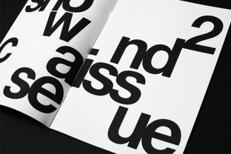
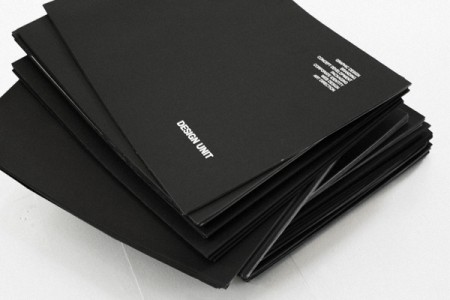
Assorted works by Designunit. One of my teachers at school likes to use the expression “swipeable” when describing cool/inspiring work. Our goal in class is to create something badass enough for people to want to “swipe” and use for inspiration. The above work by Designunit meets that criteria for me (and for people on Dropular just about every other day…). It’s been a mainstay in my inspiration folder for some time now.
My favorite medium of design is the magazine and I consistently look to them for inspiration when starting a new editorial project. They have a interesting approach to layout—grid based but still somewhat loose—and I find it to be very polished and refined. It manages to maintain a classic quality while still seeming hip and progressive. Designunit is based in Copenhagen and you can see the rest of their work on their site.