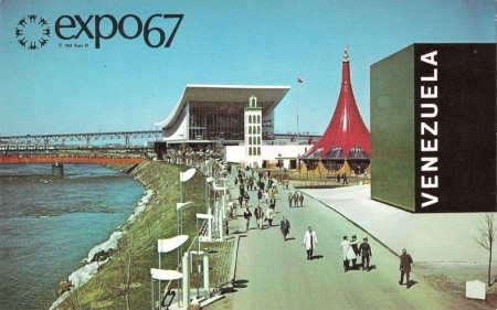
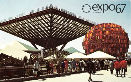
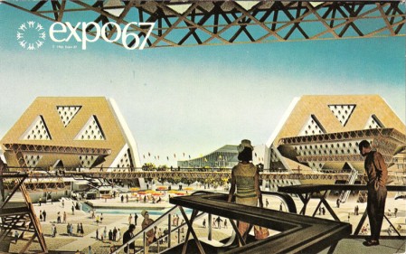
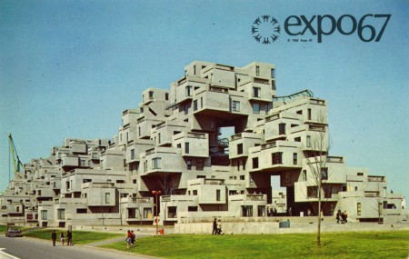
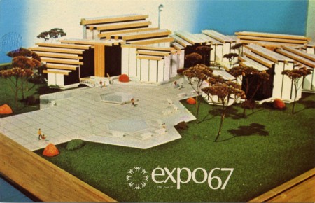
I’ve posted on Expo 67 before but it’s so good I thought it was time to bring it up again for the uninitiated. Alamedinfo has what looks like the full collection of Expo67 postcards from the Montreal World’s Fair. I will never get over this style, it’s just so perfectly executed. It says a lot about the spirit of an age when they had such fanciful visions of the future. Of course, it could be that very kind of irrational exuberance that landed us where we’re at now — and it’s probably a good thing given way to a more pragmatic vision — but it’s still nice to look back and smile. Link
Posts in Print
Expo 67 Full Collection
Jonathan Calugi / Happy Lovers Town
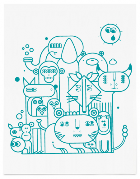
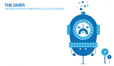
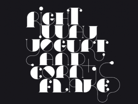

A few illustrations by Jonathan Calugi. I first came across his portfolio when he was featured on Behance, and have been following him ever since. The majority of his work is illustration based, but he also has created a few custom typefaces consistent with his whimsy aesthetic. His style reminds me a bit of Sanna Annukka (especially her Keane project), but with a little more playfulness thrown in. I love how random and awesomely weird it is. See the rest of his portfolio here.
Side note: I am currently blogging this on a WiFi equipped airplane, which i have to say, is pretty awesome. It’s actually a faster connection than my one at home (sigh). I usually hate flying, but Virgin America continues to make it easier and easier.
Dollar Redesign Project
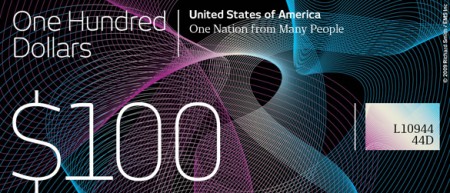

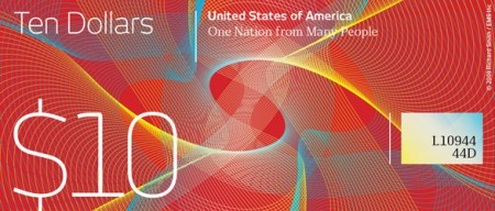

Some cool alternate takes on US currency over at The Dollar Redesign Project. I’ve always admired the more colorful, better designed currencies from places like the UK and Canada so it’s nice to see people apply those design ethics to the good old greenback. Honestly, anything is better than our new stuff with the pink and the huge heads, looking more and more generic by the day.
via @trashrockx
Graduating to Graphic Design
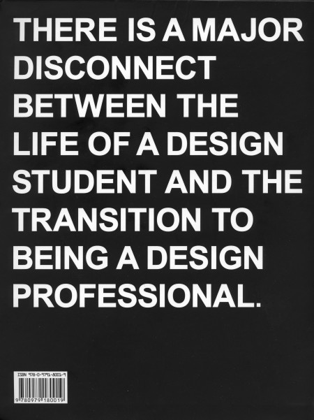
I just finished reading Never Sleep, the new book by Andre Adreev and Dan Covert of dress code. As a student, the back of the book (pictured) kind of freaked me out when I first saw it. My brief and occasional foray into the world of freelance has exposed me to some differences between school and the professional world of design, but I’ve always figured I’ll be in for a wake up call when I graduate regardless. I was psyched to see a book written about this exact process, and I spent last night (as the title suggested) reading the lot of it.
The book chronicles Andre and Dan’s transition from design school to the professional world. They describe, in-depth, just about every aspect of their journey; studying at CCA, working for MTV, and the eventual creation of their own studio in NYC. Along the way, they include examples of their own work from each stage of their career, as well as various essays by professors and professional designers (many of which are available on the site). The book describes just about everything that happened to Andre and Dan, even the occasional IM conversation, and this makes for a very engaging read. The third person narrative is just about as random as it is amusing, and is ultimately very accessible and insightful for the struggling design student (that’s me).
Dan is Ohio. Andre is Bulgaria. They is dress code. At the combined age of 50 their work has been recognized by shiny awards, appeared in lots of magazines, coffee table books, and 3 museums. They met while studying graphics designs at California College of the Arts. Then moved to New York and got jobs with MTV working in motion and print—before stupidly leaving their dream jobs to start a studio of their own. (Buy)
Astrid Stavro / Barcelona Studio
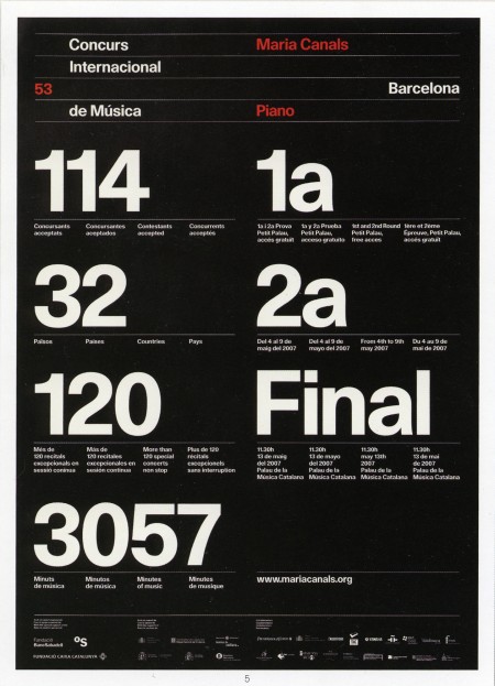
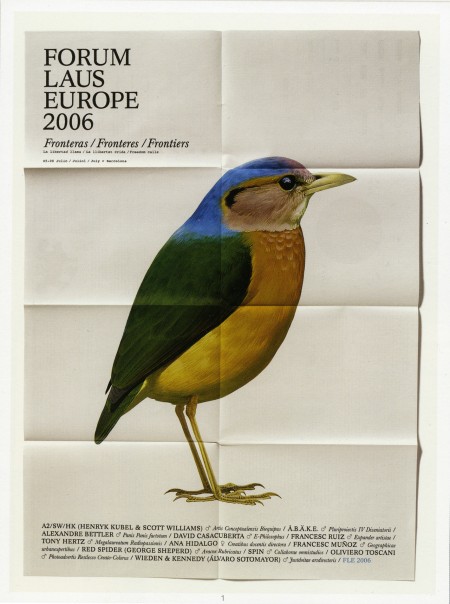
A couple pieces from the wonderful Astrid Stavro. The top image was the poster for Maria Canals International Piano Competition in 2007, and the bottom is from the Forum Laus Europe in 2006. I’ve seen some of her other work circulating on the blogs recently, but I prefer these older posters for their refined typography.
I also enjoyed this quote they have up on their website: “Small design companies produce good work, large ones produce shit work.” (Jonathan Barnbrook). Not sure if I agree completely (because I just don’t know, not because I have evidence to the contrary), but the work coming out of Astrid’s studio certainly validates the claim.
JNTO Envelope
Epson Large Format Printers
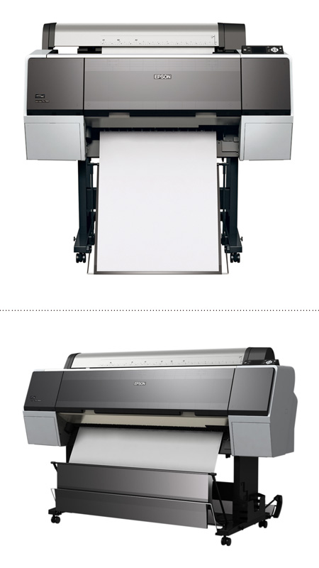
I got an Epson R1800 a few years back and was always happy with it; the output was incredible and it was rather inexpensive considering. Sadly, it has clogged heads now. I fed it third party ink and then hit the road for a few months. When I returned almost all the colors were jammed up and despite numerous attempts at cleaning with various methods, it’s still not working. Fortuneately, Alex has one and has been printing off my proofs in the meantime while I try to decide on a new printer.
I’ve always kicked myself for not having gone for a larger format printer when I bought the R1800; the 13″ width was very limiting and it just wasn’t economical with those tiny, expensive ink tanks. So this time around I am looking to move up to the large format models, either 26″ or 44″. I have had to outsource a lot of my large format stuff in the past and by now, I probably could have bought the printer with what I’ve spent paying the print shop for jobs. So I think I’ve narrowed the search down to the two new Epson models, the 7900 (24″) and the 9900 (44″). They both have all the same features, they only differ in maximum paper width and price. I posed the question of which one to go with on Twitter today and got some good responses. The one that stuck with me though was from @jheftman: “Buy it nice or buy it twice.” Indeed, I’ve been through that already with the R1800. But I am glad I learned my lessons with the R1800, they could have been much more expensive with one of the large models.
As for the alternatives, I did talk to my friend Erik Natzke about his setup. He’s running an HP 44″ and had nothing but good things to say about it. I have heard a lot of opinions on both platforms and it’s a tough call. In the end I might go with Epson just because that’s what I know and it was a pretty steep learning curve with a lot of trial and error to get predictable color output from the R1800, I wouldn’t want to go through that again with another brand.
So I thought I’d pose the same questions to you: What have your experiences been with large format printers? Any reason that Epson is superior at the point to HP, or vice versa? Sound off in the comments, any info you might have either way would be greatly appreciated.
Mark Weaver

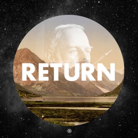

The above are from Mark Weaver’s Make Something Cool Everyday project. I’ve seen a number of these types of projects, especially on Behance, and Mark consistently has some of the more impressive results. The top image is my favorite by far; drastic big/small differences in type always appeal to me when done well.
I’ve never really put my daily “coolness generation” skills to the test; I usually make something cool over a period of weeks or months. Once I have a visual aesthetic defined, I can churn out work pretty quick, but the development of this always takes at least a week. Maybe I should start my own ‘everyday cool’ project to speed up my workflow…
Your Business Card is Crap!
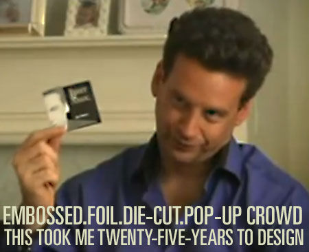
httpvh://www.youtube.com/watch?v=4YBxeDN4tbk
Hilarious, this guy is like the Tony Robbins of business cards or something. “It took me TWENTY—FIVE—YEARS to design this.” Link
Arctic Survival
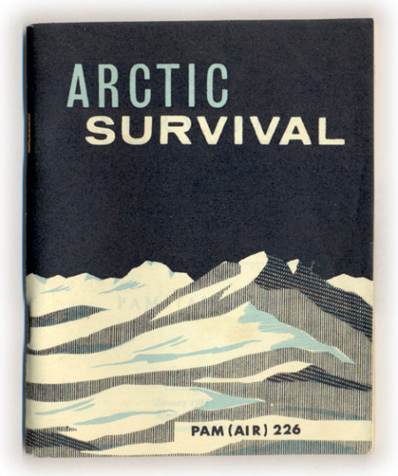
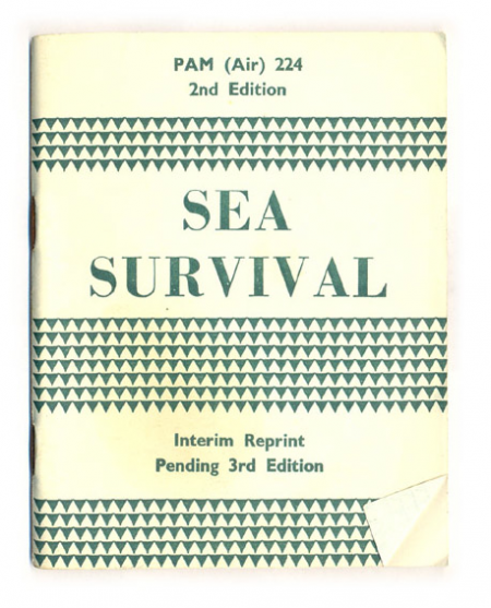
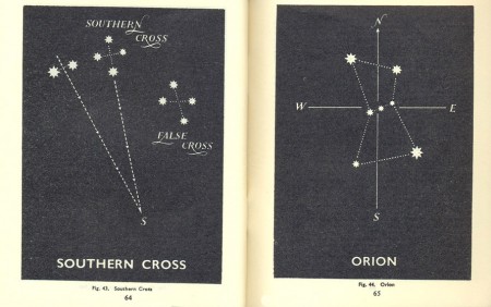
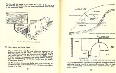
Hopefully won’t be needing either of these anytime soon, but with a cover like that, I’d take the Arctic one around with me regardless. Both survival manuals, along with a desert and jungle version, are up over at things magazine. You can even read the entire book if you think you might find yourself in an ice or sea related predicament.
Conserve your energy. Do not rush around aimlessly. Avoid fatigue. Get plenty of sleep. If you cannot sleep, just lie down and relax your body and mind. You will not freeze to death unless you are utterly exhausted. (link)
